Preferences
Every object in GraphWorX64 including This Display as well as the general application have preferences that you can set for them. For most objects, preferences set the default values for the properties of that object type so that when you work with an object of that type, its default values are those values that you typically work with. Not all object properties have defaults that can be set in the preferences; furthermore, not all preferences can be overridden for individual objects.
-
For objects, preferences set default values on the object's Properties tab.
-
For dynamics, preferences set default values on the object's Dynamic tab.
If you find that you are changing the properties of a particular class of objects on a regular basis, then modifying that property for the object class makes sense. Most of the time though the defaults should be altered for objects directly in the display. It is particularly important to be prudent when altering preferences in displays or projects that other developers are working on; changing the preferences without conferring with other people who are affected could lead to confusion and problems in your displays.
How to Go to the Preferences Tab
To view the Preferences tab:
-
Click the GraphWorX64File menu and then click on the Preferences button at the bottom right of the menu.
-
Or on the GraphWorX64 ribbon, click the View tab and enable the Preferences check box in the Show/Hide group.
All preferences are shown in the figure below (where the list has been elongated to show all of the categories). Note that preferences for 3D objects are included in the preferences list only when a 3D viewport is open on the GraphWorX64 work surface. Normally, the top part of the Preferences tab lets you scroll through and select a preference; the preference's properties appear in the bottom part of the tab (as shown later in this topic).
A List of All Preferences
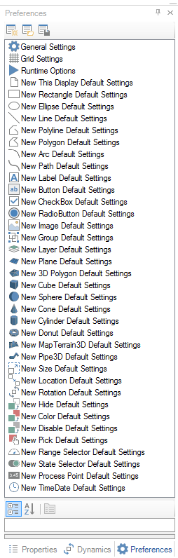
Summary of Preference Categories
Each of these Preference categories is described in more detail later in this topic. To go directly to one set of preferences, click the one you want below.
|
General |
Objects: |
Dynamics: |
|
New Rectangle (2D) |
||
|
New Ellipse (2D) |
||
|
New Line (2D) |
||
|
New Polyline (2D) |
||
|
New Polygon (2D) |
||
|
New Arc (2D) |
||
|
New Path (Spline) (2D) |
||
|
New Button (2D) |
||
|
New CheckBox (2D) |
||
|
New RadioButton (2D) |
||
|
New Image (2D) |
||
|
New Group (2D) |
||
|
New Layer (2D) |
||
|
New Plane (3D) |
||
|
New 3D Polygon (3D) |
||
|
New Cube (3D) |
||
|
New Sphere (3D) |
||
|
New Cone (3D) |
||
|
New Torus (Donut) (3D) |
||
|
New Terrain (3D) |
Setting a Preference
To set a preference:
-
Click the Preferences tab, then click the category of preferences you wish to alter.
-
Scroll through the individual properties in the details part of the tab until you locate the property you want to modify.
|
|
Note: The number of properties that appear in the Preferences tab is determined by which Application Mode you are currently working in. It is possible that you will have to change the Application Mode in order to see all of the available properties for the category you have chosen. For information about changing application modes, refer to Configuration Modes. |
-
Click the property, then make the modifications you desire.
In the figure below, New This Display Default Settings is the selected category. The display size has been altered to 800 X 600. Note the icons at the top of the tab:
-
The Save Applications Preferences button is indicated by a red circle, although preferences are automatically saved when you leave the tab or select a different category.
-
Should you decide to revert back to the standard GraphWorX64 preferences you can click the Reset to Default Application Preferences button. In the figure below that icon is indicated with a green circle.
-
Finally, you can undo changes you made in a session that haven't been saved by clicking the Reload Last Saved Application Preferences button, which is between the red and green circles.
Changing a Preference

|
|
Note: Any changes you make to the preferences are automatically saved when you exit the display and save changes. |
Preferences that Affect All Objects
Of special interest to you are the General Settings, Grid Settings, and the New This Display Default Settings because these settings alter the main objects that nearly all GraphWorX displays use. The important preferences for these three objects are described below. Click on the hyperlink to scroll directly to the topic:
-
General Settings. RestrictAngle changes the incremental angle at which objects you rotate snap when you use the Shift key during object rotation. Most important is the setting for whether RelativePathsare used for paths, and whether local aliases must be unique.
-
Grid Settings. Preferences for grids allow you to make it visible, snap to, set the point colors, and alter the vertical and horizontal spacing.
-
New This Display Default Settings. The most commonly changed default settings are size in the Measurement section, the ability to stretch, scale and zoom in on the display, the ScanRate at runtime, and default local aliases in the LocalAliases property. Additional properties are available for each individual This Display's properties.
General Settings
The following is a list of all General Settings properties that are available in Advanced application mode. General settings become the rule for working in the GraphWorX64 work surface; they cannot be overridden while working in displays, but can be changed using the Preferences tab. Setting these preferences is optional. General Settings are:
File New/Save section:
-
DefaultSaveLocation - The optional default save location for new displays.
-
DefaultNewFileName - The optional default file name for new displays.
-
DefaultNewFileType - Specify the type of file you want all GraphWorX64 displays to be saved as by default. This option is helpful if you are creating GraphWorX64 templates, displays and templates for Windows Phones, or compressed display files. For an explanation of file formats, refer to the Displays and Templates topic.
-
DefaultNewRootObjectType - Specify whether you want new displays to be on a canvas or a grid.
-
AutoSaveOnEnteringRuntime - True to automatically save the current display before entering runtime mode.
-
RelativePaths - True uses relative paths for files and URLs that are referenced in displays. False uses absolute paths.
-
CopyLocal - True if referenced images should be copied to the same directory as the current display file when the display is saved.
Layer Configuration section:
-
IsGridEditorInteractive - Determines whether a grid panel’s on-screen editor is interactive after selecting the panel.
-
IsGridEditorVisible - Determines whether a grid panel’s on-screen editor is visible after selecting the panel.
Layer Configuration section:
-
HideLayersAboveActiveLayer - If true, layers above the "active" layer will be automatically hidden in configuration mode. If false, layer visibility in configuration mode will not be affected by the currently active layer (this is the default behavior).
-
HideLayersBelowActiveLayer - If true, layers below the "active" layer will be automatically hidden in configuration mode. If false, layer visibility in configuration mode will not be affected by the currently active layer (this is the default behavior).
Miscellaneous section:
-
ExplorerText - Specify the text you want displayed for objects in the Project Explorer in GraphWorX. This affects all objects in GraphWorX. Every object that is added to a GraphWorX display has a Name property and a Title property, and also appears in the display's Project Explorer; you must specify whether objects' names or titles appear. The default is Name.
-
RestrictAngle - Determines the incremental degree to which objects snap. The default is 15 degrees. This option affects the following:
-
-
When you draw lines, polylines, polygons, and paths (splines) while holding down the Shift key, their angles are limited to the angle specified here.
-
When you resize arcs while holding down the Shift key, the angle is restricted.
-
When you rotate objects with your mouse while holding down the Shift key. For more information, refer to Rotating Objects in 2D.
-
-
DragSelectMustFullyEnclose - Determines which objects are selected when you drag your mouse to select objects inside a rectangular area you draw with your mouse on the work surface. True indicates that only those objects that are completely enclosed within the rectangular area are selected. False indicates that any object that is even partially enclosed are selected.
-
Compensate for ZoomOnInsert - When true, inserted objects will be automatically transformed to compensate for the current zoom. When zoomed in on a display, this compensation prevents line widths and font sizes from becoming too large.
-
EnsureUniqueLocalAliasNames - Determines the naming of aliases when you paste or duplicate an object that has aliases. True (the default value) generates new, unique local alias names for the copied or duplicated object; False does not, which means that you will have duplicate local aliases.
-
AdvancedBindingEditor - True enables an advanced version of the Smart Property Binding Editor. For more information, refer to Smart Symbol Creation.
-
ShowPlatformSimulationWarning - When true (the default value), a warning message appears when entering Runtime Mode in Mobile mode. This warning message serves as a reminder that the configured display might behave differently on an actual device compared to GraphWorX's simulation.
-
LockAllowsSelect - When false (the default value), a locked object will not be selectable by clicking on it. When true, a locked object can be selected on screen, but onscreen manipulation (move, resize, rotate) is disabled. This option is useful, for example, to prevent accidental moving of an object. When LockAllowsSelect = true for 2D objects, the selection grips will be grayed out to indicate that they will not resize the object. Also, hovering the mouse over the object you will see a pointer with a lock icon, indicating that the selected object cannot be moved. When true for locked 3D objects, only the selection wireframe will be shown, not the move/scale/rotate manipulators.
-
SelectDeepestObjects - True allows you to select the deepest object by default. When false, the selection mode is set to normal. For more information, refer to Objects Selection.
Mobile section:
-
DefaultFaceplateOpacity - Default opacity for device faceplates that appear in GraphWorX mobile displays (0% = transparent, 100% = opaque).
-
DefaultNewMobileFaceplate - The default faceplate selected when creating a new mobile display.
Symbol Library section:
-
RememberLastSymbolCategory - By default is value is False. When set to True, the last symbol category that was open is used as the default symbol category the next time you use the Symbols tab.
-
ConfirmDeletingSymbol - When true (the default value), a warning message appears before symbols are removed from the symbol library.
Grid Settings
The following is a list of all 2D grid settings properties that are available in Advanced application mode. All of these settings become the default grid properties for the GraphWorX64 work surface and can be overridden while working in displays. Setting these preferences is optional. For more about working with the 2D grid, refer to Grid Features.
|
|
Note: This option does not affect the 3D grid in 3D viewports. 3D GraphWorX has three individual grids, and by default one of those grids is visible when you create a new 3D viewport. For more information, refer to Grid Options in 3D. |
Grid Settings section:
-
Visible - True makes the 2D grid visible; False hides it.
-
Snap - To make it easier to align objects, select True to make the objects you add and move in a display snap to the grid so that objects align to the nearest grid point. To have more control and allow objects to move more freely, select False.
-
Width - The number of horizontal pixels between grid points.
-
Height - The number of vertical pixels between grid points.
-
Color - Specify the default color for grid points.
-
AutoAdjustGridSize - True adjusts the grid when you zoom in and out so that it is always relative to the objects in the display. False maintains the same grid marks regardless of the zoom level. This option cannot be overridden in a display.
Ruler Settings section:
-
HorizontalRulerVisible - False (the default) hides the horizontal (X axis) ruler in 2D; True shows it. This option is also available on the 2D View ribbon.
-
HorizontalRulerMultiplier - Adjust the scale of the tick marks that appear along the horizontal ruler.
-
VerticalRulerVisible - False (the default) hides the vertical (Y axis) ruler in 2D; True shows it. This option is also available on the 2D View ribbon.
-
VerticalRulerMultiplier - Adjust the scale of the tick marks that appear along the vertical ruler.
Runtime Options
You can enter caching options for runtime in order to reduce the time it takes GraphWorX64 displays to load while in Runtime mode. By default, displays are not cached. For a detailed description of how to set up caching, refer to Configuring the Caching of Displays.
Caching section:
-
CacheDisplays - Set this preference to True to enable caching and make GraphWorX64 displays load more quickly; selecting True enables the three additional preferences described below. The default is False. If you enable caching, caching can be overridden for individual displays and at runtime: You can use the display's CachePriority property to opt out for individual GraphWorX64 displays or specify the conditions under which individual windows get removed from the cache if memory runs low. Runtime users can enable and disable caching during runtime, which is helpful if memory gets low.
-
CacheDisplayExpiration - Specify the amount of time that each individual display will remain in memory after the display is loaded. The default is No Expiration; displays will not be removed from memory. To override the default, specify a length of time in hours:minutes:seconds (0:00:00 to 9:59:59).
-
PreloadLinkedDisplays - True preloads all displays that a main display references. For example, a display that is a Main Console has 20 buttons, each with a Pick dynamic Command property of Load Display that opens a separate GraphWorX64 display. Setting this preference to True would preload the additional 20 displays when the Main Console opens, and hold them in memory so that they don't have to open at the time a runtime user clicks a button. The default is False.
-
PreloadCarouselDisplays - True preloads all displays in a Carousel playlist. If you set this preference to True, for each display you can create a playlist of the windows that preload when the display is opened at runtime. (The files will preload, but the carousel will not play.) The default is False.
-
AutoSaveOnEnteringRuntime - By default this value is False. When set to True, whenever you enter Runtime mode from Configuration mode, the display that you are working on will be saved automatically, using the file's current location and file name. If the file is new and hasn't been saved yet, it will be saved in the default location using the name specified on the display's tab in GraphWorX64. (Note that the DefaultSaveLocation is specified in the General Settings preferences.)
NUI Device section:
-
EnableNUIFeature - Selecting True will enable Natural User Interface features. More options will be available through the Natural UI section of the View ribbon (View > Natural UI). This section of the ribbon is only available when EnableNUIDevice is set to 'true'.
New This Display Default Settings
You can enter preferences for all ThisDisplay properties. The following is a list of all ThisDisplay property preferences that are available in Advanced application mode. All of these settings become the default for displays' properties and can be overridden for individual displays. Setting these preferences is optional. For more about This Display properties, refer to Displays.
Common section:
-
Name - Unique string identifier for each individual object.
-
Title - Title of document.
-
Description - Description of object. (Oftentimes appears as a tooltip for the object).
-
DescriptionInToolTip - Determines whether or not the object's description is included in the object's tooltip.
-
CustomData - A custom data string.
-
Keywords - Particular keywords that can be used when searching for the particular file.
Common - Style section:
-
Opacity - Overall opacity percentage of object. (Range: 0% is fully transparent; 100% is fully opaque). [NOTE: You can’t assign a tag directly to the Opacity property. However, you can use the Hide dynamic instead. When the Hide dynamic is set to “Analog” mode and is used with an analog tag, it will change the opacity of the object.]
-
ClipToBounds - Specify True to clip the content of this object to the bounds of the object.
-
Background - Background color, gradient, or pattern of object.
Measurements section:
-
Width - Width of the object.
-
Height - Height of the object.
-
IsScalable - Select True to make the display scalable when loaded. Select False for a fixed-scale display.
-
PreferredStretch - Stretch mode is for scalable displays and "Fit to Windows" operations. Options consist of: uniform (which preserves the display's aspect ratio while keeping the entire previous view visible), fill (which stretches the display to fit inside the new window), and UniformToFill (which preserves the display's aspect ratio and causes the display to fill the window).
-
MinimumZoom - Set the smallest allowed zoom percentage.
-
MaximumZoom - Set the largest allowed zoom percentage.
-
CustomViews - Custom views that are used to change the current zoom and pan when selected by the user.
-
-
-
Views – Edit the list of custom views by selecting the ellipse and selecting a view from the custom views window.
-
-
Phone section: These options are used only for displays saved as Windows Phone displays.
-
OrientationLock - None is the default value. Choose Landscape or Portrait to lock the display in either a landscape or portrait orientation on a phone.
-
SwapDimensionsOnOrientation - Select True to swap the display's Width and Height properties when the display's orientation is changed.
Protection section:
-
Password - Use this preference to password-protect the display.
Runtime section:
-
ZoomEnabled - True (the default) allows users to zoom in displays; False prevents users from zooming.
-
PanEnabled - True (the default) allows users to pan in displays; False prevents users from panning.
-
ScanRate - The rate in milliseconds in which displays request data values by default.
-
DesiredFrameRate - Specifies the ideal frame rate for animations with a Duration (time-based). Select zero for the smoothest animation.
-
ReleaseOutOfViewData - Runtime data is automatically released for objects that are not within the currently visible display area (due to panning/zooming).
-
CachePriority - Displays are automatically removed from the cache if the cache is full. Specify your preference for handling caching when memory gets low during runtime. This property is relevant only if the CacheDisplays preference is set to True (set for the Runtime Options preference, above). For a detailed description of how to set up caching, refer to Configuring the Caching of Displays. Options are:
-
-
NotCached – Displays with this setting are not added to the cache, regardless of the CacheDisplays preference setting. Select this option if you want to exclude most displays from being cached; then override this property for individual displays.
-
Low – Displays with this setting are most likely to be removed from the cache when memory is low.
-
Normal – The default value.
-
High – Displays with this setting are least likely to be removed from the cache when memory is low.
-
NotRemovable – Displays with this setting are not removed from the cache, even when memory is low.
-
-
ShowControlCursor - Specify True to show an alternate cursor when hovering over a controllable dynamic object.
-
ShowControlFocus - Specify True to show a highlighted indicator around selected controllable objects.
-
DisableControlWhenReadOnlyData - Disables controllable dynamics that reference read-only DataSources.
-
DisableControlWhenSecurityDenied - Disables controllable dynamics when security permissions are denied.
-
UseDisabledColors - Specify True to use alternate colors to indicate that an object is disabled.
-
DisabledFillColor - Displays alternate fill/background color to indicate that an object is disabled.
-
DisabledLineColor - Displays alternate line/text color to indicate that an object is disabled.
-
UsePointFailColors - Specify True to use alternate colors to indicate point failure.
-
PointFailFillColor - Displays alternate fill/background color to indicate point failure.
-
PointFailLineColor - Displays alternate line/text color to indicate point failure.
-
UsePointFailText - Specify True to show the PointFailText to indicate that an object has a bad quality data source. When False, the last known good/uncertain value will continue to be shown (instead of the PointFailText) when there is a bad quality data source.
-
PointFailText - The text displayed for process points with data errors. Specify a single character (repeated for length of PPT) or a multi-character string (not repeated).
-
SpecifyRuntimeWindowProperties - Select True to specify non-default window properties for runtime mode.
-
RuntimeWindowProperties - Open window runtime properties.
-
-
SpecifyWindowLocation - Set to true to specify the location of the window. When false, properties related to the window location will not be applied.
-
SpecifyWindowSize - Set to true to specify the size of the window. When false, properties related to the window size will not be applied.
-
SpecifyWindowStyle - Set to true to specify the style of elements within the window. When false, properties related to the window style will not be applied.
-
SpecifyCommandingOptions - Set to true to specify the commanding options of the window. When false, properties related to the window commanding options will not be applied.
-
StartLocation - Set the starting position of the window at runtime.
-
Left - Specify the x-coordinate of the window's left edge in pixels or percentage value. Use "Unspecified" to skip setting the window's coordinate.
-
Top - Specify the y-coordinate of the window's top edge in pixels or a percentage value. Use "Unspecified" to skip setting the window's coordinate.
-
Width - Set the width of the window in pixels or a percentage value. Use "Unspecified" to skip setting the window's width. Use "Automatic" to set the window's width around the display size.
-
Height - Set the height of the window in pixels or a percentage value. Use "Unspecified" to skip setting the window's height. Use "Automatic" to set the window's height around the display size.
-
WindowState - Specify the window's state (Normal, Minimized, Maximized).
-
TitleBarVisible - Set the visibility of the window's title bar.
-
Text - Specify the text that appears in the title bar of the window.
-
ControlBox - Set whether a control box is displayed in the caption bar of the window.
-
MinimizeBox - Indicate whether a minimize button is displayed in the caption bar of the window.
-
MaximizeBox - Indicate whether a maximize button is displayed in the caption bar of the window.
-
OuterBorder - Set to true to give the window an outer border. Set to false for no outer border.
-
Resizable - Set to true to allow the window to be resizable.
-
ToolWindow - Set to true to specify the tool-window style for the window (small title bar).
-
InnerBorder - Set to true to include an inner border on the window.
-
InnerBorderBrush - Specify the color of the window's inner border.
-
InnerBorderThickness - Set the thickness around all four sides of the window's inner border.
-
HorizontalScrollVisible - Indicate whether the horizontal scroll bar is always visible (Visible), visible only when content exceeds the width of the window (Auto), invisible while maintaining the ability to scroll the window left and right (Hidden), or invisible while preventing the ability to scroll the window horizontally at all (Disabled).
-
VerticalScrollVisible - Indicate whether the vertical scroll bar is always visible (Visible) visible only when content exceeds the height of the window (Auto), invisible while maintaining the ability to scroll the window up and down (Hidden), or invisible while preventing the ability to scroll the window vertically at all (Disabled).
-
SpecifyScrollBarColors - Set to true to specify the colors of the scroll bar for the window. When set to false, the scroll bar colors will be determined by the operating system or platform.
-
RibbonVisible - Set the visibility of the window's ribbon control.
-
MenuVisible - Set the visibility of the window's main menu.
-
NavigationBarVisible - Set the visibility of the window's navigation bar.
-
StatusBarVisible - Set the visibility of the window's status bar.
-
ShowContextMenu - Determine whether to show the runtime context menu after right-clicking within the window.
-
TopMost - Set to true to have the window always appear above all other windows, even when it becomes inactive.
-
CommandingEnabled - Determine whether commands are enabled for this display. Use the CommandingName setting to specify a registration name.
-
DragAndDropCommandingEnabled - Set to true to enable receiving commands by drag and drop.
-
CommandingName - Set the name used for registering commands within this display.
-
CommandingDisplayName - Set the user friendly control name.
-
MaxCommandScope - Indicate whether commands sent and received by this display affect this display only (Process) or all displays that are currently opened (Machine).
-
OverridePreviousDisplay - Set to true to override the window properties of a previously loaded display. Set to false to retain the window properties that were set previously.
-
-
DisplayTabs - Tabs used to load display files.
-
-
TabAlignment - Specify which edge of the window the tab strip is docked.
-
FontFamily - Specify the name of the font used to render the text.
-
FontSize - Specify the font size used to render the text.
-
FontStyle - Specify the font style used to render the text (italic).
-
FontWeight - Specify the font weight used to render the text (bold).
-
FontStretch - Specify whether the tabs' rendered text is narrower than usual (Condensed), wider than usual (Expanded), or the same width as it usually is (Normal).
-
Tabs - Select the ellipsis […] button to open the Display Tabs dialog, which allows you to edit the text on the display tabs as well as the display that opens when each tab is selected. These tabs appear when entering Runtime Mode and allow users to navigate among multiple displays inside of a full window. Each individual corresponding display can be accessed by selecting the tab. The default location of the tabs is at the top of the full window.
-
-
LocalAliases - Local aliases used by most or all displays. For more information, refer to Local Aliases.
-
GlobalAliases - Global aliases used by most or all displays. For more information, refer to Global Aliasing.
-
ResolveAliasesInDragDropDataSources - Set to true to resolve all local and global aliases within a data source contained in a component as the component is dragged onto another component in a drag-and-drop operation. Set to false to delay resolving these aliases until after the component has been moved and dropped onto another component.
-
Transition - The form of animation to be used by default when a runtime user switches from the current display to another one. For more about transitions and overriding this value for a display, refer to the Transition section of Design Ribbon in GraphWorX 2D.
-
SafeTouchZoneWarningDuration - This displays the amount of time the safe-touch warning will remain active before automatically resetting to inactive.
Runtime Compatibility section:
-
DisableControlWhenAnyRelatedDynamicIsDisabled - Specify true so that if any dynamic on a given object is disabled, all other dynamics on that object will also be disabled. Specify false so that each dynamic on a given object can be disabled. The default value is false.
-
HideDynamicActiveWhenPointFailure - When true, hide dynamics that have a bad quality data source will be set to the "active" state (i.e. hidden). When false, hide dynamics that have a bad quality data source will be drawn with the "PointFailColors" (default behavior).
-
StateFieldDropDownUsesSystemsColors - When set to true, the statefield drop-down UI will use the current "System Colors" (defined by the operating system). When set to false, the statefield drop-down UI will use colors that match the Label associated with the containing ProcessPoint dynamic (default).
Script section:
-
References - Assembly references are used by most or all displays for scripting.
-
Namespaces - The namespaces are used by most or all displays for scripting.
ToolTip section:
-
ShowToolTips - Displays available tooltips.
-
IncludeObjectDescription - Provides a particular object's description in the tooltip.
-
IncludeDynamicDescription - Provides descriptions for associated dynamic animations.
-
IncludeDataSourceName - Provides datasource names used in associated dynamics.
-
IncludeDataSourceValue - Provides datasource values used in associated dynamics.
-
IncludeErrorInformation - Shows error information (i.e. the reason for the data failure).
Visual Quality section:
-
SnapsToDevicePixels - Determines whether the rendering for this object should use device-specific pixel settings during rendering.
-
EdgeMode - Determines the way the edges of objects are rendered.
-
BitmapScalingMode - Determines the quality of scaling for bitmap rendering.
New Rectangle Default Settings
You can enter preferences for all Rectangle properties for the 2D rectangle
 shape. The following is a list of all Rectangle property preferences that
are available in Advanced
application mode. All of these settings become default Rectangle properties
that can be overridden for individual Rectangles. Setting these preferences
is optional. For more about the rectangle shape, refer to Shapes
Section of the 2D Home Ribbon in GraphWorX64.
shape. The following is a list of all Rectangle property preferences that
are available in Advanced
application mode. All of these settings become default Rectangle properties
that can be overridden for individual Rectangles. Setting these preferences
is optional. For more about the rectangle shape, refer to Shapes
Section of the 2D Home Ribbon in GraphWorX64.
Common section:
-
Name - Unique string identifier for this object.
-
Title - Title for this object. Does not need to be unique.
-
Description - Description for this object. The Description typically appears as a tooltip for the object.
-
DescriptionInToolTip - Determines whether or not this object's Description is included in the tooltip for this object.
-
CustomData - Set custom data string.
-
ShareKeyword - A keyword used to mark this object as shared. Objects with the same share keyword can be updated together with the Update Shared command.
-
Visible - Determine whether this object can be seen within the display.
Common - Style section:
-
Opacity - Overall opacity percent of this object. Range: 0% (fully transparent) - 100% (fully opaque).
-
ClipToBounds - True to clip the content of this object to the bounds of this object.
-
Effect - Visual effects (3D-edge, shadow, glow, blur) applied to this object.
Fill section:
-
Fill - Fill color, gradient, or pattern for this object.
Line section:
-
Line - Line color, gradient, or pattern for this object.
-
LineWidth - Width of the line of this object.
-
LineDashes - Specifies the pattern of dashes and gaps used for the line.
-
LineDashesOffset - Specifies the distance into the line style dash pattern to start the dash.
-
LineDashCap - Specifies how the ends of each dash are drawn.
-
LineStartCap - Specifies the shape used at the start of a line.
-
LineEndCap - Specifies the shape used at the end of a line.
-
LineJoin - Specifies the shape used at the corners of lines.
-
LineMiterLimit - Line on the ratio of the miter length to the line width (must be greater than or equal to 1, or inherit).
Measurements section:
-
RoundedCornersX - X-axis radius of the ellipse used to round off the corners of the rectangle.
-
RoundedCornersY - Y-axis radius of the ellipse used to round off the corners of the rectangle.
-
StretchCornerRadius - Indicates whether or not the rounded corners of an object are stretched when resizing during configuration mode.
Visual Quality section:
-
SnapsToDevicePixels - Determines whether rendering for this object should use device-specific pixel settings during rendering.
-
EdgeMode - Determines the way the edges of objects are rendered.
New Ellipse Default Settings
You can enter preferences for all Ellipse properties for the 2D ellipse
 shape. The following is a list of all Ellipse property preferences that
are available in Advanced
application mode. All of these settings become default Ellipse properties
that can be overridden for individual Ellipses. Setting these preferences
is optional. For more about the ellipse shape, refer to Shapes
Section of the 2D Home Ribbon in GraphWorX64.
shape. The following is a list of all Ellipse property preferences that
are available in Advanced
application mode. All of these settings become default Ellipse properties
that can be overridden for individual Ellipses. Setting these preferences
is optional. For more about the ellipse shape, refer to Shapes
Section of the 2D Home Ribbon in GraphWorX64.
Common section:
-
Name - Unique string identifier for this object.
-
Title - Title for this object. Does not need to be unique.
-
Description - Description for this object. The Description typically appears as a tooltip for the object.
-
DescriptionInToolTip - Determines whether or not this object's Description is included in the tooltip for this object.
-
CustomData - Set custom data string.
-
ShareKeyword - A keyword used to mark this object as shared. Objects with the same share keyword can be updated together with the Update Shared command.
-
Visible - Determine whether this object can be seen within the display.
Common - Style section:
-
Opacity - Overall opacity percent of this object. Range: 0% (fully transparent) - 100% (fully opaque).
-
ClipToBounds - True to clip the content of this object to the bounds of this object.
-
Effect - Visual effects (3D-edge, shadow, glow, blur) applied to this object.
Fill section:
-
Fill - Fill color, gradient, or pattern for this object.
Line section:
-
Line - Line color, gradient, or pattern for this object.
-
LineWidth - Width of the line of this object.
-
LineDashes - Specifies the pattern of dashes and gaps used for the line.
-
LineDashesOffset - Specifies the distance into the line style dash pattern to start the dash.
-
LineDashCap - Specifies how the ends of each dash are drawn.
-
LineStartCap - Specifies the shape used at the start of a line.
-
LineEndCap - Specifies the shape used at the end of a line.
-
LineJoin - Specifies the shape used at the corners of lines.
-
LineMiterLimit - Line on the ratio of the miter length to the line width (must be greater than or equal to 1, or inherit).
Visual Quality section:
-
SnapsToDevicePixels - Determines whether rendering for this object should use device-specific pixel settings during rendering.
-
EdgeMode - Determines the way the edges of objects are rendered.
New Line Default Settings
You can enter preferences for all Line properties for the 2D line  shape.
The following is a list of all Line property preferences that are available
in Advanced application mode.
All of these settings become default Line properties that can be overridden
for individual Lines. Setting these preferences is optional. For more
about the line shape, refer to Shapes
Section of the 2D Home Ribbon in GraphWorX64.
shape.
The following is a list of all Line property preferences that are available
in Advanced application mode.
All of these settings become default Line properties that can be overridden
for individual Lines. Setting these preferences is optional. For more
about the line shape, refer to Shapes
Section of the 2D Home Ribbon in GraphWorX64.
Common section:
-
Name - Unique string identifier for this object.
-
Title - Title for this object. Does not need to be unique.
-
Description - Description for this object. The Description typically appears as a tooltip for the object.
-
DescriptionInToolTip - Determines whether or not this object's Description is included in the tooltip for this object.
-
CustomData - Set custom data string.
-
ShareKeyword - A keyword used to mark this object as shared. Objects with the same share keyword can be updated together with the Update Shared command.
-
Visible - Determine whether this object can be seen within the display.
Common - Style section:
-
Opacity - Overall opacity percent of this object. Range: 0% (fully transparent) - 100% (fully opaque).
-
Effect - Visual effects (3D-edge, shadow, glow, blur) applied to this object.
Line section:
-
Line - Line color, gradient, or pattern for this object.
-
LineWidth - Width of the line of this object.
-
LineDashes - Specifies the pattern of dashes and gaps used for the line.
-
LineDashesOffset - Specifies the distance into the line style dash pattern to start the dash.
-
LineDashCap - Specifies how the ends of each dash are drawn.
-
LineStartCap - Specifies the shape used at the start of a line.
-
LineEndCap - Specifies the shape used at the end of a line.
-
LineJoin - Specifies the shape used at the corners of lines.
-
LineMiterLimit - Line on the ratio of the miter length to the line width (must be greater than or equal to 1, or inherit).
Visual Quality section:
-
SnapsToDevicePixels - Determines whether rendering for this object should use device-specific pixel settings during rendering.
-
EdgeMode - Determines the way the edges of objects are rendered.
New Polyline Default Settings
You can enter preferences for all Polyline properties for the 2D polyline
 shape. The following is a list of all Polyline property preferences that
are available in Advanced
application mode. All of these settings become default Polyline properties
that can be overridden for individual Polylines. Setting these preferences
is optional. For more about the polyline shape, refer to Shapes
Section of the 2D Home Ribbon in GraphWorX64.
shape. The following is a list of all Polyline property preferences that
are available in Advanced
application mode. All of these settings become default Polyline properties
that can be overridden for individual Polylines. Setting these preferences
is optional. For more about the polyline shape, refer to Shapes
Section of the 2D Home Ribbon in GraphWorX64.
Common section:
-
Name - Unique string identifier for this object.
-
Title - Title for this object. Does not need to be unique.
-
Description - Description for this object. The Description typically appears as a tooltip for the object.
-
DescriptionInToolTip - Determines whether or not this object's Description is included in the tooltip for this object.
-
CustomData - Set custom data string.
-
ShareKeyword - A keyword used to mark this object as shared. Objects with the same share keyword can be updated together with the Update Shared command.
-
Visible - Determine whether this object can be seen within the display.
Common - Style section:
-
Opacity - Overall opacity percent of this object. Range: 0% (fully transparent) - 100% (fully opaque).
-
Effect - Visual effects (3D-edge, shadow, glow, blur) applied to this object.
Fill section:
- Fill - Fill color, gradient, or pattern for this object.
-
FillRule - Indicates the algorithm used to fill the inside of a complex shape.
Line section:
-
Line - Line color, gradient, or pattern for this object.
-
LineWidth - Width of the line of this object.
-
LineDashes - Specifies the pattern of dashes and gaps used for the line.
-
LineDashesOffset - Specifies the distance into the line style dash pattern to start the dash.
-
LineDashCap - Specifies how the ends of each dash are drawn.
-
LineStartCap - Specifies the shape used at the start of a line.
-
LineEndCap - Specifies the shape used at the end of a line.
-
LineJoin - Specifies the shape used at the corners of lines.
-
LineMiterLimit - Line on the ratio of the miter length to the line width (must be greater than or equal to 1, or inherit).
Visual Quality section:
-
SnapsToDevicePixels - Determines whether rendering for this object should use device-specific pixel settings during rendering.
-
EdgeMode - Determines the way the edges of objects are rendered.
New Polygon Default Settings
You can enter preferences for all Polygon properties for the 2D polygon
 shape. The following is a list of all Polygon property preferences that
are available in Advanced
application mode. All of these settings become default Polygon properties
that can be overridden for individual Polygons. Setting these preferences
is optional. For more about the polygon shape, refer to Shapes
Section of the 2D Home Ribbon in GraphWorX64.
shape. The following is a list of all Polygon property preferences that
are available in Advanced
application mode. All of these settings become default Polygon properties
that can be overridden for individual Polygons. Setting these preferences
is optional. For more about the polygon shape, refer to Shapes
Section of the 2D Home Ribbon in GraphWorX64.
Common section:
-
Name - Unique string identifier for this object.
-
Title - Title for this object. Does not need to be unique.
-
Description - Description for this object. The Description typically appears as a tooltip for the object.
-
DescriptionInToolTip - Determines whether or not this object's Description is included in the tooltip for this object.
-
CustomData - Set custom data string.
-
ShareKeyword - A keyword used to mark this object as shared. Objects with the same share keyword can be updated together with the Update Shared command.
-
Visible - Determine whether this object can be seen within the display.
Common - Style section:
-
Opacity - Overall opacity percent of this object. Range: 0% (fully transparent) - 100% (fully opaque).
-
Effect - Visual effects (3D-edge, shadow, glow, blur) applied to this object.
Fill section:
-
Fill - Fill color, gradient, or pattern for this object.
-
FillRule - Indicates the algorithm used to fill the inside of a complex shape.
Line section:
-
Line - Line color, gradient, or pattern for this object.
-
LineWidth - Width of the line of this object.
-
LineDashes - Specifies the pattern of dashes and gaps used for the line.
-
LineDashesOffset - Specifies the distance into the line style dash pattern to start the dash.
-
LineDashCap - Specifies how the ends of each dash are drawn.
-
LineStartCap - Specifies the shape used at the start of a line.
-
LineEndCap - Specifies the shape used at the end of a line.
-
LineJoin - Specifies the shape used at the corners of lines.
-
LineMiterLimit - Line on the ratio of the miter length to the line width (must be greater than or equal to 1, or inherit).
Visual Quality section:
-
SnapsToDevicePixels - Determines whether rendering for this object should use device-specific pixel settings during rendering.
-
EdgeMode - Determines the way the edges of objects are rendered.
New Arc Default Settings
You can enter preferences for all Arc properties for the 2D arc  shape. The following is a list of all Arc property preferences that are
available in Advanced application
mode. All of these settings become default Arc properties that can
be overridden for individual Arcs. Setting these preferences is optional.
For more about the arc shape, refer to Shapes
Section of the 2D Home Ribbon in GraphWorX64.
shape. The following is a list of all Arc property preferences that are
available in Advanced application
mode. All of these settings become default Arc properties that can
be overridden for individual Arcs. Setting these preferences is optional.
For more about the arc shape, refer to Shapes
Section of the 2D Home Ribbon in GraphWorX64.
Common section:
-
Name - Unique string identifier for this object.
-
Title - Title for this object. Does not need to be unique.
-
Description - Description for this object. The Description typically appears as a tooltip for the object.
-
DescriptionInToolTip - Determines whether or not this object's Description is included in the tooltip for this object.
-
CustomData - Set custom data string.
-
ShareKeyword - A keyword used to mark this object as shared. Objects with the same share keyword can be updated together with the Update Shared command.
-
Visible - Determine whether this object can be seen within the display.
Common - Style section:
-
Opacity - Overall opacity percent of this object. Range: 0% (fully transparent) - 100% (fully opaque).
-
Effect - Visual effects (3D-edge, shadow, glow, blur) applied to this object.
Fill section:
-
Fill - Fill color, gradient, or pattern for this object.
-
FillRule - Indicates the algorithm used to fill the inside of a complex shape.
Line section:
-
Line - Line color, gradient, or pattern for this object.
-
LineWidth - Width of the line of this object.
-
LineDashes - Specifies the pattern of dashes and gaps used for the line.
-
LineDashesOffset - Specifies the distance into the line style dash pattern to start the dash.
-
LineDashCap - Specifies how the ends of each dash are drawn.
-
LineStartCap - Specifies the shape used at the start of a line.
-
LineEndCap - Specifies the shape used at the end of a line.
-
LineJoin - Specifies the shape used at the corners of lines.
-
LineMiterLimit - Line on the ratio of the miter length to the line width (must be greater than or equal to 1, or inherit).
Measurements section:
-
ArcStyle - Values are Arc, Pie, or Chord.
Visual Quality section:
-
SnapsToDevicePixels - Determines whether rendering for this object should use device-specific pixel settings during rendering.
-
EdgeMode - Determines the way the edges of objects are rendered.
New Path Default Settings
You can enter preferences for all Path (also called Spline) properties
for the 2D Path  shape. The following is a list of
all Path property preferences that are available in Advanced
application mode. All of these settings become default Path properties
that can be overridden for individual Paths. Setting these preferences
is optional. For more about the path shape, refer to Shapes
Section of the 2D Home Ribbon in GraphWorX64.
shape. The following is a list of
all Path property preferences that are available in Advanced
application mode. All of these settings become default Path properties
that can be overridden for individual Paths. Setting these preferences
is optional. For more about the path shape, refer to Shapes
Section of the 2D Home Ribbon in GraphWorX64.
Common section:
-
Name - Unique string identifier for this object.
-
Title - Title for this object. Does not need to be unique.
-
Description - Description for this object. The Description typically appears as a tooltip for the object.
-
DescriptionInToolTip - Determines whether or not this object's Description is included in the tooltip for this object.
-
CustomData - Set custom data string.
-
ShareKeyword - A keyword used to mark this object as shared. Objects with the same share keyword can be updated together with the Update Shared command.
-
Visible - Determine whether this object can be seen within the display.
Common - Style section:
-
Opacity - Overall opacity percent of this object. Range: 0% (fully transparent) - 100% (fully opaque).
-
Effect - Visual effects (3D-edge, shadow, glow, blur) applied to this object.
Fill section:
-
Fill - Fill color, gradient, or pattern for this object.
-
FillRule - Indicates the algorithm used to fill the inside of a complex shape.
Line section:
-
Line - Line color, gradient, or pattern for this object.
-
LineWidth - Width of the line of this object.
-
LineDashes - Specifies the pattern of dashes and gaps used for the line.
-
LineDashesOffset - Specifies the distance into the line style dash pattern to start the dash.
-
LineDashCap - Specifies how the ends of each dash are drawn.
-
LineStartCap - Specifies the shape used at the start of a line.
-
LineEndCap - Specifies the shape used at the end of a line.
-
LineJoin - Specifies the shape used at the corners of lines.
-
LineMiterLimit - Line on the ratio of the miter length to the line width (must be greater than or equal to 1, or inherit).
Visual Quality section:
-
SnapsToDevicePixels - Determines whether rendering for this object should use device-specific pixel settings during rendering.
-
EdgeMode - Determines the way the edges of objects are rendered.
New Label (or Data Entry or 3D Annotation) Default Settings
You can enter preferences for properties that are used as defaults for:
 shape in 2D
 in 2D and
3D
in 2D and
3D in 3D
in 3DThe following is a list of the property preferences that are available for these objects in Advanced application mode. All of these settings become default properties that can be overridden for individual objects. Setting these preferences is optional. For more information, refer to Labels, Process Points and Data Entry Labels, Properties for 3D Process Point and Data Entry Object Dynamics, or 3D Annotations.
Common section:
-
Name - Unique string identifier for this object.
-
Title - Title for this object. Does not need to be unique.
-
Description - Description for this object. The Description typically appears as a tooltip for the object.
-
DescriptionInToolTip - Determines whether or not this object's Description is included in the tooltip for this object.
-
CustomData - Set custom data string.
-
ShareKeyword - A keyword used to mark this object as shared. Objects with the same share keyword can be updated together with the Update Shared command.
-
Visible - Determine whether this object can be seen within the display.
Common - Style section:
-
Opacity - Overall opacity percent of this object. Range: 0% (fully transparent) - 100% (fully opaque).
-
ClipToBounds - True to clip the content of this object to the bounds of this object.
-
Effect - Visual effects (3D-edge, shadow, glow, blur) applied to this object.
-
Foreground - Foreground color, gradient, or pattern of this object.
-
Background - Background color, gradient, or pattern of this object.
-
BorderBrush - The color, gradient, or pattern of the border surrounding this object.
-
BorderThickness - Set the width of the border surrounding this object.
Content section:
-
Text - Specifies the text context. Select the ellipsis button to browse for a Language Alias, Global Alias, or Local Alias.
Measurements section:
-
Padding - The amount of space surrounding the content of this object.
-
HorizontalContentAlignment - Indicates where an element should be displayed on the horizontal axis relative to the containing box.
-
VerticalContentAlignment - Indicates where an element should be displayed on the vertical axis relative to the containing box.
-
RuntimeStretch - Define how the text of this object will be stretched when the object's text changes during runtime mode (Uniform = preserve aspect ratio, Fill = fill parent object).
Text section:
-
FontFamily - Specify the name of the font used to render text.
-
FontSize - Specify the size of the font used to render text.
-
FontStyle - Specify the style of the font used to render text.
-
FontWeight - Specify the thickness of the font used to render text.
-
FontStretch - Specify the degree to which a font is considered or expanded on the screen.
-
TextAlignment - Specify the horizontal alignment of the text.
Visual Quality section:
-
SnapsToDevicePixels - Determines whether rendering for this object should use device-specific pixel settings during rendering.
-
EdgeMode - Determines the way the edges of objects are rendered.
New Button Default Settings
You can enter preferences for all Normal Button dynamic properties for
the button  dynamic in 2D. The following is a list of
all Button dynamic preferences that are available in Advanced
application mode. All of these settings become default Normal Button
properties that can be overridden for individual Normal Buttons. Setting
these preferences is optional. For more information, refer to Buttons.
dynamic in 2D. The following is a list of
all Button dynamic preferences that are available in Advanced
application mode. All of these settings become default Normal Button
properties that can be overridden for individual Normal Buttons. Setting
these preferences is optional. For more information, refer to Buttons.
Common section:
-
Name - Unique string identifier for this object.
-
Title - Title for this object. Does not need to be unique.
-
Description - Description for this object. The Description typically appears as a tooltip for the object.
-
DescriptionInToolTip - Determines whether or not this object's Description is included in the tooltip for this object.
-
CustomData - Set custom data string.
-
ShareKeyword - A keyword used to mark this object as shared. Objects with the same share keyword can be updated together with the Update Shared command.
-
Visible - Determine whether this object can be seen within the display.
Common - Behavior section:
-
ClickMode - Specifies the mouse action that should cause the Click Event to occur.
Common - Style section:
-
Opacity - Overall opacity percent of this object. Range: 0% (fully transparent) - 100% (fully opaque).
-
ClipToBounds - True to clip the content of this object to the bounds of this object.
-
Effect - Visual effects (3D-edge, shadow, glow, blur) applied to this object.
-
Foreground - Foreground color, gradient, or pattern of this object.
-
Background - Background color, gradient, or pattern of this object.
-
BorderBrush - The color, gradient, or pattern of the border surrounding this object.
Content section:
-
Text - Specifies the text context. Select the ellipsis button to browse for a Language Alias, Global Alias, or Local Alias.
Measurements section:
-
Padding - The amount of space surrounding the content of this object.
-
HorizontalContentAlignment - Indicates where an element should be displayed on the horizontal axis relative to the containing box.
-
VerticalContentAlignment - Indicates where an element should be displayed on the vertical axis relative to the containing box.
-
RuntimeStretch - Define how the text of this object will be stretched when the object's text changes during runtime mode (Uniform = preserve aspect ratio, Fill = fill parent object).
Text section:
-
FontFamily - Specify the name of the font used to render text.
-
FontSize - Specify the size of the font used to render text.
-
FontStyle - Specify the style of the font used to render text.
-
FontWeight - Specify the thickness of the font used to render text.
-
FontStretch - Specify whether a font appears with a typical width (Normal), narrower than usual (Condensed), or wider than usual (Expanded).
-
TextAlignment - Specify the horizontal alignment of the text.
Visual Quality section:
-
SnapsToDevicePixels - Determines whether rendering for this object should use device-specific pixel settings during rendering.
-
EdgeMode - Determines the way the edges of objects are rendered.
New CheckBox Default Settings
You can enter preferences for all CheckBox dynamic properties for the
CheckBox  dynamic in 2D. The following is a list of all CheckBox dynamic preferences
that are available in Advanced
application mode. All of these settings become default Checkbox properties
that can be overridden for individual Checkboxes. Setting these preferences
is optional. For more information, refer to Buttons.
dynamic in 2D. The following is a list of all CheckBox dynamic preferences
that are available in Advanced
application mode. All of these settings become default Checkbox properties
that can be overridden for individual Checkboxes. Setting these preferences
is optional. For more information, refer to Buttons.
Common section:
-
Name - Unique string identifier for this object.
-
Title - Title for this object. Does not need to be unique.
-
Description - Description for this object. The Description typically appears as a tooltip for the object.
-
DescriptionInToolTip - Determines whether or not this object's Description is included in the tooltip for this object.
-
CustomData - Set custom data string.
-
ShareKeyword - A keyword used to mark this object as shared. Objects with the same share keyword can be updated together with the Update Shared command.
-
Visible - Determine whether this object can be seen within the display.
Common - Behavior section:
-
ClickMode - Specify which mouse event should indicate that the check box has become checked or unchecked.
-
IsChecked - Set whether or not the button is checked.
-
IsThreeState - Determine whether the control supports three conditions (true) or only two conditions (false).
Common - Style section:
-
Opacity - Overall opacity percent of this object. Range: 0% (fully transparent) - 100% (fully opaque).
-
ClipToBounds - True to clip the content of this object to the bounds of this object.
-
Effect - Visual effects (3D-edge, shadow, glow, blur) applied to this object.
-
Foreground - Foreground color, gradient, or pattern of this object.
-
Background - Background color, gradient, or pattern of this object.
-
BorderBrush - The color, gradient, or pattern of the border surrounding this object.
Content section:
-
Text - Specifies the text context. Select the ellipsis button to browse for a Language Alias, Global Alias, or Local Alias.
Measurements section:
-
Padding - The amount of space surrounding the content of this object.
-
HorizontalContentAlignment - Indicates where an element should be displayed on the horizontal axis relative to the containing box.
-
VerticalContentAlignment - Indicates where an element should be displayed on the vertical axis relative to the containing box.
Text section:
-
FontFamily - Specify the name of the font used to render text.
-
FontSize - Specify the size of the font used to render text.
-
FontStyle - Specify the style of the font used to render text.
-
FontWeight - Specify the thickness of the font used to render text.
-
FontStretch - Specify the degree to which a font is considered or expanded on the screen.
-
TextAlignment - Specify the horizontal alignment of the text.
Visual Quality section:
-
SnapsToDevicePixels - Determines whether rendering for this object should use device-specific pixel settings during rendering.
-
EdgeMode - Determines the way the edges of objects are rendered.
New RadioButton Default Settings
You can enter preferences for all RadioButton dynamic properties for
the RadioButton  dynamic in 2D. The following is
a list of all RadioButton dynamic preferences that are available in Advanced application mode.
All of these settings become default RadioButton properties that can be
overridden for individual RadioButtons. Setting these preferences is optional.
For more information, refer to Buttons.
dynamic in 2D. The following is
a list of all RadioButton dynamic preferences that are available in Advanced application mode.
All of these settings become default RadioButton properties that can be
overridden for individual RadioButtons. Setting these preferences is optional.
For more information, refer to Buttons.
Common section:
-
Name - Unique string identifier for this object.
-
Title - Title for this object. Does not need to be unique.
-
Description - Description for this object. The Description typically appears as a tooltip for the object.
-
DescriptionInToolTip - Determines whether or not this object's Description is included in the tooltip for this object.
-
CustomData - Set custom data string.
-
ShareKeyword - A keyword used to mark this object as shared. Objects with the same share keyword can be updated together with the Update Shared command.
-
Visible - Determine whether this object can be seen within the display.
Common - Behavior section:
-
ClickMode - Specify which mouse event should indicate that the check box has become checked or unchecked.
-
GroupName - Set a mutually exclusive RadioButton group.
-
IsChecked - Set whether or not the button is checked.
-
IsThreeState - Determine whether the control supports three conditions (true) or only two conditions (false).
Common - Style section:
-
Opacity - Overall opacity percent of this object. Range: 0% (fully transparent) - 100% (fully opaque).
-
ClipToBounds - True to clip the content of this object to the bounds of this object.
-
Effect - Visual effects (3D-edge, shadow, glow, blur) applied to this object.
-
Foreground - Foreground color, gradient, or pattern of this object.
-
Background - Background color, gradient, or pattern of this object.
-
BorderBrush - The color, gradient, or pattern of the border surrounding this object.
Content section:
-
Text - Specifies the text context. Select the ellipsis button to browse for a Language Alias, Global Alias, or Local Alias.
Measurements section:
-
Padding - The amount of space surrounding the content of this object.
-
HorizontalContentAlignment - Indicates where an element should be displayed on the horizontal axis relative to the containing box.
-
VerticalContentAlignment - Indicates where an element should be displayed on the vertical axis relative to the containing box.
-
RuntimeStretch - Define how the text of this object will be stretched when the object's text changes during runtime mode.
Text section:
-
FontFamily - Specify the name of the font used to render text next to the radio button.
-
FontSize - Specify the size of the font used to render text next to the radio button.
-
FontStyle - Specify the style of the font used to render text next to the radio button.
-
FontWeight - Specify the thickness of the font used to render text next to the radio button.
-
FontStretch - Specify the degree to which next to the radio button is condensed or expanded on the screen.
-
TextAlignment - Specify the horizontal alignment of the text next to the radio button.
Visual Quality section:
-
SnapsToDevicePixels - Determines whether rendering for this object should use device-specific pixel settings during rendering.
-
EdgeMode - Determines the way the edges of objects are rendered.
New Image Default Settings
You can enter property preferences for referenced  and embedded
  images in 2D. The following is a list
of all image property preferences that are available in Advanced
application mode. All of these settings become default properties
that can be overridden for individual images. Setting these preferences
is optional.
images in 2D. The following is a list
of all image property preferences that are available in Advanced
application mode. All of these settings become default properties
that can be overridden for individual images. Setting these preferences
is optional.
Common section:
-
Name - Unique string identifier for this object.
-
Title - Title for this object. Does not need to be unique.
-
Description - Description for this object. The Description typically appears as a tooltip for the object.
-
DescriptionInToolTip - Determines whether or not this object's Description is included in the tooltip for this object.
-
CustomData - Set custom data string.
-
ShareKeyword - A keyword used to mark this object as shared. Objects with the same share keyword can be updated together with the Update Shared command.
-
Visible - Determine whether this object can be seen within the display.
Common - Style section:
-
Opacity - Overall opacity percent of this object. Range: 0% (fully transparent) - 100% (fully opaque).
-
ClipToBounds - True to clip the content of this object to the bounds of this object.
-
Effect - Visual effects (3D-edge, shadow, glow, blur) applied to this object.
-
Stretch - Specifies how an object should be stretched to fill the destination rectangle (Uniform = preserve aspect ratio, Fill = fill parent object).
-
StretchDirection - Indicates the direction in which this element can be scaled (UpOnly = Support scaling to larger sizes only, DownOnly = Support scaling to smaller sizes only, Both = Scale to fit the parent container).
Content section:
-
SourceDataSource - DataSource that provides the filename/URL of the image to be displayed.
Visual Quality section:
-
SnapsToDevicePixels - Set whether this object should use device-specific pixel settings during rendering.
-
EdgeMode - Determines the way the edges of objects are rendered.
-
BitmapScalingMode - Values are Unspecified, Low Quality, or High Quality.
New Group Default Settings
You can enter preferences for all group properties for new groups  in 2D GraphWorX64 displays. The following is a list of all group property
preferences that are available in Advanced
application mode. All of these settings become default Group properties
that can be overridden for individual Groups. Setting these preferences
is optional. (These preferences do not affect 3D groups.) For more information
about groups and their properties, refer to Groups.
in 2D GraphWorX64 displays. The following is a list of all group property
preferences that are available in Advanced
application mode. All of these settings become default Group properties
that can be overridden for individual Groups. Setting these preferences
is optional. (These preferences do not affect 3D groups.) For more information
about groups and their properties, refer to Groups.
Common section:
-
Name - Unique string identifier for this object.
-
Title - Title for this object. Does not need to be unique.
-
Description - Description for this object. The Description typically appears as a tooltip for the object.
-
DescriptionInToolTip - Determines whether or not this object's Description is included in the tooltip for this object.
-
CustomData - Set custom data string.
-
ShareKeyword - A keyword used to mark this object as shared. Objects with the same share keyword can be updated together with the Update Shared command.
-
Visible - Determine whether this object can be seen within the display.
Common - Style section:
-
Opacity - Overall opacity percent of this object. Range: 0% (fully transparent) - 100% (fully opaque).
-
Effect - Visual effects (3D-edge, shadow, glow, blur) applied to this object.
Measurements section:
-
DescendantBounds - The size of the rectangle enclosing the graphical elements that this group contains.
-
X - The position of the left edge of the left-most child object in the group.
-
Y - The position of the top edge of the top-most child object in the group.
-
Width - The width of the set of child objects in this group.
-
Height - The height of the set of child objects in this group.
Visual Quality section:
-
SnapsToDevicePixels - Set whether rendering for this object should use device-specific pixel settings during rendering.
-
EdgeMode - Determine the way the edges of objects are rendered.
New Layer Default Settings
You can enter preferences for all Layer properties for new 2D layers
 in GraphWorX64 displays. The following is a list of all layer property
preferences that are available in Advanced
application mode. All of these settings become default Layer properties
that can be overridden for individual Layers. Setting these preferences
is optional. For more about layers, refer to Layers.
in GraphWorX64 displays. The following is a list of all layer property
preferences that are available in Advanced
application mode. All of these settings become default Layer properties
that can be overridden for individual Layers. Setting these preferences
is optional. For more about layers, refer to Layers.
Common section:
-
Name - Unique string identifier for this object.
-
Title - Title for this object. Does not need to be unique.
-
Description - Description for this object. The Description typically appears as a tooltip for the object.
-
DescriptionInToolTip - Determines whether or not this object's Description is included in the tooltip for this object.
-
CustomData - Set custom data string.
-
ShareKeyword - A keyword used to mark this object as shared. Objects with the same share keyword can be updated together with the Update Shared command.
-
Visible - Determine whether this object can be seen within the display.
Common - Style section:
-
Opacity - Overall opacity percent of this object. Range: 0% (fully transparent) - 100% (fully opaque).
-
Effect - Visual effects (3D-edge, shadow, glow, blur) applied to this object.
Declutter section:
-
HideWhenZoomLessThan - Zooming out to a zoom level less than the provided value hides this layer during runtime.
-
HideWhenZoomMoreThan - Zooming in to a zoom level greater than the provided value hides this layer during runtime.
-
HideOnZoomOrScale - Indicate whether the layer decluttering options depend on the display's zoom level (ZoomOnly), the display's scale factor only (ScaleOnly), or a combination of zoom level and scale factor (ZoomAndScale).
-
HideWhenSecurityDenied - Set to true if this layer should be hidden during runtime when the user is denied permission to access the full display.
-
ReleaseDataWhenHidden - Set to true to release runtime data when this layer becomes hidden and to request runtime data when the layer becomes visible again.
Layout section:
-
NoZoom - When true, this layer's apparent size will remain constant, even when the parent display's zoom level changes.
-
NoPan - When true, this layer's apparent position will remain constant, even while panning across the parent display.
-
NoScaling - When true, this layer's apparent scale factor will remain constant, even when the parent display's scale factor changes.
Visual Quality section:
-
SnapsToDevicePixels - Determines whether rendering for this object should use device-specific pixel settings during rendering.
-
EdgeMode - Determines the way the edges of objects are rendered.
New Plane Default Settings
You can enter preferences for all Plane properties to be used as default
values for new 3D planes  added in the GraphWorX64
3D viewport. The following is a list of all plane property preferences
that are available in Advanced
application mode. These properties can be overridden for individual
Planes. Setting these preferences is optional. For more about planes in
3D mode, refer to The 3D Plane
Primitive.
added in the GraphWorX64
3D viewport. The following is a list of all plane property preferences
that are available in Advanced
application mode. These properties can be overridden for individual
Planes. Setting these preferences is optional. For more about planes in
3D mode, refer to The 3D Plane
Primitive.
|
|
Note: This preference appears in the Preferences tab only when a 3D viewport is open on the GraphWorX64 work surface. |
Appearance section:
-
Center - Set the center of the object, used as a pivot point for rotation and scaling.
-
WidthSegments - The number of sections along the width of the plane (x-axis by default).
-
LengthSegments - The number of sections along the length (or depth) of the plane (z-axis by default).
-
Direction - Set the direction normal to the plane.
-
Width - Set the width of the plane.
-
Length - Set the length of the plane.
Common section:
-
Name - Unique string identifier for this object.
-
Title - Title for this object. Does not need to be unique.
-
Description - See Common Properties for All 3D Primitives
-
DescriptionInToolTip - Determines whether or not this object's Description is included in the tooltip for this object.
-
CustomData - Set custom data string.
-
Visible - Determine whether this object can be seen within the display.
Material section:
-
Tiling - Determine how tiling is applied to the 3D object for texture mapping purposes.
-
Custom Tile - An ordered pair indicating the number of tiles along the u-axis and the number of tiles along the v-axis for applying custom UV tiling to the 3D object. If the Tiling setting is not set to Custom, this option has no effect.
-
Mapping - Specifies how the 3D object's texture is applied.
-
Mapping Direction - The direction in which the 3D object's texture is applied. This setting is used only for planar, spherical and cylindrical mappings.
-
Material - Specify the diffuse, ambient, specular, and/or emissive colors to apply to the front side of the 3D object.
-
BackMaterial - Specify the diffuse, ambient, specular, and/or emissive colors to apply to the back side (or underside) of the 3D object.
Transformation (absolute) section:
-
Rotation - An ordered triplet representing the rotation angles (in degrees) about the x-axis, y-axis and z-axis of the object (relative to the object's center within the parent viewport's root coordinate space).
-
Scale - An ordered triplet representing the scale factors along the x-axis, y-axis and z-axis of the object (using the object's center within the parent viewport's root coordinate space as the anchor point).
-
Translation - An ordered triplet representing the object's position offset along the x-axis, y-axis and z-axis of the object (within the parent viewport's root coordinate space).
Transformation (relative) section:
-
Rotation - An ordered triplet representing the rotation angles (in degrees) about the x-axis, y-axis and z-axis of the object (relative to the object's center within its local coordinate space).
-
Scale - An ordered triplet representing the scale factors along the x-axis, y-axis and z-axis of the object (using the object's center within its local coordinate space as the anchor point).
-
Translation - An ordered triplet representing the object's position offset along the x-axis, y-axis and z-axis of the object (within the object's local coordinate space).
New 3D Polygon Default Settings
You can enter preferences for all Polygon properties to be used as default
values for new 3D polygons  added in the GraphWorX64
3D viewport. The following is a list of all Polygon property preferences
that are available in Advanced
application mode. These properties can be overridden for individual
3D polygons. Setting these preferences is optional. For more about polygons
in 3D mode, refer to The 3D
Polygon Primitive.
added in the GraphWorX64
3D viewport. The following is a list of all Polygon property preferences
that are available in Advanced
application mode. These properties can be overridden for individual
3D polygons. Setting these preferences is optional. For more about polygons
in 3D mode, refer to The 3D
Polygon Primitive.
|
|
Note: This preference appears in the Preferences tab only when a 3D viewport is open on the GraphWorX64 work surface. |
Appearance section:
-
Center - The location of the center of the object. This location is used as the pivot point for rotation and scaling.
-
Radius - The distance from the center of the polygon to its outer edge.
-
Radius2 - The distance from the center of the polygon to its inner edge. A value greater than zero for this setting creates a ring-like shape for the polygon.
-
Sides - The number of sides that the polygon contains. Higher numbers shade and render the polygon more accurately.
-
Slice Angle - The angle (in degrees) of the major arc formed by the visible part of the polygon.
-
Direction - A 3D vector that is the normal to the polygon.
Common section:
-
Name - Unique string identifier for this object.
-
Title - Title for this object. Does not need to be unique.
-
Description - See Common Properties for All 3D Primitives
-
DescriptionInToolTip - Determines whether or not this object's Description is included in the tooltip for this object.
-
CustomData - Set custom data string.
-
Visible - Determine whether this object can be seen within the display.
Material section:
-
Tiling - Determine how tiling is applied to the 3D object for texture mapping purposes.
-
Custom Tile - An ordered pair indicating the number of tiles along the u-axis and the number of tiles along the v-axis for applying custom UV tiling to the 3D object. If the Tiling setting is not set to Custom, this option has no effect.
-
Mapping - Specifies how the 3D object's texture is applied.
-
Mapping Direction - The direction in which the 3D object's texture is applied. This setting is used only for planar, spherical and cylindrical mappings.
-
Material - Specify the diffuse, ambient, specular, and/or emissive colors to apply to the front side of the 3D object.
-
BackMaterial - Specify the diffuse, ambient, specular, and/or emissive colors to apply to the back side (or underside) of the 3D object.
Transformation (absolute) section:
-
Rotation - An ordered triplet representing the rotation angles (in degrees) about the x-axis, y-axis and z-axis of the object (relative to the object's center within the parent viewport's root coordinate space).
-
Scale - An ordered triplet representing the scale factors along the x-axis, y-axis and z-axis of the object (using the object's center within the parent viewport's root coordinate space as the anchor point).
-
Translation - An ordered triplet representing the object's position offset along the x-axis, y-axis and z-axis of the object (within the parent viewport's root coordinate space).
Transformation (relative) section:
-
Rotation - An ordered triplet representing the rotation angles (in degrees) about the x-axis, y-axis and z-axis of the object (relative to the object's center within its local coordinate space).
-
Scale - An ordered triplet representing the scale factors along the x-axis, y-axis and z-axis of the object (using the object's center within its local coordinate space as the anchor point).
-
Translation - An ordered triplet representing the object's position offset along the x-axis, y-axis and z-axis of the object (within the object's local coordinate space).
New Cube Default Settings
You can enter preferences for all Cube properties to be used as default
values for new 3D cubes  added in the GraphWorX64
3D viewport. The following is a list of all Cube property preferences
that are available in Advanced
application mode. These properties can be overridden for individual
Cubes. Setting these preferences is optional. For more about cubes in
3D mode, refer to The 3D Cube Primitive.
added in the GraphWorX64
3D viewport. The following is a list of all Cube property preferences
that are available in Advanced
application mode. These properties can be overridden for individual
Cubes. Setting these preferences is optional. For more about cubes in
3D mode, refer to The 3D Cube Primitive.
|
|
Note: This preference appears in the Preferences tab only when a 3D viewport is open on the GraphWorX64 work surface. |
Appearance section:
-
Center - The location of the center of the object. This location is used as the pivot point for rotation and scaling.
-
Segments - The number of sections along each dimension in the cube.
-
Width - Set the width of the cube.
-
Length - Set the length of the cube.
-
Height - Set the height of the cube.
Common section:
-
Name - Unique string identifier for this object.
-
Title - Title for this object. Does not need to be unique.
-
Description - See Common Properties for All 3D Primitives
-
DescriptionInToolTip - Determines whether or not this object's Description is included in the tooltip for this object.
-
CustomData - Set custom data string.
-
Visible - Determine whether this object can be seen within the display.
Material section:
-
Tiling - Determine how tiling is applied to the 3D object for texture mapping purposes.
-
Custom Tile - An ordered pair indicating the number of tiles along the u-axis and the number of tiles along the v-axis for applying custom UV tiling to the 3D object. If the Tiling setting is not set to Custom, this option has no effect.
-
Mapping - Specifies how the 3D object's texture is applied.
-
Mapping Direction - The direction in which the 3D object's texture is applied. This setting is used only for planar, spherical and cylindrical mappings.
-
Material - Specify the diffuse, ambient, specular, and/or emissive colors to apply to the front side of the 3D object.
-
BackMaterial - Specify the diffuse, ambient, specular, and/or emissive colors to apply to the back side (or underside) of the 3D object.
Transformation (absolute) section:
-
Rotation - An ordered triplet representing the rotation angles (in degrees) about the x-axis, y-axis and z-axis of the object (relative to the object's center within the parent viewport's root coordinate space).
-
Scale - An ordered triplet representing the scale factors along the x-axis, y-axis and z-axis of the object (using the object' center within the parent viewport's root coordinate space as the anchor point).
-
Translation - An ordered triplet representing the object's position offset along the x-axis, y-axis and z-axis of the object (within the parent viewport's root coordinate space).
Transformation (relative) section:
-
Rotation - An ordered triplet representing the rotation angles (in degrees) about the x-axis, y-axis and z-axis of the object (relative to the object's center within its local coordinate space).
-
Scale - An ordered triplet representing the scale factors along the x-axis, y-axis and z-axis of the object (using the object' center within its local coordinate space as the anchor point).
-
Translation - An ordered triplet representing the object's position offset along the x-axis, y-axis and z-axis of the object (within the object's local coordinate space).
New Sphere Default Settings
You can enter preferences for all Sphere properties to be used as default
values for new 3D spheres  added in the GraphWorX64
3D viewport. The following is a list of all Sphere property preferences
that are available in Advanced
application mode. These properties can be overridden for individual
Spheres. Setting these preferences is optional. For more about spheres
in 3D mode, refer to The 3D Sphere
Primitive.
added in the GraphWorX64
3D viewport. The following is a list of all Sphere property preferences
that are available in Advanced
application mode. These properties can be overridden for individual
Spheres. Setting these preferences is optional. For more about spheres
in 3D mode, refer to The 3D Sphere
Primitive.
|
|
Note: This preference appears in the Preferences tab only when a 3D viewport is open on the GraphWorX64 work surface. |
Appearance section:
-
Center - The location of the center of the object. This location is used as the pivot point for rotation and scaling.
-
Radius - The distance from the center to the edge of the sphere.
-
Sides - The number of vertical (longitudinal) slices contained in the sphere. Higher numbers shade and render the sphere more accurately.
-
Height Segments - The number of horizontal (parallel) slices contained in the sphere, drawn about its major axis. Higher numbers shade and render the sphere more accurately.
-
Hemisphere - One limit of the subset of "latitudes" that are visible within the sphere (0 = "bottom pole", 0.5 = "equator", 1 = "top pole").
-
Hemisphere2 - The other limit of the subset of "latitudes" that are visible within the sphere (0 = "bottom pole", 0.5 = "equator", 1 = "top pole"). Setting this value equal to Hemisphere reduces the sphere to a circle.
-
Slice Angle - The angle (in degrees) of the major arc formed by the visible part of the sphere.
-
CapTop - Determines whether a sphere is drawn at the "latitude" position indicated by the larger value between Hemisphere and Hemisphere2, covering the top of the sphere.
-
CapBottom - Determines whether a sphere is drawn at the "latitude" position indicated by the smaller value between Hemisphere and Hemisphere2, covering the bottom of the sphere.
Common section:
-
Name - Unique string identifier for this object.
-
Title - Title for this object. Does not need to be unique.
-
Description - See Common Properties for All 3D Primitives
-
DescriptionInToolTip - Determines whether or not this object's Description is included in the tooltip for this object.
-
CustomData - Set custom data string.
-
Visible - Determine whether this object can be seen within the display.
Material section:
-
Tiling - Determine how tiling is applied to the 3D object for texture mapping purposes.
-
Custom Tile - An ordered pair indicating the number of tiles along the u-axis and the number of tiles along the v-axis for applying custom UV tiling to the 3D object. If the Tiling setting is not set to Custom, this option has no effect.
-
Mapping - Specifies how the 3D object's texture is applied.
-
Mapping Direction - The direction in which the 3D object's texture is applied. This setting is used only for planar, spherical and cylindrical mappings.
-
Material - Specify the diffuse, ambient, specular, and/or emissive colors to apply to the front side of the 3D object.
-
BackMaterial - Specify the diffuse, ambient, specular, and/or emissive colors to apply to the back side (or underside) of the 3D object.
Transformation (absolute) section:
-
Rotation - An ordered triplet representing the rotation angles (in degrees) about the x-axis, y-axis and z-axis of the object (relative to the object's center within the parent viewport's root coordinate space).
-
Scale - An ordered triplet representing the scale factors along the x-axis, y-axis and z-axis of the object (using the object' center within the parent viewport's root coordinate space as the anchor point).
-
Translation - An ordered triplet representing the object's position offset along the x-axis, y-axis and z-axis of the object (within the parent viewport's root coordinate space).
Transformation (relative) section:
-
Rotation - An ordered triplet representing the rotation angles (in degrees) about the x-axis, y-axis and z-axis of the object (relative to the object's center within its local coordinate space).
-
Scale - An ordered triplet representing the scale factors along the x-axis, y-axis and z-axis of the object (using the object' center within its local coordinate space as the anchor point).
-
Translation - An ordered triplet representing the object's position offset along the x-axis, y-axis and z-axis of the object (within the object's local coordinate space).
New Cone Default Settings
You can enter preferences for all Cone properties to be used as default
values for new 3D cones  added in the GraphWorX64
3D viewport. The following is a list of all Cone property preferences
that are available in Advanced
application mode. These properties can be overridden for individual
Cones. Setting these preferences is optional. For more about cones in
3D mode, refer to The 3D Cone Primitive.
added in the GraphWorX64
3D viewport. The following is a list of all Cone property preferences
that are available in Advanced
application mode. These properties can be overridden for individual
Cones. Setting these preferences is optional. For more about cones in
3D mode, refer to The 3D Cone Primitive.
|
|
Note: This preference appears in the Preferences tab only when a 3D viewport is open on the GraphWorX64 work surface. |
Appearance section:
-
Center - The location of the center of the object. This location is used as the pivot point for rotation and scaling.
-
Radius1 - The radius of the circle forming the bottom of the cone. A value of zero indicates that the bottom of the cone meets at a point.
-
Radius2 - The radius of the circle forming the top of the cone. A value of zero indicates that the top of the cone meets at a point.
-
Sides - The number of vertical (longitudinal) slices contained in the cone. Higher numbers shade and render the sphere more accurately.
-
Height - Set the height of the cone.
-
Height Segments - The number of horizontal (parallel) slices contained in the cone, drawn about its major axis. Higher numbers shade and render the cone more accurately.
-
Slice Angle - The angle (in degrees) of the major arc formed by the visible part of the cone.
-
CapTop - Determines whether a plane is drawn at the "latitude" position indicated by the larger value between Hemisphere and Hemisphere2, covering the top of the cone.
-
CapBottom - Determines whether a plane is drawn at the "latitude" position indicated by the smaller value between Hemisphere and Hemisphere2, covering the bottom of the cone.
Common section:
-
Name - Unique string identifier for this object.
-
Title - Title for this object. Does not need to be unique.
-
Description - Description for this object. This description typically appears as a tooltip.
-
DescriptionInToolTip - Determines whether or not this object's Description is included in the tooltip for this object.
-
CustomData - Set custom data string.
-
Visible - Determine whether this object can be seen within the display.
Material section:
-
Tiling - Determine how tiling is applied to the 3D object for texture mapping purposes.
-
Custom Tile - An ordered pair indicating the number of tiles along the u-axis and the number of tiles along the v-axis for applying custom UV tiling to the 3D object. If the Tiling setting is not set to Custom, this option has no effect.
-
Mapping - Specifies how the 3D object's texture is applied.
-
Mapping Direction - The direction in which the 3D object's texture is applied. This setting is used only for planar, spherical and cylindrical mappings.
-
Material - Specify the diffuse, ambient, specular, and/or emissive colors to apply to the front side of the 3D object.
-
BackMaterial - Specify the diffuse, ambient, specular, and/or emissive colors to apply to the back side (or underside) of the 3D object.
Transformation (absolute) section:
-
Rotation - An ordered triplet representing the rotation angles (in degrees) about the x-axis, y-axis and z-axis of the object (relative to the object's center within the parent viewport's root coordinate space).
-
Scale - An ordered triplet representing the scale factors along the x-axis, y-axis and z-axis of the object (using the object' center within the parent viewport's root coordinate space as the anchor point).
-
Translation - An ordered triplet representing the object's position offset along the x-axis, y-axis and z-axis of the object (within the parent viewport's root coordinate space).
Transformation (relative) section:
-
Rotation - An ordered triplet representing the rotation angles (in degrees) about the x-axis, y-axis and z-axis of the object (relative to the object's center within its local coordinate space).
-
Scale - An ordered triplet representing the scale factors along the x-axis, y-axis and z-axis of the object (using the object' center within its local coordinate space as the anchor point).
-
Translation - An ordered triplet representing the object's position offset along the x-axis, y-axis and z-axis of the object (within the object's local coordinate space).
New Cylinder (or Tube) Default Settings
You can enter preferences for all properties to be used as default values
for new 3D cylinders  added in the GraphWorX64 3D viewport.
The following is a list of all Cylinder property preferences that are
available in Advanced application
mode. These properties can be overridden for individual Cylinders.
Setting these preferences is optional. For more about cylinders in 3D
mode, refer to The 3D Cylinder
Primitive.
added in the GraphWorX64 3D viewport.
The following is a list of all Cylinder property preferences that are
available in Advanced application
mode. These properties can be overridden for individual Cylinders.
Setting these preferences is optional. For more about cylinders in 3D
mode, refer to The 3D Cylinder
Primitive.
|
|
Note: This preference appears in the Preferences tab only when a 3D viewport is open on the GraphWorX64 work surface. |
Appearance section:
-
Center - The location of the center of the object. This location is used as the pivot point for rotation and scaling.
-
Radius - The radius of the circle forming the bottom of the cylinder. A value of zero indicates that the bottom of the cylinder meets at a point.
-
Radius2 - The radius of the circle forming the top of the cylinder. A value of zero indicates that the top of the cylinder meets at a point.
-
Sides - The number of vertical (longitudinal) slices contained in the cylinder. Higher numbers shade and render the cylinder more accurately.
-
Height - Set the height of the cylinder.
-
Height Segments - The number of horizontal (parallel) slices contained in the cylinder, drawn about its major axis. Higher numbers shade and render the sphere more accurately.
-
Slice Angle - The angle (in degrees) of the major arc formed by the visible part of the cylinder.
-
CapTop - Determines whether a plane is drawn at the "latitude" position indicated by the larger value between Hemisphere and Hemisphere2, covering the top of the cylinder.
-
CapBottom - Determines whether a plane is drawn at the "latitude" position indicated by the smaller value between Hemisphere and Hemisphere2, covering the bottom of the cylinder.
Common section:
-
Name - Unique string identifier for this object.
-
Title - Title for this object. Does not need to be unique.
-
Description - Description for this object. This description typically appears as a tooltip.
-
DescriptionInToolTip - Determines whether or not this object's Description is included in the tooltip for this object.
-
CustomData - Set custom data string.
-
Visible - Determine whether this object can be seen within the display.
Material section:
-
Tiling - Determine how tiling is applied to the 3D object for texture mapping purposes.
-
Custom Tile - An ordered pair indicating the number of tiles along the u-axis and the number of tiles along the v-axis for applying custom UV tiling to the 3D object. If the Tiling setting is not set to Custom, this option has no effect.
-
Mapping - Specifies how the 3D object's texture is applied.
-
Mapping Direction - The direction in which the 3D object's texture is applied. This setting is used only for planar, spherical and cylindrical mappings.
-
Material - Specify the diffuse, ambient, specular, and/or emissive colors to apply to the front side of the 3D object.
-
BackMaterial - Specify the diffuse, ambient, specular, and/or emissive colors to apply to the back side (or underside) of the 3D object.
Transformation (absolute) section:
-
Rotation - An ordered triplet representing the rotation angles (in degrees) about the x-axis, y-axis and z-axis of the object (relative to the object's center within the parent viewport's root coordinate space).
-
Scale - An ordered triplet representing the scale factors along the x-axis, y-axis and z-axis of the object (using the object' center within the parent viewport's root coordinate space as the anchor point).
-
Translation - An ordered triplet representing the object's position offset along the x-axis, y-axis and z-axis of the object (within the parent viewport's root coordinate space).
Transformation (relative) section:
-
Rotation - An ordered triplet representing the rotation angles (in degrees) about the x-axis, y-axis and z-axis of the object (relative to the object's center within its local coordinate space).
-
Scale - An ordered triplet representing the scale factors along the x-axis, y-axis and z-axis of the object (using the object' center within its local coordinate space as the anchor point).
-
Translation - An ordered triplet representing the object's position offset along the x-axis, y-axis and z-axis of the object (within the object's local coordinate space).
New Donut (Torus) Default Settings
You can enter preferences for all Donut (also called Torus) properties
to be used as default values for new 3D donuts  added
in the GraphWorX64 3D viewport. The following is a list of all Donut (Torus)
property preferences that are available in Advanced
application mode. These properties can be overridden for individual
Donuts. Setting these preferences is optional. For more about donuts in
3D mode, refer to The 3D Donut
Primitive.
added
in the GraphWorX64 3D viewport. The following is a list of all Donut (Torus)
property preferences that are available in Advanced
application mode. These properties can be overridden for individual
Donuts. Setting these preferences is optional. For more about donuts in
3D mode, refer to The 3D Donut
Primitive.
|
|
Note: This preference appears in the Preferences tab only when a 3D viewport is open on the GraphWorX64 work surface. |
Appearance section:
-
Center - The location of the center of the object. This location is used as the pivot point for rotation and scaling.
-
Radius - The distance from the center to the edge of the donut.
-
Sides - The number of vertical (longitudinal) sides that the donut contains. Higher numbers shade and render the sphere more accurately.
-
Slice Angle - The angle (in degrees) of the major arc formed by the visible part of the donut.
-
SectionRadius - The apparent thickness of the visible part of the donut.
-
SectionSides - Set the number of horizontal (parallel) slices contained in the donut, drawn about its major axis. Higher numbers shade and render the donut more accurately.
-
SideCurving - Applies curve smoothing to the circular sections on each side of the donut. Higher numbers shade and render the donut more accurately.
-
SideCurvingPrecision - Introduce a precision factor to further improve curve smoothing on the donut's side.
-
CapStart - Determine whether a plane is drawn to cover the beginning of the major arc formed by the visible part of the donut.
-
CapEnd - Determine whether a plane is drawn to cover the end of the major arc formed by the visible part of the donut.
Common section:
-
Name - Unique string identifier for this object.
-
Title - Title for this object. Does not need to be unique.
-
Description - Description for this object. This description typically appears as a tooltip.
-
DescriptionInToolTip - Determines whether or not this object's Description is included in the tooltip for this object.
-
CustomData - Set custom data string.
-
Visible - Determine whether this object can be seen within the display.
Material section:
-
Tiling - Determine how tiling is applied to the 3D object for texture mapping purposes.
-
Custom Tile - An ordered pair indicating the number of tiles along the u-axis and the number of tiles along the v-axis for applying custom UV tiling to the 3D object. If the Tiling setting is not set to Custom, this option has no effect.
-
Mapping - Specifies how the 3D object's texture is applied.
-
Mapping Direction - The direction in which the 3D object's texture is applied. This setting is used only for planar, spherical and cylindrical mappings.
-
Material - Specify the diffuse, ambient, specular, and/or emissive colors to apply to the front side of the 3D object.
-
BackMaterial - Specify the diffuse, ambient, specular, and/or emissive colors to apply to the back side (or underside) of the 3D object.
Transformation (absolute) section:
-
Rotation - An ordered triplet representing the rotation angles (in degrees) about the x-axis, y-axis and z-axis of the object (relative to the object's center within the parent viewport's root coordinate space).
-
Scale - An ordered triplet representing the scale factors along the x-axis, y-axis and z-axis of the object (using the object' center within the parent viewport's root coordinate space as the anchor point).
-
Translation - An ordered triplet representing the object's position offset along the x-axis, y-axis and z-axis of the object (within the parent viewport's root coordinate space).
Transformation (relative) section:
-
Rotation - An ordered triplet representing the rotation angles (in degrees) about the x-axis, y-axis and z-axis of the object (relative to the object's center within its local coordinate space).
-
Scale - An ordered triplet representing the scale factors along the x-axis, y-axis and z-axis of the object (using the object' center within its local coordinate space as the anchor point).
-
Translation - An ordered triplet representing the object's position offset along the x-axis, y-axis and z-axis of the object (within the object's local coordinate space).
New Terrain Default Settings
You can enter preferences for all Terrain properties to be used as default
values for new 3D terrains  added in the GraphWorX64
3D viewport. The following is a list of all Terrain property preferences
that are available in Advanced
application mode. These properties can be overridden for individual
Terrain objects. Setting these preferences is optional. For more about
terrain in 3D mode, refer to The
3D Terrain Primitive.
added in the GraphWorX64
3D viewport. The following is a list of all Terrain property preferences
that are available in Advanced
application mode. These properties can be overridden for individual
Terrain objects. Setting these preferences is optional. For more about
terrain in 3D mode, refer to The
3D Terrain Primitive.
|
|
Note: This preference appears in the Preferences tab only when a 3D viewport is open on the GraphWorX64 work surface. |
Appearance section:
-
Center - The location of the center of the object. This location is used as the pivot point for rotation and scaling.
-
RandomSeed - A seed value used to change how the terrain is randomly created.
-
WidthSegments - The number of sections along the width of the terrain (x-axis by default).
-
LengthSegments - The number of sections along the length (or depth) of the terrain (z-axis).
-
Direction - A 3D vector that is the normal to the bottom edge of the terrain.
-
Width - Set the width of the terrain.
-
Length - Set the length of the terrain.
-
VerticalDisplacement - Set the maximum vertical height used for random generation of Y coordinates for the points of the terrain.
-
BordersDisplacement - Determines whether the borders of the terrain change to match the actual terrain height at the terrain's edges. When false, the terrain's borders appear along its bottom edge.
-
ElevationBitmap - Select an image for automatic generation of the terrain.
Common section:
-
Name - Unique string identifier for this object.
-
Title - Title for this object. Does not need to be unique.
-
Description - See Common Properties for All 3D Primitives
-
DescriptionInToolTip - Determines whether or not this object's Description is included in the tooltip for this object.
-
CustomData - Set custom data string.
-
Visible - Determine whether this object can be seen within the display.
Material section:
-
Tiling - Determine how tiling is applied to the 3D object for texture mapping purposes.
-
Custom Tile - An ordered pair indicating the number of tiles along the u-axis and the number of tiles along the v-axis for applying custom UV tiling to the 3D object. If the Tiling setting is not set to Custom, this option has no effect.
-
Mapping - Specifies how the 3D object's texture is applied.
-
Mapping Direction - The direction in which the 3D object's texture is applied. This setting is used only for planar, spherical and cylindrical mappings.
-
Material - Specify the diffuse, ambient, specular, and/or emissive colors to apply to the front side of the 3D object.
-
BackMaterial - Specify the diffuse, ambient, specular, and/or emissive colors to apply to the back side (or underside) of the 3D object.
Transformation (absolute) section:
-
Rotation - An ordered triplet representing the rotation angles (in degrees) about the x-axis, y-axis and z-axis of the object (relative to the object's center within the parent viewport's root coordinate space).
-
Scale - An ordered triplet representing the scale factors along the x-axis, y-axis and z-axis of the object (using the object' center within the parent viewport's root coordinate space as the anchor point).
-
Translation - An ordered triplet representing the object's position offset along the x-axis, y-axis and z-axis of the object (within the parent viewport's root coordinate space).
Transformation (relative) section:
-
Rotation - An ordered triplet representing the rotation angles (in degrees) about the x-axis, y-axis and z-axis of the object (relative to the object's center within its local coordinate space).
-
Scale - An ordered triplet representing the scale factors along the x-axis, y-axis and z-axis of the object (using the object' center within its local coordinate space as the anchor point).
-
Translation - An ordered triplet representing the object's position offset along the x-axis, y-axis and z-axis of the object (within the object's local coordinate space).
New Size Default Settings
You can enter preferences for all properties to be used for new Size
dynamics added to 2D and 3D
displays. The following is a list of all Size dynamic property preferences
that are available in Advanced
application mode. All of these settings become default Size dynamic
properties that can be overridden for individual uses of the size dynamic.
Setting these preferences is optional.
added to 2D and 3D
displays. The following is a list of all Size dynamic property preferences
that are available in Advanced
application mode. All of these settings become default Size dynamic
properties that can be overridden for individual uses of the size dynamic.
Setting these preferences is optional.
For more information about the Size dynamic's properties as preferences, refer to the following topics:
- For dynamics in 2D, refer to Size Dynamic Properties.
- For dynamics in 3D, refer to Animation Mode for 3D Dynamics and Size Dynamic Properties for 3D.
Common section:
-
Name - Unique string identifier for this object.
-
Description - Description for this object.
-
CustomData - Set custom data string.
Data section:
-
DataSource - Primary data source for this dynamic object.
-
DragDropDataSource - True indicates that during runtime a data source can be dragged from this dynamic object and dropped into another object. Once dropped into an object, the data source's value can affect that object's properties.
-
LowLimit - The smallest value of the data source that triggers the animation associated with this dynamic object.
-
HighLimit - The largest value of the data source that triggers the animation associated with this dynamic object.
-
ActiveWhen - Animation will be active only when the given expression evaluates to true. The default value of Always indicates that the animation is always active whenever the data source value falls between the give low limit and the given high limit.
Dynamic Behavior section:
-
AnimationMode - Indicates whether the animation associated with this dynamic object is gradual (Analog) or demonstrates on/off behavior (Discrete).
-
StartPercent - Specify the position along this dynamic object's typical animation timeline (0% = beginning, 100% = end) where the animation's visual effects begin.
-
EndPercent - Specify the position along this dynamic object's typical animation timeline (0% = beginning, 100% = end) where the animation's visual effects end.
-
SizeMode - Choose one of the size animation templates to set the sizing behavior in one step.
-
SizeHorizontal - True indicates that the object will resize horizontally (x-axis).
-
SizeVertical - True indicates that the object will resize vertically (y-axis).
-
HorizontalAnchor - The percentage along the horizontal (x-axis) of the object (range 0% = left edge, 50% = center, 100% = right edge) where the resize anchor point is located.
-
VerticalAnchor - The percentage along the vertical (y-axis) of the object (range 0% = top edge, 50% = center, 100% = bottom edge) where the resize anchor point is located.
-
Clip - Set to true to reveal the object by resizing a clipping rectangle around the object. Set as false to resize the object itself.
-
Bias - Set to true to have the object resize on one side of the horizontal and vertical anchors, then on the other side of the anchors, instead of resizing on both sides of the anchor simultaneously. Note that, if a given dimension's anchor is 0% or 100%, or if the dimension's size property (SizeHorizontal or SizeVertical) is set to False, this setting will have no effect on the object's animation for that dimension.
Dynamic Behavior - Detents section (appears only if the Animation Mode property is Analog):
-
DetentType - Indicate how to define the detent behavior of this analog dynamic.
-
DetentValue - Indicate the number of subdivisions, or increment/decrement value.
-
DetentOrigin - Specify the starting analog value from which subsequent steps are calculated.
Dynamic Behavior - Discrete section (appears only if the Animation Mode property is Discrete):
-
StartDelay - Set the delay time (in milliseconds) before an activated animation will begin. A data source may be used for this option.
-
Duration - Set the time (in milliseconds) it takes for an animation to complete a cycle. A data source may be used for this option.
-
SkipInitialDuration - Set true if the animation cycle should be skipped for the first data update.
-
AccelerationRatio - Set the percentage of the animation's duration spent accelerating to the animation's maximum speed.
-
DecelerationRatio -Set the percentage of the animation's duration spent decelerating from the animation's maximum speed.
-
AnimateWhenTrue - Set the animation to be active when the data source expression evaluates to true.
-
ReverseAnimateWhenFalse - Set the animation to be active (in the reverse direction) when the data source expression evaluates to false.
-
AutoReverse - Set the dynamic object to alternate its animation path between the forward direction and the reverse direction.
-
RepeatCount - Set a discrete state animation to be performed the specified number of times while activated (set to -1 for infinite repetition).
-
FillBehavior - Determine whether the dynamic object holds its ending position (HoldEnd) or reverts to its unanimated state (Stop) when its associated animation (including repeats) is complete.
-
FreezeWhenNotAnimating - Determine whether this dynamic object maintains its current position (true) or reverts to its initial position (false)when the animation condition becomes false.
Dynamic Behavior - Toggle section (appears only if the Animation Mode property is Discrete):
-
PeriodicToggleRate - The time interval (in milliseconds) between toggle state changes (such as flash rate). A data source may be used for this option.
-
DynamicStateWhenToggleOff - Indicate whether the alternate state of this dynamic should be used when this object is not toggling among its states.
ToolTip section:
-
ShowToolTip - Set whether or not to include information for this dynamic object in tooltips.
-
ShowDescription - Set whether or not to include the Description for this dynamic object in tooltips.
-
ShowDataSourceName - Set whether or not to include the DataSource Name for this dynamic object in tooltips.
-
ShowDataSourceValue - Set whether or not to include the DataSource Value for this dynamic object in tooltips.
-
ShowErrorInformation - Set whether or not to include error information for this dynamic object in tooltips.
New Location Default Settings
You can enter preferences for all properties to be used for new Location
dynamics  added to 2D and 3D
displays. The following is a list of all Location dynamic property preferences
that are available in Advanced
application mode. All of these settings become default Location dynamic
properties that can be overridden for individual uses of the Location
dynamic. Setting these preferences is optional.
added to 2D and 3D
displays. The following is a list of all Location dynamic property preferences
that are available in Advanced
application mode. All of these settings become default Location dynamic
properties that can be overridden for individual uses of the Location
dynamic. Setting these preferences is optional.
For more information about the Location dynamic's properties as preferences, refer to the following topics:
- For dynamics in 2D, refer to Location Dynamic Properties.
- For dynamics in 3D, refer to Animation Mode for 3D Dynamics and Location Dynamics Properties in 3D.
Common section:
-
Name - Unique string identifier for this object.
-
Description - Description for this object.
-
CustomData - Set custom data string.
Data section:
-
DataSource - Primary data source for this dynamic object.
-
DragDropDataSource - True indicates that during runtime a data source can be dragged from this dynamic object and dropped into another object. Once dropped into an object, the data source's value can affect that object's properties.
-
LowLimit - The smallest value of the data source that triggers the animation associated with this dynamic object.
-
HighLimit - The largest value of the data source that triggers the animation associated with this dynamic object.
-
ActiveWhen - Animation will be active only when the given expression evaluates to true. The default value of Always indicates that the animation is always active whenever the data source value falls between the give low limit and the given high limit.
Dynamic Behavior section:
-
AnimationMode - Indicates whether the animation associated with this dynamic object is gradual (Analog) or demonstrates on/off behavior (Discrete).
-
Slider - Set an object as user-interactive.
-
StartPercent - Specify the position along this dynamic object's typical animation timeline (0% = beginning, 100% = end) where the animation's visual effects begin.
-
EndPercent - Specify the position along this dynamic object's typical animation timeline (0% = beginning, 100% = end) where the animation's visual effects end.
-
The AutoRotate feature has some specific requirements:
-
The visual object should "point" to the right (east) by default. AutoRotate angle calculation is based on zero-degrees being along the x-axis to the right.
-
The object cannot be staticly rotated, i.e. the Angle property should be zero. AutoRotate overrides the static angle when animating, so a non-zero static Angle does not influence the auto-rotation.
 AutoRotate
Set true to automatically rotate the associated object such that the bottom of the object is always tangent to the animation path.
-
Path - Select the ellipse (...) button to edit the list of points that create this object's animation path.
Dynamic Behavior - Detents section (appears only if the Animation Mode property is Analog):
-
DetentType - Indicate how to define the detent behavior of this analog dynamic.
-
DetentValue - Indicate the number of subdivisions, or increment/decrement value.
-
DetentOrigin - Specify the starting analog value from which subsequent steps are calculated.
Dynamic Behavior - Discrete section (appears only if the Animation Mode property is Discrete):
-
StartDelay - Set the delay time (in milliseconds) before an activated animation will begin. A data source may be used for this option.
-
Duration - Set the time (in milliseconds) it takes for an animation to complete a cycle. A data source may be used for this option.
-
SkipInitialDuration - Set true if the animation cycle should be skipped for the first data update.
-
AccelerationRatio - Set the percentage of the animation's duration spent accelerating to the animation's maximum speed.
-
DecelerationRatio -Set the percentage of the animation's duration spent decelerating from the animation's maximum speed.
-
AnimateWhenTrue - Set the animation to be active when the data source expression evaluates to true.
-
ReverseAnimateWhenFalse - Set the animation to be active (in the reverse direction) when the data source expression evaluates to false.
-
AutoReverse - Set the dynamic object to alternate its animation path between the forward direction and the reverse direction.
-
RepeatCount - Set a discrete state animation to be performed the specified number of times while activated (set to -1 for infinite repetition).
-
FillBehavior - Determine whether the dynamic object holds its ending position (HoldEnd) or reverts to its unanimated state (Stop) when its associated animation (including repeats) is complete.
-
FreezeWhenNotAnimating - Determine whether this dynamic object maintains its current position (true) or reverts to its initial position (false)when the animation condition becomes false.
Dynamic Behavior - Toggle section (appears only if the Animation Mode property is Discrete):
-
PeriodicToggleRate - The time interval (in milliseconds) between toggle state changes (such as flash rate). A data source may be used for this option.
-
DynamicStateWhenToggleOff - Indicate whether the alternate state of this dynamic should be used when this object is not toggling among its states.
ToolTip section:
-
ShowToolTip - Set whether or not to include information for this dynamic object in tooltips.
-
ShowDescription - Set whether or not to include the Description for this dynamic object in tooltips.
-
ShowDataSourceName - Set whether or not to include the DataSource Name for this dynamic object in tooltips.
-
ShowDataSourceValue - Set whether or not to include the DataSource Value for this dynamic object in tooltips.
-
ShowErrorInformation - Set whether or not to include error information for this dynamic object in tooltips.
New Rotation Default Settings
You can enter preferences for all properties to be used for new Rotation
dynamics  added to 2D and 3D displays. The following
is a list of all Rotation dynamic property preferences that are available
in Advanced application mode.
All of these settings become default Rotation dynamic properties that
can be overridden for individual uses of the Rotation dynamic. Setting
these preferences is optional.
added to 2D and 3D displays. The following
is a list of all Rotation dynamic property preferences that are available
in Advanced application mode.
All of these settings become default Rotation dynamic properties that
can be overridden for individual uses of the Rotation dynamic. Setting
these preferences is optional.
For more information about the Rotation dynamic's properties as preferences, refer to the following topics:
- For dynamics in 2D, refer to Rotation Dynamic Properties.
- For dynamics in 3D, refer to Animation Mode for 3D Dynamics and Rotation Dynamic Properties for 3D.
Common section:
-
Name - Unique string identifier for this object.
-
Description - Description for this object.
-
CustomData - Set custom data string.
Data section:
-
DataSource - Primary data source for this dynamic object.
-
DragDropDataSource - True indicates that during runtime a data source can be dragged from this dynamic object and dropped into another object. Once dropped into an object, the data source's value can affect that object's properties.
-
LowLimit - The smallest value of the data source that triggers the animation associated with this dynamic object.
-
HighLimit - The largest value of the data source that triggers the animation associated with this dynamic object.
-
ActiveWhen - Animation will be active only when the given expression evaluates to true. The default value of Always indicates that the animation is always active whenever the data source value falls between the give low limit and the given high limit.
Dynamic Behavior section:
-
AnimationMode - Indicates whether the animation associated with this dynamic object is gradual (Analog) or demonstrates on/off behavior (Discrete).
- Dial - Set an object as user-interactive.
-
StartPercent - Specify the position along this dynamic object's typical animation timeline (0% = beginning, 100% = end) where the animation's visual effects begin.
-
EndPercent - Specify the position along this dynamic object's typical animation timeline (0% = beginning, 100% = end) where the animation's visual effects end.
-
Clockwise - Set true to rotate in the clockwise direction. Set to false to rotate in the counterclockwise direction.
-
StartAngle - Set the starting angle (in degrees) of the rotation (range 0 - 360).
-
EndAngle - Set the ending angle (in degrees) of the rotation (range 0 - 360).
-
PivotOffsetX - Set the horizontal (x-axis) offset from the center of the object for the pivot point of the rotation.
-
PivotOffsetY - Set the vertical (y-axis) offset from the center of the object for the pivot point of the rotation.
Dynamic Behavior - Detents section (appears only if the Animation Mode property is Analog):
-
DetentType - Indicate how to define the detent behavior of this analog dynamic.
-
DetentValue - Indicate the number of subdivisions, or increment/decrement value.
-
DetentOrigin - Specify the starting analog value from which subsequent steps are calculated.
Dynamic Behavior - Discrete section (appears only if the Animation Mode property is Discrete):
-
StartDelay - Set the delay time (in milliseconds) before an activated animation will begin. A data source may be used for this option.
-
Duration - Set the time (in milliseconds) it takes for an animation to complete a cycle. A data source may be used for this option.
-
SkipInitialDuration - Set true if the animation cycle should be skipped for the first data update.
-
AccelerationRatio - Set the percentage of the animation's duration spent accelerating to the animation's maximum speed.
-
DecelerationRatio -Set the percentage of the animation's duration spent decelerating from the animation's maximum speed.
-
AnimateWhenTrue - Set the animation to be active when the data source expression evaluates to true.
-
ReverseAnimateWhenFalse - Set the animation to be active (in the reverse direction) when the data source expression evaluates to false.
-
AutoReverse - Set the dynamic object to alternate its animation path between the forward direction and the reverse direction.
-
RepeatCount - Set a discrete state animation to be performed the specified number of times while activated (set to -1 for infinite repetition).
-
FillBehavior - Determine whether the dynamic object holds its ending position (HoldEnd) or reverts to its unanimated state (Stop) when its associated animation (including repeats) is complete.
-
FreezeWhenNotAnimating - Determine whether this dynamic object maintains its current position (true) or reverts to its initial position (false)when the animation condition becomes false.
Dynamic Behavior - Toggle section (appears only if the Animation Mode property is Discrete):
-
PeriodicToggleRate - The time interval (in milliseconds) between toggle state changes (such as flash rate). A data source may be used for this option.
-
DynamicStateWhenToggleOff - Indicate whether the alternate state of this dynamic should be used when this object is not toggling among its states.
ToolTip section:
-
ShowToolTip - Set whether or not to include information for this dynamic object in tooltips.
-
ShowDescription - Set whether or not to include the Description for this dynamic object in tooltips.
-
ShowDataSourceName - Set whether or not to include the DataSource Name for this dynamic object in tooltips.
-
ShowDataSourceValue - Set whether or not to include the DataSource Value for this dynamic object in tooltips.
-
ShowErrorInformation - Set whether or not to include error information for this dynamic object in tooltips.
New Hide Default Settings
You can enter preferences for all properties to be used for new Hide
dynamics  added to 2D and 3D displays. The following
is a list of all Hide dynamic property preferences that are available
in Advanced application mode.
All of these settings become default Hide dynamic properties that can
be overridden for individual uses of the dynamic. Setting these preferences
is optional.
added to 2D and 3D displays. The following
is a list of all Hide dynamic property preferences that are available
in Advanced application mode.
All of these settings become default Hide dynamic properties that can
be overridden for individual uses of the dynamic. Setting these preferences
is optional.
For more information about the Hide dynamic's properties as preferences, refer to the following topics:
- For dynamics in 2D, refer to Hide Dynamic Properties.
- For dynamics in 3D, refer to Hide Dynamic’s Properties in 3D.
Common section:
-
Name - Unique string identifier for this object.
-
Description - Description for this object.
-
CustomData - Set custom data string.
Data section:
-
DataSource - Primary data source for this dynamic object.
-
DragDropDataSource - True indicates that during runtime a data source can be dragged from this dynamic object and dropped into another object. Once dropped into an object, the data source's value can affect that object's properties.
-
LowLimit - The smallest value of the data source that triggers the animation associated with this dynamic object.
-
HighLimit - The largest value of the data source that triggers the animation associated with this dynamic object.
-
HideWhen - Animation will be active only when the given expression evaluates to true. The default value of Always indicates that the animation is always active whenever the data source value falls between the give low limit and the given high limit.
Dynamic Behavior section:
-
AnimationMode - Indicates whether the animation associated with this dynamic object is gradual (Analog) or demonstrates on/off behavior (Discrete).
-
StartPercent - Specify the position along this dynamic object's typical animation timeline (0% = beginning, 100% = end) where the animation's visual effects begin.
-
EndPercent - Specify the position along this dynamic object's typical animation timeline (0% = beginning, 100% = end) where the animation's visual effects end.
-
ExplicitHide - Set this option to true to cause a visible object to become hidden when its dynamic animation activates.
-
ExplicitShow - Set this option to true to cause a hidden object to become visible when its dynamic animation activates.
Dynamic Behavior - Detents section (appears only if the Animation Mode property is Analog):
-
DetentType - Indicate how to define the detent behavior of this analog dynamic.
-
DetentValue - Indicate the number of subdivisions, or increment/decrement value.
-
DetentOrigin - Specify the starting analog value from which subsequent steps are calculated.
Dynamic Behavior - Discrete section (appears only if the Animation Mode property is Discrete):
-
StartDelay - Set the delay time (in milliseconds) before an activated animation will begin. A data source may be used for this option.
-
Duration - Set the time (in milliseconds) it takes for an animation to complete a cycle. A data source may be used for this option.
-
SkipInitialDuration - Set true if the animation cycle should be skipped for the first data update.
-
AccelerationRatio - Set the percentage of the animation's duration spent accelerating to the animation's maximum speed.
-
DecelerationRatio -Set the percentage of the animation's duration spent decelerating from the animation's maximum speed.
-
AnimateWhenTrue - Set the animation to be active when the data source expression evaluates to true.
-
ReverseAnimateWhenFalse - Set the animation to be active (in the reverse direction) when the data source expression evaluates to false.
-
AutoReverse - Set the dynamic object to alternate its animation path between the forward direction and the reverse direction.
-
RepeatCount - Set a discrete state animation to be performed the specified number of times while activated (set to -1 for infinite repetition).
-
FillBehavior - Determine whether the dynamic object holds its ending position (HoldEnd) or reverts to its unanimated state (Stop) when its associated animation (including repeats) is complete.
-
FreezeWhenNotAnimating - Determine whether this dynamic object maintains its current position (true) or reverts to its initial position (false)when the animation condition becomes false.
Dynamic Behavior - Toggle section (appears only if the Animation Mode property is Discrete):
-
PeriodicToggleRate - The time interval (in milliseconds) between toggle state changes (such as flash rate). A data source may be used for this option.
-
DynamicStateWhenToggleOff - Indicate whether the alternate state of this dynamic should be used when this object is not toggling among its states.
Flash section:
-
FlashRate - Time interval (in milliseconds) between flash state changes. A data source may be used for this option.
-
HideWhenNotFlashing -Indicates whether this dynamic object should be hidden when it is not flashing.
ToolTip section:
-
ShowToolTip - Set whether or not to include information for this dynamic object in tooltips.
-
ShowDescription - Set whether or not to include the Description for this dynamic object in tooltips.
-
ShowDataSourceName - Set whether or not to include the DataSource Name for this dynamic object in tooltips.
-
ShowDataSourceValue - Set whether or not to include the DataSource Value for this dynamic object in tooltips.
-
ShowErrorInformation - Set whether or not to include error information for this dynamic object in tooltips.
New Color Default Settings
You can enter preferences for all properties to be used for new Color
dynamics  added to 2D and 3D displays. The following
is a list of all Color dynamic property preferences that are available
in Advanced application mode.
All of these settings become default Color dynamic properties that can
be overridden for individual uses of the dynamic. Setting these preferences
is optional.
added to 2D and 3D displays. The following
is a list of all Color dynamic property preferences that are available
in Advanced application mode.
All of these settings become default Color dynamic properties that can
be overridden for individual uses of the dynamic. Setting these preferences
is optional.
For more information about the Color dynamic's properties as preferences, refer to the following topics:
- For dynamics in 2D, refer to Color Dynamic Properties.
- For dynamics in 3D, refer to 3D Color Dynamics Properties.
Common section:
-
Name - Unique string identifier for this object.
-
Description - Description for this object.
-
CustomData - Set custom data string.
Data section:
-
DataSource - Primary data source for this dynamic object.
-
DragDropDataSource - True indicates that during runtime a data source can be dragged from this dynamic object and dropped into another object. Once dropped into an object, the data source's value can affect that object's properties.
-
LowLimit - The smallest value of the data source that triggers the animation associated with this dynamic object.
-
HighLimit - The largest value of the data source that triggers the animation associated with this dynamic object.
-
ActiveWhen - Animation will be active only when the given expression evaluates to true. The default value of Always indicates that the animation is always active whenever the data source value falls between the give low limit and the given high limit.
Dynamic Behavior section:
-
AnimationMode - Indicates whether the animation associated with this dynamic object is gradual (Analog) or demonstrates on/off behavior (Discrete).
-
StartPercent - Specify the position along this dynamic object's typical animation timeline (0% = beginning, 100% = end) where the animation's visual effects begin.
-
EndPercent - Specify the position along this dynamic object's typical animation timeline (0% = beginning, 100% = end) where the animation's visual effects end.
-
TargetPropertyName - Name the property that changes color when the animation for this dynamic object activates.
-
TargetPropertyIndex - Represents an index into a list of colors defining a gradient. The element at the provided index changes color when the animation for the dynamic object activates.
-
UseStartColor - Set as true to specify a starting color for the color change animation.
-
StartColor - Set the starting color for the color change animation (optional - specify for an analog or time-based color sweep).
-
UseEndColor - Set as true to specify a ending color for the color change animation.
-
EndColor - Set the ending color for the color change animation.
-
DeepColorChange - Indicate whether color changes for a container object should also result in color changes for each object within the container.
Dynamic Behavior - Detents section (appears only if the Animation Mode property is Analog):
-
DetentType - Indicate how to define the detent behavior of this analog dynamic.
-
DetentValue - Indicate the number of subdivisions, or increment/decrement value.
-
DetentOrigin - Specify the starting analog value from which subsequent steps are calculated.
Dynamic Behavior - Discrete section (appears only if the Animation Mode property is Discrete):
-
StartDelay - Set the delay time (in milliseconds) before an activated animation will begin. A data source may be used for this option.
-
Duration - Set the time (in milliseconds) it takes for an animation to complete a cycle. A data source may be used for this option.
-
SkipInitialDuration - Set true if the animation cycle should be skipped for the first data update.
-
AccelerationRatio - Set the percentage of the animation's duration spent accelerating to the animation's maximum speed.
-
DecelerationRatio -Set the percentage of the animation's duration spent decelerating from the animation's maximum speed.
-
AnimateWhenTrue - Set the animation to be active when the data source expression evaluates to true.
-
ReverseAnimateWhenFalse - Set the animation to be active (in the reverse direction) when the data source expression evaluates to false.
-
AutoReverse - Set the dynamic object to alternate its animation path between the forward direction and the reverse direction.
-
RepeatCount - Set a discrete state animation to be performed the specified number of times while activated (set to -1 for infinite repetition).
-
FillBehavior - Determine whether the dynamic object holds its ending position (HoldEnd) or reverts to its unanimated state (Stop) when its associated animation (including repeats) is complete.
-
FreezeWhenNotAnimating - Determine whether this dynamic object maintains its current position (true) or reverts to its initial position (false)when the animation condition becomes false.
Dynamic Behavior - Toggle section (appears only if the Animation Mode property is Discrete):
-
PeriodicToggleRate - The time interval (in milliseconds) between toggle state changes (such as flash rate). A data source may be used for this option.
-
DynamicStateWhenToggleOff - Indicate whether the alternate state of this dynamic should be used when this object is not toggling among its states.
Flash section:
-
FlashRate - Time interval (in milliseconds) between flash state changes. A data source may be used for this option.
-
DynamicColorWhenNotFlashing -Indicates whether this dynamic object should change color when it is not flashing.
ToolTip section:
-
ShowToolTip - Set whether or not to include information for this dynamic object in tooltips.
-
ShowDescription - Set whether or not to include the Description for this dynamic object in tooltips.
-
ShowDataSourceName - Set whether or not to include the DataSource Name for this dynamic object in tooltips.
-
ShowDataSourceValue - Set whether or not to include the DataSource Value for this dynamic object in tooltips.
-
ShowErrorInformation - Set whether or not to include error information for this dynamic object in tooltips.
New Disable Default Settings
You can enter preferences for all properties to be used for new Disable
dynamics  added to 2D and 3D displays. The following
is a list of all Disable dynamic property preferences that are available
in Advanced application mode.
All of these settings become default Disable dynamic properties that can
be overridden for individual uses of the dynamic. Setting these preferences
is optional.
added to 2D and 3D displays. The following
is a list of all Disable dynamic property preferences that are available
in Advanced application mode.
All of these settings become default Disable dynamic properties that can
be overridden for individual uses of the dynamic. Setting these preferences
is optional.
For more information about the Disable dynamic's properties as preferences, refer to the following topics:
- For dynamics in 2D, refer to Disable Dynamic Properties.
- For dynamics in 3D, refer to 3D Disable Dynamic Properties.
Common section:
-
Name - Unique string identifier for this object.
-
Description - Description for this object.
-
CustomData - Set custom data string.
Data section:
-
DataSource - Primary data source for this dynamic object.
-
DragDropDataSource - True indicates that during runtime a data source can be dragged from this dynamic object and dropped into another object. Once dropped into an object, the data source's value can affect that object's properties.
-
LowLimit - The smallest value of the data source that triggers the animation associated with this dynamic object.
-
HighLimit - The largest value of the data source that triggers the animation associated with this dynamic object.
-
ActiveWhen - Animation will be active only when the given expression evaluates to true. The default value of Always indicates that the animation is always active whenever the data source value falls between the give low limit and the given high limit.
ToolTip section:
-
ShowToolTip - Set whether or not to include information for this dynamic in tooltips.
-
ShowDescription - Set whether or not to include the Description for this dynamic in tooltips.
-
ShowDataSourceName - Set whether or not to include the DataSource Name for this dynamic in tooltips.
-
ShowDataSourceValue - Set whether or not to include the DataSource Value for this dynamic in tooltips.
-
ShowErrorInformation - Set whether or not to include error information for this dynamic in tooltips.
New Pick Default Settings
You can enter preferences for all properties to be used for new Pick
action dynamics  added to 2D and 3D displays. The
following is a list of all Pick action dynamic property preferences that
are available in Advanced
application mode. All of these settings become default Pick dynamic
properties that can be overridden for individual uses of the dynamic.
Setting these preferences is optional.
added to 2D and 3D displays. The
following is a list of all Pick action dynamic property preferences that
are available in Advanced
application mode. All of these settings become default Pick dynamic
properties that can be overridden for individual uses of the dynamic.
Setting these preferences is optional.
For more information about the Pick dynamic's properties as preferences, refer to the following topics:
- For dynamics in 2D, refer to Properties for the Pick Action Dynamic.
- For dynamics in 3D, refer to Pick Actions in 3D.
Common section:
-
Name - Unique string identifier for this object.
-
Description - Description for this object.
-
CustomData - Set custom data string.
Data Write section:
- SafeTouch- When set to true, the pick action will occur only when touching a "safe zone" within the display. Note that this preference applies only to touch-enabled displays; when using a keyboard or mouse to interact with a display, this setting is ignored.
Dynamic Behavior section:
-
PickMode - Designate the type of pick behavior to use (normal button, check button, or radio button).
-
InitialClick - Determine whether to perform the pick command associated with this dynamic object immediately upon entering runtime mode.
-
GroupName - Indicate the radio button group to which this dynamic object belongs. When one object in a group is enabled, all other objects with the same group name are disabled automatically.
-
Command - Set the name of the command to execute when this dynamic object is selected.
-
CommandParameters - Set parameters for the command to execute when this dynamic object is selected [see the command parameters topic/section to learn more information about these settings].
Execution Trigger - Key section:
-
ShortcutKey - Specify a shortcut key used to activate the pick command.
-
ShortcutModifierKeys - Specify the shortcut modifier keys (used in conjunction with the shortcut key) used to activate the pick command.
Execution Trigger - Mouse section:
-
LeftMouseButton - Set to true for the left button to trigger the pick command.
-
MiddleMouseButton - Set to true for the middle mouse button to trigger the pick command.
-
RightMouseButton - Set to true for the right button to trigger the pick command.
-
MouseModifiersKeys - Set mouse modifier keys (used in conjunction with mouse buttons) that specify when to activate the pick.
Execution Trigger - When section:
-
ExecuteOnDown - Indicate whether the pick command is executed when the configured mouse-button initially goes down.
-
ExecuteWhileDown - Indicate whether the pick command is executed when the configured mouse-button is held down (at a specified rate).
-
WhileDownInterval - Set the rate (in milliseconds) at which to repeatedly trigger the command while the mouse button is pressed. If "ExecuteWhileDown" is false, this setting has no effect.
-
ExecuteOnUp - If set to true, the pick command is executed when the configured mouse-button initially is released.
-
ExecuteOnDoubleClick - If set to true, the pick command is executed when the configured mouse-button initially is released.
-
ExecuteOnMouseMove - If set to true, the pick command is executed when the mouse is moved while over the associated object.
-
ExecuteOnMouseEnter - If set to true, the pick command is executed when the mouse is moved onto the associated object.
-
ExecuteOnMouseLeave - If set to true, the pick command is executed when the mouse is moved away from the associated object.
ToolTip section:
-
ShowToolTip - Set whether or not to include information for this dynamic in tooltips.
-
ShowDescription - Set whether or not to include the Description for this dynamic in tooltips.
-
ShowDataSourceName - Set whether or not to include the DataSource Name for this dynamic in tooltips.
-
ShowDataSourceValue - Set whether or not to include the DataSource Value for this dynamic in tooltips.
-
ShowErrorInformation - Set whether or not to include error information for this dynamic in tooltips.
New Range Selector Default Settings
You can enter preferences for all properties to be used for new Range
Selector dynamics  added to 2D and 3D displays. The
following is a list of all Range Selector dynamic property preferences
that are available in Advanced
application mode. All of these settings become default Range Selector
dynamic properties that can be overridden for individual uses of the dynamic.
Setting these preferences is optional. For more about Range Selectors,
refer to Range Selector 3D
Animation in Discrete Mode and Selectors
and Animation.
added to 2D and 3D displays. The
following is a list of all Range Selector dynamic property preferences
that are available in Advanced
application mode. All of these settings become default Range Selector
dynamic properties that can be overridden for individual uses of the dynamic.
Setting these preferences is optional. For more about Range Selectors,
refer to Range Selector 3D
Animation in Discrete Mode and Selectors
and Animation.
Common section:
-
Name - Unique string identifier for this object.
-
Description - Description for this object.
-
CustomData - Set custom data string.
Data section:
-
DataSource - Primary data source for this dynamic object.
-
DragDropDataSource - True indicates that during runtime a data source can be dragged from this dynamic object and dropped into another object. Once dropped into an object, the data source's value can affect that object's properties.
-
LowLimit - The smallest value of the data source that triggers the animation associated with this dynamic object.
-
HighLimit - The largest value of the data source that triggers the animation associated with this dynamic object.
-
ActiveWhen - Animation will be active only when the given expression evaluates to true. The default value of Always indicates that the animation is always active whenever the data source value falls between the give low limit and the given high limit.
Dynamic Behavior section:
-
AnimationMode - Indicates whether the animation associated with this dynamic object is gradual (Analog) or demonstrates on/off behavior (Discrete).
-
StartPercent - Specify the position along this dynamic object's typical animation timeline (0% = beginning, 100% = end) where the animation's visual effects begin.
-
EndPercent - Specify the position along this dynamic object's typical animation timeline (0% = beginning, 100% = end) where the animation's visual effects end.
-
FrameDistribution - List of percentage magnitudes defing custom ranges, which determine when different state object (frames) are visible. Uses even distribution if not specified.
-
SmoothTransitionRate - Set the rate (in milliseconds) during which state object (frames) fade in and out when changing states. Zero for instant state change.
Dynamic Behavior - Detents section (appears only if the Animation Mode property is Analog):
-
DetentType - Indicate how to define the detent behavior of this analog dynamic.
-
DetentValue - Indicate the number of subdivisions, or increment/decrement value.
-
DetentOrigin - Specify the starting analog value from which subsequent steps are calculated.
Dynamic Behavior - Discrete section (appears only if the Animation Mode property is Discrete Animator):
-
StartDelay - Set the delay time before an activated animation will begin (in milliseconds). A datasource may be used for this option.
-
Duration - Set the time it takes for an animation to complete a cycle (in milliseconds). A datasource may be used for this option.
-
SkipInitialDuration - Set true if the Duration should be skipped for the first data update.
-
AnimateWhenTrue - Set the animation to be active when the datasource comparison yields a "true" result.
-
ReverseAnimateWhenFalse - Set the animation to be active (in the reverse direction) when the datasource comparison yields a result of false.
-
AutoReverse - Set the animation to automatically play in reverse after the forward iteration has finished.
-
RepeatCount - Set a discrete state animation to be performed the specified number of times activated (set to -1 for infinite repetition).
-
FreezeWhenNotAnimating - Set to "true" to stay in the current state when the animation is stopped. Set to false to return to the default state when animation is finished.
Dynamic Behavior - Toggle section (appears only if the Animation Mode property is Discrete):
-
PeriodicToggleRate - Set the time (in milliseconds) between toggle state changes.
-
DynamicStateWhenToggleOff - Set to true that when this dynamic is not toggling, the alternate state of the dynamic should be used.
ToolTip section:
-
ShowToolTip - Set whether or not to include information for this dynamic in tooltips.
-
ShowDescription - Set whether or not to include the Description for this dynamic in tooltips.
-
ShowDataSourceName - Set whether or not to include the DataSource Name for this dynamic in tooltips.
-
ShowDataSourceValue - Set whether or not to include the DataSource Value for this dynamic in tooltips.
-
ShowErrorInformation - Set whether or not to include error information for this dynamic in tooltips.
New State Selector Default Settings
You can enter preferences for all properties to be used for new State
Selector dynamics  added to 2D and 3D displays. The
following is a list of all State Selector dynamic property preferences
that are available in Advanced
application mode. All of these settings become default State Selector
dynamic properties that can be overridden for individual uses of the dynamic.
Setting these preferences is optional. For more about State Selectors,
refer to State Selector Animation
in 3D and Selectors
and Animation.
added to 2D and 3D displays. The
following is a list of all State Selector dynamic property preferences
that are available in Advanced
application mode. All of these settings become default State Selector
dynamic properties that can be overridden for individual uses of the dynamic.
Setting these preferences is optional. For more about State Selectors,
refer to State Selector Animation
in 3D and Selectors
and Animation.
Common section:
-
Name - Unique string identifier for this object.
-
Description - Description for this object.
-
CustomData - Set custom data string.
Data section:
-
DataSource - Primary data source for this dynamic object.
-
DragDropDataSource - True indicates that a data source defined for a State Selector dynamic can, during runtime, be dragged by a user and dropped into another component so that the State Selector dynamic then affects the component where it is dropped.
States section:
-
States - Click the ellipsis [...] button to view a list of state definitions, used for triggering the visibility of elements that this state selector contains. Items closer to the bottom of the list have higher priority.
ToolTip section:
-
ShowToolTip - Set whether or not to include information for this dynamic in tooltips.
-
ShowDescription - Set whether or not to include the Description for this dynamic in tooltips.
-
ShowDataSourceName - Set whether or not to include the DataSource Name for this dynamic in tooltips.
-
ShowDataSourceValue - Set whether or not to include the DataSource Value for this dynamic in tooltips.
-
ShowErrorInformation - Set whether or not to include error information for this dynamic in tooltips.
New Process Point Default Settings
You can enter preferences for all Process Point properties for the 2D and 3D process point dynamics. The following is a list of all Process Point property preferences that are available in Advanced application mode. All of these settings become default properties that can be overridden for individual Process Points. Setting these preferences is optional. For more information, refer to Properties for 3D Process Point and Data Entry Object Dynamics and Process Points and Data Entry Labels.
Common section:
-
Name - Unique string identifier for this object.
-
Description - Description for this object.
-
CustomData - Set custom data string.
Data section:
-
DataSource - Primary data source for this dynamic object.
-
DragDropDataSource - True indicates that a data source defined for a Process Point dynamic can, during runtime, be dragged by a user and dropped into another component so that the Process Point dynamic then affects the component where it is dropped.
-
LowLimit - The smallest value of the data source that triggers the animation associated with this dynamic object.
-
HighLimit - The largest value of the data source that triggers the animation associated with this dynamic object.
-
RangeValidation - Specify the logic that determines whether entered values are valid.
Data Write section (visible only when "DataEntry" is true):
-
Confirm - Indicate whether a confirmation message should appear before writing a new value.
-
WriteInitialValue - Select whether this dynamic object will write an initial value.
-
InitialValue - Initial value to be written to the data source associated with this dynamic object.
-
SafeTouch - When true, the user must be touching a "safe zone" in order to use this control in runtime mode. This property only applies to "Touch" interaction - mouse and keyboard interactions are not affected by this property.
Dynamic Behavior section:
-
DataEntry - Set an object as user-interactive.
-
Update - Indicates that the dynamic updates whenever the value of the associated data source changes.
-
Keypad - Indicate whether an on-screen keyboard or number pad is visible when editing the data value.
Format section:
-
ShowAsDataType - Convert the data source value to the selected type prior to displaying the value. If the data source value does not need converting, use the "Object Type".
-
MaximumLength - Set the maximum number of characters that can be displayed per line (set to zero for no limit).
-
NumberOfLines - Set the maximum number of lines of text that can be displayed (set to zero for no limit).
-
MaximumIntegerDigits - Indicate the number of digits displayed to the left of the decimal point (-1 for unlimited).
-
DecimalPlaces - Set the number of digits to display to the right of the decimal point (set to "Default" to use the current regional settings).
-
DigitGrouping - Indicate whether the value contains digit-grouping characters (such as thousands separators). The specific characters used depend on the current regional settings.
-
ScientificNotation - Set to true to display numbers in scientific notation.
-
Radix - Select the number system to use when displaying numeric values. Use 2 for binary, 8 for octal, 10 for decimal and 16 for hexadecimal.
-
PadLeft - Set to true to fill in characters (zeros) to the left of a value that is shorter than the specified MaximumLength.
-
PrefixLabel - Set the label to prepend to the displayed value.
-
PrefixSeparator - Set the text used to separate the prepended label from the displayed value.
-
PostfixSeparator - Set the text used to separate the appended label from the displayed value.
-
PostfixLabel - Specify the label to append to the displayed value.
StateField section:
-
StateField - Indicate whether this process point should use a series of state strings (true) or a single value (false) to represent the data source's current content.
-
States - Select the ellipse (...) button to view a list of state definitions. Items closer to the bottom of the list have higher priority.
ToolTip section:
-
ShowToolTip - Set whether or not to include information for this dynamic in tooltips.
-
ShowDescription - Set whether or not to include the Description for this dynamic in tooltips.
-
ShowDataSourceName - Set whether or not to include the DataSource Name for this dynamic in tooltips.
-
ShowDataSourceValue - Set whether or not to include the DataSource Value for this dynamic in tooltips.
-
ShowErrorInformation - Set whether or not to include error information for this dynamic in tooltips.
New TimeDate Default Settings
You can enter preferences for all Time or TimeDate properties for the 2D and 3D TimeDate dynamics. The following is a list of all TimeDate property preferences that are available in Advanced application mode. All of these settings become default TimeDate dynamic properties that can be overridden for individual uses of the dynamic. Setting these preferences is optional. For more information, refer to Time and Date Text Labels.
Common section:
-
Name - Unique string identifier for this object.
-
Description - Description for this object.
-
CustomData - Set custom data string.
Data section:
-
DataSource - Primary data source for this dynamic object.
Format section:
-
TimeDateMode - Indicate whether to display the time and/or date, as well as the order in which these elements should appear.
-
DateFormat - Indicate which format to use for the date.
-
TimeFormat - Indicate which format to use for the time.
-
Separator - Specify the string used to separate the time and date.
-
MaximumLength - Set the maximum number of characters that can be displayed (set to zero for no limit).
ToolTip section:
-
ShowToolTip - Set whether or not to include information for this dynamic in tooltips.
-
ShowDescription - Set whether or not to include the Description for this dynamic in tooltips.
-
ShowDataSourceName - Set whether or not to include the DataSource Name for this dynamic in tooltips.
-
ShowDataSourceValue - Set whether or not to include the DataSource Value for this dynamic in tooltips.
-
ShowErrorInformation - Set whether or not to include error information for this dynamic in tooltips.