Buttons
Buttons are shapes that can have actions associated with click events, mouse overs, and other actions. GraphWorX64 provides four predefined button types, plus the Pick Action, which is a dynamic that you can apply to any object to turn that object into a button. A pick action identifies the command that a button performs; when you create a button, you select from the same commands no matter what type of button you are creating. The predefined buttons and pick action dynamic are available from the GraphWorX 2D Dynamics ribbon in the Buttons section; they are:
-
 Normal Button. A text button is an animated labeled rectangle that performs an action when the runtime user interacts with it.
 -
 Checkbox. A checkbox button belongs to a group that allows the runtime user to select any number of boxes in the group to set a program state. A checkbox button can stand alone or it can be grouped in with other checkbox buttons.
 -
 Radio Button. A radio button belongs to a group that allows a runtime user to select one member of the group of buttons to specify a single program state or value. It is assumed that a radio button will be part of a collection of radio buttons that are grouped. A radio button is a state selector that is boolean; it is either on or off. When you group two or more radio buttons into a group object only one of the radio buttons in the group may be selected (on) at any given time.
 -
 Display Button. A display button shows a thumbnail of a GraphWorX64 display or template and is used to perform the action Load Display to open the display that is illustrated on the button.
 -
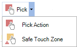 Pick Action. A pick action is a dynamic that can be used to create a button if none of the buttons listed above meet the user's needs. (Note that each of the buttons described above has a Pick action already assigned to it.) Apply a pick action to an object; the pick action dynamic identifies the trigger event that occurs when a runtime user interacts with the object. (The pick action dynamic is not described in this topic. Refer to Pick Actions for more information.)
The Safe Touch Zone plays a similar role but is intended for mobile displays.
Adding a Button to a Display
To add a button to a GraphWorX display:
-
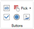
Go to the Dynamics ribbon then click the type of button you want to add to the display. For a plain text button, click
. For a checkbox button, click . For a radio button, click . For a display button, click .
The Buttons Section
-
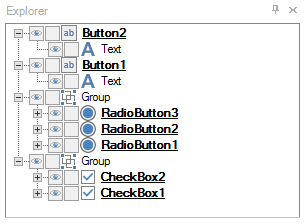
To use the button's default size, click the design surface. Alternatively, you can click and drag the button onto the design surface. The four types of buttons are shown below.
A Plain Button, a Group of Radio Buttons, a Group of Checkbox Buttons, and a Display Button
-
Change the button's text label. To do this, double-click on the button's text until it is selected, then type the new text.
-
With the button selected, go to the Dynamics tab. If you look at the top of the Dynamics tab you can see that the button already has its own Pick dynamic which is automatically included in the button object when you add it. Note that its PickMode property is already set to the type of button you are creating; do not change it.
-
In the Command property (in the Dynamic Behavior section), select the command that the button will execute when a runtime user interacts with the button. For a description of the commands, refer to Commands for Buttons, Pick Actions, and Function Keys.
Dynamic Properties for a Normal Button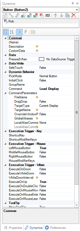
-
Fill in the Command Parameters. (You may have to expand the Command Parameters property to see them.) Command parameters are different for each command. For example, they may include the file name and target for a Load Display dynamic, or the value(s) for the Write Value actions. Detailed descriptions for some parameters are provided inProperties for the Pick Action Dynamic; others are described inCommands for Buttons, Pick Actions, and Function Keys.
-
There are additional property values that you must set on the Dynamics tab. For help setting them, refer to Properties for the Pick Action Dynamic.
-
If you are creating a Radio Button group or a Check Box group, add additional buttons as described in the prior steps. Then group them by selecting all of them, then from the Home tab's Arrange section click the Group
 button.
 -
In a radio buttongroup, only one button in the group can be selected (on) at a time; whereas in a checkbox button group, any number of its members can be selected. In order to enforce the rules for radio button behavior, for each radio button in the group, go to its GroupName property on the Dynamics tab and enter its group name. For example, if the radio buttons let runtime users select a region, the group name you assign to the radio buttons might be SelectRegion. Make sure the name is not used by any other radio button group in the display; this field is case sensitive, so make sure you use the same capitalization for each radio button in the group.
Button Example
Buttons are a great way of setting a state assignment so that one action occurs or a condition on your display is encountered. In the example that follows a Button is created and toggled as a Boolean value such that it controls the value of a process point and the color dynamic of a circle. This situation often occurs in displays as part of their programmed logic.
To create an on/off, true/false, or yes/no Boolean type of button action:
-
Click on the Process Point button in the Text Objects tab group on the Dynamics ribbon and then click on the design surface to create a Process Point object.
-
Set the DataSource property of the Process Point to localsim::var1.
-
Click on the Button in the Buttons tab group of the Dynamics menu, then click on the design surface.
-
Set the DataSource property of the Button object to localsim::var1, set the Command to Toggle Value; then enter the two values 0 and 1 for ValueOne and ValueTwo, respectively.
-
Click on the Oval tool, hold the Shift key and drag a circle on the design surface.
-
With the circle selected, change its color to red (255,0,0), then click on the Color button in the Color tab group to assign a color dynamic to the circle.
You should see the selection handles change from blue to red indicating that the object has a dynamic property assigned to it.
-
Set the Color dynamic for the Circle so that the DataSource is localsim::var1, the AnimiationMode is Discrete, the UseEndColor property is set to True and the EndColor isgreen (0,255,0). Since the
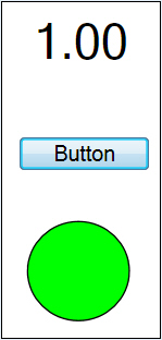
When the button is pressed the first time the button changes the variable var1 to 1 and that value is expressed as the value 1.00 in the Process Point and the color green in the circle. The second time you click the button var1 toggles back to 0, the Process Point shows 0.00 and the circle changes back to its default color of red. Buttons can be a quite powerful dynamic design element.
See also: