Object Properties
Object properties are exposed in the Properties tab in configuration mode in GraphWorX64. The Property tab shares an area of the GraphWorX work surface with two other tabs. The three tabs contain the settings for:
-
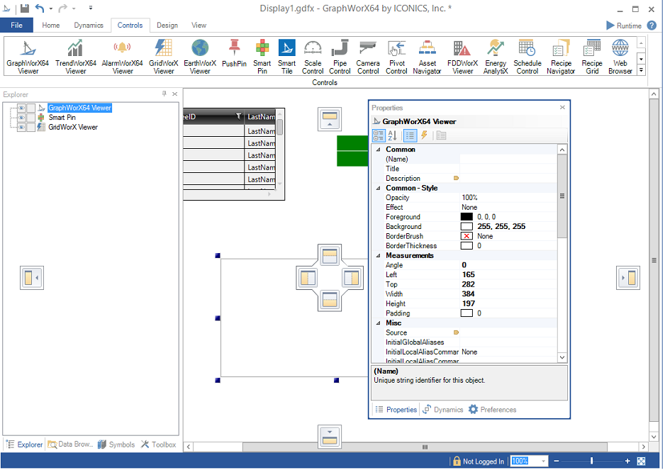
Properties. The settings for each selected object are shown on the Properties tab. You assign values to the different properties by clicking on the data cell next to the property name and either entering the value or by clicking the ellipsis button
 selecting the value or expression from the Unified Data Browser. You can view this tab by putting a check mark next to Properties in the Show/Hide section of the View ribbon in 2D GraphWorX64, or you can right-click an object in the display then, from the pop-up menu, click Object Properties. Objects' properties are described throughout the help system; you can use the Search feature to find them. The most common properties, though, are described below, in Common Properties.
-
Dynamics. The Dynamics tab of the Properties pane shows the different actions and events that are defined for an object; properties on this tab are called dynamic properties. Not all objects have dynamics associated with them, but those that do appear as underlined text in the Object Explorer. You can associate a dynamic with an object by selecting that object and clicking on the various actions in the Buttons, Dimensions, Colors, Selectors, and Smart Symbols tab groups in the GraphWorX64 Dynamics ribbon. You can also use the buttons for the different actions underneath the object drop down menu in the Dynamics tab. You can view this tab by enabling the Dynamics check box in the Show/Hide section of the View ribbon in 2D GraphWorX64, or you can right-click an object in the display then, from the pop-up menu, click Dynamic Properties. Objects' dynamic properties are described throughout the help system; you can use the Search feature to find them.
-
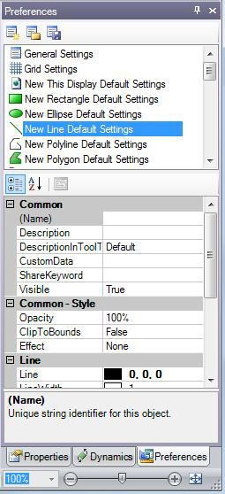
Preferences. The
 Preferences tab allows you to set properties for applications, object groups, and dynamic action types. You set the properties that are the default condition for the various objects by altering the values or expressions in the list of properties below the object types. You can view this tab by enabling the Preferences check box in the Show/Hide section of the View ribbon in 2D GraphWorX64. For detailed information, refer to Preferences.
This list of properties on these tabs changes depending on the application mode you are using while working in GENESIS64 (refer to the Application Modes topic for more about modes).
Working with the Properties Tab
The Properties tab consists of several different areas:
-
The Title bar
-
The Object Type Label
-
View buttons
-
Property Groups and Settings
To alter the view of the Properties that you see you can use the buttons shown in the figure below. From left to right the buttons:
-
Sort properties into categories
-
Sort properties alphabetically
-
Display properties only
-
Display events only
-
Expose the property pages for objects (controls) that contain their own properties. TrendWorX64 , AlarmWorX64 , and Smart Pins are examples of these object types.
Properties View Buttons
Changing an Object's Properties
You change a property by clicking in the property value cell and entering the value or expression. Some cells display an ellipsis button which opens a utility like the Unified Data Browser, or perhaps the Color Picker for visual objects. You can always enter these values using your keyboard, but these utilities will enter them automatically and using the correct syntax.
You can also make global or wide-spread changes to object properties by using the GraphWorX Find and Replace feature; for more information, refer to Find and Replace Properties in Displays and Symbols.
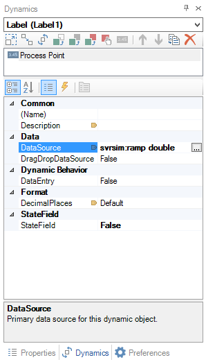
To see all of the properties in a property group (such as Data) click the Expand box to the left of the group name. If you don't see a property that you expect to see, switch to a more-detailed Application Mode. In the illustration below, a label's DataSource property is selected.
Changing a Property for a Datasource
Tooltips for Properties
Notice that below the last property is the name of the currently selected property as well as a tooltip description of the properties purpose or setting types. The tabs are the very bottom show you the current group of properties that are displayed (Dynamics) and allow you to switch between those types.
Common Properties
Some properties are unique to the GraphWorX objects with which they are used. But some properties are common to many or most objects. The GraphWorX Find and Replace feature (described in Find and Replace Properties in Displays and Symbols) lets you find objects by looking for the common object properties of: Name, Description, Title, CustomData, ShareKeyword, DataSource, and referenced file names.
-
Name - A optional name for the object that will appear in the object Explorer. By default, the Explorer displays a generic word for the object's type, such as Group, or Rectangle, or 3D View. You can change the name in the Properties tab or in the Explorer. When using the Find and Replace feature, you can search for objects using all or part of a name.
-
Description - An optional description of the object. You can type a description here or click the ellipsis button
to open the Data Browser where you can choose a tag or alias be used. -
DescriptionInToolTip - Select True to include the object's description in its tooltip.
-
CustomData- This property appears for all objects inand allows programmers to store information associated with an object that can be recalled and used by scripts or other programmed logic. Here's one example of how you might use a
-
ShareKeyword - A free-form field for storing keywords that are used by the Update Shared Objects Feature. This property holds a keyword that identifies the object that is used in multiple grouping or Smart Symbols; refer to Updating Shared Objects in Groups or Symbols for important information about using this field. When using the Find and Replace feature, you can search for objects using all or part of a ShareKeyword string.
-
FocusableFocusable
Pickable dynamics may be explicitly coded to override the value of 'Focusable' during runtime to be True. The logic was this way because the typical default expectation would be that pickable objects are also focusable (as in ICONICS' GraphWorX32 application).
However, in Windows Presentation Foundatoin (WPF), only Controls (buttons, etc.) are Focusable by default. Shapes [Rectangles, etc.] are not Focusable by default, hence the need to override the Focusable property to get the typically expected default behavior.
Logic for this setting has been enhanced so that GraphWorX64 will not override the Focusable property if the Focusable property has been explicitly set by the user in the configuration.
Setting the Focusable State for a Rectangle in GraphWorX64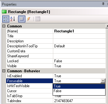
Focusable has 3 possible values: explicitly-True, explicitly-False, and Default (which may be True or False depending on the object type, but will behave as True during runtime).
An explicitly set value will appear bold in the property editor. The default value will be non-bold. You can reset it to the default value via the right-click-context menu-Reset command in the property editor.
This allows user override of the Focusable behavior, while still maintaining compatibility with the behavior of existing displays (which would have rarely had this property as a non-default value). - This property is used when scripting needs to receive keyboard input from the object. True allows the object to receive focus and reports keyboard input from runtime users. If the value is False, no keyboard events are reported. -
IsHitTestVisible - This property is used when scripting needs to receive mouse input from the object. True allows the object to receive focus and reports mouse-click events from runtime users, such as MouseLeftButtonDown. If the value is False, no mouse-click events are reported.
-
Opacity - The percentage of opacity for the object. You can select 0, 25, 50, 75, or 100, or type a number from 0 to 100. 0 makes the object completely transparent or invisible; 100 makes it appear solid.
-
Angle - This property controls the angle of the object. In the Measurements section of the Properties tab, there is an Angle option that can angle the selected object in the display. Using this property, you can angle any 2D object from 0 to 360 degrees in a display. (In a 3D view, object angles can be changed using the 3D manipulators found on the 3D Home ribbon.)
Positioning the Properties Tab
The Properties tab can either float or be docked to any side of the display. To move the tab click and drag on its title bar. You will see the Diamond Dock feature that allows you to snap the pane into place in the location you desire. Panes can be stacked with other panes, or can be left on the design surface, as shown in the figure below.
Using the Diamond Dock to Position the Object Properties Pane
To switch a pane between free floating or docked, double-click on the pane title bar.
|
|
Note: The Zoom controls and the Fit to Window button that appear at the bottom of the window below the Properties tab in the figure above affect the display window and not the Properties tab. |
See also:
Find and Replace Properties in Displays and Symbols
2D topics:
3D topics:
Common Properties for All 3D Primitives
Properties for 3D Process Point and Data Entry Object Dynamics
Add a 3D Location Dynamic and Set Properties
Add a 3D Rotation Dynamic and Set Properties
Add a 3D Size Dynamic and Set Properties