Configuring a PushPin
The PushPin is a control on the GraphWorX64 2D ribbon's Controls tab. An advanced version of the PushPin control is also available in GraphWorX64 when an EarthWorX Viewer map has been added to the display. To add a PushPin, simply click the PushPin control then click on the map where you want the PushPin to appear. Once the PushPin appears you will see it listed in the object Explorer and the Properties window will display the settings for the PushPin. You can resize, change the color, and link data to the PushPin. Note that when the PushPin is added to an EarthWorX map, you can specify the latitude and longitude for where the PushPin is to be located on the map, as described below in Specifying a PushPin's GPS Coordinates.
This topic describes how to:
Add a PushPin to a Display or Map
Enter Keys and Data Values for a PushPin
Change the Appearance of the PushPin
Create a New PushPin Template for EarthWorX
For additional information, refer to:
Adding a PushPin to a Map Using API Methods
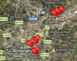
Add a PushPin to a Display or to a Map
PushPins quickly identify locations on a map or in any 2D display. A PushPin is simply another object in the display, with its own object properties. To add a PushPin to a map or display:
-
On the 2D ribbon's Controls tab, click the PushPin icon, then click the design surface to create a PushPin at the default size.
-
Alternatively, from the Toolbox you can click PushPin and drag the cursor to your work surface to add the pushpin to the surface.
-
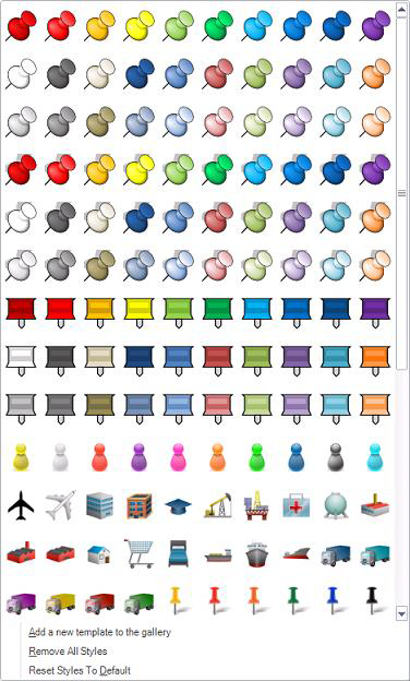
The EarthWorX Viewer has a
 PushPin gallery on EarthWorX Configuration ribbon that you can use if the display has an EarthWorX map in it. Click the pin you want to add, then click on the map where you want the pin to appear.
Enter Keys and Data Values for a PushPin's Tooltips
You can enter use data values and aliases in the PushPin's tooltips so that runtime users can easily access information about the location that the PushPin identifies. To add such information to a PushPin's tooltips:
-
Double click the PushPin in the display. The Edit Data Values dialog box appears.
-
For each data value you are going to include in the tooltips, type a key (this is a label that tells users what the corresponding value means) and then specify the value (such as a value, a string, an OPC tag, or an alias). You can click the ellipsis button
 in the Value column to choose a value from the Data Browser.
 -
Click OK when you are done.
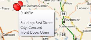
In the following example, a global alias identifies the building, and an OPC tag flags the front door. The tooltip displays the name in the Name property and the data values entered here.
|
|
Important: To display data values in the PushPin's tooltip, you must leave the PushPin's Description property empty. |
Setting Data Values (left) that Display in PushPin Tooltips (right)
Change the Appearance of the PushPin
-
Select the PushPin by clicking it in the display or in the Object Explorer.
-
Go to the PushPin's Properties tab and change property values to achieve the desired appearance. PushPin properties are described at the end of this topic in PushPin Properties.
Alternatively, you can create an entirely different design for your PushPins in EarthWorX, by following the steps below.
Create a New PushPin Template for EarthWorX
If the display contains an EarthWorX map, you can design a new PushPin that you can save for reuse.
-
In the Object Explorer, select the EarthWorX Viewer object.
-
From the EarthWorX Configuration ribbon, click the drop-down menu at the right of the Pins Gallery section.
-
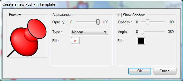
Select Add a new template to the gallery(at the bottom of the drop-down menu). The following dialog box appears:
Create a New PushPin Template
-
Design the PushPin you desire. You can configure the PushPin's appearance (specify its opacity, type, and color or fill). Optionally, you can configure its shadow (put a checkmark in the Show Shadow check box and then specify the shadow's appearance). Click OK when you are done.
PushPinTypes are:
|
Classic:
|
Disc:
|
Image: An image of your choosing, saved in an image file. |
Modern:
|
Square:
|


Note that the options that are available on the dialog box change in accordance with the type of PushPin you are designing. For example, shadowing is available only with type Modern.
-
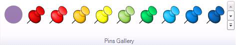
The new template design is now available in the Pins Gallery on the EarthWorX Configuration ribbon. The following figure shows a new PushPin template in the form of a lilac-colored disc, added in the first position of the Pins Gallery. You can now add your new template to an EarthWorX map.
New PushPin Template (on the left) in the Pins Gallery
Specifying a PushPin's GPS Coordinates
If you are working with a PushPin in a GraphWorX64 display that contains an EarthWorX Viewer and map, you can place a PushPin accurately on the map by entering its GPS coordinates latitude and longitude on the map.
-
Add the PushPin to the map.
-
Make sure you are in advanced mode. To do this, go to the ribbon's View tab, then drop down the Application Mode button on the far right and select Advanced Mode.
-
With the PushPin still selected, click on its Properties tab, and scroll down to the bottom of the properties list.
-
In the Latitude and Longitude properties, specify the GPS coordinates where the PushPin is to be located.
PushPin Properties
After you place a PushPin on the design surface, you can make changes to it using the PushPin's Properties tab. To access a PushPin's properties, select the PushPin, then set its properties. Properties that are available in Advanced mode are described below; to understand Basic, Standard, and Advanced modes, refer to the Application Modes topic.
-
Fill - The color of the PushPin. Type the color coordinates or click the ellipsis button
to choose a predefined color. -
Source - Available when theTypeproperty value isImage, this property identifies the image file to be used as the PushPin. Click the drop-down box and choose Referenced Images or Embedded Images. (If you reference the image, you must remember to include it, along with its path, in runtime installations of the display; if you embed it, it will automatically be included in runtime installations.) Then navigate to the image, select it, and click Open. The image is added to the display.
-
NoZoom - This property is used only in an EarthWorX map. Available when the Type is Modern or Classic or Disc or Square. WhenTrue, the SmartPin maintains its initial size regardless of the zoom level in an EarthWorX map. WhenFalse, the SmartPin appears bigger when you zoom in and smaller when you zoom out. For a detailed understanding, refer to Zoom Capabilities in an EarthWorX Map. Setting this value to False is an advantage if you are creating a region. For more information, refer to Limiting an EarthWorX Map to a Region.
-
ShadowFill - Available when theTypeproperty value isModern, this property determines the PushPin's shadow's color. Type the color coordinates or click the ellipsis button
to choose a predefined color. The default is black. -
ShadowAngle - Available when theTypeproperty value isModern, this property determines the angle of the PushPin's shadow. Enter a number from 0 to 360 or click the drop-down box to use a dial to set the angle. The default is 0.
-
ShadowOpacity - Available when theTypeproperty value isModern. The percentage of opacity of the PushPin's shadow. You can select 0, 25, 50, 75, or 100, or type a number from 0 to 100. 0 makes the shadow invisible; 100 makes the shadow appear solid.
-
ShadowVisibility - Available when theTypeproperty value isModern, when the value for this property is Visible, the PushPin has a shadow.
-
Line - Available when theTypeproperty value isDiscorSquare, this property determines the color of the perimeter of the disc-shaped or square PushPin. Type the color coordinates or click the ellipsis button
to choose a predefined color. The default is black. -
LineWidth - Available when theTypeproperty value isDiscorSquare, the property determines the width of the perimeter color. Select a width from the drop-down list. The default is 1.
-
Type - The type of PushPin. Types are: Modern, Classic, Image, Disc, and Square.
|
Modern:
|
Classic:
|
Image: An image of your choosing, saved in an image file. |
Disc:
|
Square:
|
-
Name - A name that will identify the PushPin uniquely in the Project Explorer. Type a name (using alphanumeric characters but beginning with a letter) that helps you identify the PushPin and its use. This name appears in the Project Explorer and in the PushPin's tooltip.
-
Description - An optional description for the PushPin. Enter a description or click the ellipsis button
to pick any data source, tag, alias, as the description in the Unified Data Browser. This description is used as the tooltip for the PushPin when the DescriptionInToolTip property below is True or Default; it overrides the item data values entered for the PushPin. If you want the PushPin's item data values to be used as the PushPin's tooltip, leave this property empty. For more information, refer toEnter Keys and Data Values for a PushPin. -
DescriptionInToolTip - Select True to include the Description property above in the tool tip for the PushPin; the Description is prefixed to the Name. Select False suppresses the PushPin's tooltip. Default uses the display-level tooltip setting.
-
CustomData - A free-form field that you can use as you desire, this property is typically used for holding data strings related to the PushPin; these data strings are typically by with custom scripts that run as part of the display.
-
ShareKeyword - A free-form field for storing keywords that are used by custom scripts that run as part of the display. This property typically holds a keyword or keywords that identify something specific about this PushPin that a custom script might need to find when scanning objects in the display.
-
Locked - True prevents the PushPin from being modified in configuration mode. False allows the PushPin to be modified. Once you have finished modifying the PushPin, set this value to True to prevent further modification.
-
Visible - True displays the SmartPin in runtime. False hides it. Select False if the SmartPin is not ready for production in a map or display that you are putting into production.
-
IsEnabled - When True, the pushpin can be accessed by scripts. When False, all events and dynamics associated with the pushpin are disabled, including the tooltip.
-
Focusable - True allows runtime users to select the PushPin; False prevents runtime users from selecting it.
-
IsHitTestVisible - This property is used when scripting needs to receive mouse input from the PushPin. True reports mouse-click events, such as MouseLeftButtonDown, on the PushPin by runtime users. If the value is False, no mouse-click events are reported.
-
IsTabStop - True lets runtime users tab to the PushPin using Tab key; False skips the PushPin when a runtime user tabs through objects in the display.
-
Opacity - The percentage of opacity of the PushPin's color. You can select 0, 25, 50, 75, or 100, or type a number from 0 to 100. 0 makes the PushPin invisible; 100 makes the PushPin appear solid.
-
Items - (Collection) appears for this property; click the ellipsis button
to open the Items dialog box to display or modify the PushPins key/value pairs. -
Angle - The angle of rotation for the PushPin. Type a degree of rotation from 0 to 360, or select the PushPin and rotate it using the curved arrow handle at one of its corners.
-
Left - The top-left corner of the PushPin is this number of pixels from the left edge of the GraphWorX work surface. Use this property to precisely align the pushpin with another object to share the same spot in the display. If precision isn't an issue, you can drag and drop the PushPin to its location.
-
Top - The top-left corner of the PushPin is this number of pixels from the top edge of the GraphWorX work surface. Use this property to precisely align the pushpin with another object to share the same spot in the display. If precision isn't an issue, you can drag and drop the PushPin to its location.
-
Width - The width of the PushPin, in pixels. Use this property if you want the size of the PushPin to be precise. If precision isn't an issue, you can grab and drag the PushPin's handles to change its dimensions.
-
Height - The height of the PushPin, in pixels. Use this property if you want the size of the PushPin to be precise. If precision isn't an issue, you can grab and drag the PushPin's handles to change its dimensions.
-
MinWidth - Used when scripts resize the PushPin in runtime, this property determines the smallest width the PushPin can be rendered at. Note that even though the Width property may be less than this minimum, the PushPin's width will not be rendered smaller that the width entered here. The default is 0.
-
MinHeight - Used when scripts resize the PushPin in runtime, this property determines the smallest height the PushPin can be rendered at. Note that even though the Height property may be less than this minimum, the PushPin's height will not be rendered smaller that the height entered here. The default is 0.
-
MaxWidth - Used when scripts resize the PushPin in runtime, this property determines the broadest width the PushPin can be rendered at. Note that even though the Width property may exceed this maximum, the PushPin's width will not be rendered larger that the width entered here. The default is Infinity.
-
MaxHeight - Used when scripts resize the PushPin in runtime, this property determines the largest height the PushPin can be rendered at. Note that even though the Height property may exceed this maximum, the PushPin's height will not be rendered larger that the height entered here. The default is Infinity.
-
HorizontalAlignment - Used in an EarthWorX map, this property determines the PushPin's horizontal orientation in relation to the GPS point when zooming. Options are: the Left edge of the PushPin aligns to the GPS point, the Center of the PushPin aligns with the GPS point, the Right edge of the PushPin aligns to the GPS point, and the PushPin is Stretched (the default) to align with the GPS point.
-
VerticalAlignment - Used in an EarthWorX map, this property determines the PushPin's vertical orientation in relation to the GPS point when zooming. Options are: the Top edge of the PushPin aligns to the GPS point, the Center of the PushPin aligns with the GPS point, the Bottom edge of the PushPin aligns to the GPS point, and the PushPin is Stretched (the default) to align with the GPS point.
-
Latitude - Available only with an EarthWorX map, this is the latitudinal GPS position of the PushPin.
-
Longitude - Available only with an EarthWorX map, this is the longitudinal GPS position of the PushPin.
-
EdgeMode - A property you can use for optimizing performance. Default (which is the default value) gives the PushPin smooth, refined edges; choosing Aliased improves performance by removing pixels from the edge, making the edge appear grainy but making the PushPin more efficient. (Note that this option has nothing to do with aliasing in GraphWorX.)
See also: