GridWorX64 Configuration Ribbon
The GridWorX64 Configuration tab appears in GraphWorX64 when a GridWorX Viewer has been added to a GraphWorX64 display.
GridWorX64 Configuration Ribbon
The ribbon's buttons are used only in a GridWorX Viewer that has been added to the GraphWorX64 display. Each button on the ribbon, as well as the configurator that the ribbon opens, is described below.
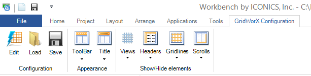
Configuration
- Edit opens the GridWorX Configurator in the form of the Configure Your Control dialog box, where you can configure basic read and write actions for the grid. In the configurator you can add tabs to the control, and grids to each tab. The GridWorX configurator in the GraphWorX64 display configuration has the following components:
-
-
For the Control:
-
-
The Appearance tab lets you configure the control's overall appearance.
-
The Advanced tab gives you access to the control's properties. Helpful tool tips that appear on the tab describe selected properties.
-
-
For each Tab:
-
-
The Appearance tab lets you configure the tab's appearance.
-
The Advanced tab gives you access to the tab's properties. Helpful tool tips that appear on the tab describe selected properties.
-
-
The following tabs for each Grid:
-
-
Source is where you select a subscription and Data Tag.
-
Appearance is where you configure the grid's general appearance.
-
Behavior is where you configure how the grid works under specified conditions.
-
Column is where you configure each column to appear in the grid.
-
Condition is where you configure the visual cues that display for all values in the grid; to do this, you specify the conditions under which a value appears normally and all levels under which the data escalates to warning and critical stages.
-
Grouping is where you select the criteria on which to group columns in your grid.
-
Grouping Range is where you group large volumes of information so that runtime users can find it more easily.
-
Text Translator is where you can translate data values into words so that text, not the values themselves, appears in the grid.
-
Status Indicator is where you can define sets of icons to be used in the grid.
-
Rules is where you can configure rule-based error messages that display for specified values in the grid
-
Advanced gives you access to the grid's properties. Helpful tool tips that appear on the tab describe selected properties.
-
-
- Load lets you open a saved grid configuration.
- Save lets you save the current grid configuration.
Appearance
- Toolbar lets you hide or specify the location of the GridWorX toolbar during runtime.
- Title lets you show and hide the title and subtitle of the data grid during runtime.
Show/Hide elements
- Views lists the tabs (views) in the grid along with information about each, and lets you select one.
- Headers lets you choose the types of headers to display in the grid.
- Gridlines lets you hide and show gridlines in the grid.
- Scrolls lets you control when and whether the scroll bars are shown or hidden for the grid.
See also: