Column Tab (GridWorX Viewer)
Each GridWorX configuration contains one or more columns. A column can contain multiple values. A column corresponds to the values or data points that you want to analyze in a grid. The columns that are defined for a configuration appear as child elements of the configuration in the tree control.
You can also use the Column tab to define Column properties. Select a column in the top grid in order to make changes to its properties in the Column Properties section below.
NOTES
-
Since each column is bound to a Subscription Data Field, no column can be added or removed. You can change the caption, width, and visibility of a column. The caption of a column can also be a global alias or language alias. You can also apply a status indicator for each column.
-
It's possible to show tooltips to visualize additional information for an alarm. You can associate a field to the tooltip in the Behavior tab. This will be the default value shown in the tooltip. However, you can also change the tooltips in runtime. Just check the checkbox "Can be Tooltip". You will get all the fields selected in the context menu, and you will be able to switch the content of the tooltip by clicking on them.
-
Please note that you need to click on the Apply Changes button to see the changes on the grid. This will optimize your changes and save your time.
-
Using Wrap Text on all the columns may decrease performance.
Column Tab
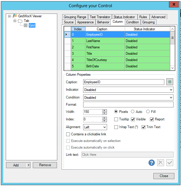
Column Properties
-
Caption -Enter a caption in the text entry field or click on the # button to open the Data Browser and navigate to the data source for your selected caption.
-
Indicator -Use the pulldown menu to select from Disabled, Access Level Translation, or User Access Level Translation.
-
Condition -Use the pulldown menu to select the condition of the column.
-
Format -Enter a format for the column in the text entry field.
-
Width -Enter a number (in Pixels, if selected nearby) in the text entry field (or use the up/down arrow buttons). You can also choose to use Auto or Fill.
-
Index -Enter an index number in the text entry field (or use the up/down arrow buttons). You can also opt to use a Tooltip and decide whether to make the item Visible or used with a Report.
-
Alignment -Use the pulldown menu to select from Center, Left, Right, or Justify. You can also opt to Wrap Text or Trim Text.
-
Contains a clickable link -True if the column contains a clickable link.
-
Execute automatically on selection -True to automatically execute on selection.
-
Execute automatically on click - True to automatically execute upon clicking.
-
Link text -If the column contains a clickable link, enter the link text in the text entry field.
See also: