Chart Options for Trends
The chart object of a TrendWorX64 Viewer is where most of the properties of the viewer are configured. It sets visual properties such as the background color and axis titles, and also controls how data is retrieved.
 Chart Tab
The ![]() Chart tab contains general properties about the chart, such as the colors for the background, plot area, and grid. This tab is also where you can customize the context menu and configure commands on events.
Chart tab contains general properties about the chart, such as the colors for the background, plot area, and grid. This tab is also where you can customize the context menu and configure commands on events.
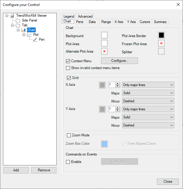
This table describes some of the settings on this tab:
|
Setting name |
Description |
|---|---|
|
Alternate Plot Area |
When a color is chosen, the plot area will alternate between this color and the plot area color. The alternations will happen between major x-axis grid lines. Learn more |
|
Context Menu |
Enables and configures the chart and pen context menus. Learn more |
|
Commands on Events |
Enables and configures commands that can be executed on events such as double-click or pen added. Learn more about commands |
Pens Tab
The ![]() Pens tab contains general settings about how pens are handled, such as how to treat uncertain or bad quality samples and default settings for newly added pens.
Pens tab contains general settings about how pens are handled, such as how to treat uncertain or bad quality samples and default settings for newly added pens.
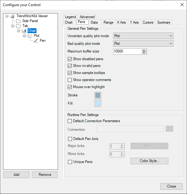
This table describes some of the settings on this tab:
|
Setting name |
Description |
|---|---|
|
Uncertain quality plot mode |
Sets how uncertain quality samples are handled. The options are:
|
|
Bad quality plot mode |
Same as uncertain quality plot mode, but for bad quality samples. |
|
Maximum buffer size |
The maximum amount of samples that can be buffered per pen in this chart. This limit prevents a pen with too many samples from using too much memory. |
|
Show disabled pens |
When checked, disabled pens are shown in the legend. When unchecked, they are hidden completely. (Disabled pens are never shown in the chart.) |
|
Show invalid pens |
When checked, pens with an invalid data source are shown in the legend and chart. When unchecked, they are hidden completely. |
|
Runtime pen settings |
The settings in this section set the properties for a pen added in runtime, such as via drag-and-drop or the add pen command. Learn more |
|
Unique pens |
If enabled, the viewer will not allow the same data source to be added as a pen more than once. |
|
Color style |
Defines the palette of colors used when pens are added in runtime. |
Data Tab
The ![]() Data tab contains settings for how data is sampled, time values are displayed, and how the data and statistics export reports are configured.
Data tab contains settings for how data is sampled, time values are displayed, and how the data and statistics export reports are configured.
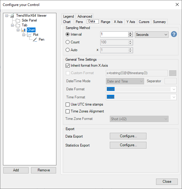
This table describes some of the settings on this tab:
|
Setting name |
Description |
|---|---|
| Sampling Method |
This setting determines how the data is sampled and how often a sample is drawn on the viewer for each pen. The options are:
|
| General time settings > Custom format |
When enabled, allows you to use an expression to customize your date and time format. Use the {{@@timestamp}} placeholder to represent the time being formatted.
This format applies to the legend and tooltip. |
| Use UTC time stamps |
When checked, timestamps are displayed in UTC. When unchecked, timestamps are displayed in the client's local time zone. |
| Time zones alignment | Enables time zone alignment. To learn more about time zone alignment, click here. |
 For best performance, if you expect your operators to be zooming or changing the range, choose
  Different pen types use the sampling interval differently as described below:
Range Tab
The ![]() Range tab contains settings for the range and period of the chart, animation and history read rates, and settings related to freeze mode.
Range tab contains settings for the range and period of the chart, animation and history read rates, and settings related to freeze mode.
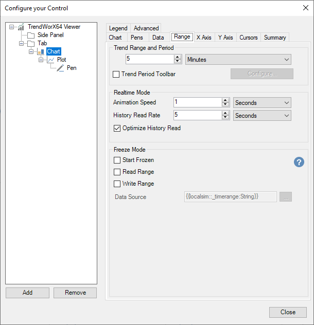
This table describes some of the settings on this tab:
|
Setting name |
Description |
|---|---|
| Trend Range and Period |
The period of time covered by the chart, ending with the current time. |
| Trend Period Toolbar | When checked, adds a series of buttons to the bottom of the chart that can be used to quickly change the trend period in runtime. Select the Configure button to customize the buttons on this toolbar. Learn more |
| Animation Speed |
The speed at which the viewer is animated when not in freeze mode.
|
| History Read Rate |
The rate at which historical reads are made. If Optimize History Read rate is enabled, this becomes the minimum allowed history refresh rate.
|
|
Optimize History Read |
When checked, the viewer will automatically choose an optimal history read rate, based on the sampling interval.
|
|
Read range |
When checked, the viewer will read the value in data source and change the chart range to match. This only applies when the viewer is in freeze mode. |
|
Write range |
When checked, the viewer will write its range to the data source point whenever the range is updated. |
|
Data Source |
The data source to use when reading or writing the viewer's range. You can enter a tag name manually or choose one of these options:
|
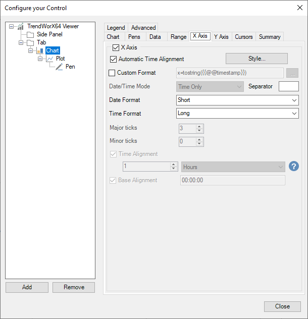
X Axis Tab
The ![]() X Axis tab contains settings relating to the chart's x-axis. This is sometimes referred to as the "time axis".
X Axis tab contains settings relating to the chart's x-axis. This is sometimes referred to as the "time axis".
This table describes some of the settings on this tab:
|
Setting name |
Description |
|---|---|
| Automatic Time Alignment |
When checked, the time labels on the x-axis will be automatically aligned with even or rounded timestamps. The exact timestamps will be determined from the viewer's range. For example, if your range is 5 hours, the times on the axis will be exact hours, such as 8:00:00 AM, 9:00:00 AM, etc.
|
| Style | The settings in this button determine the visual style for the x-axis, including its color, font, title, and the length in pixels of the major and minor tick marks. Learn more |
| Custom Format |
When enabled, allows you to use an expression to customize your date and time format. Use the {{@@timestamp}} placeholder to represent the time being formatted.
|
| Time Alignment |
When checked, the time labels on the x-axis will be aligned with the given settings. For example, if time alignment is configured for 1 hour with a base alignment of 00:45:00 then the labels on the x-axis will show 45 minutes after each hour, such as 8:45:00 AM, 9:45:00 AM, etc..
|
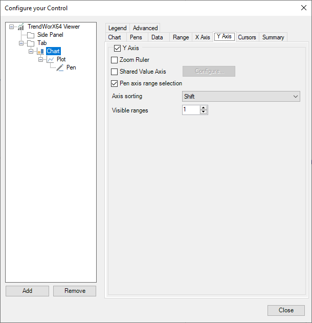
Y Axis Tab
The ![]() Y Axis tab contains settings relating to the chart's y-axis. This is sometimes referred to as the "value axis".
Y Axis tab contains settings relating to the chart's y-axis. This is sometimes referred to as the "value axis".
This table describes some of the settings on this tab:
|
Setting name |
Description |
|---|---|
| Shared Value Axis |
When enabled, all pens in the chart can share y-axes. These shared axes can be configured using the Configure button. Learn more When disabled, each pen will have its own y-axis. |
| Pen axis range selection |
When enabled, the user can change what range is displayed next to the chart in runtime by selecting a pen in the legend.
|
| Axis sorting |
Sets how the y-axes are resorted when a pen is selected, based on these options:
|
| Visible ranges |
When shared axes are not in use, this sets the number of visible y-axes. If you have more pens than this value, the y-axes for the extra pens will be hidden. |
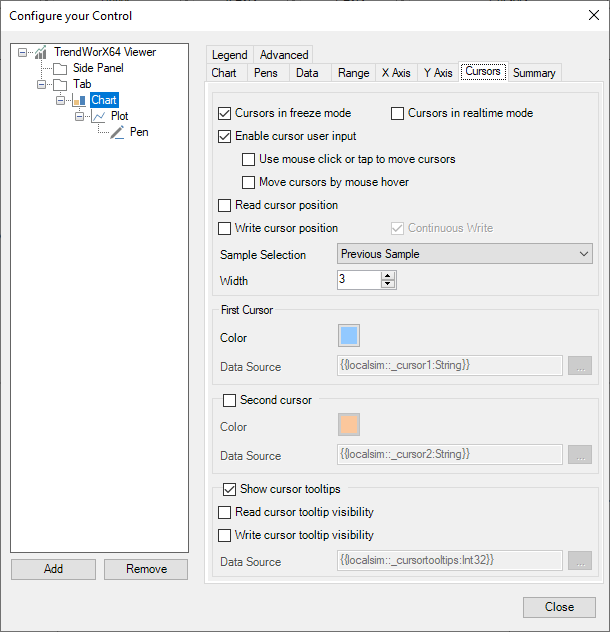
Cursors Tab
The ![]() Cursors tab contains settings for cursors in freeze mode and real-time mode.
Cursors tab contains settings for cursors in freeze mode and real-time mode.
This table describes some of the settings on this tab:
|
Setting name |
Description |
|---|---|
| Enable cursor user input | When enabled, allows the user to move the cursor with the mouse, touch, or keyboard. |
| Use mouse click or tap to move cursors | When enabled, the user can move the cursor to a new position by clicking or tapping the chart in that position. |
| Move cursors by mouse hover |
When enabled, the cursor will follow the mouse cursor when it is moved over the chart.
|
| Read cursor position | When enabled, cursors will move to the position indicated by their data source when the data source is updated. |
| Write cursor position | When enabled, the position of the cursors will be written to their data source when the cursor is moved. |
| Sample Selection |
Determines which sample is selected by the cursor. It can have one of these values:
|
| First Cursor > Data Source |
The data source used for reading and writing for the first cursor.
|
| Second Cursor > Data Source |
The data source used for reading and writing for the second cursor.
|
|
Read cursor tooltip visibility |
When enabled, the cursor tooltip's visibility is read from the data source when the data source is updated. |
|
Write cursor tooltip visibility |
When enabled, the cursor tooltip's visibility is written to the data source when the visibility changes. |
| Show cursor tooltips > Data Source |
The data source used for reading and writing the tooltip visibility.
|
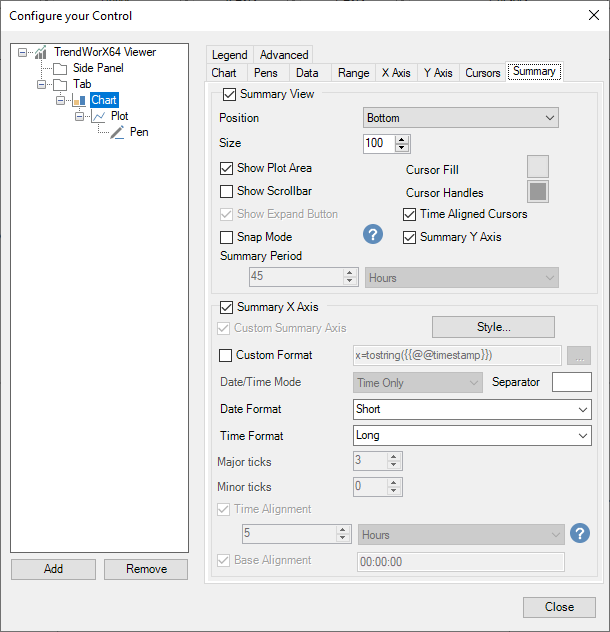
Summary Tab
The ![]() Summary tab contains settings for the chart's summary view.
Summary tab contains settings for the chart's summary view.
This table describes some of the settings on this tab:
|
Setting name |
Description |
|---|---|
| Size | The height of the summary view in pixels. |
| Cursor Fill |
The color to use when shading the area between the cursors in summary view.
|
| Time Aligned Cursors | If time alignment is enabled on the X Axis tab, enabling this will ensure moving the summary cursors results in a time-aligned window. |
| Snap Mode |
When in snap mode, summary view behaves as follows:
|
| Summary Period | The period covered by the summary view. |
| Custom Format |
When enabled, allows you to use an expression to customize your date and time format. Use the {{@@timestamp}} placeholder to represent the time being formatted.
|
Legend Tab
The ![]() Legend tab contains settings for the chart's legend.
Legend tab contains settings for the chart's legend.
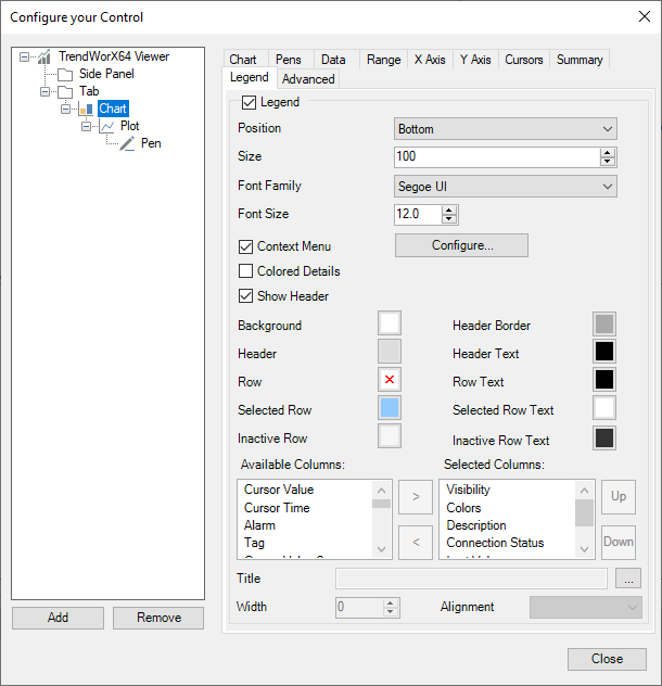
This table describes some of the settings on this tab:
|
Setting name |
Description |
|---|---|
| Context Menu | When enabled, provides a context menu for the legend. Use the configure button to customize the menu. Learn more |
| Colored Details | When enabled, colors the text of each legend row to match the pen color. When disabled, the text uses the row text color. |
| Available Columns | Columns that are available to be added to the legend. Use the > button to add them. |
| Selected Columns | Columns that will be displayed in the legend. Use the < button to remove them and the Up and Down buttons to rearrange them. |