Plot Options for Trend Charts
A plot determines the design of a chart. Each plot has at least one pen. To customize a Plot object, open the TrendWorX64 Viewer Configurator and select the plot in the tree navigation area on the left. You can customize each Plot object using the following tabs. The Advanced tab contains the plot's properties.
|
|
Warning. Not all TrendWorX64 features are supported in Microsoft Silverlight. If you are saving Silverlight files, refer to Silverlight Files in GENESIS64 for more information. |
Plot Tab
Many of the important controls over trend chart behavior are found on
the ![]() Plot tab.
From there you can determine the type of chart in which you want your
data displayed and configure how the plot scales your data.
Plot tab.
From there you can determine the type of chart in which you want your
data displayed and configure how the plot scales your data.
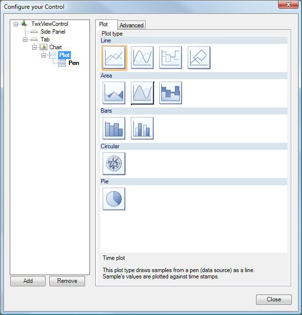
The Plot tab shows some sample plot types that you could use for your trend display. Click a chart type to select it. The types are:
-
Line: The Line plot draws a straight line connecting all trending data points for a pen line. The types of line plotting are: Time plot, Time Spline plot, Step Time plot, and XY plot.
-
Area: Area plots show the contribution of a trend value to the overall total. The types of area plotting are: Time Area plot, Time Spline Area plot, and Time Step Area plot.
-
Bars: Vertical bar plots compare items or groups as bars so that trends can be visualized. A higher bar denotes a larger value of the data point. The types of bar plotting are: Bar plot and Histogram plot.
-
Circular:The Circular plot displays trending data as a set of varying distances from the center of a circle, with time progressing around the circle's circumference. Lines that extend farther from the center of the circle denote larger values of the data point.
-
Pie: The Pie plot shows the total amount of an item broken down into individual segments or slices, forming a traditional pie chart. The size of the segment is scaled to show that portion’s contribution as a percentage of the total.
-
SPC: The SPC plot shows how the sample values for an SPC tag vary over time with respect to the defined control limits (UCL, CL, and LCL). These limits appear with the sample values on a chart when this plot is selected. Using this plot type, you can easily view the time(s) during which samples have exceeded the defined control limits and have triggered an alarm state. You can also see at a glance the samples that contain operator annotations.
|
|
Note: The SPC plot type is applicable only to users who have installed a Quality AnalytiX package from the AnalytiX suite. for more information about installing Quality AnalytiX, see the Installing Quality AnalytiX topic. |
To further define the plot style, use the chart'sAdvanced tab. (Note that the plot's Advanced tab offers few options.) For example:
-
By default, all plot types display in two-dimensions (2D). You can, however, switch any chart to a three-dimensional (3D) orientation by using the Advanced tab and setting the chart's Show3D property (in the Appearance category) to True.
-
Charts support the following types of tooltips if you set the chart's Show Sample Tooltips property (in the Appearance category) to True:
-
-
When using the cursor to analyze the visualized data, cursor tooltips appear for each visible pen, showing the source, closest value, and a timestamp of that value.
-
Markers (the small shapes that mark data points in a chart) have marker tooltips that appear when you hold your cursor over the marker. These tooltips show the source, value, and timestamp.
-
Permanent tooltips can show additional information for each sample (in various plot types) without the need to hold the mouse over the sample.
-
For information about the Advanced tab, see the Advanced Display Options topic.
See also: