Configuring TrendWorX64 Viewer

Configuring the TrendWorX64 Viewer Chart allows the user to define key aspects that appear in runtime mode.

It is recommended that the user connect their trend using the Hyper Historian located within the Workbench. This is allows for the synchronization of historical data with the TrendWorX64 trend.

Creating a TrendWorX64 Viewer Chart:

  1. Open GraphWorX64.

  2. Click the Controls tab at the top of the Ribbon.

  3. Select the TrendWorX64 Viewer button. Your cursor becomes a cross hair.

  4. Click and drag the cursor to create a TrendWorX64 Viewer Chart. Ensure that the chart is large enough to adequately display a satisfactory amount of data.

  5. Double-click the chart "graphic" drawn with the crosshair. This will open the Configure your Control window, shown below.

Configure your Control Window - Properties for TrendWorX64 Viewer

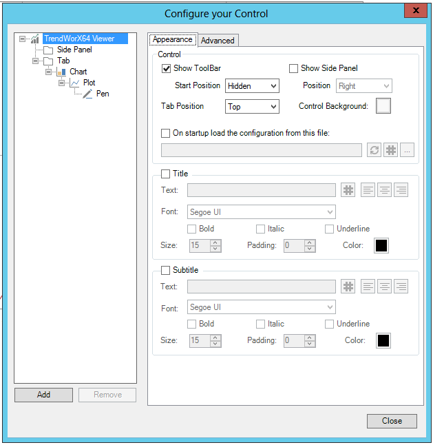
Each level of the Control allows you to set its individual properties. In the example above, you would be able to set properties for the TrendWorX Viewer itself, for the Side Panel, for the Tab, for the Chart, for the Plot, and for the Pen.

TrendWorX Viewer Properties

Appearance

Control

  • Show Toolbar -Show or hide the toolbar.

  • Start Position - Set the starting position of the toolbar. Use the pulldown menu to select from Top, Bottom, Left, Right, Float, or Hidden.

  • Tab Position -Set the tab position. Use the pulldown menu to select from Top, Bottom, Left, or Right.

  • Show Side Panel -Show or hide the side panel.

  • Position -Set the position of the side panel. Use the pulldown menu to select from Top, Bottom, Left, or Right.

  • Control Background -Click the box near this property to open the Color window, to set either a Solid Color, Gradient, Image, or Global Color.

  • On startup load the configuration from this file -Click this checkbox in order to load a TrendWorX Viewer confguration file upon startup. Note: If you specify a link to an external file, all the configuration changes to the control will be ignored when the display is saved. You can enter a location in the text entry field or click on the () button to open the Data Browser to navigate to your saved TrendWorX Viewer configuration file. You can also click on the ellipsis (...) button to open a file browser to navigate to your saved TrendWorX Viewer configuration file. You can click on the refresh button () to check if your entered file destination is valid.

Title

  • Title -Click this checkbox if you intend to include a Title with your TrendWorX Viewer control.

  • Text -Enter the text you wish to include as a title for your TrendWorX Viewer control in the text entry field. You can also click on the () button to open the Data Browser to navigate to your selected text. You can then apply one of the text justification buttons () to left align, center, or right align the entered text for the TrendWorX Viewer title.

  • Font -Use the pulldown menu to select a font for the title from the included installed fonts.

  • Bold -Click to set the bold style for the entered title.

  • Italic - Click to set the italic style for the entered title.

  • Underline - Click to set the underline style for the entered title.

  • Size -Enter a font size in the text entry field or use the up/down buttons.

  • Padding -Enter an area of text padding in the text entry field or use the up/down buttons.

  • Color -Click the box near this property to open the Color window, to set either a Solid Color, Gradient, Image, or Global Color.

Subtitle

  • Subtitle -Click this checkbox if you intend to include a Subtitle with your TrendWorX Viewer control.

  • Text -Enter the text you wish to include as a subtitle for your TrendWorX Viewer control in the text entry field. You can also click on the () button to open the Data Browser to navigate to your selected text. You can then apply one of the text justification buttons () to left align, center, or right align the entered text for the TrendWorX Viewer subtitle.

  • Font -Use the pulldown menu to select a font for the subtitle from the included installed fonts.

  • Bold -Click to set the bold style for the entered subtitle.

  • Italic - Click to set the italic style for the entered subtitle.

  • Underline - Click to set the underline style for the entered subtitle.

  • Size -Enter a font size in the text entry field or use the up/down buttons.

  • Padding - Amount of space between the boundaries of the object and its content. Enter an area of text padding in the text entry field or use the up/down buttons.

  • Color -Click the box near this property to open the Color window, to set either a Solid Color, Gradient, Image, or Global Color.

Advanced

Common

  • (Name) -Unique string identifier for this object.

  • AllowChartDrag -Enables dragging charts from this viewer.

  • AllowChartDrop -Enables dropping charts into this viewer.

  • Show Runtime Ribbon -Show ribbon in runtime mode.

  • Visibility -Overall Visibility state of the object.

Common - Behavior

  • AliasLifeTime -Specifies the time (in milliseconds) after which the unused Global/Language Aliases are released from the cache.

  • ConfigurationFilePath -Gets or sets the configuration file path that must be used to load the configuration during startup.

  • Focusable -Gets or sets a value that indicates whether the element can receive focus.

  • InitializeWhenHidden - True to initialize the viewer when hidden.

  • IsEnabled -Indicates whether the object is enabled in the user interface.

  • IsHitTestVisible -Indicates whether this object can receive mouse input.

  • IsTabStop -Indicates whether the user can use the TAB key to give focus to this object.

  • ScanRate -The ScanRate (in milliseconds) used to update the real-time tags requested by the control.

  • ShouldLoadConfiguration -True to load the control configuration file.

  • TabIndex -Determines the index in the TAB order that this object will occupy.

Common - Style

  • Background -Overall Background color, gradient or pattern of this object.

  • BorderBrush -Overall Background color, graident

  • BorderThickness -Width of the border of this object.

  • ClipToBounds -True to clip the content of this object to its bounds.

  • Effect -Overall Visual Effects (3D-edge, shadow, glow, blur) applied to this object.

  • EnableSilentMode -Enable silent mode if you want to hide all the MessageBoxes shown by this control in runtime. All the errors will be notified using the NotifyError event. All the confirmation dialogs will be silently approved.

  • Foreground -Overall Foreground color, gradient or pattern of this object.

  • HeaderText -Gets or sets the text used for the Header.

  • NotifyingBrush -The brush used to blink the tab header when there is a notifcation.

  • Opacity -Overall Opacity of the objects. Range: 0% (fully transparent) - 100% (fully opaque).

  • SubHeader -Gets or sets the text used for the SubHeader.

  • ToolBarBackground - Overall Background color, gradient or pattern of the toolbar.

Measurements

  • Height -Height of the object.

  • HorizontalAlignment - Horizontal alignment can be Left, Center, Right, or Stretch.

  • Margin -Amount of space between the boundaries of the object and its container.

  • MaxHeight -Specifies the Maximum Height constraint of the object.

  • MaxWidth -Specifies Maximum Width constraint of the object.

  • MinHeight -Specifies the Minimum Height constraint of the object.

  • MinWidth -Specifies the Minimum Width constraint of the object.

  • Padding -Amount of space between the boundaries of the object and its content.

  • VerticalAlignment -Indicates where an element should be displayed on the vertical axis relative to its parent element.

  • Width -Width of the object.

Misc - Commanding

  • CommandingDisplayName -User friendly control name.

  • CommandingEnabled -Determines whether commands are enabled for this display. Use the CommandingName setting to specify a registration name.

  • CommandingName -Name used for registering the control for commanding.

  • DragAndDropCommandingEnabled -True to enable receiving commands by drag and drop.

  • MaxCommandScope -Indicates whether commands sent and received by this display affect the current process only (Process) or all processes that are currently opened (Machine). For inter-process commanding, use the Machine option.

Printing

  • Use Economy Printing -Specifies whether to apply economy settings when printing the viewer and its content.

Side Panel

  • Show Side Panel -True to show the Side Panel, else hidden.

  • Side Panel Dock -Specifies the dock position of the Side Panel in the viewer.

Text

  • FontFamily -Specifies the name of the default font used to render text for the entire object.

  • FontSize -Specifies the size of the font used to render text for this object.

  • FontStretch -Specifies Degree to which a font is condensed or expanded on the screen.

  • FontStyle -Specifies the style of the font used to render text (italic).

  • FontWeight -Specifies the thickness of the font used to render text (bold).

ToolBar

  • IsToolBarAllowed -If set to False, the ToolBar is always hidden, despite its visibility.

  • IsToolbarAlwaysVisible -Toolbar cannot be hidden.

  • IsToolBarFloating -Specifies if the ToolBar should be visualized in a floating window.

  • ToolBarPlacement -Specifies the position of the ToolBar when it's docked.

  • ToolBarVisibility -Show/hide the ToolBar.

Visual Quality

  • SnapsToDevicePixels -Determines whether rendering for this object should use device specific pixel settings during rendering.

Tab Properties

Appearance

Unselected Tab Properties

  • Background -Click the nearby box to open the Color window to set a Solid Color, Gradient, Image or Global Color for the unselected tab background.

  • Border -Click the nearby box to open the Color window to set a Solid Color, Gradient, Image or Global Color for the unselected tab border.

  • Foreground -Click the nearby box to open the Color window to set a Solid Color, Gradient, Image or Global Color for the unselected tab foreground.

Selected Tab Properties

  • Background -Click the nearby box to open the Color window to set a Solid Color, Gradient, Image or Global Color for the selected tab background.

  • Border -Click the nearby box to open the Color window to set a Solid Color, Gradient, Image or Global Color for the selected tab border.

  • Foreground -Click the nearby box to open the Color window to set a Solid Color, Gradient, Image or Global Color for the selected tab foreground.

Title

  • Text -Enter a title for the tab in the text entry field or click on the button to open the Data Browser to navigate to your selected text.

  • Font -Use the pulldown menu to select a font for the tab title from the included installed fonts.

  • Bold -Click to set the bold style for the entered tab title.

  • Italic - Click to set the italic style for the entered tab title.

  • Stretch -Click to expand the text of the tab title.

  • Size -Enter a font size in the text entry field or use the up/down buttons.

  • Padding - Amount of space between the boundaries of the object and its content. Enter an area of text padding in the text entry field or use the up/down buttons.

  • Apply To All Tabs - Click this button to apply these settings to all tabs.

Advanced

Common

  • (Name) -Unique string identifier for this object.

  • Visibility -Overall Visibility state of the object.

Common - Behavior

  • Focusable -Gets of sets a value that indicates whether the element can receive focus.

  • IsEnabled -Indicates whether the object is enabled in the user interface.

  • IsHitTestVisible -Indicates whether this object can receive mouse input.

  • IsNotifying -Specifies if the object is notifying with a special behavior.

  • IsSelected -Specifies if the object is selected.

  • IsTabStop - Indicates whether the user can use the TAB key to give focus to this object.

  • TabIndex - Determines the index in the TAB order that this object will occupy.

Common - Style

  • Background -Overall Background color, gradient or pattern of this object.

  • BorderBrush -Overall Background color, gradient or pattern of the border of this object.

  • ClipToBounds -True to clip the content of this object to its bounds.

  • Effect -Overall Visual effects (3D-edge, shadow, glow, blur) applied to this object.

  • Foreground -Overall Foreground color, gradient or pattern of this object.

  • Opacity -Overall Opacity of the object. Range: 0% (fully transparent) - 100% (fully opaque)

  • SelectionBackground -Overall Background color, gradient or pattern of the object when it's selected.

  • SelectionBorderBrush -Overall Foreground color, gradient or pattern of the border of object when it's selected.

  • SelectionForeground -Overall Foreground color, gradient or pattern of the object when it's selected.

Measurements

  • Padding -Amount of space between the boundaries of object and its content.

Text

  • FontFamily -Specifies the name of the default font used to render text for the entire object.

  • FontSize - Specifies the size of the font used to render text for this object.

  • FontStretch -Specifies Degree to which a font is condensed or expanded on the screen.

  • FontStyle - Specifies the style of the font used to render text (italic).

  • FontWeight - Specifies the thickness of the font used to render text (bold)

VisualQuality

  • SnapsToDevicePixels -Determines whether rendering for this object should used device specific pixel settings during rendering.

Chart Properties

Chart

Chart

  • Background - Background color of entire chart area. Click on the nearby box to open the Color window to select a Solid Color, Gradient, Image, or Global Color.

  • Plot Area -Background color of plot area. Click on the nearby box to open the Color window to select a Solid Color, Gradient, Image, or Global Color.

  • Alternate Plot Area -Alternate background color of plot area for even major X grid lines. Click on the nearby box to open the Color window to select a Solid Color, Gradient, Image, or Global Color. [See Alternate Background Colors]

  • Plot Area Border -Border color of plot area. Click on the nearby box to open the Color window to select a Solid Color, Gradient, Image, or Global Color.

  • Frozen Plot Area -Background color of plot area of chart in freeze mode. If not defined, plot area background is used.

  • Splitter -Color of chart splitters.

  • Context Menu -Show context menu for chart areas.

  • Configure -Clicking this button opens the Context Menu Configuration window, where you can add/remove/order both Context Menu Items (Separator, Command, Pen Menu, Reset Zoom) and Pen Menu Items (Separator, Switch Trend Plot, Refresh, Delete, Command, Add operator comment, Add Sample, Edit Sample, Delete Sample).

Grid

  • Grid - Show or hide grid lines in the chart.

  • X Axis - Click the nearby box to open the Color window to select a Solid Color or Global Color for X axis grid lines. In the next nearby box, you can enter (in the text entry field or via the up/down buttons) the stroke thickness of the X axis grid lines. The pulldown menu allows users to select X axis grid lines visibility. You can select from None, Only major lines, or All lines.

  • Major -Line style of major X axis grid lines. Use the pulldown menu to select from Solid, Dashed, Dotted or Dotted-Dash.

  • Minor -Lines style of minor X axis grid lines. Use the pulldown menu to select from Solid, Dashed, Dotted or Dotted-Dash.

  • YAxis  - Click the nearby box to open the Color window to select a Solid Color or Global Color for Y axis grid lines. In the next nearby box, you can enter (in the text entry field or via the up/down buttons) the stroke thickness of the Y axis grid lines. The pulldown menu allows users to select Y axis grid lines visibility. You can select from None, Only major lines, or All lines.

  • Major -Line style of major Y axis grid lines. Use the pulldown menu to select from Solid, Dashed, Dotted or Dotted-Dash.

  • Minor -Lines style of minor Y axis grid lines. Use the pulldown menu to select from Solid, Dashed, Dotted or Dotted-Dash.

Zoom Mode

  • Zoom Mode - Specifies whether user can zoom chart in or out.

  • Zoom Box Color - Fill color of zooming box. Click on the nearby box to open the Color window to select a Solid Color, Gradient, Image, or Global Color.

  • Time Aligned Zoom - If time alignment is enabled on X axis, all zoom operations results in time aligned period.

Commands on Events

The TrendWorX64 Viewer is one of many controls that now supports executing commands on events. These events vary per control, but, for the TrendWorX64 Viewer, they include:

  • Double Click

  • Pen Added

  • Pen New Data

  • Right Click

  • Sample Click

  • Started

  • Time Range Changed

To configure the command to be executed when this event occurs, select your chart and go to the Chart tab. Find the Commands on Events section, check Enable Commands on Events, then select the Configure button.

  • Enable - True to enable commands to run upon TrendWorX64 Viewer events.

  • Configure - Click this button for Control Events configuration. This opens the ClosedControl Events Configuration windowControl Events Configuration Window
    , where you can select an Event (Double Click, Pen Added, Pen New Data, Right Click, Sample Click, Started, or Time Range Changed). Within the Actions section of the window, you can click on the plus sign [+] to add an item to the list. Click on the minus sign [-] to remove a listed item. Click on the up arrow to move a selected item higher in the list. Click on the down arrow to move a selected item lower in the list. Click on the button to duplicate a selected entry in the list. Clicking the plus sign [+] allows you to add a Custom Command and then set that selected specific command's properties. Click HERE for more info on Commands in GraphWorX64.

Pens

General Pen Settings

  • Uncertain quality plot mode -Specifies how to plot uncertain quality data. Use the pulldown menu to select from Leave gap, Plot, or Span Over.

  • Bad quality plot mode -Specifies how to plot bad quality data. Use the pulldown meu to select from Leave gap, Plot, or Span Over.

  • Maximum buffer size - The maximum amount of samples each pen in a chart can buffer. It protects against excessive system system resources usage in runtime mode. Replaces obsolete buffer limit for raw historical data. Enter a size in the text entry field or use the up/down arrows.

  • Show disabled pens -Specifies whether disabled pens are displayed in areas of the control such as the legend.

  • Show invalid pens -Show pens with invalid datasources in chart and legend.

  • Show sample tooltips -Show tooltips with sample description while hovering one of them.

  • Show operator comments -Specifies whether operator comments will be displayed for the pen, if supported by the current pen's data source.

  • Mouse over highlight -Enable mouse over style of pie and bar samples.

  • Stroke -Mouse over strike of pie and bar samples. Click on the nearby box to open the Color window to select a Solid Color, Gradient, Image, or Global Color.

  • Fill -Mouse over fill of pie and bar samples. Click on the nearby box to open the Color window to select a Solid Color, Gradient, Image, or Global Color.

Runtime Pen Settings

  • Default Connection Parameters -Enable to fill in default connection parameters for pens added in runtime. Does not apply in case the pen already declares the connection parameters.

  • Connection - Enter Connection parameters in the text entry field or click on the ellipsis button [...] to select from either "Configure...", which opens the Connection Configuration window, or "Browse...", which opens the Data Browser, allowing you to browse for your specific Connection parameters.

  • Default Pen Axis -Enable to apply default pen axis configuration for pens added in runtime.

  • Major ticks -Specifies the size of major tickmarks in pixels. Enter a number in the text entry field or use the up/down buttons.

  • Style -Click the Style button to open the Axis Configuration window to set your axis configuration style properties.

  • Minor ticks -Specifies the size of minor tickmarks in pixels. Enter a number in the text entry field or use the up/down buttons.

Data

Sampling Method

  • Interval -Sampling interval for calculated historical data or collection rate for real-time data. It has no effect on historical data. If selected, you can then enter an amount in the text entry field, or use the up/down arrow buttons. You can then use the pulldown menu to select an interval type from Custom, Seconds, Minutes, or Hours.

    Note: Choose the sampling method that best meets the requirements. Please notes that the sampling method is applicable only for historical and aggregated data sources.

    Real-time data sources use a sampling interval as a data collection rate. Raw historical data sources do not use sampling methods.

    Choose a sampling interval when the trend period is pre-configured and does not change in runtime.

    Choose static count of samples when you expect an operator to analyze analog data in runtime using zoom, or by changing the trend period.

    The time aligned sampling method is only applicable for a time aligned X axis. This method attempts to align the samples to major tick marks. However, the maximum sampling interval is one hour. User can define sample counts by major tick mark interval. If the X axis is not aligned to the time, the sampling interval is used by default.

  • Count -Desired count of samples for each pen in this chart. If selected, you can then enter an amount in the text entry field or use the up/down arrow buttons.

  • Auto -Sample count per major tick mark.

    Note: You must enable Time Alignment on X Axis in order to align sampling interval automatically.

General Time Settings

  • Inherit format from X Axis -Enable to inherit date and time format settings from one time axis.

  • Date/Time Mode -Visibility of date and time components in tooltips, legend and reports. Use the pulldown menu to select from Date and Time, Time and Date, Date Only, or Time Only.

  • Date Format -Time format in toolitps, legend and reports. Use the pulldown menu to select from Short, Long, M/d/yyyy, M/d/yy, MM/dd/yy, MM/dd/yyyy, yy/MM/dd, yyyy-MM-dd, dd-MMM-yy, dddd.MMMM d.yyyy, MMMM d.yyyy, dddd d MMMM.yyyy, or d MMM yyyy.

  • Time Format -Date format type in tooltips, legend and reports. Use the pulldown menu to select from Short, Long, h mm tt, hh mm tt, H mm, HH mm, h mm ss tt, hh mm ss tt, H mm ss tt, H mm ss, or HH mm ss.

  • Separator -Date/time separator in tooltips, legend and reports. Enter a separator in the text entry field.

  • Use UTC time stamps -When enabled, all dates and times in this chart are converted to UTC time.

  • Time Zones Alignment -Enable to align all pens to local time zone. Samples from different time zones are aligned to current time.

  • Time Zone Format -Format of time zone used in dates and times, in case time zone alignment is enabled.

Export

Range

Time Range and Period

  • Trend Range and Period -Select time range. Aligned time range is preferred over custom range. In the first text entry field, enter a number of units, or use the up/down arrow buttons. IN the second pulldown menu, select the type of units (Custom, Seconds, Minutes, Hours, Days, Weeks, Months, or Years).

  • Trend Period Toolbar -Shows trend period toolbar with customizable buttons.

  • Configure -Clicking this button opens the Configure Trend Period Toolbar window.

Realtime Mode

  • Animation Speed -Animation speed for trends in real-time mode. In the first field, enter a number of units or use the up/down arrow buttons. In the nearby pulldown menu, select from Custom, Seconds, Minutes or Hours.

  • History Read Rate -Desired historical data request interval. If OptimizeHistoryRefreshRate is enabled, HistoryRefreshRate defines minimum allowed value. In the first field, enter a number of units or use the up/down arrow buttons. In the nearby pulldown menu, select from Custom, Seconds, Minutes or Hours.

  • Optimize History Read -Automatically adjust frequency of reading historical data to improve performance.

Freeze Mode

  • Start Frozen -Freeze the chart immediately after entering the Runtime mode.

  • Read Range -When enabled, if this chart is in freeze mode, trend range is obtained from time range data source.

  • Write Range -When enabled, actual trend range is stored in time range data source and can be shared with other controls.

  • Data Source -Data source of global time range. Enter a source in the text entry field or click on the ellipsis button [...] to Browse for a data source (via the Data Browser), use the Current Range, or use the Default.

X Axis

  • X Axis -Shows trend period axis area. TwxChartComponent.ShowAxes property takes precedence over this one.

  • Automatic Time Alignment -Let the control automatically set tick marks based on control's size and actual trend period. Time alignment settings for main chart and summary chart is ignored. This option applies to 2D cartesian time-based charts only.

  • Style -Click the Style button to open the Axis Configuration window to set your axis configuration style properties.

  • Date/Time Mode -Visibility of date and time components in tick mark labels. Use the pulldown menu to select from Date and Time, Time and Date, Date Only, or Time Only.

  • Date Format -Date format of tick mark labels. Use the pulldown menu to select from Short, Long, M/d/yyyy, M/d/yy, MM/dd/yy, MM/dd/yyyy, yy/MM/dd, yyyy-MM-dd, dd-MMMM-yy, dddd.MMM d.yyyy, MMMM d.yyyy, dddd.d MMMM.yyyy, or d MMMM.yyyy.

  • Time Format -Time format of tick mark labels. Use the pulldown menu to select from Short, Long, h:mm tt, hh:mm tt, H:mm, HH:mm, h:mm:ss tt, hh:mm:ss tt, H:mm:ss, or HH:mm:ss.

  • Separator -Custom separate of date and time components. Enter the separator in the text entry field.

  • Major ticks -Number of major tick marks with labels. Enter a number in the text entry field or use the up/down arrow keys.

  • Minor ticks -Number of minor tick marks between major tick marks. Minor tick marks do not have labels. Enter a number in the text entry field or use the up/down arrow keys.

  • Time Alignment -Enables time alignment of major tick marks and gridlines. Once selected, you can enter a number in the below text entry field (or use the up/down arrow keys). In the nearby pulldown menu, you can select the unit type from Custom, Seconds, Minutes, Hours, Days, Weeks, Months, or Years.

    Note: Enabling Time Alignment automatically generates major tick marks using specified interval. When enabled, the number of major tick marks is ignored. However, the number of minor tick marks is used in both modes.

    For example:

    Generating tick marks every hour: Enable Time Alignment and set interval to one hour. Make sure to keep the Base Alignment zero.

    Generating one tick mark per day at 6AM: Enable Time Alignment, set interval to one day and change the Base Alignment to 06:00:00.

    Generating tick marks every Wednesday at noon: Enable Time Alignment, set interval to one week and change the Base Alignment to 3.12:00:00.

  • Base Alignment - Enables base alignment for major ticks and gridlines. Applies for constant number of tick marks as well as for time-aligned tick marks. Once selected, you can set the alignment in the nearby text entry field, which sets the base time alignment for major tick marks and gridlines. Use this to set shift time of generated tick marks to specific fraction of the major interval. For example, set TickmarkTimeAlignment to Days and then set this value to 6:00:00 to generate one tick mark per day at 6 AM.

Y Axis

  • Y Axis -Enable/disable the visibility of the value axis area(s).

  • Zoom Ruler -Specifies whether charts in the chart component will display a zoom ruler.

  • Shared Value Axis -If enabled, all the pens in the chart will share the same value axis, otherwise every pen will use its own value axis (formerly named Global Range). Click HERE for info on Multiple Shared Axes.

  • Configure -Click this button to open the Shared Axes Configuration window.

  • Pen axis range selection -Specifies whether the main range axis displayed in the chart will be the one of the pen selected in the legend.

  • Axis sorting -Use the pulldown menu to select Shift or Stack.

  • Visible ranges -Select the maximum count of pen's value axes which should be displayed in the chart (when the shared value axis mode is not enabled).

Cursors

  • Cursors in freeze mode -Gets or sets whether chart cursors are visible in freeze mode.

  • Cursors in realtime mode -Gets or sets whether char cursors are visible in realtime mode.

  • Enable cursor user input -When enabled, user can change cursor positions using keyboard or pointing device.

  • Use mouse click or tap to move cursors -Enable to allow moving cursors by mouse click or tap.

  • Move cursors by mouse hover -Enable to allow moving chart cursors with mouse cursor. Not available when second cursor is visible. Disables zoom by mouse.

  • Read cursor position -When enabled, cursor positions are obtained from cursor data sources.

  • Write cursor position -When enabled, cursor positions are stored in cursor data sources.

  • Continuous Write -When enabled, cursor position is continuously stored when dragging the cursors.

  • Sample Selection -Specifies the criteria used when highlighting samples. Use the pulldown menu to select from Previous Sample, Closest Sample, or Next Sample.

  • Width -Width of cursor bars. Enter a number in the text entry field or use the up/down arrow buttons.

Notes:

  • The data source for the first and second cursors have additional options on the "more" ("...") button. Choosing "Current Position" will hard-code the current cursor position into the field. This value becomes the starting position for the cursor. Choosing "Default" will reset the cursor to its default value ("{{localsim::_cursor1:String}}" or "{{localsim::_cursor2:String}}").

  • The data source for the cursor tooltips has additional options on the "more" ("...") button. Choosing "First (1)" or "Second (2)" will hard-code a value of 1 or 2, respectively. Choosing "Default" will reset the visibility data source to its default value ("{{localsim::_cursortooltips:Int32}}").

First Cursor

  • Color -First cursor color. Click on the box to open the Color window to select a Solid Color, Gradient, Image, or Global Color.

  • Data Sources -Data source of first cursor position. It must be a string data type. Enter a source in the text entry field or click on the ellipsis button [...] to either Browse for a source via the Data Browser, or set the Current Position or Default.

Second cursor

  • Second cursor - Gets or sets whether the second chart cursor is visible.

  • Color -Second cursor color.  Click on the box to open the Color window to select a Solid Color, Gradient, Image, or Global Color.

  • Data Sources - Data source of first cursor position. It must be a string data type. Enter a source in the text entry field or click on the ellipsis button [...] to either Browse for a source via the Data Browser, or set the Current Position or Default.

Show cursor tooltips

  • Show cursor tooltips -Gets or sets whether tooltips will be displayed when dragging a cursor.

  • Read cursor tooltip visibility -When enabled, cursor tooltips visibility is obtained from CursorTooltipsVisibilityDataSource.

  • Write cursor tooltip visibility -When enabled, cursor tooltips visibility is stored in CursorTooltipsVisibilityDataSource.

  • Data Source -Data source of cursor tooltip visibility. It must be an integer data type. Click on the ellipsis button [...] to either Browse for a source via the Data Browser, or set the First (1), Second (2), or Default.

Notes: Also, see Tooltips on Sample Hover.

Summary

Summary View

  • Summary View -Show/hide the view used to display data history for the tags in the chart control.

  • Position -Select the positioning of the summary view within the chart control. Use the pulldown menu to select from Top or Bottom.

  • Size -Enter a size in the text entry field or use the up/down arrow buttons.

  • Show Plot Area -True to show the plot area.

  • Show Scrollbar -True to show the scrollbar.

  • Show Expand Button -True to show the expand button.

  • Snap Mode -Enable to snap summary cursor and scrollbar to closest tick marks.

  • Cursor Fill -Sets the cursor fill color. Click on the box to open the Color window to select a Solid Color, Gradient, Image, or Global Color.

  • Cursor Handles -Sets the cursor handles color.  Click on the box to open the Color window to select a Solid Color, Gradient, Image, or Global Color.

  • Time Aligned Cursors -If time alignment is enabled on X axis, dragging summary cursors results in time aligned period.

  • Summary Y Axis -Show value range axis in summary chart.

  • Summary Period -Select time range. Aligned time range is preferred over custom range. Enter a number in the first text entry field (or use the up/down arrow buttons). Use the nearby pulldown menu to select from Custom, Seconds, Minutes, Hours, Days, Weeks, Months, or Years.

Summary X Axis

  • Summary X Axis -Show trend period axis in summary chart.

  • Custom Summary Axis -Use custom settings for trend period axis in summary chart.

  • Style - Configuration of summary trend period axis. Click this button to open the Axis Configuration window.

  • Date/Time Mode -Visibility of date and time components in tick mark labels. Use the pulldown menu to select from Date and Time, Time and Date, Date Only, or Time Only.

  • Date Format -Date format of tick mark labels. Use the pulldown menu to select from Short, Long, M/d/yyyy, M/d/yy, MM/dd/yy, MM/dd/yyyy, yy/MM/dd, yyyy-MM-dd, dd-MMM-yy, dddd.MMMM d.yyy, MMMM d.yyyy, dddd d MMMM.yyyy, or d MMMM.yyyy.

  • Time Format -Time format of tick mark labels. Use the pulldown menu to select from Short, Long, h:mm tt, hh:mm tt, H:mm, HH:mm, h:mm:ss tt, hh:mm:ss tt, H:mm:ss, or HH:mm:ss.

  • Separator -Custom separator of date and time components. Enter a separator in the text entry field.

  • Major ticks -Number of major tick marks with labels. Enter a number in the text entry field or use the up/down arrow buttons.

  • Minor ticks -Number of minor tick marks between major tick marks. Minor tick marks do not have labels. Enter a number in the text entry field or use the up/down arrow buttons.

  • Time Alignment -Enables time alignment of major tick marks and gridlines. Enter a number in the text entry field or use the up/down arrow buttons. In the nearby pulldown menu, select Custom, Seconds, Minutes, Hours, Days, Weeks, Months, or Years.

    Note: Enabling Time Alignment automatically generates major tick marks using specified interval. When enabled, the number of tick marks is ignored. However, the number of minor tick marks is used in both modes.

    For example:

    Generating tick marks every hour: Enable Time Alignment and set interval to one hour. Make sure to keep the Base Alignment zero.

    Generating one tick mark per day at 6 AM: Enable Time Alignment, set interval to one day and change the Base Alignment to 06:00:00.

    Generating tick marks every Wednesday at noon: Enable Time Alignment, set interval to one week and change the Base Alignment to 3.12:00:00.

  • Base Alignment -Enables base alignment for major tick marks and gridlines. Applies for constant number of tick marks as well as for time-aligned tick marks. In the text entry field, set base time alignment for major tick marks and gridlines. Use to shift time of generated tick marks to specific fraction of the major interval. For example, set TickmarkTimeAlignment to Day and then set this value to 6:00:00 to generate one tick mark per day at 6 AM.

Legend

Legend

  • Legend -Show/hide the legend.

  • Position -Select the positioning of the legend within the chart control. Use the pulldown menu to select from Left, Top, Right, or Bottom.

  • Size -Size of the legend. Enter a number in the text entry field or user the up/down arrow button.

  • Font Family -Sets the font used in the legend. Use the pulldown menu to select from the installed, available fonts.

  • Font Size -Legend font point size. Enter a number in the text entry field or click on the up/down arrow buttons.

  • Context Menu -Show content menu for legend area.

  • Configure -Clicking this button opens the Context Menu Configuration window, where you can add/remove/order both Context Menu Items (Separator, Command, Pen Menu, Delete) and Pen Menu Items (Separator, Switch Trend Plot, Refresh, Delete, Command, Add operator comment, Add Sample, Edit Sample, Delete Sample).

  • Colored Details -Check to display text elements and other details in the legend by the color of associated pens.

  • Show Header -Show/hide the legend header.

  • Background -Legend background. Click the nearby box to open the Color window to select a Solid Color, Gradient, Image, or Global Color.

  • Header Border -Header border color. Click the nearby box to open the Color window to select a Solid Color, Gradient, Image, or Global Color.

  • Header -Header color. Click the nearby box to open the Color window to select a Solid Color, Gradient, Image, or Global Color.

  • Header Text -Header text color. Click the nearby box to open the Color window to select a Solid Color, Gradient, Image, or Global Color.

  • Row -Row color. Click the nearby box to open the Color window to select a Solid Color, Gradient, Image, or Global Color.

  • Row Text -Row text color. Click the nearby box to open the Color window to select a Solid Color, Gradient, Image, or Global Color.

  • Selected Row -Selected row color. Click the nearby box to open the Color window to select a Solid Color, Gradient, Image, or Global Color.

  • Selected Row Text -Selected row text color. Click the nearby box to open the Color window to select a Solid Color, Gradient, Image, or Global Color.

  • Inactive Row -Inactive row color. Click the nearby box to open the Color window to select a Solid Color, Gradient, Image, or Global Color.

  • Inactive Row Text -Inactive row text color. Click the nearby box to open the Color window to select a Solid Color, Gradient, Image, or Global Color.

Near the bottom of the Legend tab properties, you are able to select and move Legend details between boxes/columns using the '>', '<', 'Up' and 'Down' buttons. Included details include Cursor Value, Cursor Time, Alarm, Cursor Value 2, Cursor Time 2, Value Difference, Time Difference, Low Range, High Range, Low Low Limit, Low Limit, High Limit, High Limit, High High Limit, Filter, Units, Sample Count, Minimum, Maximum, Average, Standard Deviation, Total, Last Quality, Cursor Quality, Cursor Quality 2, Custom Data, Tag, Colors, Description, Connection Status, Last Value, and Last Time.

Selecting any of the details individually allows you to then set its Title, Width, and Alignment in the properties below.

  • Title -For any selected Legend detail, you can enter a Title in the text entry field or click on the ellipsis button [...] to open the Data Browser and navigate to your selected title.

  • Width -Selected legend detail title width. Enter a number in the text entry field or click on the up/down arrow buttons.

  • Alignment -Alignment of the selected legend detail title. Use the pulldown menu to select from Left, Center, or Right.

Notes:

  • The "Available Columns" and "Selected Columns" fields are now labeled.

  • In the default columns added to the legend in a new TrendWorX64 Viewer, the width of the Description column has been increased from 100 to 200.

Advanced

Appearance

  • Background -Background brush for the entire ChartView.

  • ChartBackground -Background color of entire chart area.

  • ChartInnerAlternateBackground -Alternate background color of plot area for even major X grid lines.

  • ChartInnerBackground -Background color of plot area.

  • ChartInnerBorder -Border color of plot area.

  • EnableSampleMouseOver -Enable mouse over style of pie and bar samples.

  • Height -Height of the chart.

  • Layout Mode -Specifies how charts in the view will be positioned.

  • PlotAreaFrozenBackground -Background color of plot area of chart in freeze mode. If not defined, plot area background is used.

  • SampleMouseOverFill -Mouse over fill of pie and bar samples.

  • SampleMouseOverStroke -Mouse over stroke of pie and bar samples.

  • Show Thumb -Show thumb for resizing the chart.

  • ShowChartContextMenu -Show context menu for chart area.

  • SplitterColor -Color of chart splitters.

  • StartFrozen -Freeze the chart immediately after entering the Runtime mode.

  • Title -Custom title for the group of charts displayed in this ChartView.

  • Use High Performance Mode -Specifies if high performance mode is enabled for the chart component. When this property is set to true then rendering and other performance optimizations would be applied to the content of the chart(s).

Axis

  • Allow Pen Range Selection -Specifies whether the main range axis displayed in the chart will be the one of the pen selected in the legend.

  • AxisSorting -Shift - sorts axes from last pen to first pen and shifts the list so that the axis of selected pen is next to chart area. Stack - moves axis of selected pen next to chart area and shifts all others to left.

  • DefaultPenAxis -Default configuration of pen axis for pens added in runtime.

  • DefaultPenAxisEnabled -Enable to apply default pen axis configuration for pens added in runtime.

  • RangeAxis -The axis displaying a global value range for all the pens contained in each chart.

  • RangeAxisAreaSize -Requested size of value range area. When set to zero or empty, the area has automatic size. Enter number of pixels (50) or percents (10%).

  • ShowAxes -Show or hide all the Ais areas in the chart(s).

  • ShowTrendPeriodArea -Shows trend period axis area. TwxChartCOmponent.ShowAxes property takes precedence over this one.

  • ShowValueRangeArea -Show or hide the value range Axis areas in the chart(s).

  • SwapAxes -Speifies if the X and Y axes in the charts will be reverted to provide vertical plotting of all the plots that support it.

  • TrendPeriodAxis -Configuration of trend period axis.

Common

  • Name - Unique string identifier for this object.

Cursor

  • ContinuousWriteCursorPosition -When enabled, cursor position is continuously stored when dragging the cursors.

  • CursorDataSource -Data source of first cursor position. It must be a string data type.

  • CursorJumpToClick -Enable to allow moving cursors by mouse click or tap.

  • CursorMoveWithMouse -Enable to allow moving chart cursors with mouse cursor. Not available when second cursor is visible. Disables zoom by mouse.

  • CursorSampleMode -Specifies the criteria when highlighting samples.

  • CursorStroke -First cursor color.

  • CursorTooltipsVisibilityDataSource -Data source of cursor tooltip visibility. It must be an integer data type.

  • CursorWidth -Width of cursor bars.

  • EnableCursorUserInput -When enabled, user can change cursor positions using keyboard or pointing devices.

  • ReadCursorPosition -When enabled, cursor positions are obtained from cursor data sources.

  • ReadCursorTooltipsVisibility -When enabled, cursor tooltips visibility is obtained from CursorTooltipsVisibilityDataSource.

  • SecondCursorDataSource -Data source of second cursor position. It must be a string data type.

  • SecondCursorStroke -Second cursor color.

  • ShowCursorInFreezeMode -Gets or sets whether chart cursors are visible in freeze mode.

  • ShowCursorOnRealtime -Gets or sets whether chart cursors are visible in realtime mode.

  • ShowCursorTooltips -Gets or sets whether tooltips will be displayed when dragging a cursor.

  • ShowSecondCursor -Gets or sets whether the second chart cursor is visible.

  • WriteCursorPosition -When enabled, cursor positions are stored in cursor data sources.

  • WriteCursorTooltipsVisibility -When enabled, cursor tooltips visibility is stored in CursorTooltipsVisibilityDataSource.

Data

  • DataSamplingMethod -Data sampling method used to generate samples in this chart.

  • Historical Update Sync -Defines whether the Display Refresh (shifting the time axis) will be triggered after receiving new historical data.

  • HistoryRefreshRate -Desired historical data request interval. If OptimizeHistoryRefreshRate is enabled, HistoryRefreshRate defines minimum allowed value.

  • HistoryRefreshRateAlignment -Historical data request interval time alignment. If set to TimeAlignment Custom, HistoryRefreshRate specifies custom interval. Otherwise HistoryRefreshRateValue defines number of selected time intervals.

  • HistoryRefreshRateValue -Number of intervals specified by HistoryRefreshRateAlignment. Not used in case HistoryRefreshRateAlignment equals TimeAlignmentCustom.

  • IsSessionBufferSizeAutomatic -Whether the SessionBufferSize will be automatically adjusted as needed while in runtime mode.

  • MaxAutomaticSessionBufferSize -The maximum amount of samples each pen in a chart can buffer. It protects against excessive system resources usage in runtime mode. Replaces obsolete buffer limit for raw historical data.

  • OptimizeHistoryRefreshRate -Automatically adjust frequency of reading historical data to improve performance.

  • RefreshRate -Animation speed for trends in real-time mode.

  • RefreshRateAlignment -Animation rate period alignment of the chart in real-time mode. If set to TimeAlignment Custom, RefreshRate specifies custom period. Otherwise, RefreshRateValue defines number of selected time intervals.

  • RefreshRateValue -Number of intervals specified by RefreshRateAlignment. Not used in case RefreshRateAlignment equals TimeAlignment Custom.

  • SamplingInterval - Sampling interval for calculated historical data or collection rate for real-time data. It has no effect on raw historical data.

  • SamplingInternalAlignment -Sampling interval time alignment. If set to TimeAlignment Custom, SamplingInterval specifies custom interval. Otherwise, SamplingInternalValue defines number of selected time intervals.

  • SamplingInternalValue -Number of intervals specified by SamplingIntervalAlignment. Not used in case SamplingIntervalAlignment equals TimeAlignment Custom.

  • SamplingMultiplier -Sample count per major tick mark.

  • SamplingTotalCount -Desired count of samples for each pen in this chart.

  • SessionBufferSize -Maximum limit of data samples each pen can visualize in runtime mode. Applies to historical client-side aggregates. Does not apply to historical raw data, server-side aggregates or real-time data.

  • UseParentDataManager -Gets or sets whether to use parent container data manager, if available. Enable if you need to share local variables.

Grid

  • GridXMajorLineStyle -Line style of major X axis grid lines.

  • GridXMinorLineStyle -Line style of minor X axis grid lines.

  • GridXStroke -Color of X axis grid lines.

  • GridXStrokeThickness -Stroke thickness of X axis grid lines.

  • GridYMajorLineStyle -Line style of major Y axis grid lines.

  • GridYMinorLineStyle -Line style of minor Y axis grid lines.

  • GridYStroke -Color of Y axis grid lines.

  • GridYStrokeThickness -Stroke thickness of Y axis grid lines.

  • ShowGrid -Show of hide grid lines in the chart.

  • TrendPeriodGridVisibility -Select X axis grid lines visibility.

  • ValueRangeGridVisibility -Select Y axis grid lines visibility.

Legend

  • GridLinesVisibility -Legend grid lines visibility.

  • HorizontalGridLines -Horizontal legend grid lines brush. See GridLinesVisibility property.

  • LegendActiveSelectionBackground -Specifies background color of selected legend row.

  • LegendActiveSelectionForeground -Specifies foreground color of selected legend row.

  • LegendBackground -Specifies the legend background brush.

  • LegendBorderBrush -Specifies the legend border brush.

  • LegendBorderThickness -Specifies the legend border thickness.

  • LegendDock -Specifies the position of the legend in the chart component.

  • LegendFontFamily -Specifies font family of legend header and row text.

  • LegendFontSize -Specifies font size of legend header and row text.

  • LegendHeaderBackground -Specifies background color of legend header.

  • LegendHeaderBorder -Specifies color of legend header border lines.

  • LegendHeaderForeground -Specifies foreground of legend header.

  • LegendInactiveSelectionBackground -Specifies background color of inactive selected legend row.

  • LegendInactiveSelectionForeground -Specifies foreground color of inactive selected legend row.

  • LegendRowBackground -Specifies background color of legend row.

  • LegendRowForeground -Specifies foreground color of legend row.

  • LegendScrollbarBackground -Specifies background color of legend scrollbars.

  • LegendScrollbarForeground -Specifies foreground color of legend scrollbars.

  • LegendScrollbarHoverColor -Specifies hover color of legend scrollbars.

  • Show Colored Details -Specifies whether text elements and other details in the legend use the color of the associated pens.

  • Show Header -Gets or sets whether the legend header is displayed.

  • Show Legend -Show or hide the legend.

  • Show Totalizer Engineering Units -Specifies whether totalizer engineering units are displayed together with pen's totalizer values.

  • ShowLegendContextMenu -Show context menu to legend area.

  • VerticalGridLines - Vertical legend grid lines brush. See GridLinesVisibility property.

Misc

  • EnableControlEvents -True to enable configuring actions and commands for control events.

  • Series -Clicking the ellipsis button [...] will open the TwxSeries Collection Editor. In the Members section, you can Add or Remove Plots. Select a Plot in the Members section and you can then edit its Plot properties [Appearance: Name and Title] and Pen [Pens - Clicking the ellipsis button [...] will open the TwxChartPen Collection Editor. In the Members section, you can Add or Remove Pens. Select a Pen in the Members section and you can then edit its Pen Properties [Alarm] [Appearance] [Cursor] [Data] [General] [Range] [Statistics] [Time].

Pens

  • BadQualityPlotMode -Specifies how to plot bad quality data.

  • DefaultConnectionParameters -Default connection parameters for pens added in runtime. Does not apply in case the pen already declares its connection parameters.

  • ShowAnnotation -Specifies whether operator comments will be displayed for the pen if supported by the current pen's data source.

  • ShowDisabledPens -Specifies whether disabled pens are displayed in areas of the control such as the legend.

  • ShowInvalidPens -Show pens with invalid datasources in chart and legend.

  • ShowSampleTooltips -Show tooltips with sample description while hovering one of them.

  • UncertainQualityPlotMode -Specifies how to plot uncertain quality data.

  • UseDefaultConnectionParameters -Enable to fill in default connection parameters for pens added in runtime. Does not apply in case the pen already declares the connection parameters.

Notes:

    • For new TrendWorX64 Viewers, the default for uncertain and bad plot mode was changed to "Plot" instead of "Leave gap".

Range

  • Auto Scale Margin -Specifies a percentage of extra space added to the range when in auto scale mode.

  • RangeMaximumTag -Tag used to resolve the numeric value to be used as maximum for the global value range axis (when the global option is enabled).

  • RangeMinimumTag -Tag used to resolve the numeric value to be used as minimum for the global value range axis (when the global option is enabled).

  • ShowSignalMarkers -Specifies whether the inner charts will display signal's markers along the value range.

  • VisibleValueRanges -Specifies the count of visible ranges when the value range of this viewer is not global.

Notes:

    • The data source for the range has additional options on the "more" ("...") button. Choosing "Current Range" will hard-code the current range into the field. This value becomes the starting range for the viewer. Choosing "Default" will reset the range to its default value ("{{localsim::_timerange:String}}").

SummaryChart

  • ShowSummaryChart -Whether to display the summary chart when in freeze mode.

  • ShowSummaryExpandButton -Enable to show summary expand button.

  • ShowSummaryPlot -Enable to show summary chart.

  • ShowSummaryRangeAxis -Show value range axis in summary chart.

  • ShowSummaryScrollbar -Enable to show summary scroll bar below the summary chart.

  • ShowSummaryTrendAxis -Show trend period axis in summary chart.

  • SummaryChartDock -Specifies the position of the summary buffer view in the chart component.

  • SummaryCursorFill -Brush used to fill cursor outer area.

  • SummaryCursorStroke -Brush used for cursor handle.

  • SummarySnapMode -Enable to snap summary cursor and scrollbar to closest tick marks.

  • SummaryTrendAxis -Configuration of summary trend period axis.

  • SummaryTrendPeriod -The trend period which the summary chart will span.

  • SummaryTrendPeriodAlignment -Trend period alignment of summary chart. If set to DateTimeAlignment Custom, SummaryTrendPeriod specifies custom period. Otherwise, SummaryTrendPeriodValue defines number of selected intervals.

  • SummaryTrendPeriodValue -Number of intervals specified by SummaryTrendPeriodAlignment. Not used in case SummaryTrendPeriodAlignment equals DateTimeAlignmentCustom.

  • TimeAlignedSummaryCursors -If time alignment is enabled on X axis, dragging summary cursors results in time aligned period.

  • UseCustomSummaryTrendAxis -Use custom settings for trend period axis in summary chart.

Time

  • CustomGeneralDateFormat -Custom date format in tooltips, legend and reports.

  • CustomGeneralTimeFormat -Custom time format in tooltips, legend and reports.

  • GeneralDateFormat -Date format type in tooltips, legend and reports.

  • GeneralDateTimeMode -Visibility of date and time components in tooltips, legend and reports.

  • GeneralDateTimeSeparator -Date/time separator in tooltips, legend and reports.

  • GeneralTimeFormat -Time format in tooltips, legend and reports.

  • InheritDateTimeFormat -Enable to inherit date and time format settings from time axis.

  • TimeZoneFormat -Format of time zone used in dates and times, in case time zone alignment is enabled.

  • TimeZonesAlignment -Enable to align all pens to local time zone. Samples from different time zones are aligned to current time.

  • UseUtcTime -When enabled, all dates and times in this chart are converted to UTC time.

Trend period

  • AutoTimeAlignment -Let the control automatically set tick marks based on control's size and actual trend period. Time alignment settings for main chart and summary chart is ignored. This option applies to 2D cartesian time-based charts only.

  • ReadTimeRange -When enabled, if this chart is in freeze mode, trend range is obtained from time range data source.

  • ShowTrendPeriodToolBar -Shows trend period toolbar with customizable buttons.

  • TimeRangeDataSource -Data source of global time range.

  • TimeShiftValue -Specifies a time span used as an offset for the current instant displayed in the charts of this view.

  • Trend Period Buttons -Gets the collection of trend period buttons displayed in the control.

  • TrendPeriod -Custom trend period of the chart. Used only if TrendPeriodAlignment is set to DateTimeAlignmentCustom.

  • TrendPeriodAlignment -Trend period alignment of summary chart. If set to DateTimeAlignmentCustom. SummaryTrendPeriod specifies custom period. Otherwise, SummaryTrendPeriodValue defines number of selected intervals.

  • TrendPeriodValue -Number of intervals specified by TrendPeriodAlignment. Not used in case TrendPeriodAlignment equals DateTimeAlignmentCustom.

  • WriteTimeRange -When enabled, actual trend range is stored in time range data source and can be shared with other controls.

Zoom

  • IsZoomModeEnabled -Specifies whether user can zoom chart in or out.

  • Show Range Zoom Ruler -Specifies whether charts in the chart component will display a zoom ruler associated to the main range axis.

  • Simple Wheel Zoom -Chart is zoomed directly by mouse wheel 9without need to hold Ctrl+Shift key).

  • TimeAlignedZoom -If time alignment is enabled on X axis, all zoom operations result in time aligned period.

  • ZoomFill -Fill color of zooming box.

Plot Properties

The Plot properties allow you to select a Plot type based on Line, Area, Bars, Circular or Pie. To assist with selection, you can choose to Hide legacy plot types (Recommened) via checkbox at the bottom of the window. Users can also combine  multiple plot types in a single TrendWorX64 Viewer chart. See HERE.

Plot

Plot type

Line

Line

This plot type draws samples from a pen (data source) as a line. Sample's values are plotted against time stamps.

Spline

This plot type draws samples from a pen (data source) as a spline. Sample's values are plotted against time stamps.

Stepped Line

This plot type samples from a pen (data source) as a step-line. Sample's values are plotted against time stamps.

XY

This plot type samples from two pens (data sources) into a single line. Resulting samples in the current time window of the viewer are plotted against the X and Y axis.

Area

Area

This plot type draws samples from a pen (data source) as an area. Sample's values are plotted against time stamps.

Spline Area

This plot type draws samples from a pen (data source) as a spline area. Sample's values are plotted against time stamps.

Stepped Area

This plot type draws samples from a pen (data source) as a step-area. Sample's value are plotted against time stamps.

Stacked Area

This plot type draws samples from pens as areas stacked on each other. Sample's values are plotted against time stamps.

Stacked Spline Area

This plot type draws samples from pens as spline areas stacked on each other. Sample's values are plotted against time stamps.

Stacked Stepped Area

This plot type draws samples from pens as stepped areas stacked on each other. Sample's values are plotted against time stamps.

100% Stacked Area

This plot type draws samples from pens as areas stacked on each other and normalizes them to fill entire space. Sample's values are plotted against time stamps.

100% Stacked Spline Area

This plot type draws samples from pens as spline areas stacked on each other and normalizes them to fill entire space. Sample's values are plotted against time stamps.

100% Stacked Stepped Area

This plot type draws samples from pens as stepped areas stacked on each other and normalizes them to fill entire space. Sample's values are plotted against time stamps.

Bars

Bar

This plot draws samples from a pen (data source) as parallel bars. The height of each bar represents a sample's value.

Stacked Bars

This plot type draws samples from pens as bars stacked on each other. Sample's values are plotted against time stamps.

100% Stacked Bars

This plot type draws samples from pens as bars stacked on each other and normalizes them to fill entire space. Sample's values are plotted against time stamps.

Histogram

This plot draws samples from multiple pens (data sources) as parallel bars. The height of each bar represents a pen's value for the current instant.

Circular

Circular

This plot type draws samples from a pen (data source) as a line in a circular chart. Sample's values are plotted against time stamps.

Pie

Pie

This plot type draws samples from multiple pens (data sources) as slices of a pie. The size of each slice represents each pen's value for the current instant.

Advanced

Appearance

  • Name -The name used to identify this object in the namescope.

  • Title -Custom title for the plot.

Pen

Pen Properties

General

  • Name -Enter a name for the pen in the text entry field.

  • Data Source -Select a data source for the pen. Enter a data source in the text entry field or click on the ellipsis button [...] to open the Data Browser to navigate to your selected Data Source.

  • Connection -Select a connection. Click on the ellipsis button. You will have the option to either Autodetect the connection, to Configure it (via the Connection Configuration window) or Browse (via the Data Browser where you can navigate to your selected connection).

  • Is Enabled Tag -True to enable tag. Use the pulldown menu to select from true or false. You can also click on the ellipsis button [...] to open the Data Browser to make a selection to set this property.

  • Description -Select a custom description for the pen. It can be either a constant string, an alias, or an expression. Enter a description in the text entry field or click on the ellipsis button [...] to open the Data Browser to navigate to your selected description.

  • Units -Enter units in the text entry field or click on the ellipsis [...] button to open the Data Browser to set your selected units.

  • Numeric Format -Select, insert, or browse for a pattern string to format numbers. Standard formats are:
    C (Currency) - adds the locale currency symbol to the value
    D (Decimal) - converts integer values to decimal digits (0-9)
    E (Exponential) - converts values to exponential format
    F (Fixed - point) - shows a fixed number of decimal places
    F (General) - converts different value types using default precisions
    N (Number) - formats a value with group separators
    P (Percent) - add the percentage symbol to the value
    X (Hexadecimal) - converts values to hexadecimal format (0-9, A-F)
    Click the ellipsis button [...] to open the Data Browser to navigate to your selected numeric format.

  • Custom Data -User defined data or data source. Enter custom data in the text entry field or click on the ellipsis button [...] to open the Data Browser to navigate to your selected custom data.

    • Show Custom Data in Legend - Users can add custom data to a pen and show it in the legend. Configure the trend viewer, select your pen, and fill in this Custom Data field. This field can be static text, a global or language alias, a tag, or an expression. Once your pens are configured with their custom data, select your chart in the tree, go to the Legend tab, enable the legend, and move Custom Data from Available Columns to Selected Columns.

  • Preserve sample text values - Specifies whether to preserve string values for data samples and try to plot them as text elements rather than converting them to Y coordinates.

Notes:

  • The parameters in the Connection field are now automatically set when adding multiple pens at once or when changing the pen data source while the connection parameters are undefined.

  • The time zone and ideal pen settings have been moved into the "Time Settings" section on the General tab, along with the new time shift setting.

Time Settings

  • Time Zone - Time zone of data source (Examples: Eastern Standard Time, Central Europe Standard Time, UTC+01, UTC-0330, UTC+04:30, -06). Enter a time zone in the text entry field or click on the ellipsis button [...] to either Configure (via the Select Time Zone window) or Browse (via the Data Browser, to navigate to your selected time zone).

  • Ideal Pen -Enable to plot data from specific historical time range. When Ideal Pen settings is enabled, this property defines the start time of the interval. Enter an ideal pen in the text entry field or click on the ellipsis button [...] to Browse (via the Data Browser, to navigate to your selected Ideal Pen), Select Date/Time (via the Pick Date/Time window), Search Operator Comments (via the Select Operator Comment/Batch window) or Reset the setting itself.

  • Time Shift -When defined, current time interval is shifted by given value. Enter a time shift in the text entry field or click on the ellipsis button [...] to Browse (via the Data Browser, to navigate to your selected Time Shift), or set 1 Hour Before, 1 Day Before, 1 Week Before, 1 Month Before, or 1 Year Before, or Reset the setting itself.

Style

Appearance

  • Opacity -Select the opacity applied to all the visual elements used to represent the pen in the chart. Enter a number in the text entry field or use the up/down arrow keys. You can also set the opacity with the nearby slider.

  • Show pen markers -True to show pen markers.

Sample Style

  • Stroke -Select the brush used as stroke when the pen is displayed in the chart. THe way the brush is applied depends on the specific plot type in use. Click on the nearby box to open the Color window to set a Solid Color, Gradient, Image, or Global Color. The nearby text entry field allows you to select the stroke thickness used to represent the pen in the chart. How this setting affects the size of shape(s) representing the pen in the chart depends on the specific plot type in use. Enter a number in the text entry field or use the up/down arrow buttons. The pulldown menu allows you to select from Solid, Dashed, Dotted, Dotted-Dash, or Custom (Advanced).

  • Fill -Select the brush used as fill when the pen is displayed in the chart. The way the brush is applied depends on the specific plot type in used. Click on the nearby box to open the Color window to set a Solid Color, Gradient, Image, or Global Color.

  • Markers -Enter a number in the text entry field or use the up/down arrow buttons. Use the pulldown menu to select from None, Circle, Square, or Triangle.

Bad/Uncertain Quality Style

  • Automatic style -True for automatic style, else set properties for Stroke, Fill and Markers for Bad/Uncertain Style.

  • Stroke -Select the brush used as stroke when the pen is displayed in the chart. THe way the brush is applied depends on the specific plot type in use. Click on the nearby box to open the Color window to set a Solid Color, Gradient, Image, or Global Color. The nearby text entry field allows you to select the stroke thickness used to represent the pen in the chart. How this setting affects the size of shape(s) representing the pen in the chart depends on the specific plot type in use. Enter a number in the text entry field or use the up/down arrow buttons. The pulldown menu allows you to select from Solid, Dashed, Dotted, Dotted-Dash, or Custom (Advanced).

  • Fill -Select the brush used as fill when the pen is displayed in the chart. The way the brush is applied depends on the specific plot type in used. Click on the nearby box to open the Color window to set a Solid Color, Gradient, Image, or Global Color.

  • Markers -Enter a number in the text entry field or use the up/down arrow buttons. Use the pulldown menu to select from None, Circle, Square, or Triangle.

  • Inherit plot mode -True to inherit plot mode, else set properties for Uncertain quality and Bad quality.

  • Uncertain quality -Set mode for uncertain quality. Use the pulldown menu to select from Leave gap, Plot, or Span Over.

  • Bad quality -Set mode for bad quality. Use the pulldown menu to select from Leave gap, Plot, or Span Over.

Notes:

  • Items related to the pen style have been moved to a new Style tab.

  • Maker size is now available on the Style tab. Previously it was only available on the Advanced tab. A value of zero will make the marker size automatically

Ranges

  • Turn on - Pen ranges are enabled and individual pen axis will be displayed for plotting data. Click the button to turn shared value axes on instead.

Shared Axis

  • Name -Select a shared axis for this pen. Keep the name empty to use the default shared axis. Enter a name in the text entry field, which can also be used as a pulldown menu for further selection.

Minimum

  • Auto -Specifies that the minimum is retrieved from the server, if available.

  • Auto Scale -Specifies that the minimum is automatically calculated based on values which are visible on screen.

  • Manual -Specifies that the minimum is calculated from a user specified tag. If selected, enter a minimum number in the text entry field or click on the ellipse button [...] to open the Data Browser and navigate to your selected minimum.

Maximum

  • Auto -Specifies that the maximum is retrieved from the server, if available.

  • Auto Scale -Specifies that the maximum is automatically calculated based on values which are visible on screen.

  • Manual -Specifies that the maximum is calculated from a user specified tag. If selected, enter a maximum number in the text entry field or click on the ellipse button [...] to open the Data Browser and navigate to your selected maximum.

Axis

  • Auto Scale Margin (%) -Specifies a margin around the minimum and maximum when they are in auto scale mode.

  • Style -Shows the configuration for the pen's range axis. Click on the Style button to open the Axis Configuration window.

  • Major ticks -Enter a number in the text entry field or use the up/down arrow buttons.

  • Minor ticks -Enter a number in the text entry field or use the up/down arrow buttons.

  • Symmetric Auto Scale -If the Minimum or Maximum values are set to Auto Scale, the range of the axis is set to the highest value below and above zero.

Values

Limits

  • Limits -True to enable limits.

  • High High -Setting for High High. Enter in the text entry field or click on the ellipsis button to open the Data Browser and navigate to your selected High High. Click on the box below to open the Color window to select a Single Color, Gradient, Image, or Global Color. Enter a number in the next text entry field or use the up/down arrow buttons. The pulldown menu allows you to select from Solid, Dashed, Dotted, or Dotted-Dash.

  • High -Setting for High. Enter in the text entry field or click on the ellipsis button to open the Data Browser and navigate to your selected High. Click on the box below to open the Color window to select a Single Color, Gradient, Image, or Global Color. Enter a number in the next text entry field or use the up/down arrow buttons. The pulldown menu allows you to select from Solid, Dashed, Dotted, or Dotted-Dash.

  • Low -Setting for Low. Enter in the text entry field or click on the ellipsis button to open the Data Browser and navigate to your selected Low. Click on the box below to open the Color window to select a Single Color, Gradient, Image, or Global Color. Enter a number in the next text entry field or use the up/down arrow buttons. The pulldown menu allows you to select from Solid, Dashed, Dotted, or Dotted-Dash.

  • Low Low -Setting for Low Low. Enter in the text entry field or click on the ellipsis button to open the Data Browser and navigate to your selected Low Low. Click on the box below to open the Color window to select a Single Color, Gradient, Image, or Global Color. Enter a number in the next text entry field or use the up/down arrow buttons. The pulldown menu allows you to select from Solid, Dashed, Dotted, or Dotted-Dash.

Totalizer

  • Time Units -Use the pulldown menu to select from None, Second, Minute, Hour, or Day.

  • Divisor -Enter a divisor in the text entry field.

  • Eng. Units - Enter the Eng. Units to use with the Totalizer in the text entry field.

Cursors

  • Write first cursor value -Enable to store value of sample selected by chart cursor.

  • Data Source -Data source to store value of sample selected by chart cursor. Enter a data source in the text entry field or click on the ellipsis [...] to open the Data Browser to navigate to your selected data source.

  • Write second cursor value -Enable to store value of sample selected by second chart cursor.

  • Data Source -Data source to store value of sample selected by second chart cursor. Enter a data source in the text entry field or click on the ellipsis [...] to open the Data Browser to navigate to your selected data source.

Notes:

The former "Calculations" tab has been renamed to "Values".

Advanced

Alarm

  • High High Limit -Specifies the range High High Limit for the pen.

  • High Limit -Specifies the range High Limit for the pen.

  • IsAlarmEnabled -Specifies whether alarms are enabled for the pen.

  • Low Limit -Specifies the range Low Limit for the pen.

  • Low Low Limit -Specifies the range Low Low Limit for the pen.

Appearance

  • Auto Quality Style -Specifies whether the style displayed for bad/uncertain quality samples is automatically generated from the normal pen's style.

  • Bad Quality Fill -Specifies the fill brush for bad/uncertain quality data.

  • Bad Quality Marker Shape -Specifies the style of sample markers for bad/uncertain quality data.

  • Bad Quality Marker Size -Specifies the size of sample markers for bad/uncertain quality data.

  • Bad Quality Stroke -Specifies the stroke brush for bad/uncertain quality data.

  • Bad Quality Stroke Dashes -Specifies the stroke dash for bad/uncertain quality data.

  • Bad Quality Stroke Thickness -Specifies the stroke thickness for bad/uncertain quality data.

  • Fill -Brush used to pain the fill of the pen.

  • Has Preview -Specifies if this pen will be previewed in the summary chart.

  • Hide Values When Invisible -Specifies whether to hid values (Min, Max, etc.) when is pen hidden.

  • Last Sample Stretch -Specifies how the last sample plotted for the pen stretches in a chart.

  • MarkerShape -Shape of the marker used to highlight data samples over a pen.

  • MarkerSize -Specifies the size of a marker used to highlight a pen's sample. Setting - for this property automatically scales the marker size to the stroke thickness selected for the pen.

  • Opacity -The opacity level used when drawing the pen.

  • Pen Marker Size -Size of pen marker shown on the axis.

  • Pen Marker Style -Style of pen marker shown on the axis.

  • Show Pen Marker -Specifies if the pen marker will be displayed in the chart for the pen (according to the pen's plot type).

  • Stroke -The brush used to pain the stroke of the pen.

  • Stroke Dashes -Specifies the dash style used by plots for the pen's stroke.

  • StrokeThickness -Thickness for the stroke of the pen.

  • Text Marker Shape -Shape of the marker used to highlight pen's data samples whose value is represented as a string.

  • Trim Bad Samples -Trim bad/uncertain quality samples from the end of the collection.

Cursor

  • CursorValueDataSource -Darta source to store value of sample selected by chart cursor.

  • SecondCursorValueDataSource -Data source to store value of sample selected by second chart cursor.

  • WriterCursorValue -Enable to store value of sample selected by chart cursor.

  • WriteSecondCursorValue -Enable to store value of sample selected by second chart cursor.

Data

  • BadQualityPlotMode -Specifies how to plot bad quality data.

  • Inherit Quality Plot Mode -Specifies whether the pen inherits quality plot modes from the parent chart.

  • Preserve String Values -Specifies whether to preserve string value for data samples and try to plot them as text elements rather than converting them to Y coordinates.

  • SampleDecluttering -True to enable sample visibility filtering based on number of samples and chart area size.

  • ShowAnnotation -Specifies whether operator comments will be displayed for the pen, if supported by the current pen's data source.

  • UncertainQualityPlotMode -Specifies how to plot uncertain quality data.

  • Use Real Time Interpolation -Specifies whether intermediate samples will be generated for real-time data when no updates are received for longer than the Sampling Interval period set in the parent chart view.

General

  • ConnectionParameters -Parameters defining connection to data source.

  • CustomData -User defined data or data source

  • DataSource -Data source of this pen.

  • Description -Description of the pen. Can be aliased.

  • Format -Specifies a string pattern used to format pen's numeric values when displayed in user interface.

  • IsEnabledTag -Specifies a tag resolved in runtime to determine whether the pen will connect to the data source.

  • Name -The name used to identify this object in the namescope.

  • Shared Axis Name -Select a shared axis for this pen. Keep the name empty to used the default shared axis.

  • TimeZone -Time zone of data source (Examples: Easter Standard Time, Central Europe Standard Time, UTC+01, UTC-0330, UTC+04:30, -06).

  • Units -Specifies the units for values coming from the Data Source. This property can be set to an alias to resolve in runtime.

Range

  • Auto Scale Margin -Specifies a percentage of extra space added to the range when in auto scale mode.

  • RangeAxis -Specifies properties of the value range axis used by this pen (when requested).

  • RangeMaximumTag -Tag used to resolve the numeric value to be used as maximum for the value range axis this pen refers to (when available).

  • RangeMinimumTag -Tag used to resolve the numeric value to be used as minimum for the value range axis this pen refers to (when available).

  • SymmetricAutoScale -If the minimum and maximum value are set to auto scale, the range of the axis is set to the highest value below and above zero.

Statistics

  • Totalizer Divisor -Specifies a value used to adjust (divide) the Total calculated for the pen.

  • Totalizer Engineering Units -Specifies the source tag used to display totalizer engineering units for the pen.

  • Totalizer Time Units -Specifies the time unit used in the formula for totalizing pen sample values.

Time

  • IdealStartTime -When Ideal Pen settings is enabled, this property defines the start time of the interval.

  • IsIdeal -Enable to plot data from specific historical time range.

  • TimeShiftValue -When defined, current time interval is shifted by given value.

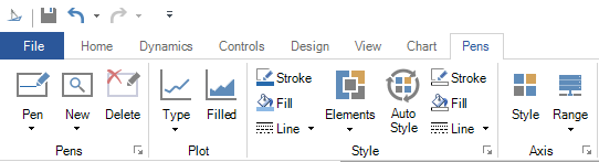
Using the Chart Ribbon

  1. Click on the chart to select it. This opens the Chart tab in the TrendWorX64 Ribbon.

  2. The user can customize and configure their TrendWorX64 Viewer Chart using the buttons on the Chart tab shown below.


    From here, the user has access to 10 different sections that feature 30 total buttons, each with a separate configuration purpose. See TrendWorX64 Viewer Configuration Ribbon (Chart) for more information on what purpose each button serves.

Using the Pens Ribbon

  1. Once the user has adequately configured their TrendWorX64 Viewer Chart using the buttons on the Chart tab, they can configure the Pens within their chart (as shown below).

    From here, the user has access to 4 different sections that feature 15 total buttons, each with a separate configuration purpose. See TrendWorX64 Viewer Configuration Ribbon (Pens) for more information on what purpose each button serves.

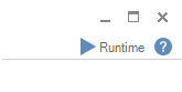
    Once the user has adequately configured their TrendWorX64 Viewer Pens using the buttons on the Pens tab, they can enter Runtime mode.

    Click the Runtime mode button located at the top right of the GraphWorX64 window, as shown below.

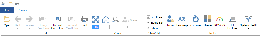
    Once in Runtime mode, the TrendWorX64 Viewer Chart begins to display data. The standard Runtime ribbon is open, as shown below.


  2. Click on the TrendWorX64 Viewer Chart. The Ribbon becomes the TrendWorX64 Runtime Ribbon as shown below.

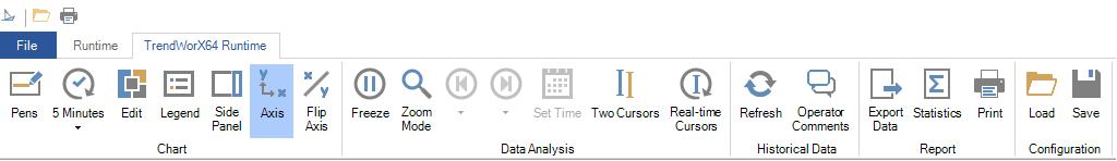
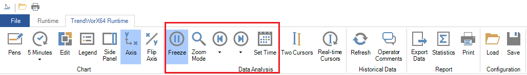
    From here, the user has access to 5 fields with 21 total buttons, each with a separate Runtime configuration purpose. See TrendWorX64 Runtime Ribbon for more information on what purpose each button serves. The greyed out buttons are available only in Freeze mode.

    Within Runtime mode, a smaller version of the TrendWorX64 Runtime Ribbon appears above the TrendWorX64 Viewer Chart as shown below.

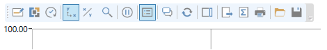
    Freeze mode plays a key role in the available Small Ribbon options. When not in Freeze mode (shown above) the smaller ribbon provides the user with a similar group of options as the original TrendWorX64 Runtime Ribbon. The primary difference is the lack of the Freeze mode button on the Small Ribbon, which is only available on the Ribbon located at the top of the window.

    Click the Freeze mode button to activate it. The previously greyed out options are now available on the original TrendWorX64 Runtime Ribbon.


    They are also available on the Small Ribbon above your TrendWorX64 Viewer Chart, as shown below.

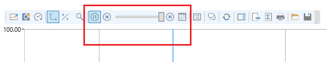
    See TrendWorX64 Runtime Data Analysis for more information on what purpose each button serves.

See Also:

TrendWorX64 Viewer

TrendWorX64 Runtime