Series Tab
The Series Tab allows you to add or remove data as a series and then set that series' properties.
NOTE: The Series tab properties will change according to the Chart Type selected on the Chart and Axis Tab. Some fields will be inactive, while others will be different depending on the chart type. See Using SPC Charts in GridWorX and Using Histogram Charts for other chart options and properties.
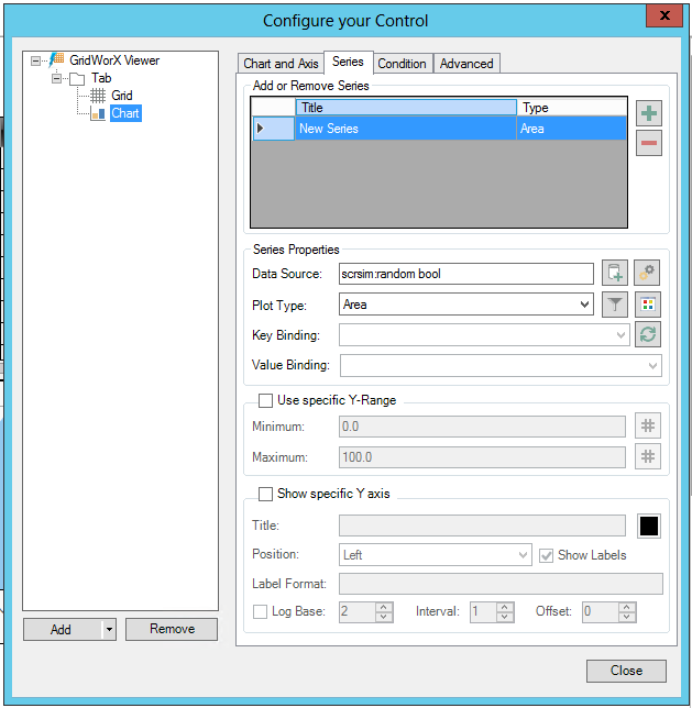
A GridWorX Chart's Series Tab
-
Add or Remove Series - Click the plus sign [+] to access the data browser. Once you have selected the source of your series of data, it will appear in this section. You can click on the minus sign [-] to remove a previously selected series. Clicking the Palette button
 allows you to
  select
from pre-set color palettes for your series in the chart.
select
from pre-set color palettes for your series in the chart.
Series Properties
-
Data Source - Enter the tag used to retrieve the values for the series. Click on the
 button
to open the Data Browser and navigate to your selected data source.
Click on the
button
to open the Data Browser and navigate to your selected data source.
Click on the  button to open the Series
advanced settings Window.
button to open the Series
advanced settings Window. -
Plot Type - Use the pulldown menu to select from Area, Bars, Line, Spline Area or Spline. Click on the
 button to open the 'Filter configurator'
window to set any filter conditions. Click on the
button to open the 'Filter configurator'
window to set any filter conditions. Click on the  to
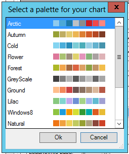
open the 'Select a palette for your chart' window and select from
the preset color palettes.
to
open the 'Select a palette for your chart' window and select from
the preset color palettes. -
Key Binding - When activated, use the pulldown menu to select the key binding for the Series.
-
Value Binding - When activated, use the pulldown menu to select the value binding for the Series.
-
Configure Filter - Click on the ellipsis button to open the Filter configurator window. Click on the plus sign [+] to access the Configure the filter window. Add your selected filter then click OK, then click OK again to return to the Configure your Control window.
-
Use specific Y-Range - Click this checkbox in order to explicitly specify a range for the Y Axis. Once selected, you can enter the Minimum and Maximum of the range in the text entry fields. You can click on the # button for either field to open the Data Browser and navigate to the data source for either value.
-
Show specific Y axis - Show or hide the Y axis
-
Title - Enter a title for the Y axis in the text entry field. Click on the nearby box to open the Color window to select a color for the title.
-
Position - Y axis alignment. Use the pulldown menu to select from Left or Right.
-
Show Labels - True to show labels on the Y axis.
-
Label Format -Enter the label format for the Y axis in the text entry field.
-
Log Base -True to use logarithmic values on the Y axis. Once active, you can enter the logarithmic base in the nearby text entry field or use the up/down arrow buttons.
-
Interval -Label interval. Once active, enter a value in the text entry field or use the up/down arrow buttons.
-
Offset -Label offset. Once active, enter a value in the text entry field or use the up/down arrow buttons.
-
Cursor Format- Specifies the format of the text visualized by the cursor tooltip. You can use %f as a placeholder for the field key (X axis) and %v as a placeholder for the value. For special SPC charts, you can also use %usl, %lsl, %t. For SPC Line charts, you can use %ucl, %lcl, %alarm, %note, %ts. For SPC Bar charts, you can use %distr.
-
Conditions - Select from any existing condition created/stored in the Condition tab.
-
Format - This is the “axis label format” and can be horizontal or vertical. It can be general for the chart or specific for each series. It is used to format the numbers in the labels of the axis (e.g. how many decimal digits they should have, etc). For more information, see https://msdn.microsoft.com/en-us/library/0c899ak8.aspx.
See Also: