Security Indicator Control in GraphWorX
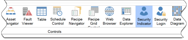
The Security Indicator in the GraphWorX™64 viewer is located on the Controls tab. The security indicator control allows the current user and handling security events to be displayed. The security indicator control is separate from the Security Login Control. For more information on creating a security server, see Security.
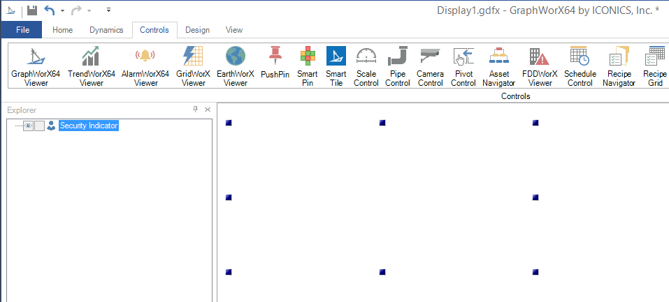
To create a Security Indicator Control, select the Security Indicator control icon from the Controls ribbon.
Your cursor becomes a cross hair. Use the cross hair to draw the perimeter of the Security Indicator on the display. Your Security Indicator will now be visible.
Security Indicator Control
The right side of the screen will now display the Security Indicator Control Properties. Security Indicator Controls have a number of standard properties such as Measurements and Text, but also have a number of unique properties.
Security Indicator Object Properties
The Security Indicator properties can be configured either through the Configuration window, shown below, or via the Properties section of the Workbench on the right side of the GraphWorX64 window.
Configuration Through the Security Indicator Configuration Window
General
Security Indicator Configuration Window - GENERAL Tab
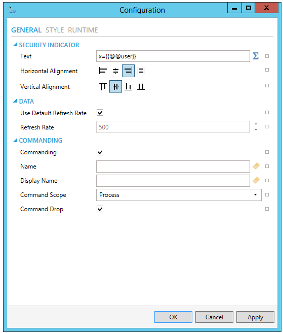
SECURITY INDICATOR
-
Text - Expression to evaluate and show in runtime. Enter in the text entry field or click on the
 button to open the Expression
Editor (Configure the expression window) to construct your expression.
button to open the Expression
Editor (Configure the expression window) to construct your expression. -
Horizontal Alignment - Horizontal alignment of the formatted text field.
-
Vertical Alignment - Vertical alignment of the formatted text field.
DATA
-
Used Default Refresh Rate - Use default refresh rate or refresh rate inherited from parent container.
-
Refresh Rate - Data refresh rate of data sources defined for properties, in milliseconds. Do not modify if you intend to use local variables for sharing data with other controls, e.g. selected asset or current time range.
COMMANDING
-
Commanding - Determines whether commands are enabled for this display. Use the CommandingName setting to specify a registration name.
-
Name - Name used for registering the control for commanding.
-
Display Name - User friendly control name.
-
Command Scope - Indicates whether commands sent and received by this display affect the current process only (Process) or all processes that are currently opened (Machine). For inter-process commanding, use the Machine option.
-
Command Drop - True to enable receiving commands by drag and drop.
STYLE
Security Indicator Configuration Window - STYLE Tab
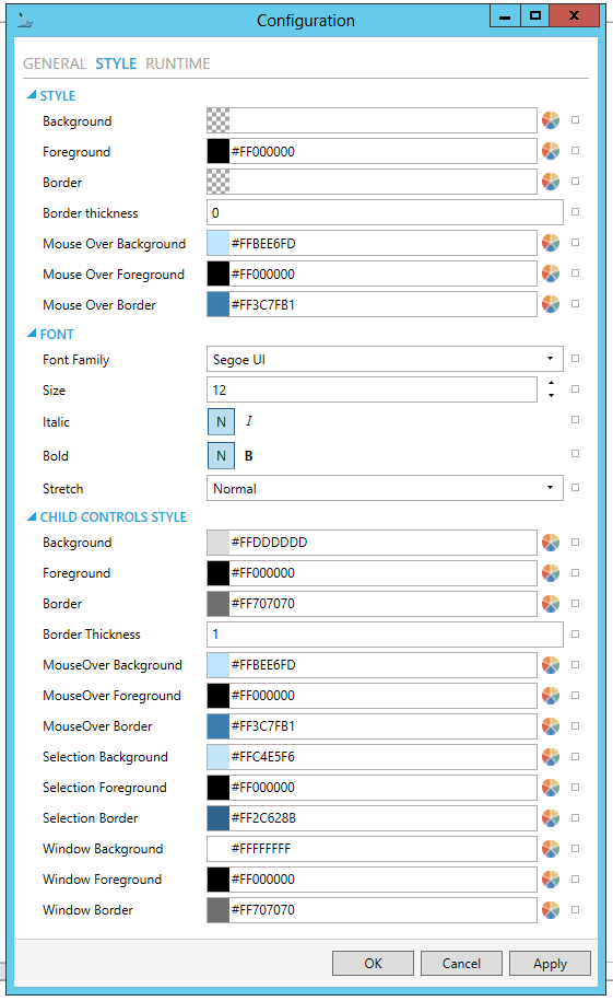
STYLE
-
Background - Background color, gradient or pattern of this object. You can enter a color code (if known) in the text entry field or click on the
 button to open the Brush Picker window and set the properties for
your background
button to open the Brush Picker window and set the properties for
your background -
Foreground - Foreground color, gradient or pattern of this object. You can enter a color code (if known) in the text entry field or click on the
button to open the Brush Picker window and set the properties for
your foreround. -
Border - Color, gradient, or pattern of the border surrounding this object. You can enter a color code (if known) in the text entry field or click on the
button to open the Brush Picker window and set the properties for
your border. -
Border thickness - Width of the border surrounding this object. Enter a thickness in the text entry field.
-
MouseOver Background - Background brush of item under mouse cursor. You can enter a color code (if known) in the text entry field or click on the
button to open the Brush
Picker window and set the properties for your mouseover background. -
MouseOver Foreground - Foreground brush of item under mouse cursor. You can enter a color code (if known) in the text entry field or click on the
button to open the Brush
Picker window and set the properties for your mouseover foreground. -
MouseOver Border - Border brush of item under mouse cursor. You can enter a color code (if known) in the text entry field or click on the
button
to open the Brush Picker window and set the properties for your mouseover
border.
FONT
- Font Family - Specifies the name of the font used to render text. Use the pulldown menu to select from installed fonts.
- Size - Specifies the size of the font used to render text. Enter a font size in the text entry field or use the up/down buttons.
- Italic - Specifies the style of the font used to render text (italic). Select "N" for Normal or "I" for Italic.
- Bold - Specifies the thickness of the font used to render text (bold) Select "N" for Normal or "B" for Bold.
- Stretch - Specifies whether a font appears with a typical width (Normal) narrower than usual (Condensed), or wider than usual (Expanded). Use the pulldown menu to make your selection.
CHILD CONTROLS STYLE
- Background - Background
brush of child controls. You can enter a color code (if known) in
the text entry field or click on the button to
open the Brush Picker window and set the properties for your background.
- Foreground - Foreground
brush of child controls. You can enter a color code (if known) in
the text entry field or click on the button to
open the Brush Picker window and set the properties for your foreground.
- Border - Border brush
of child controls. You can enter a color code (if known) in the text
entry field or click on the
button to open the Brush Picker window and set the properties for
your border.
- Border Thickness - Border thickness of child controls. Enter a thickness in the text entry field.
- MouseOver Background
- Background brush of child controls under mouse cursor. You
can enter a color code (if known) in the text entry field or click
on the button to open the Brush Picker window and
set the properties for your mouseover background.
- MouseOver Foreground
- Foreground brush of child controls under mouse cursor. You can enter
a color code (if known) in the text entry field or click on the
button to open the Brush Picker window and set the properties for
your mouseover foreground.
- MouseOver Border
- Border brush of child controls under mouse cursor. You can enter
a color code (if known) in the text entry field or click on the
button to open the Brush Picker window and set the properties for
your mouseover border.
- Selection Background
- Background brush of selected child controls. You can enter a color
code (if known) in the text entry field or click on the button to open the Brush
Picker window and set the properties for your selection background.
- Selection Foreground
- Foreground brush of selected child controls. You can enter a color
code (if known) in the text entry field or click on the button to open the Brush
Picker window and set the properties for your selection foreground.
- Selection Border
- Border brush of selected child controls. You can enter a color code
(if known) in the text entry field or click on the
button to open the Brush Picker window and set the properties for
your selection border.
- Window Background
- Background brush of child control windows. You can enter a color
code (if known) in the text entry field or click on the button to open the Brush
Picker window and set the properties for your background of child
control windows.
- Window Foreground
- Foreground brush of child control windows. You can enter a color
code (if known) in the text entry field or click on the button to open the Brush
Picker window and set the properties for your foreground of child
control windows.
- Window Border - Border brush of child control windows.
You can enter a color code (if known) in the text entry field or click
on the button to open the Brush Picker window and
set the properties for your border of child control windows.
RUNTIME
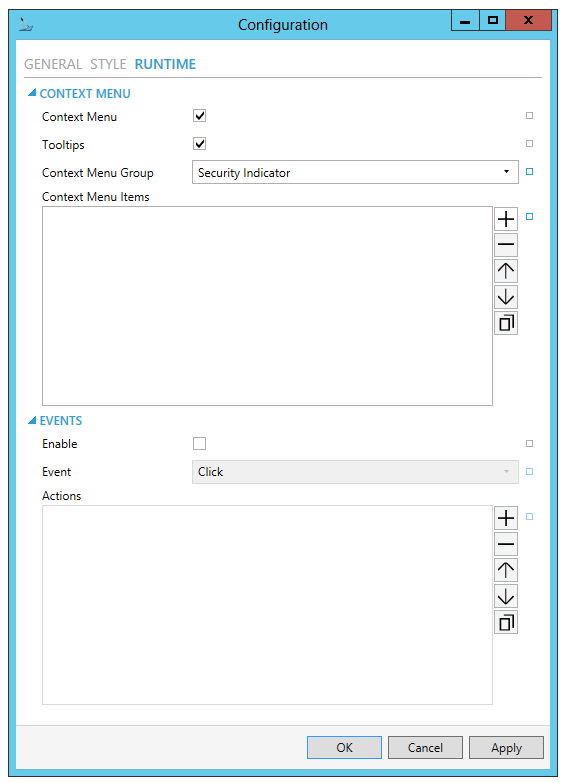
CONTEXT MENU
- Enable - True to enable context menu on right click.
- Tooltips - Enables tooltips on hover in context menu items.
- Group - Select context menu group for editing. The menu defaults to Security Indicator.
- Items - Allows users to
add items to a collection based on the selected Context Menu Group.
Click on the plus sign [+] to add an item to the list. Click on the
minus sign [-] to remove a listed item. Click on the up arrow to move
a selected item higher in the list. Click on the down arrow to move
a selected item lower in the list. Click on the
 button to duplicate a selected entry in the list.
 - Security Indicator
- Custom Command - Custom command that can be configured to run any command with custom parameters.
- Command - Use the menu to select the Command you wish to include as a Context Menu Item. See the Commands in GraphWorX64.
- Separator - Horizontal separator to separate groups of context menu items.
COMMANDS ON EVENTS
The Security Indicator is one of many controls that now supports executing commands on events. These events vary per control, but for the Security Indicator they include:
- Click
- Started
- User Changed
- Enable - True to enable configuring actions and commands for control events.
- Event - Select a control event and configure actions to fire when the event occurs. Use the pulldown menu to select from Click, Started, or User Changed.
- Commands - List of actions
to perform when selected control event occurs. Click on the plus sign
[+] to add an item to the list. Click on the minus sign [-] to remove
a listed item. Click on the up arrow to move a selected item higher
in the list. Click on the down arrow to move a selected item lower
in the list. Click on the button to duplicate
a selected entry in the list. For any Custom Command selected in the
list, you can then select a specific Command and then complete the
associated properties for that command. See the
Commands in GraphWorX64.
Configuration Through the Properties Section of the GraphWorX64 Window
Security Indicator Control Properties
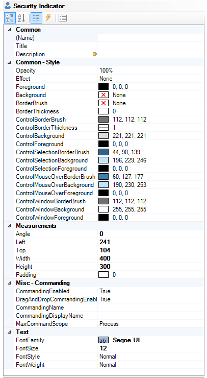
Common
(Name) - Unique string identifier for this object.
Title - Title for this object. Unlike the Name property, the Title does not have to be unique.
Description - Description for this object. The Description typically appears as a tooltip for the object.
Common-Style
Opacity - Overall opacity of this object (0% = fully transparent. 100% = fully opaque).
Effect - Visual effects (3D-edge, shadow, glow, blue) applied to this object.
Foreground - Foreground color, gradient, or pattern of this object.
Background - Background color, gradient, or pattern of this object.
Border - Color, gradient, or pattern of the border surrounding this object.
BorderWidth - Width of the border surrounding this object.
ControlBorderBrush - Border brush of child controls.
ControlBorderThickness - Border thickness of child controls.
ControlBackground - Background brush of child controls.
ControlForeground - Foreground brush of child controls.
ControlSelectionBorderBrush - Border brush of selected child controls.
ControlSelectionBackground - Background brush of selected child controls.
ControlSelectionForeground - Foreground color of selected child controls.
ControlMouseOverBorderBrush - Border brush of child controls under mouse cursor.
ControlMouseOverBackground - Background brush of child controls under mouse cursor.
ControlMouseOverForeground - Foreground brush of child controls under mouse cursor.
ControlWindowsBorderBrush - Border brush of child control windows.
ControlWindowBackground - Background brush of child control windows.
ControlWindowForeground - Foreground brush of child control windows.
Measurements
Angle - The current angle of rotation for this object.
Left - Horizontal position of top-left corner of the object.
Top - Vertical position of the top-left corner of the object.
Width - Width of the object.
Height - Height of the object.
Padding - The amount of space surrounding the content of this object.
Misc-Commanding
CommandingEnabled - Determines whether commands are enabled for this display. Use the CommandingName setting to specifiy a registration name.
DragAndDropCommandingEnabled - Set to True to enable receiving commands by drag and drop method.
CommandingName - Name used for registering the control for commanding.
CommandingDisplayName - User friendly control name.
MaxCommandScope - Indicates whether commands sent and received by this display affect the current process only (Process) or all processes that are currently opened (Machine). For inter-process commanding, use the Machine option.
Text
FontFamily - Specifies the name of the font used to render text.
FontSize - Specifies the size of the font used to render text.
FontStyle - Specifies the style of the font used to render text (italic).
FontWeight - Specifies the thickness of the font used to render text (bold).
3. After setting the Object Properties, the Security Indicator control can be saved when the containing GraphWorX64 display itself is saved.
See Also: