Recipe Navigator
The Recipe Navigator control in GraphWorX64 provides the ability to select configured recipes in Runtime mode.
 Security Authorization in GraphWorX64 defines what a user or group of users have permission to access. This layer of security is on top of the ICONICS standard security login. Running reports, recipe management, configuration and Runtime modes require single or double authorization. See Password Authorization in GraphWorX64.
To Create a Recipe Navigator Control inside a GraphWorX64 Display:
- Open GraphWorX64.
- Select the Controls tab.
- Click the Recipe Navigator icon.
Draw a box within the display pane. The box displays the configured Recipes tree (configured via the Recipes branch of the Platform Services node in the Workbench). The result looks similar to the image below.
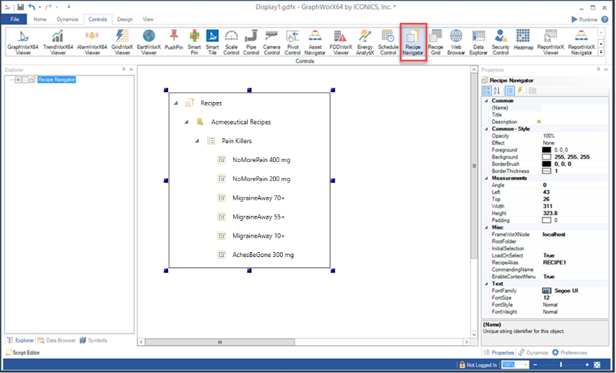
Recipe Navigator Controls
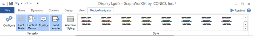
Configure displays the Recipe Navigator where you configure preset or customize settings.
The GraphWorX64 Recipe Navigation Properties Pane (right side) also gives you access to configuration objects in addition to the Recipe Navigator window (depicted below). 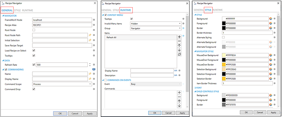
The following Recipe Navigator table defines configuration functions and descriptions for each section displayed in the General, Styles, and Runtime tabs.
 If you change any Recipe Navigator value and want to revert to the original value, click the small rectangle
  and select Default. Remember to click Apply to save any changes.
Tab - Section
Function
Description
FrameWorX Node
Identifies the server to connect to for recipes.
Recipe Alias
Alias name is used to bind the recipe tree to the grid. RECIPE1 is the default alias.
Root Node
Select the checkbox to enable the Root Node Path in the display pane.
Root Node Path
Path to node that serves as a root node for the displayed tree.
Initial Selection
Used to expand the tree to a particular item to select it.
Save Recipe Target
The Target Recipe Grid is saved to a specified target location. Leave empty to select from available targets.
Load Recipe on Select
Option to automatically load a recipe item when it is selected.
Tooltips
Option enables tool tips on recipes and commands.
GENERAL - Data
Refresh Rate
The refresh rate default is 500 ms inherited from parent container. Select the checkbox to change the value.
Do not modify the default value if you intend to use local variables for sharing data
with other controls.GENERAL - Commanding
Name
Name used for registering the control for commanding.
Click the tag icon
 to open the Data Browser and select the appropriate recipe tag.
Display Name
User friendly control name.
Click the tag icon
to open the Data Browser and select the appropriate recipe data or Runtime tag.Command Scope
Indicates whether commands sent and received by this display affects only the current process (Process) or all processes that are currently opened (Machine). For inter-process commanding, use the Machine option.
Command Drop
Option to enable receiving commands by drag and drop.
Context Menu checkbox
The Context Menu check box is selected by default to enable right-click menu functions.
Tooltips
Option enables tool tips on hover in for context menu items
Invalid Menu Items
Option for hiding or disabling menu items in Runtime.
Group
Use the drop-down list to select the recipe item for editing. Navigator is the default menu group. Selections are:
- Recipe Root and Folder
- Recipe Node
- Recipe item
Items
Allows users to add items to a collection based on the selected Context Menu Group (above).
-
Click the plus sign
[+] to add an item to the text field related to the Group setting. Selections are:
- Separator
- Refresh
- Refresh All
- Custom Command
- Copy from
- Click the minus sign [-] to remove a listed item.
- Click on the up arrow to move a selected item higher in the list.
- Click on the down arrow to move
a selected item lower in the list. Click on the
 button to duplicate a selected entry in the list.
For any custom command, you can then select a specific Command and then complete the
associated properties for that command. See Commands in GraphWorX64.Display Name
The name is displayed in the configuration collection. Enter a display name in the text entry field or click on the language alias
 button to browse and select
the name that can be converted to another language.
button to browse and select
the name that can be converted to another language. Description
The description is displayed in tool tip in configuration collection. Enter the description in the text entry field or click on the language alias
button to browse and select
the description that can be converted to another language.Commands on Events checkbox
Sect the checkbox to enable configuring actions and commands for control events.
Event
Select a control event and configure actions to execute when the event occurs. Use the drop-down list to make your selection (Busy, Ready, Recipe Selected, or Started).
Commands
Supports executing custom commands on events. List of actions to perform when selected control event occurs.
- Click the plus sign [+] to add an item to the text field. Selections are:
- Custom Command
- Acknowledgment
- Click the minus sign [-] to remove a listed item.
- Click the up arrow to move a selected item higher in the list or the down arrow to move a selected item lower in the list.
- Click on the copy icon
 to duplicate
a selected entry in the list.
to duplicate
a selected entry in the list.
For any custom command, you can then select a specific Command and then complete the
associated properties for that command. See Commands in GraphWorX64.Background,
Foreground, and BorderDefault hexadecimal color value appears. You can enter a hex color value or click
 to pick an RBG color value from the brush picker window.
Border Thickness
Pixel number value for line thickness.
Default value is 1.Alternate Styling
Select the checkbox to enable the Alternate Background and Alternate Foreground colors to appear on every other row with a grid.
STYLE - Navigation Style
MouseOver Background, MouseOver ForeGround
Default hexadecimal color value that appears for mouse over/hover functions. You can enter a hex color value or click
to pick an RBG color value from the brush picker window.MouseOver Border
Sets the color value for the mouse over border. You can enter a hex color value or click
to pick an RBG color value from the brush picker window.Selection Background, Selection Foreground
Hexadecimal color value that appears for the Selection Background and Selection Foreground fields appearing in the grid. You can enter a hex color value or click
to pick an RBG color value from the brush picker window.Selection Border
Sets the color value for the selection border. You can enter a hex color value or click
to pick an RBG color value from the brush picker window.Item Border Thickness
Pixel number value for item border line thickness. Default value is 1.
STYLES - Font
Font Family, Size,
Self-explanatory. Default font is Segue UI and font size is 12 pt.
Italic, Bold
The default setting for font Italic and Bold type is Normal (N). To change, click I and/or B.
STYLES - Child Controls
Background,
Foreground, and BorderThe default hexadecimal color value appears. You can enter a hex color value or click
to pick an RBG color value from the brush picker window.Border Thickness
Pixel number value for line thickness.
Default value is 1.MouseOver Background, MouseOver ForeGround
Default hexadecimal color value that appears for mouse over/hover functions. You can enter a hex color value or click
to pick an RBG color value from the brush picker window.MouseOver Border
Sets the color value for the mouse over border. You can enter a hex color value or click
to pick an RBG color value from the brush picker window.Selection Background, Selection Foreground
Hexadecimal color value that appears for the Selection Background and Selection Forground fields appearing in the grid. You can enter a hex color value or click
to pick an RBG color value from the brush picker window.Selection Border
Sets the color value for the selection border. You can enter a hex color value or click
to pick an RBG color value from the brush picker window.Window Background, Window Foreground
Sets the properties for child control windows. You can enter a hexadecimal color value or click
to pick an RBG color value from the brush picker window.Window Border
Sets the color value for the window border. You can enter a hexadecimal color value or click
to pick an RBG color value from the brush picker window.
GraphWorX64 Recipe Navigation Properties Pane
In the GraphWorX64 Recipe Navigator, the Properties pane displays a extensive list of object properties that are grouped by category. See GraphWorX64 Object Properties for more information.
- Common
- (Name): Unique string identifier for this object.
- Title: Title for this object. Unlike the Name property, the title does not have to be unique.
- Description: The object description can be set to a dynamic data source—typically appears as a tool tip for the object.
- Common-Style
- Background: Background color, gradient, or pattern of this object.
- Border: Color, gradient, or pattern of the border surrounding this object.
- BorderWidth: Width of the border surrounding this object.
- ControlBorderBrush: Border brush of child controls.
- ControlBorderBrush: Border thickness of child controls.
- ControlBackground: Background brush of child controls.
- ControlForeground: Foreground brush of child controls.
- ControlSelectionBorderBrush: Border brush of selected child controls.
- ControlSelectionBackground: Background brush of selected child controls.
- ControlSelectionForeground: Foreground color of selected child controls.
- ControlMouseOverBorderBrush: Border brush of selected child controls.
- ControlWindowBackground: Background brush of child control windows.
- ControlMouseOverForeground: Foreground brush of child controls under mouse cursor.
- ControlWindowsBorderBrush: Border brush of child control windows.
- ControlWindowBackground: Background brush of child control windows.
- ControlWindowForeground: Foreground brush of child control windows.
- Effect: Visual effects (3D-edge, shadow, glow, blue) applied to this object.
- Foreground: Foreground color, gradient, or pattern of this object.
- Opacity: Overall opacity of this object (0% = fully transparent. 100% = fully opaque).
- Measurements
- Angle: The current angle of rotation for this object.
- Left: Horizontal position of top-left corner of the object.
- Width: Object width
- Height: Object height
- Padding: The amount of space surrounding the content of this object.
- Misc
- FrameWorXNode: The server node connecting to recipes.
- InitialSelection: Used to automatically expand the tree to a particular item and select it. The value should contain the full path, separated by periods.
- LoadOnSelect: Enable this option to automatically load a recipe item when it is selected.
- RecipeAlias: Recipe alias used to bind the tree to the grid.
- SaveRecipeCommandTarget: Target Recipe Grid for Recipe save command in the context menu. Leave empty to select from available targets.
- EnableContextMenu: To set to true to enable the context menu on right-click, otherwise false.
- ShowRootNode: Set to true to show root node.
- ShowTooltips: Set to true to show tool tips of nodes under cursor.
- RootNode: Path to node that should serve as a root node for the displayed tree. Click the ellipsis button [...] to open the Data Points window to navigate to your selected Root Node.
- Misc-Commanding
- CommandingEnabled: Determines whether commands are enabled for this display. Use the CommandingName setting to specify a registration name.
- DragAndDropCommandingEnabled: Set to True to enable receiving commands by drag and drop method.
- CommandingName: Name used for registering the control for commanding.
- CommandingDisplayName: User friendly control name.
- MaxCommandScope: Indicates whether commands sent and received by this display affect the current process only (Process) or all processes that are currently opened (Machine). For inter-process commanding, use the Machine option.
- Text
- FontFamily: Specifies the font name used for text.
- FontSize: Specifies the font pt. size (101 pt, 11 pt, 12 pt).
- FontStyle: Used to specify italic text.
- FontStyle: Specifies the style of the font used to render text (italic).
- FontWeight: Used to specify bold text.
Recipe Navigator Runtime
Additional command options are available when viewing the recipe tree in Runtime mode in the GraphWorX64 Recipe Navigator.
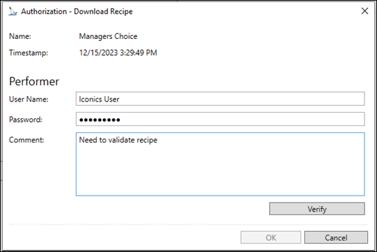
When a command is executed for a recipe item that requires authorization, the Authorization dialog is displayed. For example, you are authorized to create New Recipe Item. The single authorization dialog appears asking you, as the Performer, to enter and verify your User Name and/or Password (based on your log in status).  View image
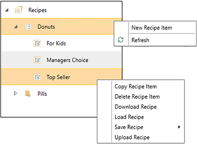
Command options at the top Recipes level are:
- New Recipe Item allows you to enter a recipe name in a pop-up Recipe Name window. The new Recipe Item appears in the navigation tree at the selected level.
- Refresh synchronizes with the Recipes branch in the Platform Services node in Workbench to show any recently configured recipe items in the current recipe tree structure.
Command options at the individual level are:
- Copy Recipe Item allows you to copy and rename a recipe item into the current recipe tree structure.
- Delete Recipe Item removes the selected recipe item from the current tree structure. A warning message appears to confirm or cancel the deletion.
- Download Recipe downloads the currently selected recipe.
- Load Recipe is used to set the Global Alias path to the selected recipe item. The default alias is RECIPE1.
- Save Recipe saves changes to the data set that is loaded into the Recipe Grid control. All detected Recipe grids in the display are presented to the user as a possible target. (Alternative) is to specify the target using the Misc >Save Recipe Target command.
- Upload Recipe reads the current values from hardware or other data sources and stores those values in the database for the selected recipe item.
See Also: