Introduction to GraphWorX

GraphWorX™, an advanced graphics design editor that you use to create displays, is human-machine interface (HMI) software for building process control displays using a data source that's connected to GENESIS. You can create different types of visualizations, such as geospatial maps, floor plans, and equipment, and then display the information in run-time mode.

GraphWorX supports a range of client options to visualize data:

  • Desktop (thick client)—Used for small, independent applications, and for dedicated control center deployments.
  • Web-based (HTML5)—Allows internet or intranet deployments. Learn more
  • Mobile devices, such as smartphones and tablets, use HTML5, which gives access to a mobile workforce, such as field operators. Applications get installed on these devices and connect to the server for real-time information. Learn more

To open GraphWorX:

Do one of the following:

  • From Workbench, click the File menu, and then select Configure Displays.
  • In the search box on the Windows taskbar (Windows 10 and 11), enter GraphWorX, and select the app in the search results.
  • On the Windows Start menu, browse the applications list for the ICONICS GENESIS folder, expand it, and select GraphWorX.

The following example depicts a tank that measures liquid tank levels and other related data points.

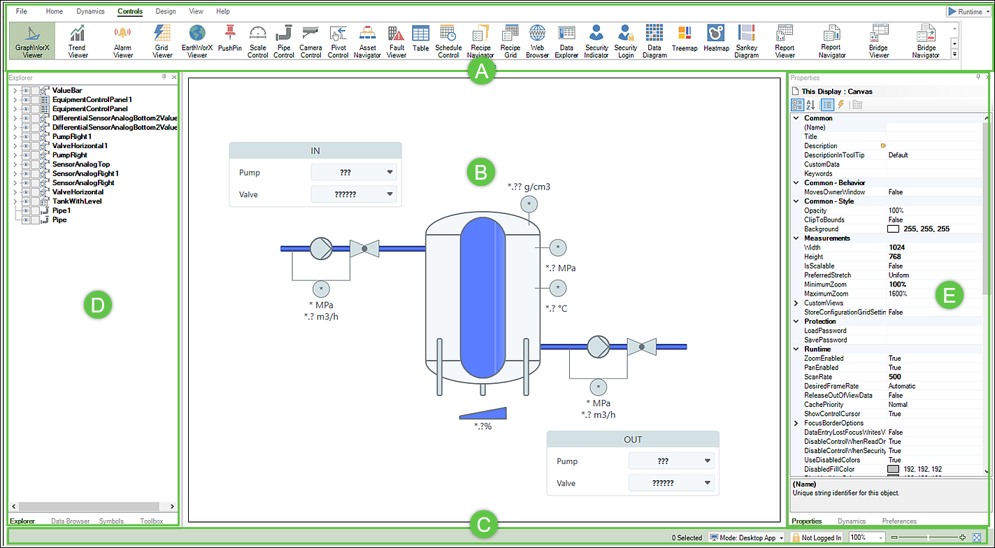
GraphWorX has extensive design functionality grouped into several main areas.

Section

Description

Function

Ribbon

The GraphWorX ribbon consists of multiple tab selections. The following is a brief description of each:

  • File Menu—Commands to create a new display, save files, import and export a file, print, and log in and log out.
  • Home—Menu items include the following sections:
    • Clipboard—Includes cut, paste, copy, and duplicate options.
    • Shapes—Includes various object types for the design (layout panels, labels, draw lines, polygons, rectangles, embed regular and 3D effects, and layers).
    • Styles and Colors—Provides visual object attributes, such as a color palette, fill color or texture, line thickness, style, and theme effects.
    • Arrange—Controls the positioning and organization of objects in a display, such as grouping, object order (move to front or send to back), and flip horizontally or vertically.
    • Text— Find and manage text objects in a display. This is useful when multiple layers or labels are used in the graphic design.
  • Dynamics—Provides animation and run-time interaction based on a dynamic command or a triggered event, such as a low liquid tank level.

    Sections of the Dynamics menu include:

    • Text Objects—Creates text label shapes related to Process Point, Data Entry, and Time Date objects. The Dynamics properties pane opens to assign dynamic properties to the text object.
    • Buttons—Use to create a variety of user interactions. such as a standard text button, checkbox, or radio button, and to execute a pick action in run-time mode.
    • Dimensions—Allows you to dynamically change a display object's size, position, or orientation.
    • Color—Allows you to dynamically change a color based on the data source, turn off user interaction, or hide objects in a display for unauthorized viewing.
    • Selectors—There are various selector functions:
      • State switches between different object states.
      • Range changes an object's visibility based on a range of values.
      • Clone generates copies of a symbol during runtime that connects to different data points.
    • This Display—This section includes the following functions:
      • Aliases are placeholders that enable you to dynamically change the data source path, which can be particularly useful in displays that are used across different systems or assets.
      • Function Key performs key-press actions and can be associated with a pick action to set a state or change a value with a click of a button.
  • Controls—Viewers and other functions allow you to focus on particular areas within the display and insert specific controls, such as trends, alarms, grids, an asset hierarchy, a map, a camera control, reports, and tables. The overall purpose is to make it easier to display data and the graphical elements in your design.
  • Design—Provides the look and feel for implementing your design using the following sections:
    • Display Settings—Change common properties for the display, such as width, height, background color, scale (resize) , and enable or disable the zoom and pan capability.
    • Templates—A collection of display properties, objects and their formats, controls, and dynamics that you add or insert into the main design display.
  • View—Contains various options to view your display, such as back and forward navigation, zoom and custom views, grid and ruler options, window layouts, and show and hide configuration tool panels.
  • Runtime—Run-time mode executes the graphic display, rendering dynamic objects, data values, and properties that you configured in your design. For example, simulate Tank 01 temperature and pressure values when filling or releasing tank liquid.

    In Desktop mode, you will see the Runtime button, whereas in Web Browser mode, Open in Web Browser is used for runtime. This mode offers a convenient auto-reload feature. This feature automatically reloads any design changes that you make on the fly, which eliminates the need to save and manually reload the file. This can significantly save you time and effort, enhancing your productivity.

Canvas

Also referred to as the main design display. This is where you create the graphical interface and configure properties and dynamic behaviors.

Status bar

From the status bar, you can easily log in and select the appropriate display mode (Desktop App, Web Browser, or Mobile App).

GraphWorX uses color to indicate what client mode is displayed on the main design canvas. Green indicates Desktop, and blue indicates both Web Browser and Mobile App modes.

Left panel

Access the left panel functions by clicking the Explorer (default), Data Browser, Symbols, or Tools tabs.

  • Explorer—A tree control listing all of the objects currently defined in the main design display.
  • Data Browser—Provides a convenient way to navigate and interact with various data sources, such as your assets and data connections, without opening a separate window.
  • Symbols—A library of visual objects, such as a tank, meter, motor, or pump that can be dragged into main design display. From the Explorer tab, you can see how a symbol is built. You can also apply dynamic attributes to an object and save it to the library.
  • Toolbox—Provides a convenient way to access functions that appear on the Controls navigation menu.

Right Panel

Access the right panel functions by clicking the Properties (default), Dynamics, and Preferences tabs. These tabs are used to customize and configure the behavior and appearance of design objects.

  • Properties—Displays the selected object's settings, and allows you to modify an object's properties, such as defining the dimensions and style.
  • Dynamics—Shows the different animations and actions that are defined for an object and allows you to apply various properties to a dynamic, such as the path to a data source.
  • Preferences—Shows an object's default properties, such as an object color, padding, name, and description. You can change default values for an object or dynamic action, if desired.