Data Diagram
The Data Diagram control is a cross-platform feature that functions on desktops, web browsers, and smart mobile devices. It presents the user with two-dimensional visual data where the values are represented by colors, and is configurable within GraphWorX64 using the color scale. The Data Diagram can be used in projects across any ICONICS 64-bit product, and is applicable to virtually any industry or vertical market.
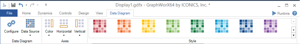
Data Diagram Configuration Ribbon:
Data Diagram Ribbon
Data Diagram
-
Configure -Open the Configuration window.
-
Data Source -Data source for the diagram. Can be any data set with at least two columns: category and value. You can set the Columns Binding, Rows Binding, and Value Binding.
Axes
-
Color -Modify visibility and location of color axis. Select from None, Top, Left, Right, or Bottom.
-
Horizontal -Modify visibility and location of horizontal axis. Select from None, Top, or Bottom.
-
Vertical -Modify visibility and location of vertical axis. Select from None, Left, or Right.
Style
-
Style -Expand this control to select from multiple preset data diagram styles.
From the Data Diagram tab on the Configuration Ribbon, the user can select the Style for their component.
Configuring the Data Diagram:
-
Open GraphWorX64.
-
Click the Controls tab.
-
Select the Data Diagram control. Your cursor becomes a cross hair.
-
Click and drag the cross hair within your window to create a Data Diagram. Ensure that your Data Diagram is large enough to display all of the boxes held within it.
-
Double-click on the Data Diagram. The Configuration window appears.
-
Here, you can input Data, configure Samples, customize the Color, Horizontal and Vertical Axes, edit the Styles, and the Commanding options.
Data Diagram Object Properties
The Data Diagram properties can be configured either through the Configuration window, shown below, or via the Properties section of the Workbench on the right side of the GraphWorX64 window.
Configuration Through the Security Indicator Configuration Window
GENERAL
Data Diagram Configuration Window - GENERAL Tab
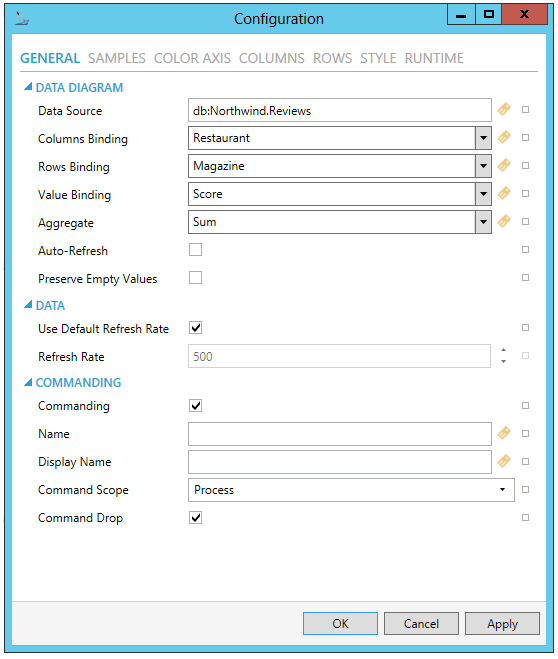
DATA DIAGRAM
-
Data Source - Data source for the Data Diagram. Can be any data set with at least two columns: category and value. Enter a data source for the Data Diagram control in the text entry field or click on the
 button to open the Data
Browser and navigate to your preferred data source. You can also click
on the
button to open the Data
Browser and navigate to your preferred data source. You can also click
on the  button to reset the current setting.
 -
Reference - Reference data source name for retrieving dataset columns. See Reference Property for more info.
-
Columns Binding - Defines data binding for horizontal axis. Enter an Columns Binding in the text entry field or use the pulldown menu to select from any recently provided setting or click on the
button
to open the Data Browser and navigate to your preferred data for the
Columns Binding setting. You can also click on the
button to reset the current setting. -
Rows Binding - Defines data binding for vertical axis. Enter a Rows Binding in the text entry field or use the pulldown menu to select from any recently provided setting or click on the
button to open
the Data Browser and navigate to your preferred data for the Rows
Binding setting. You can also click on the button
to reset the current setting. -
Value Binding - Defines data binding for sample value. Enter a Value Binding in the text entry field or use the pulldown menu to select from any recently provided setting or click on the
button to open
the Data Browser and navigate to your preferred data for the Value
Binding setting. You can also click on the button
to reset the current setting. -
Aggregate - Function used to calculate sample value. Enter an Aggregate in the text entry field or use the pulldown menu to select from Sum, Avg, Min, Max, or Count. You can also click on the
button to open the Data Browser and navigate to your preferred data
for the Aggregate setting. You can also click on the button to reset the current
setting. -
Auto-Refresh - Automatic data refresh initiated by the data source. Click this checkbox to automatically refresh data provided to the Heatmap control. You can also click on the
button to reset the current setting. -
Preserve Empty Values - Preserve empty values; do not convert them to zero.
DATA
-
Use Default Refresh Rate - Use default refresh rate or refresh rate inherited from parent container.
-
Refresh Rate - Data refresh rate of data sources defined for properties, in milliseconds. Do not modify if you intend to use local variables for sharing data with other controls, e.g. selected asset or current time range.
COMMANDING
The Data Diagram is one of many controls that now supports executing commands on events. These events vary per control, but, for the Data Diagram, they include:
• Data Source Changed
• Ready
• Right Click
• Sample Click
• Sample Double Click
• Started
To configure the command to be executed when this event occurs, go to Runtime tab. Find the Commands on Events section, check Enable Commands on Events, then configure the form below.
-
Commanding - Determines whether commands are enabled for this display. Use the CommandingName setting to specify a registration name. Click this checkbox if you intend to use Commanding with the current Data Diagram control. You can also click on the
button to reset the current setting. -
Name - Name used for registering the control for commanding. Enter a name in the text entry field to associate the current Data Diagram control with any command(s). You can also click on the
button to reset the current setting. -
Display Name - User friendly control name. Enter the name (in the text entry field) to appear in the display, associated with the current Data Diagram control and any command(s). You can also click on the
button to reset the current
setting. -
Command Scope - Indicates whether commands sent and received by this display affect the current process only (Process) or all processes that are currently opened (Machine). For inter-process commanding, use the Machine option. Use the pulldown menu to select from either Machine or Process. You can also click on the
button to reset the current setting. -
Command Drop - True to enable receiving commands by drag and drop. Click this checkbox in order to allow for Drag and Drop of commands in association with the current Data Diagram control. You can also click on the
button to reset the current
setting.
SAMPLES
Data Diagram Configuration Window - SAMPLES Tab
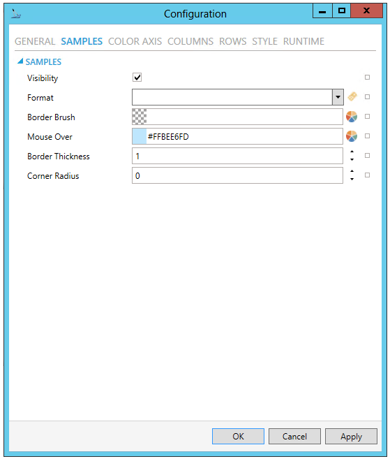
SAMPLES
-
Visibility - Visibility of sample labels.
-
Format - Numeric format of sample values. Use standard numeric format strings from .NET framework. Use the pulldown menu to select a format or click on the
button to open the Data Browser to navigate to your selected format. -
Border Brush - Sample border brush. You can enter a color code (if known) in the text entry field or click on the
 button to open the Brush Picker window and set the properties for
your border.
button to open the Brush Picker window and set the properties for
your border. -
Mouse Over - Sample brush when under mouse cursor. Enter a color code (if known) in the text entry field or click on the
button
to open the Brush Picker window and set the properties for your border. -
Border Thickness - Thickness of sample border. Enter a level of thickness in the text entry field or use the up/down arrows.
-
Corner Radius - Radius of sample corners. Enter a radius in the text entry field or use the up/down arrows.
COLOR AXIS
Data Diagram Configuration Window - COLOR AXIS Tab
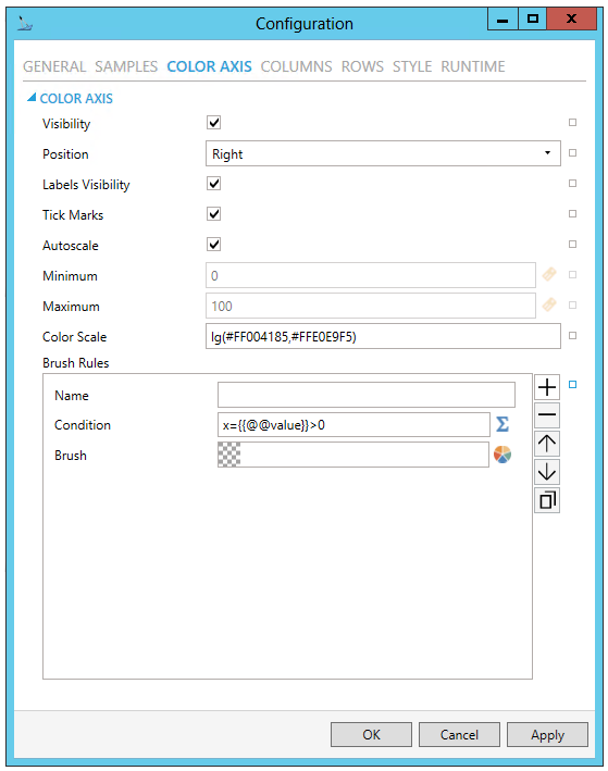
COLOR AXIS
-
Visibility - Color axis visibility. Click the checkbox to make the color axis visible. You can also click on the
button to reset
the current setting. -
Position - Color axis position relative to the control. Use the pulldown menu to select from Left, Top, Right, or Bottom. You can also click on the
button to reset the current setting. -
Labels Visibility - Color axis labels visibility. Click the checkbox to make the color axis labels visible. You can also click on the
button to reset the current setting. -
Tick Marks - Color axis tick marks visibility. Click the checkbox to make the color axis tick marks visible. You can also click on the
button to reset the current setting. -
Autoscale - Color axis automatically adjust the scale to fit actual minimum and maximum value.
-
Minimum - Color axis minimum value. Enter a minimum value in the text entry field or click on the
 button
to open the Data Browser in order to navigate to your selected minimum.
You can also click on the
button to reset the current setting.
button
to open the Data Browser in order to navigate to your selected minimum.
You can also click on the
button to reset the current setting. -
Maximum - Color axis maximum value. Enter a maximum value in the text entry field or click on the
button to open the Data Browser in order to navigate to your selected
maximum. You can also click on the button to reset
the current setting. -
Color Scale - Color/value scale used for visualization of samples. Enter the hex color codes in the text entry field or click on the
button to open the Data Browser to navigate
to your preferred color scale. You can also click on the button to reset the current
setting. -
Brush Rules - Collection of rules for sample color evaluation. Click on the plus button [+] to add a brush rule, which you can then edit via the properties listed below. You can also remove a selected brush rule via the minus button [-], move it up or down within a list of columns (via the up/down arrows) or duplicate it via the
 button.
 -
Name - Enter a name for the brush rule in the text entry field.
-
Condition - Configure the expression that serves as a condition for the brush rule. Enter the Condition in the text entry field or click on the
 button to open the Expression Editor.
 -
Brush - Brush properties. You can enter a color code (if known) in the text entry field or click on the
button to
open the Brush Picker window and set the brush properties.
COLUMNS
Data Diagram Configuration Window - COLUMNS Tab
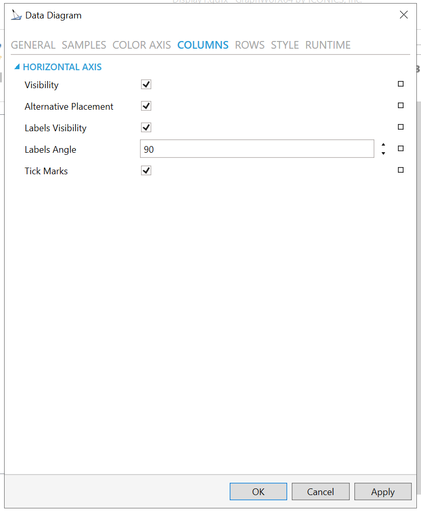
HORIZONTAL AXIS
-
Visibility - Horizontal Axis visibility. Click the checkbox to make the Horizontal axis visible. You can also click on the
button
to reset the current setting. -
Alternative Placement - Show Horizontal axis on top side. Click the checkbox to show the Horizontal axis on the top side of the control. You can also click on the
button to reset the current setting. -
Labels Visibility - Horizontal axis labels visibility. Click the checkbox to make the Horizontal axis labels visible. You can also click on the
button to reset the current
setting. -
Labels Angle - Rotation of labels on Horizontal axis. Enter a degree of rotation in the text entry field or use the up/down arrows. You can also click on the
button to reset the current setting. -
Tick Marks - Horizontal axis tick marks visibility. Click on the checkbox to make Horizontal axis tick marks visible. You can also click on the
button to reset the current setting.
ROWS
Data Diagram Configuration Window - ROWS Tab
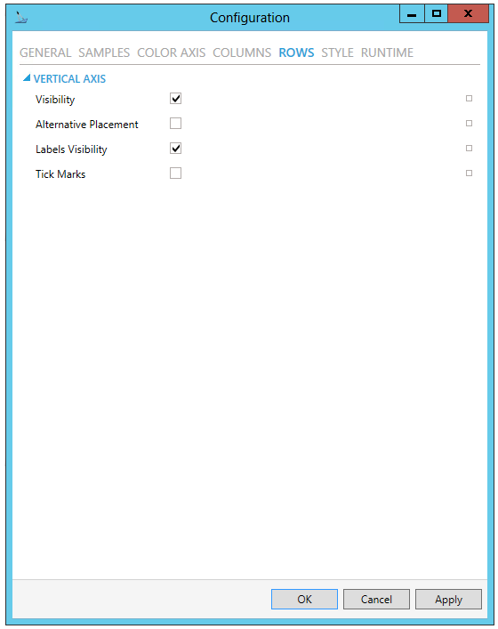
VERTICAL AXIS
-
Visibility - Vertical Axis visibility. Click the checkbox to make the Vertical axis visible. You can also click on the
button
to reset the current setting. -
Alternative Placement - Show Vertical axis on right side. Click the checkbox to show the Vertical axis on the right side of the control. You can also click on the
button to reset the current setting. -
Labels Visibility - Vertical axis labels visibility. Click the checkbox to make the Vertical axis labels visible. You can also click on the
button to reset the current
setting. -
Tick Marks - Vertical axis tick marks visibility. Click on the checkbox to make Vertical axis tick marks visible. You can also click on the
button to reset the current
setting.
STYLE
Data Diagram Configuration Window - STYLE Tab
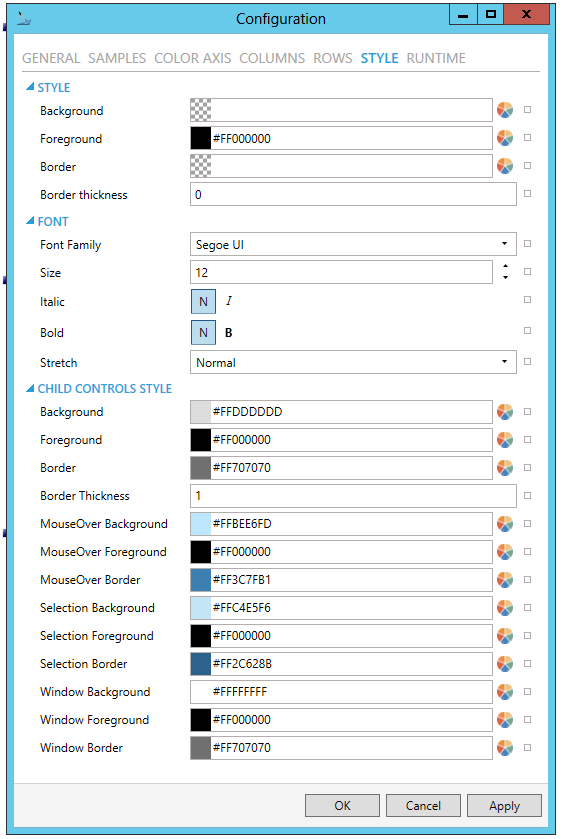
STYLE
-
Background - Background color, gradient or pattern of this object. Enter a hex color code in the text entry field or click on the
button to open the Brush Picker window and select your preferred Background.
You can also click on the
button to reset the current setting. -
Foreground - Foreground color, gradient or pattern of this object. Enter a hex color code in the text entry field or click on the
button to open the Brush Picker window and select your preferred Foreground.
You can also click on the
button to reset the current setting. -
Border - Color, gradient or pattern of the border surrounding this object. Enter a hex color code in the text entry field or click on the
button to open the Brush Picker window and select your preferred Border.
You can also click on the
button to reset the current setting. -
Border thickness - Width of the border surrounding this object. Enter a border thickness in the text entry field. You can also click on the
button to reset the current setting.
FONT
-
Font Family - Specifies the name of the font used to render text. Use the pulldown menu to select your preferred font. You can also click on the
button to
reset the current setting. -
Size - Specifies the size of the font used to render text. Enter a font size in the text entry field or use the up/down arrows. You can also click on the
button to
reset the current setting. -
Italic - Specifies the style of the font used to render text (italic). Click on either the N or I button to select your preferred style. You can also click on the
button to reset the current
setting. -
Bold - Specifies the thickness of the font used to render text (bold). Click on either the N or B buttons to select your preferred font thickness. You can also click on the
button to reset the current setting. -
Stretch - Specifies whether a font appears with a typical width (Normal), narrower than usual (Condensed), or wider than usual (Expanded). Use the pulldown menu to select from Normal, Condensed, or Expanded. You can also click on the
button to reset the current setting.
CHILD CONTROLS STYLE
-
Background - Background brush of child controls. Enter a hex color code in the text entry field or click on the
button to open
the Brush Picker window and select your preferred Background. You
can also click on the
button to reset the current setting. -
Foreground - Foreground brush of child controls. Enter a hex color code in the text entry field or click on the
button to open
the Brush Picker window and select your preferred Foreground. You
can also click on the
button to reset the current setting. -
Border - Border brush of child controls. Enter a hex color code in the text entry field or click on the
button to open the Brush Picker window and select your preferred Border.
You can also click on the
button to reset the current setting. -
Border Thickness - Border thickness of child controls. Enter a border thickness in the text entry field. You can also click on the
button to reset the current setting. -
MouseOver Background - Background brush of child controls under mouse cursor. Enter a hex color code in the text entry field or click on the
button to open the Brush Picker window and
select your preferred background brush of child controls under mouse
cursor. You can also click on the button to reset
the current setting. -
MouseOver Foreground - Foreground brush of child controls under mouse cursor. Enter a hex color code in the text entry field or click on the
button to open the Brush Picker window and
select your preferred foreground brush of child controls under mouse
cursor. You can also click on the button to reset
the current setting. -
MouseOver Border - Border brush of child controls under mouse cursor. Enter a hex color code in the text entry field or click on the
button to open the Brush Picker window and select your preferred border
brush of child controls under mouse cursor. You can also click on
the button to reset the current setting. -
Selection Background - Background brush of selected child controls. Enter a hex color code in the text entry field or click on the
button to open the Brush
Picker window and select your preferred background brush of selected
child controls. You can also click on the button
to reset the current setting. -
Selection Foreground - Foreground brush of selected child controls. Enter a hex color code in the text entry field or click on the
button to open the Brush
Picker window and select your preferred foreground brush of selected
child controls. You can also click on the button
to reset the current setting. -
Selection Border - Border brush of selected child controls. Enter a hex color code in the text entry field or click on the
button to open the Brush Picker window and select your preferred border
brush of selected child controls. You can also click on the button to reset the current
setting. -
Window Background - Background brush of child control windows. Enter a hex color code in the text entry field or click on the
button to open the Brush
Picker window and select your preferred background brush of child
control windows. You can also click on the button
to reset the current setting. -
Window Foreground - Foreground brush of child control windows. Enter a hex color code in the text entry field or click on the
button to open the Brush
Picker window and select your preferred foreground brush of child
control windows. You can also click on the button
to reset the current setting. -
Window Border - Border brush of child control windows. Enter a hex color code in the text entry field or click on the
button to open the Brush Picker window and select your preferred border
brush of child control windows. You can also click on the button to reset the current
setting.
RUNTIME
Data Diagram Configuration Window - RUNTIME Tab
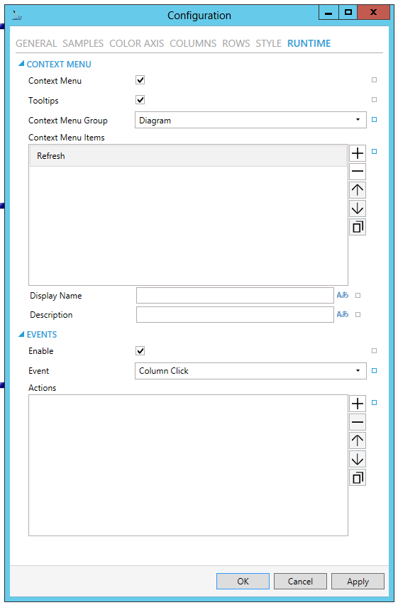
CONTEXT MENU
-
Enable - True to enable context menu on right click. Click the checkbox to enable context menu on right-click in the control. You can also click on the
button to reset the current setting. -
Tooltips - Enables tooltips on hover in context menu items.
-
Invalid Menu Items - Display mode for context menu items that are invalid (e.g. no command target).
-
Group - Select context menu group for editing. Use the pulldown menu to select from any existing context menu group. You can also click on the
button to reset the current setting. -
Items - Allows users to add items to a collection based on the selected Context Menu Group. Click on the plus sign [+] to add an item to the list. Click on the minus sign [-] to remove a listed item. Click on the up arrow to move a selected item higher in the list. Click on the down arrow to move a selected item lower in the list. Click on the
 button to duplicate a selected entry in the list.
Diagram
-
Refresh - Action to refresh this item.
-
Separator - Horizontal separator to separate groups of context menu items.
-
Custom Command - Custom command that can be configured to run any command with custom parameters.
-
Command - Use the pulldown menu to select the Command you wish to include as a Context Menu Item. See Commanding in GraphWorX64 for more info.
-
Display Name - Set the name displayed in configuration collection. Enter a Display Name in the text entry field. Click on the
 button
to open the Data Browser to set any required Language Alias. You can
also click on the button
to reset the current setting.
button
to open the Data Browser to set any required Language Alias. You can
also click on the button
to reset the current setting. -
Description - Set the description displayed in tooltip in configuration collection. Enter a Description in the text entry field. Click on the
button to open the Data
Browser to set any required Language Alias. You can also click on
the button to reset the current setting.
[For Custom Command selection]
-
Command - The command associated with the control. Use the pulldown menu to select from available commands. See the Commanding topic for command definitions. You can also click on the
button to reset the current
setting.
COMMANDS ON EVENTS
The Data Diagram is one of many controls that now supports executing commands on events. These events vary per control, but for the Data Diagram they include:
-
Busy
-
Data Source Changed
-
Ready
-
Right Click
-
Sample Click
-
Sample Double Click
-
Started
-
Enable - True to enable configuring actions and commands for control events.
-
Event - Select a control event and configure actions to fire when the event occurs. Use the pulldown menu to select from Column Click, Data Source Changed, Ready, Right Click, Row Click, Sample Click, Sample Double Click, Started.
-
Commands - List of actions to perform when selected control event occurs. Click on the plus sign [+] to add an item to the list. Click on the minus sign [-] to remove a listed item. Click on the up arrow to move a selected item higher in the list. Click on the down arrow to move a selected item lower in the list. Click on the
button to duplicate a selected
entry in the list. For any Custom Command selected in the list, you
can then select a specific Command and then complete the associated
properties for that command. See Commanding
in GraphWorX64 for more info.
Configuration Through the Properties Section of the GraphWorX64 Window
Common
-
(Name) - Unique string identifier for this object.
-
Title - Title for this object. Unlike the Name property, the Title does not have to be unique.
-
Description - Description for this object. The Description typically appears as a tooltip for the object.
Common-Style
-
Opacity - Overall opacity of this object (0% = fully transparent. 100% = fully opaque).
-
Effect - Visual effects (3D-edge, shadow, glow, blue) applied to this object.
-
Foreground - Foreground color, gradient, or pattern of this object.
-
Background - Background color, gradient, or pattern of this object.
-
Border - Color, gradient, or pattern of the border surrounding this object.
-
BorderWidth - Width of the border surrounding this object.
-
ControlBorderBrush - Border brush of child controls.
-
ControlBorderThickness - Border thickness of child controls.
-
ControlBackground - Background brush of child controls.
-
ControlForeground - Foreground brush of child controls.
-
ControlSelectionBorderBrush - Border brush of selected child controls.
-
ControlSelectionBackground - Background brush of selected child controls.
-
ControlSelectionForeground - Foreground color of selected child controls.
-
ControlMouseOverBorderBrush - Border brush of child controls under mouse cursor.
-
ControlMouseOverBackground - Background brush of child controls under mouse cursor.
-
ControlMouseOverForeground - Foreground brush of child controls under mouse cursor.
-
ControlWindowsBorderBrush - Border brush of child control windows.
-
ControlWindowBackground - Background brush of child control windows.
-
ControlWindowForeground - Foreground brush of child control windows.
Data
-
Data Source - Data source for the data diagram. Can be any data set with at least two columns: category and value.
-
Columns Binding - Defines data binding for horizontal axis.
-
Rows Binding -Defines data binding for vertical axis.
-
Value Binding - Defines data binding for sample value.
Measurements
-
Angle - The current angle of rotation for this object.
-
Left - Horizontal position of top-left corner of the object.
-
Top - Vertical position of the top-left corner of the object.
-
Width - Width of the object.
-
Height - Height of the object.
-
Padding - The amount of space surrounding the content of this object.
Misc-Commanding
-
CommandingEnabled - Determines whether commands are enabled for this display. Use the CommandingName setting to specifiy a registration name.
-
DragAndDropCommandingEnabled - Set to True to enable receiving commands by drag and drop method.
-
CommandingName - Name used for registering the control for commanding.
-
CommandingDisplayName - User friendly control name.
-
MaxCommandScope - Indicates whether commands sent and received by this display affect the current process only (Process) or all processes that are currently opened (Machine). For inter-process commanding, use the Machine option.
Text
-
FontFamily - Specifies the name of the font used to render text.
-
FontSize - Specifies the size of the font used to render text.
-
FontStyle - Specifies the style of the font used to render text (italic).
-
FontWeight - Specifies the thickness of the font used to render text (bold).
-
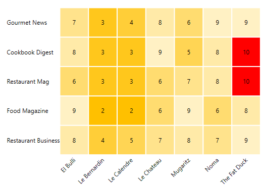
Once you have configured your Data Diagram, click OK.
-
Click on the Runtime tab at the top right of your window. The values you see can be changed to an average, minimum, maximum, or a sum. Below is an example of a completed Data Diagram.
Support for Query Interface
You can use the Query Interface by many controls that display datasets, such as the Data Diagram.
The Query Interface is an ICONICS protocol for retrieving datasets. You can use it if you want to modify the original dataset, such as if you sort, calculate aggregates, or if you want to display only a subset of the columns.
The Query Interface allows the server to process those modifications more efficiently before you send the data to your client.
If you want to see data from the Hyper Alarm Logger in the table control,
1) Configure the table control.
2) For Query, select type.
3) For Data Source, browse under Alarms and Notifications > Hyper Alarm Logger Query Interface and select .Query.
4) For Table, select the desired Hyper Alarm Logger collection.
5) Go to the Fields page
6) Select the refresh  button.
7) Go to the Columns page.
8) Select the refresh  button.
9) Make further updates to Fields or Columns as desired.
10) Select OK.
11) Go into runtime to see your data.
See Also: