Smart Tile Templates Configuration
The Smart Tile Templates sub-branch underneath the Configuration branch of the MobileHMI provider Project Explorer allows users to import Smart Tile Templates from an existing source in order to more quickly create Tiles to be used in Layouts.
To Configure Smart Tile Templates:
-
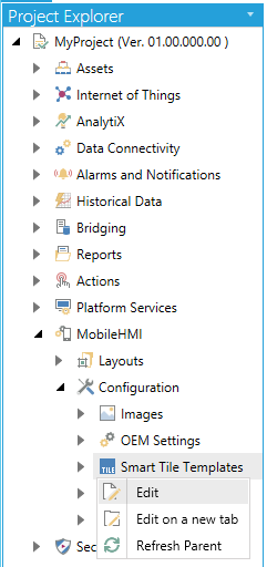
Click on the Smart Tile Templates sub-branch beneath the Configuration branch of the MobileHMI provider Project Explorer. This should automatically open the Smart Tile Templates properties window in the right side of the Workbench window. You can also right-click on the Smart Tile Templates sub-branch and select 'Edit' as shown below.
Selecting Edit from the MobileHMI Project Explorer
-OR-
You can also click on the Smart Tile Templates sub-branch and then on the 'Edit' button in the Edit section of the Home ribbon at the top of the Workbench window.
Edit Button
This will open the Smart Tile Templates properties window, as shown below.
Smart Tile Templates Configuration Properties
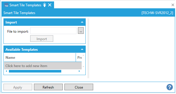
The Smart Tile Templates properties contains the ImportandAvailable Templates sections.
-
Within the Import section, you can enter a file location in the nearby File to import: text entry field or click on the ellipsis button [
 ], which will open a file explorer, allowing you to search for a Smart Tile Template File format ( .tiles.gdfxp) file. Once you have selected the file (by clicking 'Open' within the file explorer window), it will populate the 'File to import'. You must then continue by clicking the now active 'Import' button beneath the text entry field.
Once you have imported your selected Smart Tile Template (.tiles.gdfxp) file, it will populate the Available Templates section.
-
Within the Available Templates section, after you have imported a Smart Tile Template file, you'll notice the multiple columns. Smart Tile Template files can be created from within ICONICS's GraphWorX64 component. These can, in turn, contain either a single tile element or multiple tile elements. If your imported Smart Tile Template file contains multiple tile elements, you should be able to differentiate them via the Name and/or Preview columns. The content within these columns cannot be edited directly within the MobileHMI Provider. [Note that some elements within the Preview column may cycle through the display of their connected data sources in real time, e.g., something causing a displayed number to change or a color to vary, etc.] Should you wish to remove any listed tile element from your loaded Smart Tile Template file, you can do so by clicking on the Delete button in the far right column for a specified row. Once you have deleted a specific tile element (or elements), it will not show up in the Template pulldown (after refreshing) in the General Tab of the Tile properties window.
-
You also have the option of adding a new item within the Available Templates section by clicking on the Click here to add new item link.
Available Templates Section of the Smart Tile Templates Settings
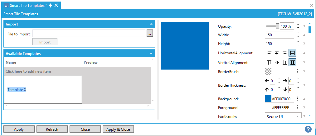
Once you have added a new item in this section, you can enter a name in the text entry field within the Name column. Double-clicking either the Name or the Preview object (within the Preview column) brings up additional settings as seen in the image above.
-
Opacity - Use the slider to set the opacity of the tile or enter a percentage of opacity in the text entry field.
-
Width - Enter your desired tile width (in pixels) in the text entry field.
-
Height - Enter your desired tile height (in pixels) in the text entry field.
-
HorizontalAlignment - Click one of the buttons to horizontally left align, center, right align, or justify the tile.
-
Vertical Alignment - Click on the buttons to vertically top align, center, bottom align, or justify the tile.
-
Border Brush - Enter your desired border brush color code in the text entry field or click on the
 button, which opens the Brush Picker window, which allows you to set your desired brush color.
 -
Border Thickness - Enter your preferred level of border thickness in each of the arrow directions (connoting left, right, top, bottom) text entry fields.
-
Background - Enter your desired border background code in the text entry field or click on the
button, which opens the Brush Picker window, which allows you to set your desired background color. -
Foreground - Enter your desired border foreground code in the text entry field or click on the
button, which opens the Brush Picker window, which allows you to set your desired foreground color. -
FontFamily - Use the pulldown menu to select from available installed fonts.
-
FontSize - Enter a font size within the text entry field.
-
FontStretch - Use the pulldown menu to select from Normal, Condensed or Expanded.
-
FontStyle - Use the provided buttons to select from Normal or Indented.
-
FontWeight - Use the provided buttons to select from Normal or Bold.
-
HorizontalContentAlignment - Click one of the buttons to horizontally left align, center, right align, or justify content within the tile.
-
VerticalContentAlignment - Click on the buttons to vertically top align, center, bottom align, or justify content within the tile.
-
Is Pressed - Clicking this button changes the preview of the tile to its pressed state.
TILE - BANNER (TOP)
-
TopBackground - The background color of the top banner of the tile. Enter your preferred color code for the tile's banner (top) in the text entry field or click on the
button to open the Brush Picker window, which allows you to set your desired TopBackground color. -
TopHeight - The height of the top banner. Enter your preferred height, in pixels, of the tile banner in the text entry field
-
TopHorizontalAlignment - The horizontal alignment of the label and value text in the top banner. Click one of the buttons to horizontally left align, center, right align, or justify the tile banner.
-
TopVertical Alignment - The vertical alignment of the label and value text in the top banner. Click on the buttons to vertically top align, center, bottom align, or justify the tile banner
TILE - BANNER (TOP) - LABEL
-
TopLabel - The text of the label in the top manner. May be a data source. Enter the text for the tile's banner (top) label in the text entry field or click on the
 to open the Data Browser and navigate to your selected text/source.
 -
TopLabelForeground - The color of the label text in the top banner. Enter your preferred color code for the tile's banner (top) label in the text entry field or click on the
button to open the Brush Picker window, which allows you to set your desired TopLabelForeground color. -
TopLabelFontFamily - The font family of the label text in the top banner. Use the pulldown menu to select from available installed fonts
-
TopLabelFontSize - The font size of the label text in the top banner. Enter a font size within the text entry field.
-
TopLabelFontWeight - The font weight of the label text in the top banner. Use the provided buttons to select from Normal or Bold.
-
TopLabelFontStyle - The font style of the label text in the top banner. Use the provided buttons to select from Normal or Indented.
-
TopLabelFontStretch - The font stretch of the label text in the top banner. Use the pulldown menu to select from Normal, Condensed or Expanded.
-
TopLabelTextWrapping - The text wrapping behavior of the label text in the top banner. Use the pulldown menu to select from WrapWithOverflow, NoWrap or Wrap.
TILE - BANNER (TOP) - VALUE
-
TopValue - The data source of the value in the top banner. Enter the tile's banner (top) Value in the text entry field or click on the
to open the Data Browser and navigate to your selected value/source. -
TopValueDecimalPlaces - The number of digits to display to the right of the decimal point in the top banner. Enter the tile's banner (top) Value decimal place in the text entry field or click on the
to open the Data Browser and navigate to your selected value decimal place/source. -
TopValueForeground - The color of the value text in the top banner. Enter your preferred color code for the tile's banner (top) Value in the text entry field or click on the
button to open the Brush Picker window, which allows you to set your desired TopValueForeground color. -
TopValueFontFamily - The font family of the value text in the top banner. Use the pulldown menu to select from available installed fonts
-
TopValueFontSize - The font size of the value text in the top banner. Enter a font size within the text entry field.
-
TopValueFontWeight - The font weight of the value text in the top banner. Use the provided buttons to select from Normal or Bold.
-
TopValueFontStyle - The font style of the value text in the top banner. Use the provided buttons to select from Normal or Indented.
-
TopValueFontStretch - The font stretch of the value text in the top banner. Use the pulldown menu to select from Normal, Condensed or Expanded.
-
TopValueTextWrapping - The text wrapping behavior of the value text in the top banner. Use the pulldown menu to select from WrapWithOverflow, NoWrap or Wrap.
TILE - BANNER (TOP) - UNITS
-
TopUnits - The text of the units in the top banner. May be a data source. Enter the tile's banner (top) Units in the text entry field or click on the
to open the Data Browser and navigate to your selected Units/source. -
TopUnitsAlignment - The position of the units text (relative to the Value text) in the top banner. Use the radio buttons surrounding the boxed 'Value' to set the alignment of the tile - banner (top) units.
-
TopUnitsForeground - The color of the units text in the top banner. Enter your preferred color code for the tile's banner (top) Units in the text entry field or click on the
button to open the Brush Picker window, which allows you to set your desired TopUnitsForeground color. -
TopUnitsFontFamily - The font family of the units text in the top banner. Use the pulldown menu to select from available installed fonts
-
TopUnitsFontSize - The font size of the units text in the top banner. Enter a font size within the text entry field.
-
TopUnitsFontWeight - The font weight of the units text in the top banner. Use the provided buttons to select from Normal or Bold.
-
TopUnitsFontStyle - The font style of the units text in the top banner. Use the provided buttons to select from Normal or Indented.
-
TopUnitsFontStretch - The font stretch of the units text in the top banner. Use the pulldown menu to select from Normal, Condensed or Expanded.
-
TopUnitsTextWrapping - The text wrapping behavior of the units text in the top banner. Use the pulldown menu to select from WrapWithOverflow, NoWrap or Wrap.
TILE - BANNER (BOTTOM)
-
BottomBackground - The background color of the bottom banner of the tile. Enter your preferred color code for the tile's banner (Bottom) in the text entry field or click on the
button to open the Brush Picker window, which allows you to set your desired BottomBackground color. -
BottomHeight - The height of the bottom banner. Enter your preferred height, in pixels, of the tile banner in the text entry field
-
BottomHorizontalAlignment - The horizontal alignment of the label and value text in the bottom banner. Click one of the buttons to horizontally left align, center, right align, or justify the tile banner.
-
BottomVertical Alignment - The vertical alignment of the label and value text in the bottom banner. Click on the buttons to vertically top align, center, bottom align, or justify the tile banner
TILE - BANNER (BOTTOM) - LABEL
-
BottomLabel - The text of the label in the bottom banner. Enter the text for the tile's banner (Bottom) label in the text entry field or click on the
to open the Data Browser and navigate to your selected text/source. -
BottomLabelForeground - The color of the label text in the bottom banner. Enter your preferred color code for the tile's banner (Bottom) label in the text entry field or click on the
button to open the Brush Picker window, which allows you to set your desired BottomLabelForeground color. -
BottomLabelFontFamily - The font family of the label text in the bottom banner. Use the pulldown menu to select from available installed fonts
-
BottomLabelFontSize - The font size of the label text in the bottom banner. Enter a font size within the text entry field.
-
BottomLabelFontWeight - The font weight of the label text in the bottom banner. Use the provided buttons to select from Normal or Bold.
-
BottomLabelFontStyle - The font style of the label text in the bottom banner. Use the provided buttons to select from Normal or Indented.
-
BottomLabelFontStretch - The font stretch of the label text in the bottom banner. Use the pulldown menu to select from Normal, Condensed or Expanded.
-
BottomLabelTextWrapping - The text wrapping behavior of the label text in the bottom banner. Use the pulldown menu to select from WrapWithOverflow, NoWrap or Wrap.
TILE-BANNER (BOTTOM) - VALUE
-
BottomValue - The data source of the value in the bottom banner. Enter the tile's banner (Bottom) Value in the text entry field or click on the
to open the Data Browser and navigate to your selected value/source. -
BottomValueDecimalPlaces - The number of digits to display to the right of the decimal point in the bottom banner. Enter the tile's banner (Bottom) Value decimal place in the text entry field or click on the
to open the Data Browser and navigate to your selected value decimal place/source. -
BottomValueForeground - The color of the value text in the bottom banner. Enter your preferred color code for the tile's banner (Bottom) Value in the text entry field or click on the
button to open the Brush Picker window, which allows you to set your desired BottomValueForeground color. -
BottomValueFontFamily - The font family of the value text in the bottom banner. Use the pulldown menu to select from available installed fonts
-
BottomValueFontSize - The font size of the value text in the bottom banner. Enter a font size within the text entry field.
-
BottomValueFontWeight - The font weight of the value text in the bottom banner. Use the provided buttons to select from Normal or Bold.
-
BottomValueFontStyle - The font style of the value text in the bottom banner. Use the provided buttons to select from Normal or Indented.
-
BottomValueFontStretch - The font stretch of the value text in the bottom banner. Use the pulldown menu to select from Normal, Condensed or Expanded.
-
BottomValueTextWrapping - The text wrapping behavior of the value text in the bottom banner. Use the pulldown menu to select from WrapWithOverflow, NoWrap or Wrap.
TILE - BANNER (BOTTOM) - UNITS
-
BottomUnits - Enter the tile's banner (Bottom) Units in the text entry field or click on the
to open the Data Browser and navigate to your selected Units/source. -
BottomUnitsAlignment - Use the radio buttons surrounding the boxed 'Value' to set the alignment of the tile - banner (Bottom) units.
-
BottomUnitsForeground - Enter your preferred color code for the tile's banner (Bottom) Units in the text entry field or click on the
button to open the Brush Picker window, which allows you to set your desired BottomUnitsForeground color. -
BottomUnitsFontFamily - Use the pulldown menu to select from available installed fonts
-
BottomUnitsFontSize - Enter a font size within the text entry field.
-
BottomUnitsFontWeight - Use the provided buttons to select from Normal or Bold.
-
BottomUnitsFontStyle - Use the provided buttons to select from Normal or Indented.
-
BottomUnitsFontStretch - Use the pulldown menu to select from Normal, Condensed or Expanded.
-
BottomUnitsTextWrapping - Use the pulldown menu to select from WrapWithOverflow, NoWrap or Wrap.
TILE - CENTER AREA
-
CenterValueWidth - The width of the area reserved for the center value. Enter the center value width, in pixels, in the text entry field.
-
CenterValueHeight - The height of the area reserved for the center value. Enter the center value height, in pixels, in the text entry field.
-
CenterValueStretch - Defines how to stretch the value in the center area. User the pulldown menu to select from Normal, Condensed or Expanded.
TILE - CENTER AREA - VALUE
-
CenterValue - The data source of the value in the center area. Enter the tile's Center Value in the text entry field or click on the
to open the Data Browser and navigate to your selected value/source. -
CenterValueDecimalPlaces - The number of digits to display to the right of the decimal point in the center area. Enter the tile's Center Value decimal place in the text entry field or click on the
to open the Data Browser and navigate to your selected value decimal place/source. -
CenterValueForeground - The color of the value text in the center area. Enter your preferred color code for the tile's Center Value in the text entry field or click on the
button to open the Brush Picker window, which allows you to set your desired CenterValueForeground color. -
CenterValueFontFamily - The font family of the value text in the center area. Use the pulldown menu to select from available installed fonts
-
CenterValueFontSize - The font size of the value text in the center area. Enter a font size within the text entry field.
-
CenterValueFontWeight - The font weight of the value text in the center area. Use the provided buttons to select from Normal or Bold.
-
CenterValueFontStyle - The font style of the value text in the center area. Use the provided buttons to select from Normal or Indented.
-
CenterValueFontStretch - The font stretch of the value text in the center area. Use the pulldown menu to select from Normal, Condensed or Expanded.
-
CenterValueTextWrapping - The text wrapping behavior of the value text in the center area. Use the pulldown menu to select from WrapWithOverflow, NoWrap or Wrap.
TILE - CENTER AREA - UNITS
-
CenterUnits - The text of the units in the center area. May be a data source. Enter the tile's Center Units in the text entry field or click on the
to open the Data Browser and navigate to your selected Units/source. -
CenterUnitsAlignment - The position of the units text (relative to the value text) in the center area. Use the radio buttons surrounding the boxed 'Value' to set the alignment of the center units.
-
CenterUnitsForeground - The color of the units text in the center area. Enter your preferred color code for the tile's Center Units in the text entry field or click on the
button to open the Brush Picker window, which allows you to set your desired CenterUnitsForeground color. -
CenterUnitsFontFamily - The font family of the units text in the center area. Use the pulldown menu to select from available installed fonts
-
CenterUnitsFontSize - The font size of the units text in the center area. Enter a font size within the text entry field.
-
CenterUnitsFontWeight - The font weight of the units text in the center area. Use the provided buttons to select from Normal or Bold.
-
CenterUnitsFontStyle - The font style of the units text in the center area. Use the provided buttons to select from Normal or Indented.
-
CenterUnitsFontStretch - The font stretch of the units text in the center area. Use the pulldown menu to select from Normal, Condensed or Expanded.
-
CenterUnitsTextWrapping - The text wrapping behavior of the units text in the center area. Use the pulldown menu to select from WrapWithOverflow, NoWrap or Wrap.
TILE - ICON
-
Icon - The icon/image to show in this Smart Tile. Click on the
button to open a file explorer to browse for your desired icon image file. -
IconWidth - The width of the icon in this Smart Tile. Enter the icon width, in pixels, in the text entry field.
-
IconHeight - The height of the icon in this Smart Tile. Enter the icon height, in pixels, in the text entry field.
-
IconStretch - Defines how to stretch the icon in the available area. User the pulldown menu to select from None, Fill, Uniform, or UniformToFill.
-
IconAlignment - Defines the position of the icon within this Smart Tile. Use the radio buttons within the grid to set the icon alignment.
TILE - CONTENT
-
Content - Use the pulldown menu to select from either None or Microchart. If you select Microchart, clicking the Configure link opens the Microchart Configuration window.
-
ContentWidth - The width of the content in this Smart Tile. Enter the content width, in pixels, in the text entry field.
-
ContentHeight - The height of the content in this Smart Tile. Enter the content height, in pixels, in the text entry field.
-
ContentPadding - The amount of extra space surrounding the content of this Smart Tile. The content padding value is relative to the actual (unscaled) size of the content. The padding will scale with the content if ContentStretch is set to Uniform or Fill. The padding value can be a single number for equal padding on all four sides, or four comma-separated numbers to individually specify padding for left, top, right, bottom. Use the text entry fields to enter an amount of padding for the left, right, top and bottom of the tile content.
-
ContentStretch - Defines how to stretch the content in the available area. User the pulldown menu to select from None, Fill, Uniform or UniformToFill.
-
ContentAlignment - Defines the position of the content within this Smart Tile. Use the radio buttons within the grid to set the content alignment.
TILE - CONTENTSOURCE
-
ContentSource - Defines a Uri that defines the content for this Smart Tile. The Uri can point to an image file (.png, .jpg, etc.) or a configuration file for graphics, trends or alarms (.gdfx, .twxx, .awxx), Note: It is more efficient to embed content directly within a Smart Tile, rather than setting a ContentSource. Enter the content source location in the text entry field or click on the
 button to open the 'Browse files or folders' window to navigate to your content source.
 -
ContentSourceWidth - The width of the content element loaded by the ContentSource. Enter the width in the text entry field.
-
ContentSourceHeight - The height of the content element loaded by the ContentSource. Enter the height in the text entry field.
-
ContentSourceIsInteractive - True if the content element loaded by ContentSource should be user-interactive. False if the content should be view-only.
TILE - STATES
-
BackgroundStates - A collection of 'background states' for this Smart Tile. A background state is a color/gradient/image and a data source (tagname) that indicates whether or not the state should be active (when the datasource value is true). The list of states is a prioritized sequential list. Click on the [+] button to add a background state or the [-] button to remove one. When you have added more than one Background State, you can use the up/down arrows to move a selected state higher or lower in order.
-
-
Background - The tile background for this state. Enter a color code in the text entry field or click on the
button, which opens the Brush Picker window, which allows you to set your desired background color. -
BlinkRate - The blink rate (milliseconds) for the background color of this state when this state is active (zero for no blink). If no data sources are configured for this state, the blink rate acts as a duration for showing this state in sequence with other states in this tile. This can be used to produce a 'slideshow' effect, where each state is visible for the specified duration. Enter the blink rate in the text entry field.
-
StateActiveWhen - Type of comparison for ConditionDataSource and Low Value/High Value (or Zero) to determine when this state should be active. Use the pulldown menu to select from Unspecified, EqualZero, NotEqualZero, EqualLowLimit, NotEqualLowLimit, LessThanLowLimit, LessThanOrEqualLowLimit, GreaterThanLowLimit, GreaterThanOrEqualLowLimit, EqualHighLimit, NotEqualHighLimit, LessThanHighLimit, LessThanOrEqualHighLimit, GreaterThanHighLimit, GreaterThanOrEqualHighLimit, BetweenLimits, BetweenLimitsOrEqualLowLimit, BetweenLimitsOrEqualHighLimit, BetweenOrEqualLimits, OutsideLimits, or OutsideLimitsOrEqualLowLimit.
-
ConditionDataSource - The condition for this state. When this data source resolves to true, this state will be considered 'active'. The list of states is a prioritized sequential list; 'true' items later in the list override true items that are earlier in the list. Enter a ConditionDataSource in the text entry field or click on the
button to open the Data Browser in order to navigate to your selected ConditionDataSource. -
LowValue - The low value for this state. Optionally used with StateActiveWhen and ConditionDataSource to determine when the state should be active. Enter a LowValue in the text entry field or click on the
button to open the Data Browser in order to navigate to your selected LowValue/source. -
HighValue - The high value for this state. Optionally used with StateActiveWhen and ConditionDataSource to determine when the state should be active. Enter a HighValue in the text entry field or click on the
button to open the Data Browser in order to navigate to your selected HighValue/source.
-
-
BackgroundStatesTransition - Defines the animation used when transitioning from one background state to another. Use the pulldown menu to select your preferred transition.
-
Once you have completed making your edits, click on Apply & Close to save your changes and return to the main the Workbench window.
-
You can then utilize your newly added Smart Tile Templates within the Template pulldown menu in the General tab of the Tile properties window.
See Also: