Table
The Table control visualizes a data set in a customizable table.
To Add a Table Control:
-
Open GraphWorX64, then click on the Controls ribbon and then on the Table control.
Selecting the Table Control in the Controls Ribbon in GraphWorX64

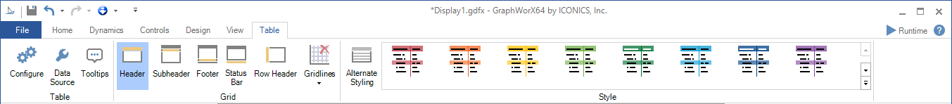
Once selected, you will be able to use the options within the Table ribbon, shown below.
Table Ribbon
Table
-
Configure -Opens the Configuration window.
Grid
-
Header/Subheader/Footer/Status Bar/Row Header - Enable to show these features in the grid.
-
Gridlines -Select displayed gridlines. Select from None, Vertical, Horizontal, or Both.
Style
-
Alternate Styling -Enables alternate background and foreground on every other row.
-
Style -Expand this section to select a theme from Light Themes, Dark Themes, Gray Themes, or Basic Themes (including Light Style [Default], Dark Style, or Custom Style).
-
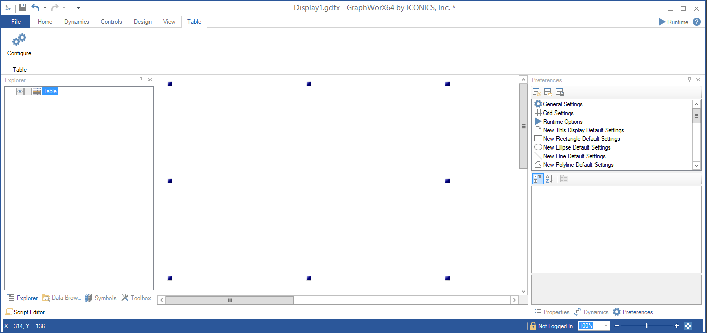
The cursor will turn into a crosshairs "+", which will allow you to draw the size of the Table control you would like in the center display portion of the GraphWorX64 configuration window.
Table Control Added to GraphWorX64 Configuration
-
You can then click on the Configure button in the now active Table ribbon in GraphWorX64 or double-click directly on the Table control. This brings up the Configuration window, shown below.
Note: If a configuration error happens in any of the tab's properties, the header of that tab will turn red. This allows an easier identification of errors, especially in complex configurations where one change can lead to configuration errors on various tabs.
Table Control Configuration Window
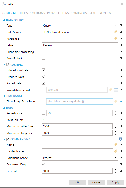
GENERAL
Table Control Configuration Window - GENERAL Tab
TABLE
-
Type - Use the pulldown menu to select from either Query or Dataset.
-
Data Source - Data source of tables. Can be any dataset. Enter a data source in the text entry field or click on the
 button to
open the Data Browser to navigate to your selected data source.
button to
open the Data Browser to navigate to your selected data source. -
Reference -Reference data source name for retrieving tables and table columns. See Reference Property for more info.
Query Type Selected
-
Table -Table name. Use the pulldown to select your table.
-
Client Side Caching - If enabled, raw data is cached on client to allow faster manipulation.
Dataset Selected
-
Autorefresh - Automatic data refresh initiated by data source.
DATA
-
Use Default Refresh Rate - Use default refresh rate or refresh rate inherited by parent container.
-
Refresh Rate - Data refresh rate of data sources defined for properties, in milliseconds. Do not modify if you intend to use local variables for sharing data with other controls, e.g. selected asset or current time range. If activated, you can enter a refresh rate in the text entry field (or use the up/down arrows).
-
Maximum Buffer Size -Maximum amount of samples each chart in this control can hold.
-
Maximum String Size - Maximum size of displayed strings.
COMMANDING
-
Commanding - Determines whether commands are enabled for this display. Use the CommandingName setting to specify a registration name.
-
Name - Name used for registering the control for commanding. Enter a name in the text entry field or click on the
 button
to open the Data Browser to navigate to your selected name.
button
to open the Data Browser to navigate to your selected name. -
Display Name - User friendly control name. Enter a display name in the text entry field or click on the
button to open the Data
Browser to navigate to your selected display name. -
Command Scope - Indicates whether commands sent and received by this display affect the current process only (Process) or all processes that are currently opened (Machine). For inter-process commanding, use the Machine option. Use the pulldown menu to select from either Process or Machine.
-
Command Drop - True to enable receiving commands by drag and drop.
-
Timeout - Timeout period in milliseconds for resolving command parameters and command execution. After this period, command will be cancelled. Enter the timeout in the text entry field (or use the up/down arrows).
FIELDS
Table Control Configuration Window - Fields Tab
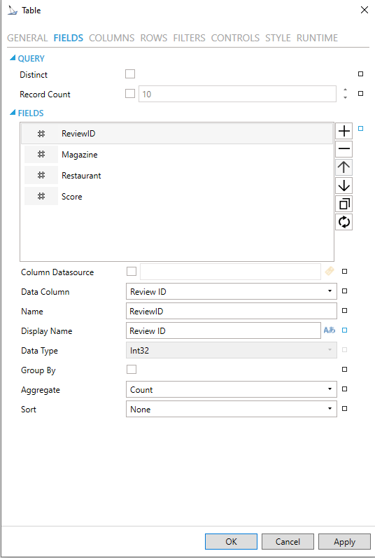
FIELDS
-
Fields -Collection of data fields used in this control. Click on the plus button [+] to add a field (of the same Fields type selected in the Fields section of the window), which you can then edit via the properties listed below. You can also remove a selected field via the minus button [-], move it up or down within a list of fields (via the up/down arrows) or duplicate it via the
 button.
-
Data Column - Select a column that will be requested on the server. Use the pulldown menu to select from available column names associated with the selected Field. Available Data Columns can include Incident ID, Asset Name, Asset Path, Fault Name, Active, Activation Time, Deactivation Time, Source Activation Time, Source Deactivation Time, Acknowledged, Resolved, Duration, Severity, Quality, Cost, Time Zone, Timeline, or Related Value (1-20).
-
Name - Unique name that is used to reference this field in configuration of columns, filters, context variables, etc.
-
Display Name - Display name that is used to reference this field in runtime configurations.
-
Data Type - Native data type declared by field data source.
-
Group By - Group items by values in this field.
-
Aggregate - If Aggregate By is not selected, this is the Aggregate used when the field is in an aggregated view. Use the pulldown menu to select from associated aggregate types depending on the selected Data Column and Data Type.
-
Sort - Use the pulldown menu to set a sort of None, Ascending, or Descending.
COLUMNS
Table Control Configuration Window - Columns Tab
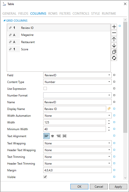
COLUMNS
-
Field - Select a field from the list of configured fields to be displayed. If no field is selected, data operations like filtering or sorting are not available.
-
Content Type - Type of content displayed in this column. Use the pulldown menu to select a content type (Number, Button, Hyperlink, Image Button). The available Content Types listed will be based on the selected field.
-
Number Format - Specify the numeric format of displayed data.
-
Expression Formatting - Check to format the cell values using an expression.
-
Command (Setting is Active for Button or Hyperlink Content Types) - Command configured in this column. Click on the
 button
to open the Configure Command window.
button
to open the Configure Command window. -
Display Name - Name of this column visible in header in runtime. Enter a name in the text entry field or click on the
 button
to open the Data Browser to navigate to a file source for your display
name.
button
to open the Data Browser to navigate to a file source for your display
name. -
Automatic Width - True to automatically expand the width of this column based on its content.
-
Width - Sets the width of the column. When activated, enter a width in the text entry field or use the up/down arrows.
-
Minimum Width - Sets the minimal allowed width of the column. Enter a minimum width in the text entry field or use the up/down arrows.
-
Text Alignment - Sets the alignment (left, right, center) of the text in this column.
-
Visibility - Uncheck to hide this column from view. It can be toggled using the Set Visibility command. It has no effect on export: invisible columns will still be exported unless the Exportable option is turned off.
-
Styling Rules - Configure rules for dynamic styling. Click on the plus button [+] to add a Styling Rule. You can also remove a Styling Rule via the minus button [-], move it up or down within a list of columns (via the up/down arrows) or duplicate it via the
 button.
 -
Name - Name of the Styling Rule. Configuration-only property to easily distinguish the rule in the collection. Enter a name in the text entry field.
-
Condition - Configure the expression that serves as a condition for this rule. Use @@self as alias for current asset to access its properties. Enter the Condition in the text entry field or click on the
 button to open the Expression Editor.
 -
Background - Background color, gradient or pattern of this object. You can enter a color code (if known) in the text entry field or click on the
 button to open the Brush Picker window
and set the properties for your background.
button to open the Brush Picker window
and set the properties for your background. -
Foreground - Foreground color, gradient or pattern of this object. You can enter a color code (if known) in the text entry field or click on the
button to open the Brush Picker window
and set the properties for your foreground.
ROWS
Table Control Configuration Window - Rows Tab
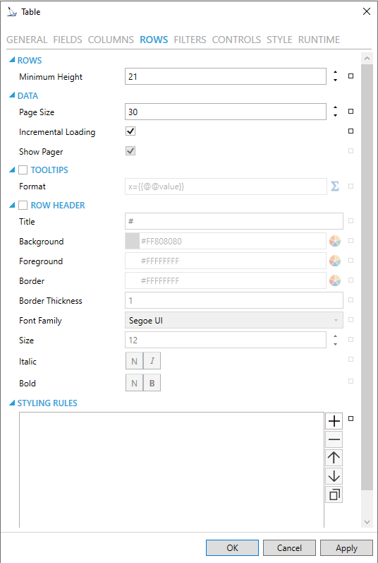
DATA
-
Page Size -Enter the number of rows per page in the text entry field or use the up/down arrow buttons.
-
Incremental Loading -Enables loading of next page when scrolling reaches the bottom of the scrollable area.
-
Show Pager - Enables or disables pager when incremental loading is off.
STYLING RULES
-
Styling Rules -Configure rules for dynamic styling. Click on the plus button [+] to add a Styling Rule. You can also remove a Styling Rule via the minus button [-], move it up or down within a list of styling rules (via the up/down arrows) or duplicate it via the
button. -
Name - Name of the Styling Rule. Configuration-only property to easily distinguish the rule in the collection. Enter a name in the text entry field.
-
Condition - Configure the expression that serves as a condition for this rule. Use @@self as alias for current asset to access its properties. Enter the Condition in the text entry field or click on the
button to open the Expression
Editor. The Condition field is required. -
Background - Background color, gradient or pattern of this object. You can enter a color code (if known) in the text entry field or click on the
button to open the Brush Picker window and set the properties
for your background. -
Foreground - Foreground color, gradient or pattern of this object. You can enter a color code (if known) in the text entry field or click on the
button to open the Brush Picker window and set the properties
for your foreground.
FILTERS
Table Control Configuration Window - Filters Tab
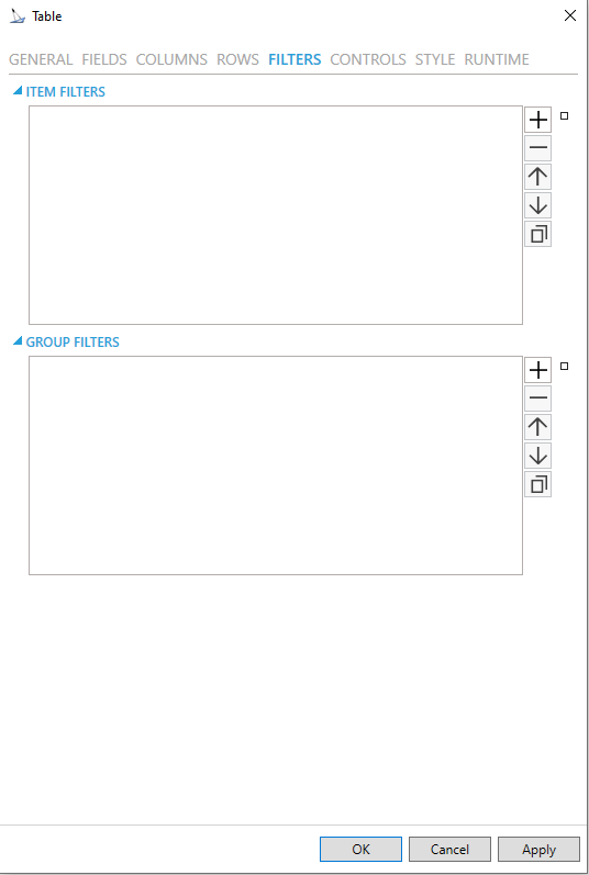
ITEM FILTERS/GROUP FILTERS
Configure rules
for filtering. Click on the plus button [+] to add a rule, which you can
then edit via the properties listed below. You can also remove a selected
rule via the minus button [-], move it up or down within a list of rules
(via the up/down arrows) or duplicate it via the
button.
-
Name - Enter a filter name in the text entry field.
-
Enabled - Click the heckbox to enable the selected filter.
-
Expressions -Click on the plus button [+] to add a filter expression. The expression can be either Field Comparison or Custom Expression. You can combine both types of filter expressions in a single filter. You can then edit the expressions via the properties listed below. You can also remove a selected filter expression via the minus button [-], move it up or down within a list of filter expressions (via the up/down arrows) or or duplicate it via the
 button.
-
Field Comparison - This type of filter expression compares a selected Field to a static or dynamic value.
-
And/Or - After adding an initial filter expression, you can edit the filter expression further by selecting And/Or from an activated pulldown menu.
-
Field - Use the pulldown menu to select a field to use for the filter expression.
-
Operator - Use the pulldown menu to select an Operator from the list including: Less Than, LessThanOrEqual, Equal, NotEqual, GreaterThanOrEqual, StartsWith, EndsWith, Contains, DoesNotContain, or ContainedIn.
-
Value - Enter a value to filter by in the text entry field or click on the
button to open the Data Browser and navigate to your selected
Value.
-
Custom Expression - This type of filter expression offers more options and possibilities than Field Comparison, but it has to be built from the group up, using the expression editor. These expressions offer a limited subset of functions. The functions that are not offered in the editor (but that are available in generic ICONICS expressions) will not work.
Context variables are necessary for using Field values, for example if somebody wants to compare the values of two Field expressions.
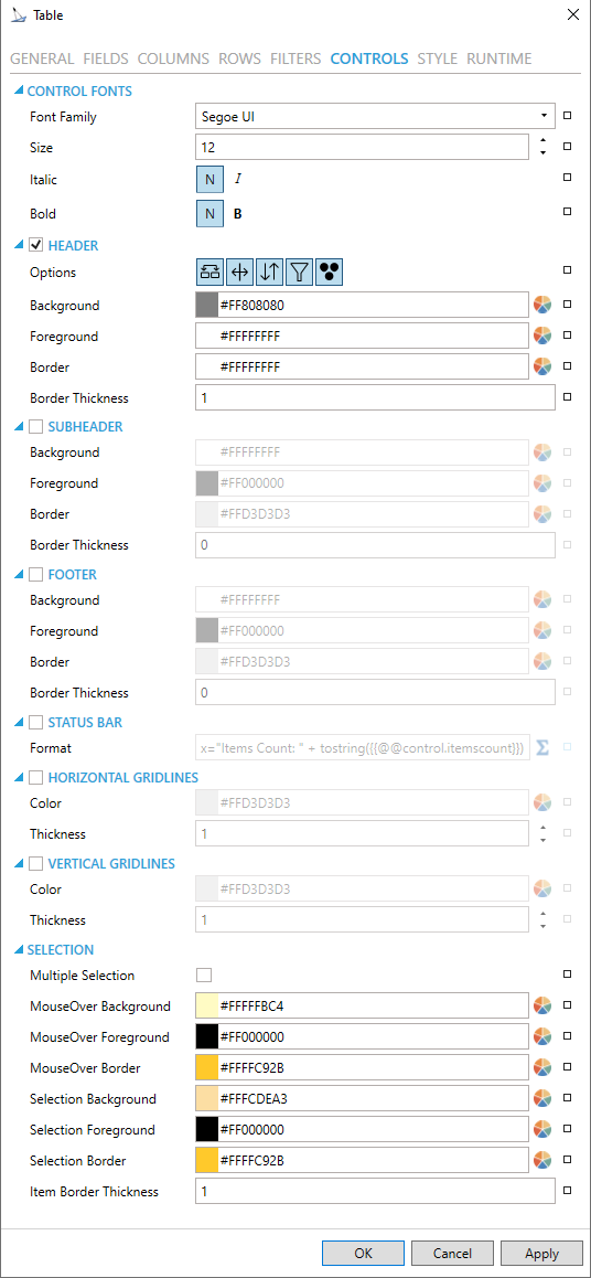
CONTROLS
Table Control Configuration Window - Controls Tab
HEADER
-
Show - True to show header of the grid.
-
Options -Configure runtime features of grid header. Options are:
-
Allow reordering columns by drag & drop in grid header.
-
Allow resizing columns in grid header using column splitters.
-
Allow sorting by clicking on grid header and show sorting options in grid header menu.
-
Show filtering options in grid header menu.
-
Show grouping options in grid header menu.
-
Background - Background brush of grid header. You can enter a color code (if known) in the text entry field or click on the
button to open the Brush Picker window and set the properties for
your background. -
Foreground - Foreground brush of grid header. You can enter a color code (if known) in the text entry field or click on the
button to open the Brush Picker window and set the properties for
your foreground. -
Border - Border brush of grid header. You can enter a color code (if known) in the text entry field or click on the
button
to open the Brush Picker window and set the properties for your border. -
Border Thickness - Border thickness of grid header. Enter a thickness in the text entry field.
-
Font Family -Specifies the name of the font used to render text in the header.
-
Size -Specifies the size of the font used to render text in the header.
-
Italic -Specifies the style of the font used to render text (italic) in the header.
-
Bold -Specifies the thickness of the font used to render text (bold) in the header.
-
Stretch -Specifies whether the header font appears with a typical width (Normal), narrower than usual (Condensed), or wider than usual (Expanded).
SUBHEADER
-
Subheader -Check to show subheader with chart axis.
-
Background -Background brush of grid subheader.
-
Foreground -Foreground brush of grid subheader.
-
Border -Border brush of grid subheader.
-
Border Thickness -Border thickness of grid subheader.
HORIZONTAL GRIDLINES
-
Show - True to show horizontal grid lines, otherwise false.
-
Color - Color of horizontal grid lines. You can enter a color code (if known) in the text entry field or click on the
button to open the Brush Picker window and set the properties for
your horizontal gridlines. -
Thickness - Thickness of horizontal gridlines. Enter a thickness in the text entry field.
VERTICAL GRIDLINES
-
Show - True to show vertical grid lines, otherwise false.
-
Color - Color of horizontal grid lines. You can enter a color code (if known) in the text entry field or click on the
button
to open the Brush Picker window and set the properties for your vertical
gridlines. -
Thickness - Thickness of vertical gridlines. Enter a thickness in the text entry field.
SELECTION
-
Multiple Selection - Enables multi-selection in the table. Multiple rows can be selected using Ctrl and Shift keys.
-
MouseOver Background - Background of item under mouse cursor. You can enter a color code (if known) in the text entry field or click on the
button to open the Brush Picker window and set the properties for
your mouseover background. -
MouseOver Foreground - Foreground of item under mouse cursor. You can enter a color code (if known) in the text entry field or click on the
button to open the Brush Picker window and set the properties for
your mouseover foreground. -
MouseOver Border - Border of item under mouse cursor. You can enter a color code (if known) in the text entry field or click on the
button to open the Brush Picker window and set the properties for
your mouseover border. -
Selection Background - Background brush of selected item. You can enter a color code (if known) in the text entry field or click on the
button to open the Brush Picker window and set the properties for
your selection background. -
Selection Foreground - Foreground brush of selected item. You can enter a color code (if known) in the text entry field or click on the
button to open the Brush Picker window and set the properties for
your selection foreground. -
Selection Border - Border brush of selected item. You can enter a color code (if known) in the text entry field or click on the
button
to open the Brush Picker window and set the properties for your selection
border. -
Item Border Thickness - Border thickness of items. Enter a thickness in the text entry field.
STYLE
Table Control Configuration Window - Style Tab
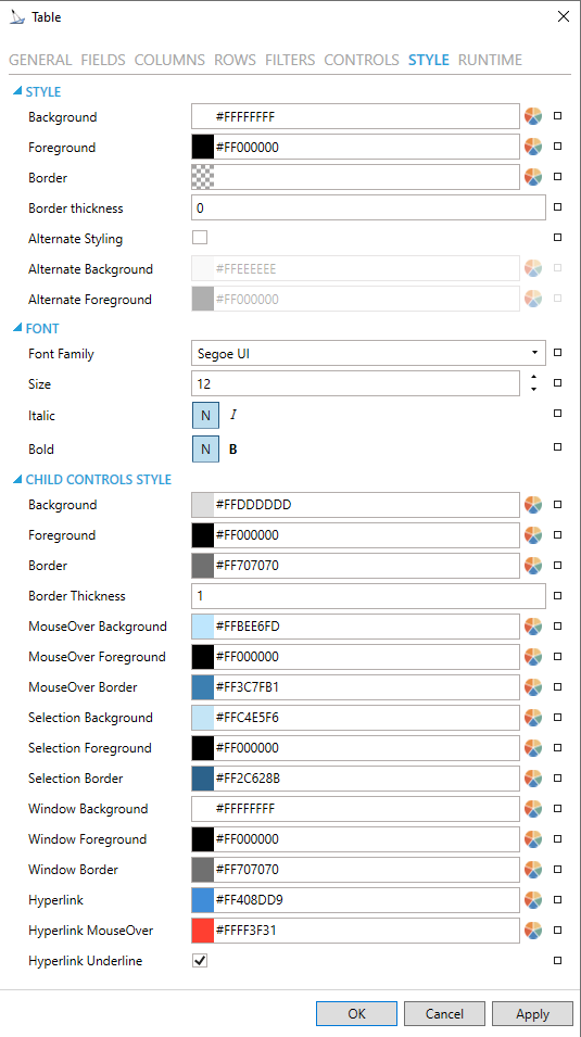
STYLE
-
Background - Background color, gradient or pattern of this object. You can enter a color code (if known) in the text entry field or click on the
button to open the Brush Picker window and set the properties for
your background. -
Foreground - Foreground color, gradient or pattern of this object. You can enter a color code (if known) in the text entry field or click on the
button to open the Brush Picker window and set the properties for
your foreround. -
Border - Color, gradient, or pattern of the border surrounding this object. You can enter a color code (if known) in the text entry field or click on the
button to open the Brush Picker window and
set the properties for your border. -
Border thickness - Width of the border surrounding this object. Enter a thickness in the text entry field.
-
Alternate Styling -Enables alternate styling applied to every other row.
-
Alternate Background -Background applied to every other row if Alternate Styling is enabled.
-
Alternate Foreground - Foreground applied to every other row if Alternate Styling is enabled.
FONT
-
Font Family - Specifies the name of the font used to render text. Use the pulldown menu to select from installed fonts.
-
Size - Specifies the size of the font used to render text. Enter a font size in the text entry field or use the up/down buttons.
-
Italic - Specifies the style of the font used to render text (italic). Select "N" for Normal or "I" for Italic.
-
Bold - Specifies the thickness of the font used to render text (bold) Select "N" for Normal or "B" for Bold.
-
Stretch - Specifies whether a font appears with a typical width (Normal) narrower than usual (Condensed), or wider than usual (Expanded). Use the pulldown menu to make your selection.
CHILD CONTROLS STYLE
-
Background - Background brush of child controls. You can enter a color code (if known) in the text entry field or click on the
button to open the Brush Picker window and set the properties for
your background. -
Foreground - Foreground brush of child controls. You can enter a color code (if known) in the text entry field or click on the
button to open the Brush Picker window and set the properties for
your foreground. -
Border - Border brush of child controls. You can enter a color code (if known) in the text entry field or click on the
button
to open the Brush Picker window and set the properties for your border. -
Border Thickness - Border thickness of child controls. Enter a thickness in the text entry field.
-
MouseOver Background - Background brush of child controls under mouse cursor. You can enter a color code (if known) in the text entry field or click on the
button to open the Brush Picker window and
set the properties for your mouseover background. -
MouseOver Foreground - Foreground brush of child controls under mouse cursor. You can enter a color code (if known) in the text entry field or click on the
button to open the Brush Picker window and set the properties for
your mouseover foreground. -
MouseOver Border - Border brush of child controls under mouse cursor. You can enter a color code (if known) in the text entry field or click on the
button to open the Brush Picker window and set the properties for
your mouseover border. -
Selection Background - Background brush of selected child controls. You can enter a color code (if known) in the text entry field or click on the
button to open the Brush
Picker window and set the properties for your selection background. -
Selection Foreground - Foreground brush of selected child controls. You can enter a color code (if known) in the text entry field or click on the
button to open the Brush
Picker window and set the properties for your selection foreground. -
Selection Border - Border brush of selected child controls. You can enter a color code (if known) in the text entry field or click on the
button to open the Brush Picker window and set the properties for
your selection border. -
Window Background - Background brush of child control windows. You can enter a color code (if known) in the text entry field or click on the
button to open the Brush
Picker window and set the properties for your background of child
control windows. -
Window Foreground - Foreground brush of child control windows. You can enter a color code (if known) in the text entry field or click on the
button to open the Brush
Picker window and set the properties for your foreground of child
control windows. -
Window Border - Border brush of child control windows. You can enter a color code (if known) in the text entry field or click on the
button to open the Brush Picker window and set the properties for
your border of child control windows. -
Hyperlink -Foreground brush of hyperlinks.
-
Hyperlink MouseOver -MouseOver foreground brush of hyperlinks.
-
Hyperlink Underline -True to show underline for the hyperlink text.
RUNTIME
Table Control Configuration Window - RUNTIME Tab
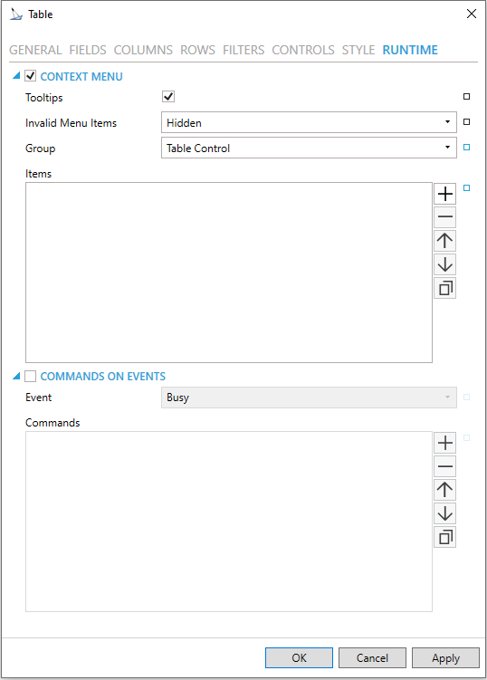
CONTEXT MENU
-
Enable - True to enable context menu on right click.
-
Tooltips - Enables tooltips on hover in context menu items.
-
Invalid Menu Items - Display mode for context menu items that are invalid (e.g. no command target).
-
Group - Select context menu group for editing. Use the pulldown menu to select from Table Control or Table Row.
-
Items - Allows users to add items to a collection based on the selected Context Menu Group. Click on the plus sign [+] to add an item to the list. Click on the minus sign [-] to remove a listed item. Click on the up arrow to move a selected item higher in the list. Click on the down arrow to move a selected item lower in the list. Click on the
 button to duplicate a selected entry
in the list.
button to duplicate a selected entry
in the list.
Table Control
-
Separator - Horizontal separator to separate groups of context menu items.
-
Custom Command - Custom command that can be configured to run any command with custom parameters.
-
Command - Use the pulldown menu to select the Command you wish to include as a Context Menu Item. See Commanding in GraphWorX64 for more info.
-
Set Runtime Filter - Action that allows configuration of one runtime-only filter.
-
Copy from - This selection gives you the option of copying all applicable items from your selected Context Menu Group.
Table Row
-
Separator - Horizontal separator to separate groups of context menu items.
-
Custom Command - Custom command that can be configured to run any command with custom parameters.
-
Command - Use the pulldown menu to select the Command you wish to include as a Context Menu Item. See Commanding in GraphWorX64 for more info.
-
Set Runtime Filter - Action that allows configuration of one runtime-only filter.
-
Copy from - This selection gives you the option of copying all applicable items from your selected Context Menu Group.
-
Display Name - Set the name displayed in configuration collection. Enter a Display Name in the text entry field. Click on the
 button to open the Data Browser to set any
required Language Alias. You can also click on the
button to open the Data Browser to set any
required Language Alias. You can also click on the  button to reset the current setting.
 -
Description - Set the description displayed in tooltip in configuration collection. Enter a Description in the text entry field. Click on the
button to
open the Data Browser to set any required Language Alias. You
can also click on the button to reset
the current setting.
COMMANDS ON EVENTS
The Table Control is one of many controls that now supports executing commands on events. These events vary per control, but for the Table Control they include:
-
Busy
-
Ready
-
Row Selected
-
Started
To configure the command to be executed when this event occurs, go to Runtime tab. Find the Commands on Events section, check Enable Commands on Events, then configure the form below.
-
Enable - True to enable configuring actions and commands for control events.
-
Event - Select a control event and configure actions to fire when the event occurs. Use the pulldown menu to select from Asset Clicked, Asset Selected, Ready, or Started.
-
Commands - List of actions to perform when selected control event occurs. Click on the plus sign [+] to add an item to the list. Click on the minus sign [-] to remove a listed item. Click on the up arrow to move a selected item higher in the list. Click on the down arrow to move a selected item lower in the list. Click on the
 button to duplicate a selected entry in the list. For any Custom Command
selected in the list, you can then select a specific Command and then
complete the associated properties for that command. See Commanding
in GraphWorX64 for more info.
button to duplicate a selected entry in the list. For any Custom Command
selected in the list, you can then select a specific Command and then
complete the associated properties for that command. See Commanding
in GraphWorX64 for more info.
-
Click on the Apply button to save your recently made settings. Click OK to close the Configuration window and return to GraphWorX64 display configuration.
Query Top and Distinct Records
The Table control can display only the top N records or distinct records.
To return only distinct records, configure the Table control, go to the Fields page, and enable Distinct.
To limit the records returned to the top rows, configure the Table control, go to the Fields page, enable Limit Record Count, and set the desired limit with Record Count.
Support for Query Interface
You can use the Query Interface by Table Control.
The Query Interface is an ICONICS protocol for retrieving datasets. You can use it if you want to modify the original dataset, such as if you sort, calculate aggregates, or if you want to display only a subset of the columns.
The Query Interface allows the server to process those modifications more efficiently before you send the data to your client. The server can also notify client that the table was changed.
If you want to see data from the Hyper Alarm Logger in the table control:
1) Configure the table control.
2) For Query, select type.
3) For Data Source, browse under Alarms and Notifications > Hyper Alarm Logger Query Interface and select .Query.
4) For Table, select the desired Hyper Alarm Logger collection.
5) Go to the Fields page.
6) Select the refresh  button.
7) Go to the Columns page.
8) Select the refresh button.
9) Make further updates to Fields or Columns as desired.
10) Select OK.
11) Go into runtime to see your data.
See Also: