Sankey Diagram
Sankey Diagrams help illustrate flow between different sources and destinations. They can be added to GraphWorX64 displays using the Controls ribbon. Sankey Diagrams are usable in desktop (WPF) and HTML5 displays.
Sankey Diagram Example
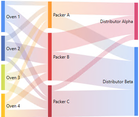
The Sankey Diagram expects a dataset with three columns, a source, a destination, and a weight. In runtime, the diagram will intelligently draw the correctly weighted lines between each source and destination. Optionally, gains and losses can be visualized. The colors and shapes of the nodes and links can be extensively customized, if desired. The control supports all of the features of modern ICONICS controls, such as a customizable context menu and commanding support. There is also a Sankey Diagram widget available in KPIWorX.
To Add a Sankey Diagram:
-
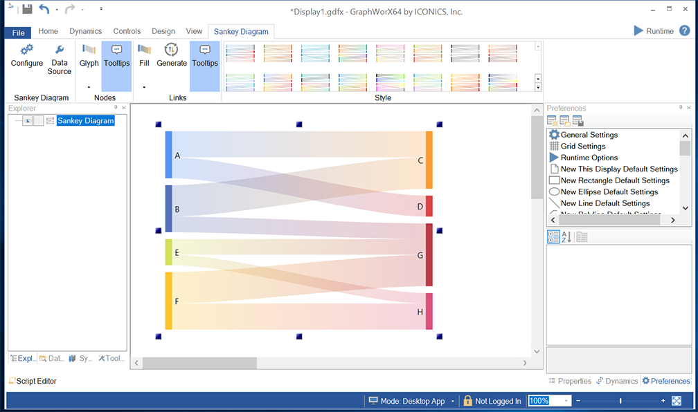
Open GraphWorX64, then click on the Controls ribbon and then on the Sankey Diagram control. The cursor will turn into a crosshairs "+", which will allow you to draw the size of the Sankey Diagram control you would like in the center display portion of the GraphWorX64 configuration window. Simultaneously, the GraphWorX64 ribbon will change to allow modification to the Sankey Diagram settings.
Sankey Diagram Control Added to GraphWorX64 Configuration
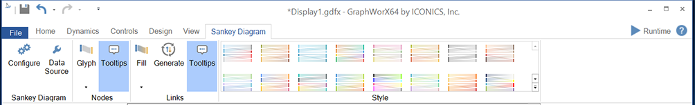
Sankey Diagram Ribbon Controls
Sankey Diagram Ribbon
Sankey Diagram
-
Configure - Clicking this button opens the separate Configuration window, allowing you to change the settings for the currently selected Sankey Diagram control.
-
Data Source - Clicking this button opens the separate Data Browser window, allowing you to navigate to your selected data source for the Sankey Diagram control.
Nodes
-
Glyph - This button sets the visibility of the glyphs representing the nodes in the diagram. Click on this button to first set if you wish to use glyphs and, if so, whether to use a Rectangle or Arrow.
-
Tooltips - This button sets the visibility of node tooltips in runtime. Set to true to include node tooltips in the diagram.
Links
-
Fill - This button sets the Fill options for the links in the diagram. You can choose from Specific, Gradient, Source Node, or Target Node.
-
Generate - Click this button if you wish to automatically genrate gains and losses based on node input and output values.
-
Tooltips - This button sets the visibility of link tooltips in runtime. Set to true to include link tooltips in the diagram.
Style
The Style section
of the Sankey Diagram ribbon allows you to select a pre-set colored Sankey
Diagram combination for your selected control. Click the  button to cycle through
provided options row by row within the Style section of the ribbon or
click on the
button to cycle through
provided options row by row within the Style section of the ribbon or
click on the  button to view all of the options.
-
Click on the Configure button or double-click directly on the Sankey Diagram control. This brings up the Confirmation window, shown below.
Configuration Window
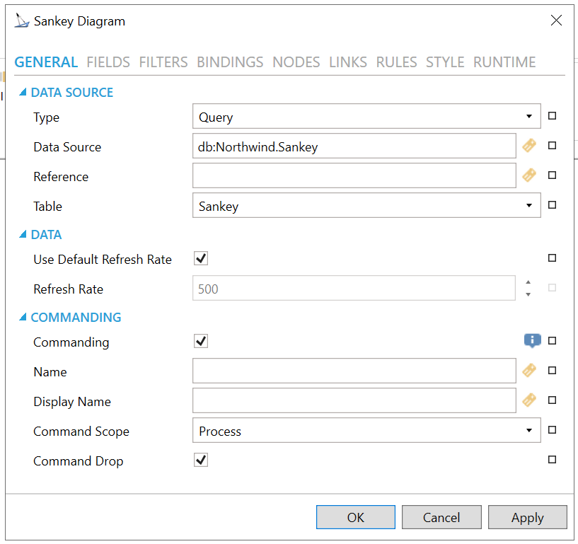
GENERAL
Configuration Window - GENERAL Tab
DATA SOURCE
-
Type - The table data source type. Use the pulldown menu to select from either Query or Dataset.
-
Data Source - Data source name. Can contain aliases. In tht case, use Reference property to retrieve additional information. Enter a data source in the text entry field or click on the
 button to open the Data Browser and navigate
to your intended data source.
button to open the Data Browser and navigate
to your intended data source. -
Reference - Reference data source name for retrieving tables and table columns. Enter a reference in the text entry field or click on the
button to open the Data Browser and navigate
to your intended reference. -
Table - Table name. If Query was selected as the data source type, use the pulldown menu to select your table.
-
Auto Refresh - Automatic data refresh initiated by data source.
DATA
-
Use Default Refresh Rate - Use default refresh rate or refresh rate inherited from parent container.
-
Refresh Rate - Data refresh rate of data sources defined for properties, in milliseconds. Do not modify if you intend to use local variables for sharing data with other controls, e.g. selected asset or current time range.
COMMANDING
The Sankey Diagram is one of many controls that now supports executing commands on events. These events vary per control.
To configure the command to be executed when this event occurs, go to Runtime tab. Find the Commands on Events section, check Enable Commands on Events, then configure the form below.
See Platform Services > Commanding > New: Execute Commands on Events for more details.
-
Commanding - Determines whether commands are enabled for this display. Use the CommandingName setting to specify a registration name. Click this checkbox if you intend to use Commanding with the current Sankey Diagram control. You can also click on the
 button to reset the current setting.
 -
Name - Name used for registering the control for commanding. Enter a name in the text entry field to associate the current Sankey Diagram control with any command(s). You can also click on the
button to reset the current setting. -
Display Name - User friendly control name. Enter the name (in the text entry field) to appear in the display, associated with the current Sankey Diagram control and any command(s). You can also click on the
button to reset the current
setting. -
Command Scope - Indicates whether commands sent and received by this display affect the current process only (Process) or all processes that are currently opened (Machine). For inter-process commanding, use the Machine option. Use the pulldown menu to select from either Machine or Process. You can also click on the
button to reset the current setting. -
Command Drop - True to enable receiving commands by drag and drop. Click this checkbox in order to allow for Drag and Drop of commands in association with the current Sankey Diagram control. You can also click on the
button to reset the current setting.
FIELDS
Configuration Window - FIELDS Tab
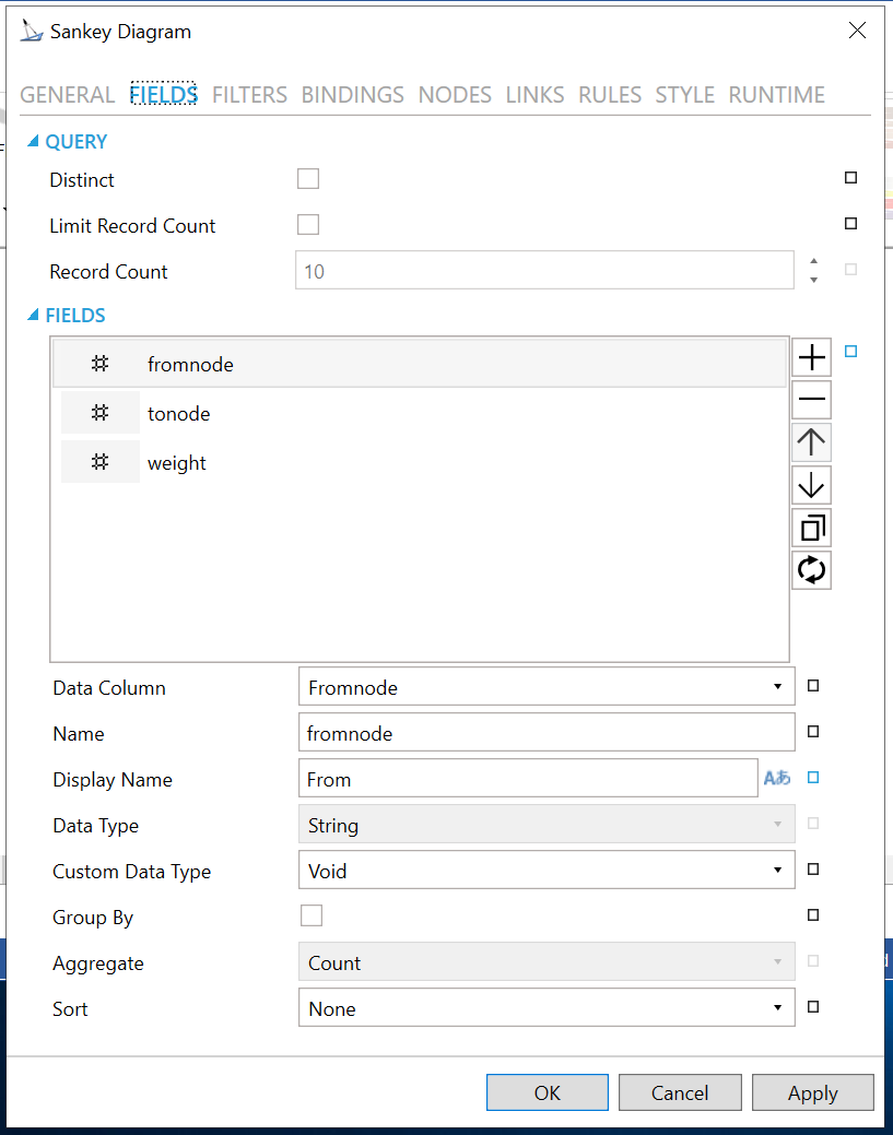
QUERY
-
Distinct - Return distinct records only.
-
Limit Record Count - Return only first N records.
-
Record Count - Count of records to read.
FIELDS
Click
on the plus button [+] to enter an item in the Fields section. You can
delete an item in the Fields section by selecting it then clicking on
the minus [-] button. You can move an item within a list in the Fields
section by selecting it then clicking on either the up or down arrow buttons.
You can duplicate an item in the Fields section by selecting it then clicking
on the
 button.
You can generate fields from the list of data columns by clicking
on the
button.
You can generate fields from the list of data columns by clicking
on the  button.
-
Data Column - Select a database column to read. Use the pulldown menu to make your selection.
-
Name - Unique name that is used to reference this field in configuration of columns, filters, context variables, etc. Enter a name in the text entry field.
-
Display Name - Display name that is used to reference this field in runtime configurations. Enter a display name in the text entry field. You can also click on the
 button
to open the Data Browser to utilize any Language Alias.
button
to open the Data Browser to utilize any Language Alias. -
Data Type - Native data type declared by field data source. If active, use the pulldown menu to select your data type.
-
Custom Data Type - Requested data value type conversion. Keep default Void to use native type. Use the pulldown menu to select from Void, Int16, Int32, Int64, Byte, Single, Double, Boolean, DateTime, DateTimeOffset, Decimal, or TimeSpan.
-
Group By - Group items by values in this field.
-
Aggregate - Aggregate used when the field is in an aggregated view.
-
Sort - Sort options for this field.
FILTERS
Configuration Window - FILTERS Tab
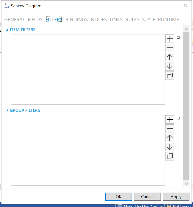
ITEM FILTERS
Click on the plus button [+] to enter an item in the ITEM
FILTERS section. You can delete an item in the ITEM FILTERS section by
selecting it then clicking on the minus [-] button. You can move an item
within a list in the ITEM FILTERS section by selecting it then clicking
on either the up or down arrow buttons. You can duplicate an item in the
ITEM FILTERS section by selecting it then clicking on the button.
-
Name -Name of the filter rule. Enter a name in the text entry field.
-
Enabled -Enables or disables the filtering rule.
-
Expressions - Set the filtering expressions for the filter.
Click on the plus button [+]
to enter an item in the Expressions section. You can delete an item in
the Expressions section by selecting it then clicking on the minus [-]
button. You can move an item within a list in the Express section by selecting
it then clicking on either the up or down arrow buttons. You can duplicate
an item in the Expressions section by selecting it then clicking on the
button.
-
Field - Select a field for the expression from the pulldown menu.
-
Operator - Select an operator with the pulldown menu. Options include Is equal to, Is not equal to, Is null, and Is not null.
-
Value - Enter a value for the expression in the text entry field or click on the
button to open the Data Browser
to navigate to your selected value.
GROUP FILTERS
Click on the plus
button [+] to enter an item in the GROUP FILTERS section. You can delete
an item in the GROUP FILTERS section by selecting it then clicking on
the minus [-] button. You can move an item within a list in the GROUP
FILTERS section by selecting it then clicking on either the up or down
arrow buttons. You can duplicate an item in the GROUP FILTERS section
by selecting it then clicking on the button.
-
Name -Name of the filter rule. Enter a name in the text entry field.
-
Enabled -Enables or disables the filtering rule.
-
Expressions - Set the filtering expressions for the filter.
Click on the plus button [+]
to enter an item in the Expressions section. You can delete an item in
the Expressions section by selecting it then clicking on the minus [-]
button. You can move an item within a list in the Express section by selecting
it then clicking on either the up or down arrow buttons. You can duplicate
an item in the Expressions section by selecting it then clicking on the
button.
-
Field - Select a field for the expression from the pulldown menu.
-
Operator - Select an operator with the pulldown menu. Options include Is equal to, Is not equal to, Is null, and Is not null.
-
Value - Enter a value for the expression in the text entry field or click on the
button to open the Data Browser
to navigate to your selected value.
BINDINGS
Configuration Window - BINDINGS Tab
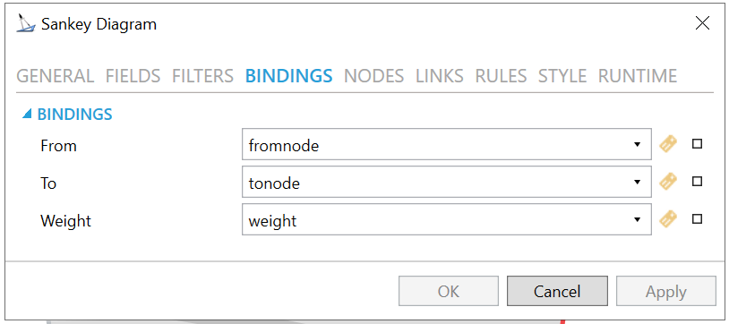
BINDINGS
-
From - Field that contains start points. Use the pulldown menu to select this item or click on the
button
to open the Data Browser and navigate to your selected item. -
To - Field that contains end points. Use the pulldown menu to select this item or click on the
button
to open the Data Browser and navigate to your selected item. -
Weight - Field that contains weights. Use the pulldown menu to select this item or click on the
button to open the Data Browser
and navigate to your selected item.
NODES
Configuration Window - NODES Tab
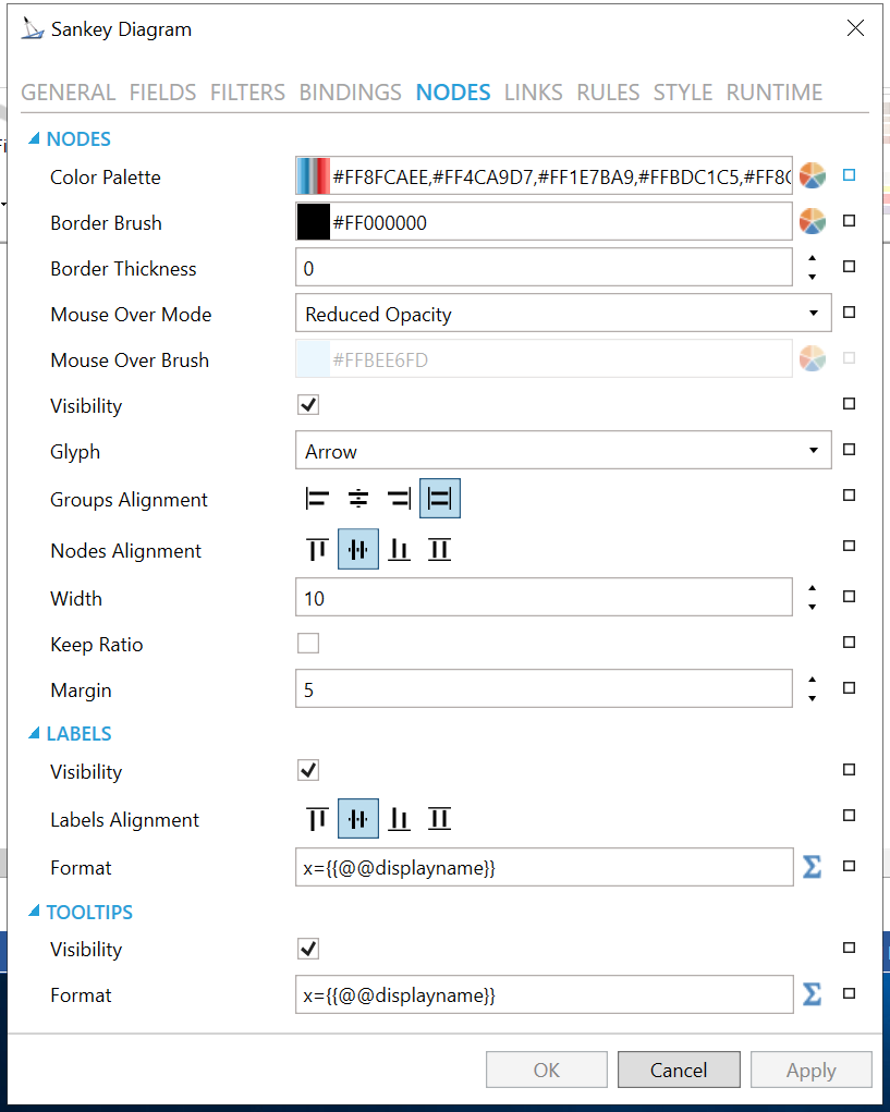
NODES
-
Color Palette - Color palette for nodes. Enter a color code, if known, for the nodes or click on the
 button to open the Color Palette
Editor to select your color.
button to open the Color Palette
Editor to select your color. -
Border Brush - Node brush color. Enter a color code, if known, for the node brush color or click on the
button to open the Color Palette
Editor to select your color. -
Border Thickness - Node border thickness. Enter a number in the text entry field or use the up/down arrow buttons.
-
Mouse Over Mode - Mouse over mode for nodes. Use the pulldown menu to select from None, Specific Color, or Reduced Opacity.
-
Mouse Over Brush - Node brush when under mouse cursor. If Specific Color was selected for Mouse Over Mode, enter a color code, if known, for the mouse over brush color or click on the
button
to open the Color Palette Editor to select your color. -
Visibility - Visibility of node glyphs. Node is still present in the diagram, but not rendered.
-
Glyph - Glyph representing the nodes in the diagram. Use the pulldown menu to select either Rectangle or Arrow.
-
Groups Alignment - Horizontal alignment of nodes and labels in the diagram.
-
Nodes Alignment - Vertical alignment of nodes in a group.
-
Width - Node width in pixels.
-
Keep Ratio - Keep node width and height ratio.
-
Margin - Node margin in pixels. Enter a number in the text entry field or use the up/down arrow buttons.
LABELS
-
Visibility - Visibility of node labels.
-
Labels Alignment - Vertical alignment of node labels.
-
Format - Expression format of node labels. Enter the format in the text entry field or click on the
 to open the Expression Editor.
TOOLTIPS
-
Visibility -Visibility of node tooltips in runtime.
-
Format - Expression format of node tooltips. Enter the format in the text entry field or click on the
to open the Expression Editor.
LINKS
Configuration Window - LINKS Tab
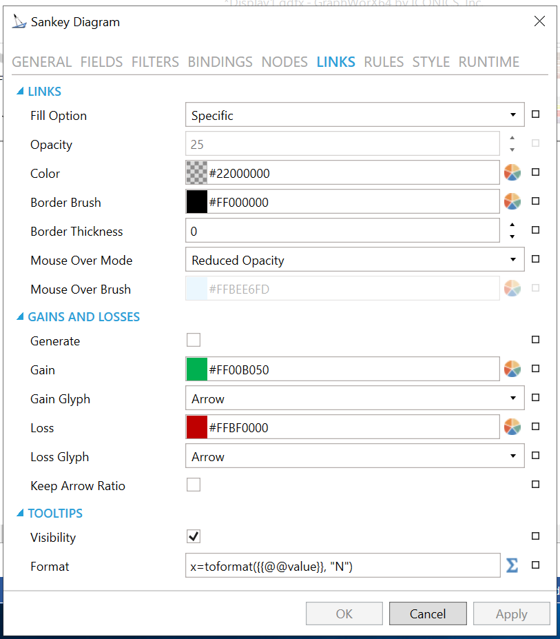
LINKS
-
Fill Option -Fill option for links. Use the pulldown menu to select from Specific, Gradient, Source Node, or Target Node.
-
Opacity - Link Opacity. Enter a number in the text entry field or use the up/down arrow buttons.
-
Color - Link color. Used when requested color information is not available. Enter a color code, if known, for the link color or click on the
button to open the Color Palette Editor to select your color. -
Border Brush -Link border brush. Enter a color code, if known, for the link color or click on the
button
to open the Color Palette Editor to select your color. -
Border Thickness - Link border thickness. Enter a number in the text entry field or use the up/down arrow buttons.
-
Mouse Over Mode -Mouse over mode for links. Use the pulldown menu to select from None, Specific Color, or Reduced Opacity.
-
Mouse Over Brush - Link brush when under mouse cursor. If Specific Color was selected for Mouse Over Mode, enter a color code, if known, for the mouse over brush color or click on the
button to open the
Color Palette Editor to select your color.
GAINS AND LOSSES
-
Generate -Automatically generate gains and losses based on node input and output values.
-
Gain - Brush for gains. Enter a color code, if known, for the gain brush color or click on the
button to open the Color Palette Editor to select your color. -
Gain Glyph -Start glyph for gains. Use the pulldown menu to select from Rectangle or Arrow.
-
Loss - Brush for losses. Enter a color code, if known, for the loss brush color or click on the
button to open the Color Palette Editor to select your color. -
Loss Glyph - End glyph for gains. Use the pulldown menu to select from Rectangle or Arrow.
-
Keep Arrow Ratio - Keep width and height ratio of gain and loss arrows.
TOOLTIPS
-
Visibility - Visibility of link tooltips in runtime.
-
Format -Expression format of link tooltips. Enter the format in the text entry field or click on the
to open the Expression Editor.
RULES
Configuration Window - RULES Tab
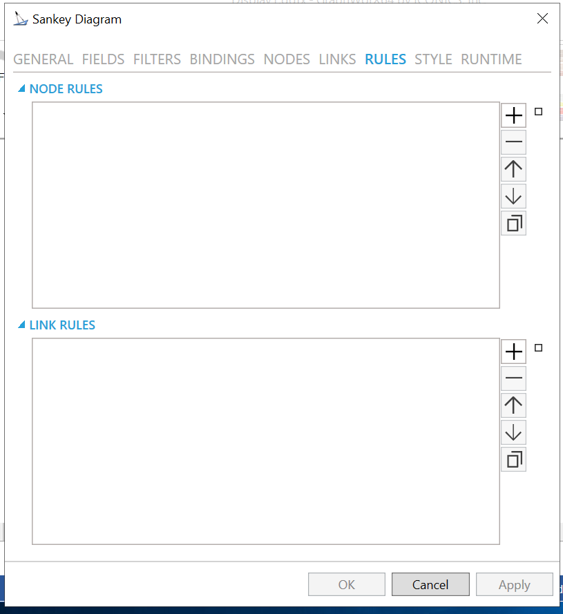
NODE RULES
Click
on the plus button [+] to enter an item in the NODE RULES section. You
can delete an item in the NODE RULES section by selecting it then clicking
on the minus [-] button. You can move an item within a list in the NODE
RULES section by selecting it then clicking on either the up or down arrow
buttons. You can duplicate an item in the NODE RULES section by selecting
it then clicking on the button.
-
Name - Name of the Styling Rule. Configuration-only property to easily distinguish the rule in the collection. Enter a name in the text entry field.
-
Condition - Configure the expression that serves as a condition for this rule. Enter the condition in the text entry field or click on the
to open the Expression Editor. -
Background - Background color, gradient, or pattern of this object. Enter a color code, if known, for the background color or click on the
button to open the
Color Palette Editor to select your color. -
Foreground - Foreground color, gradient or pattern of this object. Enter a color code, if known, for the foreground color or click on the
button to open the Color Palette Editor to select your color. -
Border - Color, gradient, or pattern of the border surrounding this object. Enter a color code, if known, for the border color or click on the
button to open the Color Palette Editor to select your color.
LINK RULES
Click
on the plus button [+] to enter an item in the LINK RULES section. You
can delete an item in the LINK RULES section by selecting it then clicking
on the minus [-] button. You can move an item within a list in the LINK
RULES section by selecting it then clicking on either the up or down arrow
buttons. You can duplicate an item in the LINK RULES section by selecting
it then clicking on the
button.
-
Name - Name of the Styling Rule. Configuration-only property to easily distinguish the rule in the collection. Enter a name in the text entry field.
-
Condition - Configure the expression that serves as a condition for this rule. Enter the condition in the text entry field or click on the
to open the Expression Editor. -
Background - Background color, gradient, or pattern of this object. Enter a color code, if known, for the background color or click on the
button to open the
Color Palette Editor to select your color. -
Foreground - Foreground color, gradient or pattern of this object. Enter a color code, if known, for the foreground color or click on the
button to open the Color Palette Editor to select your color. -
Border - Color, gradient, or pattern of the border surrounding this object. Enter a color code, if known, for the border color or click on the
button to open the Color Palette Editor to select your color.
STYLE
Configuration Window - STYLE Tab
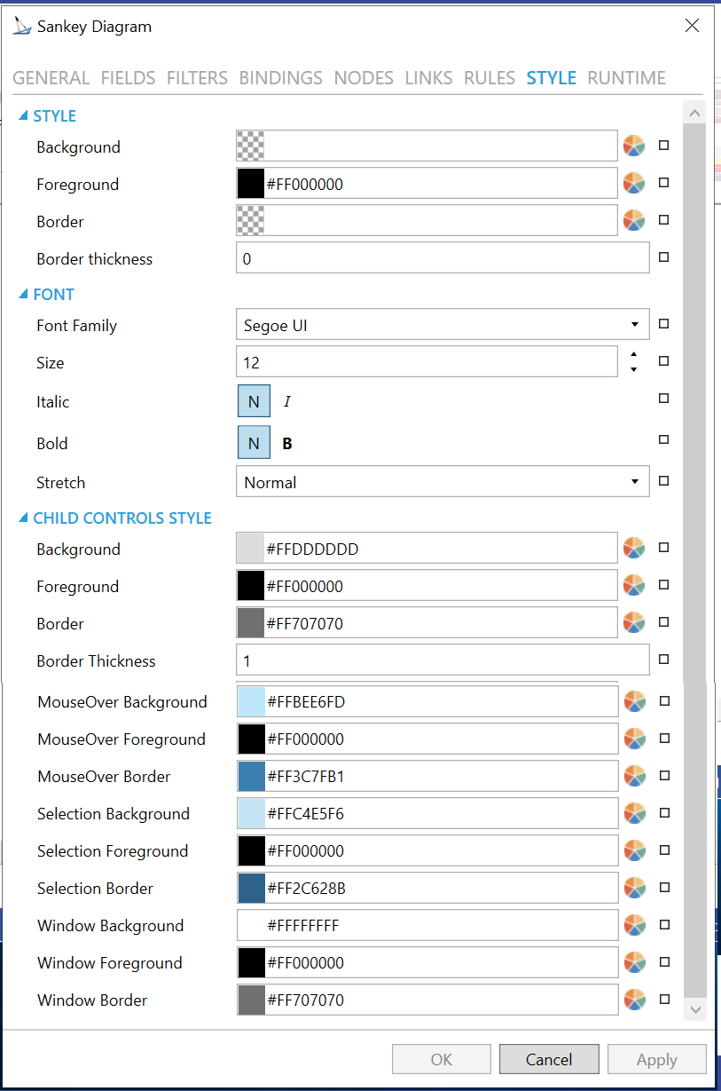
STYLE
-
Background - Background color, gradient or pattern of this object. Enter a hex color code in the text entry field or click on the
button to open the Color Palette Editor and select your preferred
Background. You can also click on the button to
reset the current setting. -
Foreground - Foreground color, gradient or pattern of this object. Enter a hex color code in the text entry field or click on the
button to open the Color Palette Editor and select your preferred
Foreground. You can also click on the button to
reset the current setting. -
Border - Color, gradient or pattern of the border surrounding this object. Enter a hex color code in the text entry field or click on the
button to open the Color Palette Editor and select your preferred
Border. You can also click on the button to reset
the current setting. -
Border thickness - Width of the border surrounding this object. Enter a border thickness in the text entry field. You can also click on the
button to reset the current setting.
FONT
-
Font Family - Specifies the name of the font used to render text. Use the pulldown menu to select your preferred font. You can also click on the
button to
reset the current setting. -
Size - Specifies the size of the font used to render text. Enter a font size in the text entry field or use the up/down arrows. You can also click on the
button to
reset the current setting. -
Italic - Specifies the style of the font used to render text (italic). Click on either the N or I button to select your preferred style. You can also click on the
button to reset the current
setting. -
Bold - Specifies the thickness of the font used to render text (bold). Click on either the N or B buttons to select your preferred font thickness. You can also click on the
button to reset the current setting. -
Stretch - Specifies whether a font appears with a typical width (Normal), narrower than usual (Condensed), or wider than usual (Expanded). Use the pulldown menu to select from Normal, Condensed, or Expanded. You can also click on the
button to reset the current setting.
CHILD CONTROLS STYLE
-
Background - Background brush of child controls. Enter a hex color code in the text entry field or click on the
button to open the Color Palette Editor and select your preferred
Background. You can also click on the button to
reset the current setting. -
Foreground - Foreground brush of child controls. Enter a hex color code in the text entry field or click on the
button to open the Color Palette Editor and select your preferred
Foreground. You can also click on the button to
reset the current setting. -
Border - Border brush of child controls. Enter a hex color code in the text entry field or click on the
button to open the Color Palette Editor and select your preferred
Border. You can also click on the button to reset
the current setting. -
Border Thickness - Border thickness of child controls. Enter a border thickness in the text entry field. You can also click on the
button to reset the current setting. -
MouseOver Background - Background brush of child controls under mouse cursor. Enter a hex color code in the text entry field or click on the
button
to open the Color Palette Editor and select your preferred background
brush of child controls under mouse cursor. You can also click on
the button to reset the current setting. -
MouseOver Foreground - Foreground brush of child controls under mouse cursor. Enter a hex color code in the text entry field or click on the
button
to open the Color Palette Editor and select your preferred foreground
brush of child controls under mouse cursor. You can also click on
the button to reset the current setting. -
MouseOver Border - Border brush of child controls under mouse cursor. Enter a hex color code in the text entry field or click on the
button to open the Color Palette Editor and select your preferred
border brush of child controls under mouse cursor. You can also click
on the button to reset the current setting. -
Selection Background - Background brush of selected child controls. Enter a hex color code in the text entry field or click on the
button to open the Color Palette Editor and select your preferred
background brush of selected child controls. You can also click on
the button to reset the current setting. -
Selection Foreground - Foreground brush of selected child controls. Enter a hex color code in the text entry field or click on the
button to open the Color Palette Editor and select your preferred
foreground brush of selected child controls. You can also click on
the button to reset the current setting. -
Selection Border - Border brush of selected child controls. Enter a hex color code in the text entry field or click on the
button to open the Color Palette Editor and select your preferred
border brush of selected child controls. You can also click on the
button to reset the current setting. -
Window Background - Background brush of child control windows. Enter a hex color code in the text entry field or click on the
button to open the Color Palette Editor and select your preferred
background brush of child control windows. You can also click on the
button to reset the current setting. -
Window Foreground - Foreground brush of child control windows. Enter a hex color code in the text entry field or click on the
button to open the Color Palette Editor and select your preferred
foreground brush of child control windows. You can also click on the
button to reset the current setting. -
Window Border - Border brush of child control windows. Enter a hex color code in the text entry field or click on the
button to open the Color Palette Editor and select your preferred
border brush of child control windows. You can also click on the button to reset the current setting.
RUNTIME
Configuration Window - RUNTIME Tab
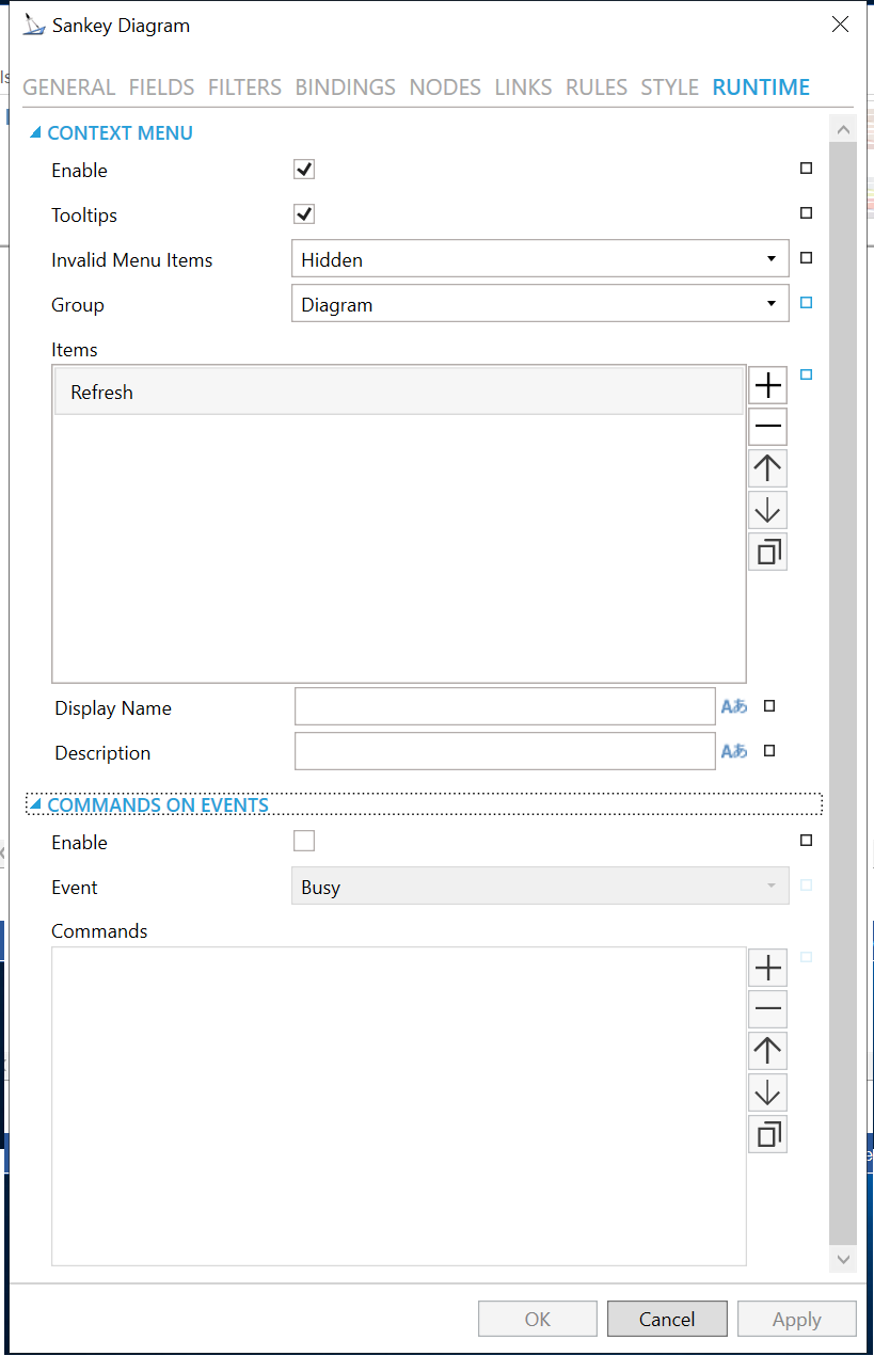
CONTEXT MENU
-
Enable - True to enable context menu on right click.
-
Tooltips - Enables tooltips on hover in context menu items.
-
Invalid Menu Items - Display mode for context menu items that are invalid (e.g. no command target).
-
Group - Select context menu group for editing. Use the pulldown menu to select from Table Control or Table Row.
-
Items - Allows users to add items to a collection based on the selected Context Menu Group. Click on the plus sign [+] to add an item to the list. Click on the minus sign [-] to remove a listed item. Click on the up arrow to move a selected item higher in the list. Click on the down arrow to move a selected item lower in the list. Click on the
 button to
duplicate a selected entry in the list.
button to
duplicate a selected entry in the list.
Sankey Diagram
-
Refresh - Action to refresh this item.
-
Separator - Horizontal separator to separate groups of context menu items.
-
Custom Command - Custom command that can be configured to run any command with custom parameters.
-
Command - Use the pulldown menu to select the Command you wish to include as a Context Menu Item. See Commanding in GraphWorX64 for more info.
-
Display Name - Set the name displayed in configuration collection. Enter a Display Name in the text entry field. Click on the
button
to open the Data Browser to set any required Language Alias. You can
also click on the button
to reset the current setting. -
Description - Set the description displayed in tooltip in configuration collection. Enter a Description in the text entry field. Click on the
button to open the Data
Browser to set any required Language Alias. You can also click on
the button to reset the current setting.
COMMANDS ON EVENTS
The Sankey Diagram is one of many controls that now supports executing commands on events. These events vary per control.
To configure the command to be executed when this event occurs, go to Runtime tab. Find the Commands on Events section, check Enable Commands on Events, then configure the form below.
-
Enable - True to enable configuring actions and commands for control events.
-
Event - Select a control event and configure actions to fire when the event occurs. Use the pulldown menu to select from Asset Clicked, Asset Selected, Ready, or Started.
-
Commands - List of actions to perform when selected control event occurs. Click on the plus sign [+] to add an item to the list. Click on the minus sign [-] to remove a listed item. Click on the up arrow to move a selected item higher in the list. Click on the down arrow to move a selected item lower in the list. Click on the
button to duplicate a selected
entry in the list. For any Custom Command selected in the list, you
can then select a specific Command and then complete the associated
properties for that command. See Commanding
in GraphWorX64 for more info.
-
Click on the Apply button to save your recently made settings. Click OK to close the Configuration window and return to GraphWorX64 display configuration.
Support for Query Interface
You can use the Query Interface by many controls that display datasets, such as the Sankey Diagram.
The Query Interface is an ICONICS protocol for retrieving datasets. You can use it if you want to modify the original dataset, such as if you sort, calculate aggregates, or if you want to display only a subset of the columns.
The Query Interface allows the server to process those modifications more efficiently before you send the data to your client.
If you want to see data from the Hyper Alarm Logger in the table control,
1) Configure the table control.
2) For Query, select type.
3) For Data Source, browse under Alarms and Notifications > Hyper Alarm Logger Query Interface and select .Query.
4) For Table, select the desired Hyper Alarm Logger collection.
5) Go to the Fields page
6) Select the refresh  button.
7) Go to the Columns page.
8) Select the refresh  button.
9) Make further updates to Fields or Columns as desired.
10) Select OK.
11) Go into runtime to see your data.
See Also: