BridgeWorX64 Viewer

The BridgeWorX64 Viewer control in GraphWorX64 provides the ability to configure bridging in Runtime mode in a GraphWorX64 display.
To Use the BridgeWorX64 Viewer:
-
Within a GraphWorX64 display configuration, click on the Controls ribbon and then select the BridgeWorX64 Viewer control. This activates the control with a "+", allowing you to draw a box within the display field to your preferred size/measurement. Once you release the mouse button, the control will populate with a report configuration form. The result will look similar to the image below.
Configuring the BridgeWorX64 Viewer Control in GraphWorX64
-
Once you have inserted the BridgeWorX64 Viewer control, you can edit its properties by right-clicking on the box and selecting Object Properties.
BridgeWorX64 Viewer Object Properties
The BridgeWorX64 Viewer properties can be configured either through the Configuration window, shown below, or via the Properties section of the Workbench on the right side of the GraphWorX64 window.
Configuration Through the BridgeWorX64 Viewer Configuration Window
General
BridgeWorX64 Viewer Configuration Window - GENERAL Tab
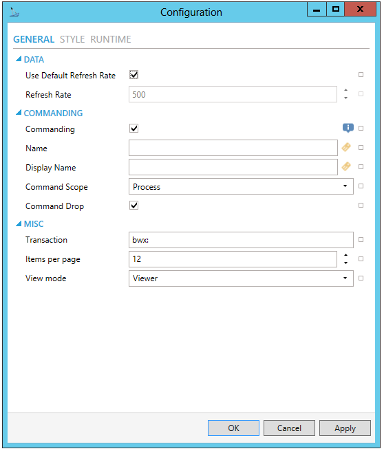
DATA
-
Use Default Refresh Rate -Use default refresh rate or refresh rate inherited from parent container.
-
Refresh Rate - Data refresh rate of data sources defined for properties, in milliseconds. Do not modify if you intend to use local variables for sharing data with other controls, e.g. selected asset or current time range.
COMMANDING
-
Commanding -Determines whether commands are enabled for this display. Use the CommandingName setting to specify a registration name.
-
Name -Name used for registering the control for commanding.
-
Display Name -User friendly control name.
-
Command Scope -Indicates whether commands sent and received by this display affect the current process only (Process) or all processes that are currently opened (Machine). For inter-process commanding, use the Machine option.
-
Command Drop -True to enable receiving commands by drag and drop.
MISC
-
Transaction -
-
Items per page -
-
View mode -
STYLE
BridgeWorX64 Viewer Configuration Window - STYLE Tab
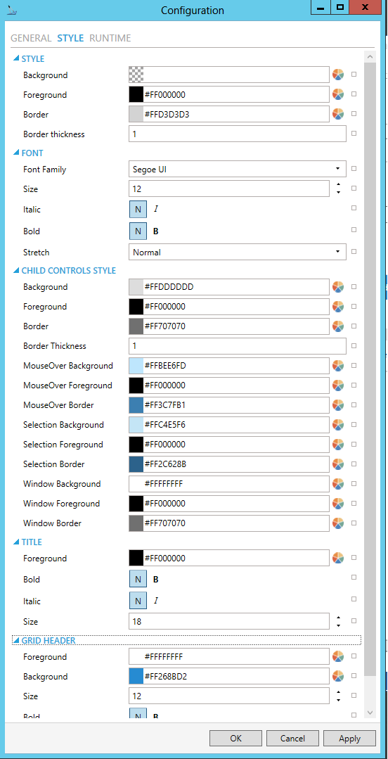
STYLE
-
Background - Background color, gradient or pattern of this object. You can enter a color code (if known) in the text entry field or click on the
 button to open the Brush Picker window and set the properties for
your background
button to open the Brush Picker window and set the properties for
your background -
Foreground - Foreground color, gradient or pattern of this object. You can enter a color code (if known) in the text entry field or click on the
button to open the Brush Picker window and set the properties for
your foreround. -
Border - Color, gradient, or pattern of the border surrounding this object. You can enter a color code (if known) in the text entry field or click on the
button to open the Brush Picker window and set the properties for
your border. -
Border thickness - Width of the border surrounding this object. Enter a thickness in the text entry field.
- Alternate Styling -Enables alternate styling applied to every other row.
- Alternate Background -
Background applied to every other row if Alternate Styling is enabled.
You can enter a color code (if known) in the text entry field or click
on the button to open the Brush Picker window and
set the properties for your alternate background.
- Alternate Foreground -Foreground
applied to every other row if Alternate Styling is enabled. You can
enter a color code (if known) in the text entry field or click on
the button to open the Brush Picker window and
set the properties for your alternate foreground.
NAVIGATOR STYLE
-
MouseOver Background - Background brush of item under mouse cursor. You can enter a color code (if known) in the text entry field or click on the
button to open the Brush
Picker window and set the properties for your mouseover background. -
MouseOver Foreground - Foreground brush of item under mouse cursor. You can enter a color code (if known) in the text entry field or click on the
button to open the Brush
Picker window and set the properties for your mouseover foreground. -
MouseOver Border - Border brush of item under mouse cursor. You can enter a color code (if known) in the text entry field or click on the
button
to open the Brush Picker window and set the properties for your mouseover
border. -
Selection Background - Background brush of selected item. You can enter a color code (if known) in the text entry field or click on the
button to open the Brush Picker window and set the properties for
your selection background. -
Selection Foreground - Foreground brush of selected item. You can enter a color code (if known) in the text entry field or click on the
button to open the Brush Picker window and set the properties for
your selection foreground. -
Selection Border - Border brush of selected item. You can enter a color code (if known) in the text entry field or click on the
button to open
the Brush Picker window and set the properties for your selection
border.
-
Item Border Thickness - Border thickness of items. Enter a thickness in the text entry field.
-
Horizontal Gridlines -Brush of horizontal grid lines. You can enter a color code (if known) in the text entry field or click on the
button
to open the Brush Picker window and set the properties for your horizontal
gridlines. -
Vertical Gridlines -Brush of vertical grid lines. You can enter a color code (if known) in the text entry field or click on the
button to open
the Brush Picker window and set the properties for your vertical gridlines.
-
Header Background - Background brush of grid header. You can enter a color code (if known) in the text entry field or click on the
button
to open the Brush Picker window and set the properties for your header
background. -
Header Foreground - Foreground brush of grid header. You can enter a color code (if known) in the text entry field or click on the
button
to open the Brush Picker window and set the properties for your header
foreground. -
Header Border - Border brush of grid header. You can enter a color code (if known) in the text entry field or click on the
button to open
the Brush Picker window and set the properties for your header border.
FONT
- Font Family - Specifies the name of the font used to render text. Use the pulldown menu to select from installed fonts.
- Size - Specifies the size of the font used to render text. Enter a font size in the text entry field or use the up/down buttons.
- Italic - Specifies the style of the font used to render text (italic). Select "N" for Normal or "I" for Italic.
- Bold - Specifies the thickness of the font used to render text (bold) Select "N" for Normal or "B" for Bold.
- Stretch - Specifies whether a font appears with a typical width (Normal) narrower than usual (Condensed), or wider than usual (Expanded). Use the pulldown menu to make your selection.
CHILD CONTROLS STYLE
- Background - Background
brush of child controls. You can enter a color code (if known) in
the text entry field or click on the button to
open the Brush Picker window and set the properties for your background.
- Foreground - Foreground
brush of child controls. You can enter a color code (if known) in
the text entry field or click on the button to
open the Brush Picker window and set the properties for your foreground.
- Border - Border brush
of child controls. You can enter a color code (if known) in the text
entry field or click on the
button to open the Brush Picker window and set the properties for
your border.
- Border Thickness - Border thickness of child controls. Enter a thickness in the text entry field.
- MouseOver Background
- Background brush of child controls under mouse cursor. You
can enter a color code (if known) in the text entry field or click
on the button to open the Brush Picker window and
set the properties for your mouseover background.
- MouseOver Foreground
- Foreground brush of child controls under mouse cursor. You can enter
a color code (if known) in the text entry field or click on the
button to open the Brush Picker window and set the properties for
your mouseover foreground.
- MouseOver Border
- Border brush of child controls under mouse cursor. You can enter
a color code (if known) in the text entry field or click on the
button to open the Brush Picker window and set the properties for
your mouseover border.
- Selection Background
- Background brush of selected child controls. You can enter a color
code (if known) in the text entry field or click on the button to open the Brush
Picker window and set the properties for your selection background.
- Selection Foreground
- Foreground brush of selected child controls. You can enter a color
code (if known) in the text entry field or click on the button to open the Brush
Picker window and set the properties for your selection foreground.
- Selection Border
- Border brush of selected child controls. You can enter a color code
(if known) in the text entry field or click on the
button to open the Brush Picker window and set the properties for
your selection border.
- Window Background
- Background brush of child control windows. You can enter a color
code (if known) in the text entry field or click on the button to open the Brush
Picker window and set the properties for your background of child
control windows.
- Window Foreground
- Foreground brush of child control windows. You can enter a color
code (if known) in the text entry field or click on the button to open the Brush
Picker window and set the properties for your foreground of child
control windows.
- Window Border - Border brush of child control windows.
You can enter a color code (if known) in the text entry field or click
on the button to open the Brush Picker window and
set the properties for your border of child control windows.
TITLE
-
Foreground -Foreground color, gradient or pattern of this object.
-
Bold -Specifies the thickness of the font used to render text (bold).
-
Italic -Specifies the style of the font used to render text (italic).
-
Size -Specifies the size of the font used to render text.
GRID HEADER
-
Foreground -Foreground color, gradient or pattern of this object.
-
Background -Background color, gradient or pattern of this object.
-
Size -Specifies the size of the font used to render text.
-
Bold -Specifies the thickness of the font used to render text (bold).
-
Italic -Specifies the style of the font used to render text (italic).
RUNTIME
BridgeWorX64 Viewer Configuration Window - RUNTIME Tab
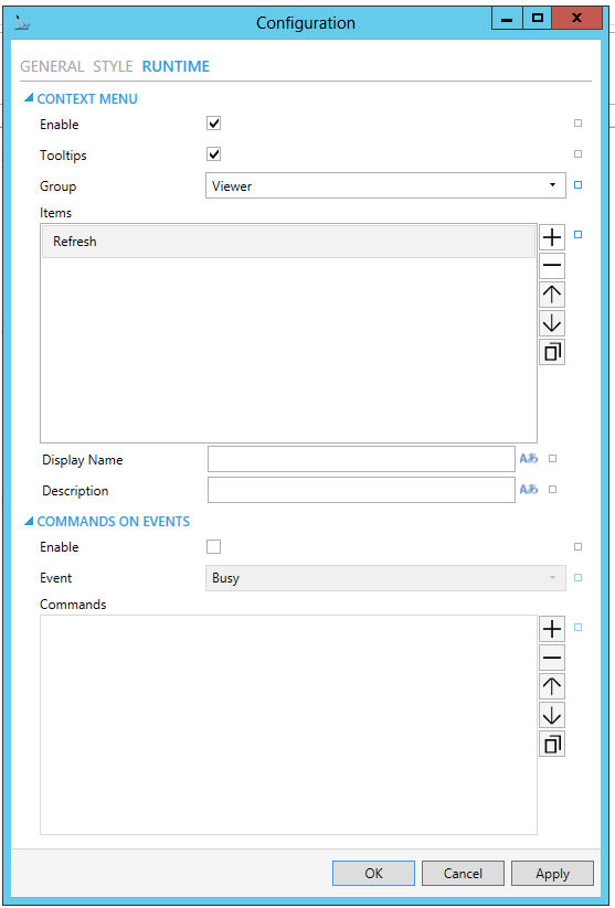
CONTEXT MENU
-
Enable - True to enable context menu on right click. Click the checkbox to enable context menu on right-click in the control. You can also click on the
 button to reset the current setting.
 -
Tooltips - Enables tooltips on hover in context menu items.
-
Group - Select context menu group for editing. Use the pulldown menu to select from any existing context menu group. You can also click on the
button to reset the current setting. -
Items - Allows users to add items to a collection based on the selected Context Menu Group. Click on the plus sign [+] to add an item to the list. Click on the minus sign [-] to remove a listed item. Click on the up arrow to move a selected item higher in the list. Click on the down arrow to move a selected item lower in the list. Click on the
 button to duplicate a selected entry in the list.
Viewer
-
Refresh - Action to refresh this item.
-
Separator - Horizontal separator to separate groups of context menu items.
-
Custom Command - Custom command that can be configured to run any command with custom parameters.
-
Command - Use the pulldown menu to select the Command you wish to include as a Context Menu Item. Click HERE for more info on Commands in GraphWorX64.
-
Display Name - Set the name displayed in configuration collection. Enter a Display Name in the text entry field. Click on the
 button
to open the Data Browser to set any required Language Alias. You can
also click on the button
to reset the current setting.
button
to open the Data Browser to set any required Language Alias. You can
also click on the button
to reset the current setting. -
Description - Set the description displayed in tooltip in configuration collection. Enter a Description in the text entry field. Click on the
button to open the Data
Browser to set any required Language Alias. You can also click on
the button to reset the current setting.
[For Custom Command selection]
-
Command - The command associated with the control. Use the pulldown menu to select from available commands. See the Commanding topic for command definitions. You can also click on the
button to reset the current
setting.
COMMANDS ON EVENTS
Note: The BridgeWorX64 Viewer is one of many controls that now supports executing commands on events. These events vary per control, but for the BridgeWorX64 Viewer they include:
-
Busy
-
Ready
-
Row Selected
-
Started
To configure the command to be executed when this event occurs, go to Runtime tab. Find the Commands on Events section, check Enable Commands on Events, then configure the form below.
- Enable - True to enable configuring actions and commands for control events.
- Event - Select a control event and configure actions to fire when the event occurs. Use the pulldown menu to select from Busy, Ready, Row Selected, or Started.
- Commands - List of commands
to perform when selected control event occurs. Click on the plus sign
[+] to add an item to the list. Click on the minus sign [-] to remove
a listed item. Click on the up arrow to move a selected item higher
in the list. Click on the down arrow to move a selected item lower
in the list. Click on the button to duplicate
a selected entry in the list. For any Custom Command selected in the
list, you can then select a specific Command and then complete the
associated properties for that command. Click
HERE for more info on Commands in GraphWorX64.
BridgeWorX64 Viewer Object Properties
Common
-
(Name) - Unique string identifier for this object.
-
Title - Title for this object. Unlike the Name property, the Title does not have to be unique.
-
Description - Description for this object. The Description typically appears as a tooltip for the object.
Common-Style
-
Opacity - Overall opacity of this object (0% = fully transparent. 100% = fully opaque).
-
Effect - Visual effects (3D-edge, shadow, glow, blue) applied to this object.
-
Foreground - Foreground color, gradient, or pattern of this object.
-
Background - Background color, gradient, or pattern of this object.
-
Border - Color, gradient, or pattern of the border surrounding this object.
-
BorderWidth - Width of the border surrounding this object.
-
ControlBorderBrush - Border brush of child controls.
-
ControlBorderThickness - Border thickness of child controls.
-
ControlBackground - Background brush of child controls.
-
ControlForeground - Foreground brush of child controls.
-
ControlSelectionBorderBrush - Border brush of selected child controls.
-
ControlSelectionBackground - Background brush of selected child controls.
-
ControlSelectionForeground - Foreground color of selected child controls.
-
ControlMouseOverBorderBrush - Border brush of child controls under mouse cursor.
-
ControlMouseOverBackground - Background brush of child controls under mouse cursor.
-
ControlMouseOverForeground - Foreground brush of child controls under mouse cursor.
-
ControlWindowsBorderBrush - Border brush of child control windows.
-
ControlWindowBackground - Background brush of child control windows.
-
ControlWindowForeground - Foreground brush of child control windows.
Grid header
-
Foreground -Foreground color, gradient, or pattern of this object.
-
Background -Background color, gradient, or pattern of this object.
-
Size -Specifies the size of the font used to render text.
-
Bold -Specifies the thickness of the font used to render text (bold).
-
Italic -Specifies the style of the font used to render text (italic).
Measurements
-
Angle - The current angle of rotation for this object.
-
Left - Horizontal position of top-left corner of the object.
-
Top - Vertical position of the top-left corner of the object.
-
Width - Width of the object.
-
Height - Height of the object.
-
Padding - The amount of space surrounding the content of this object.
Misc
-
Transaction -
-
View Mode -
-
Items per page -
Misc-Commanding
-
CommandingEnabled - Determines whether commands are enabled for this display. Use the CommandingName setting to specifiy a registration name.
-
DragAndDropCommandingEnabled - Set to True to enable receiving commands by drag and drop method.
-
CommandingName - Name used for registering the control for commanding.
-
CommandingDisplayName - User friendly control name.
-
MaxCommandScope - Indicates whether commands sent and received by this display affect the current process only (Process) or all processes that are currently opened (Machine). For inter-process commanding, use the Machine option.
Note: The BridgeWorX64 Viewer is one of many controls that now supports executing commands on events. These events vary per control, but for the BridgeWorX64 Viewer they include:
-
Busy
-
Ready
-
Row Selected
-
Started
To configure the command to be executed when this event occurs, go to Runtime tab. Find the Commands on Events section, check Enable Commands on Events, then configure the form below.
Text
-
FontFamily - Specifies the name of the font used to render text.
-
FontSize - Specifies the size of the font used to render text.
-
FontStyle - Specifies the style of the font used to render text (italic).
-
FontWeight - Specifies the thickness of the font used to render text (bold).
Title
-
Foreground -Foreground color, gradient, or pattern of this object.
-
Bold -Specifies the thickness of the font used to render text (bold).
-
Italic -Specifies the style of the font used to render text (italic).
-
Size -Specifies the size of the font used to render text.
3. After setting the Object Properties, the BridgeWorX64 Viewer control can be saved when the containing GraphWorX64 display itself is saved.
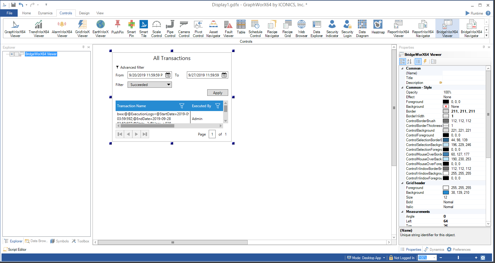
BridgeWorX64 Viewer Runtime
Putting a GraphWorX64 display containing a BridgeWorX64 Viewer control into Runtime mode allows for additional options, as shown below.
The BridgeWorX64 Viewer control can work in conjunction with the BridgeWorX64 Navigator control within the same GraphWorX64 display. In the example below, the BridgeWorX64 Navigator control can be seen in the right side of the display area.
BridgeWorX64 Viewer in Runtime Mode in GraphWorX64
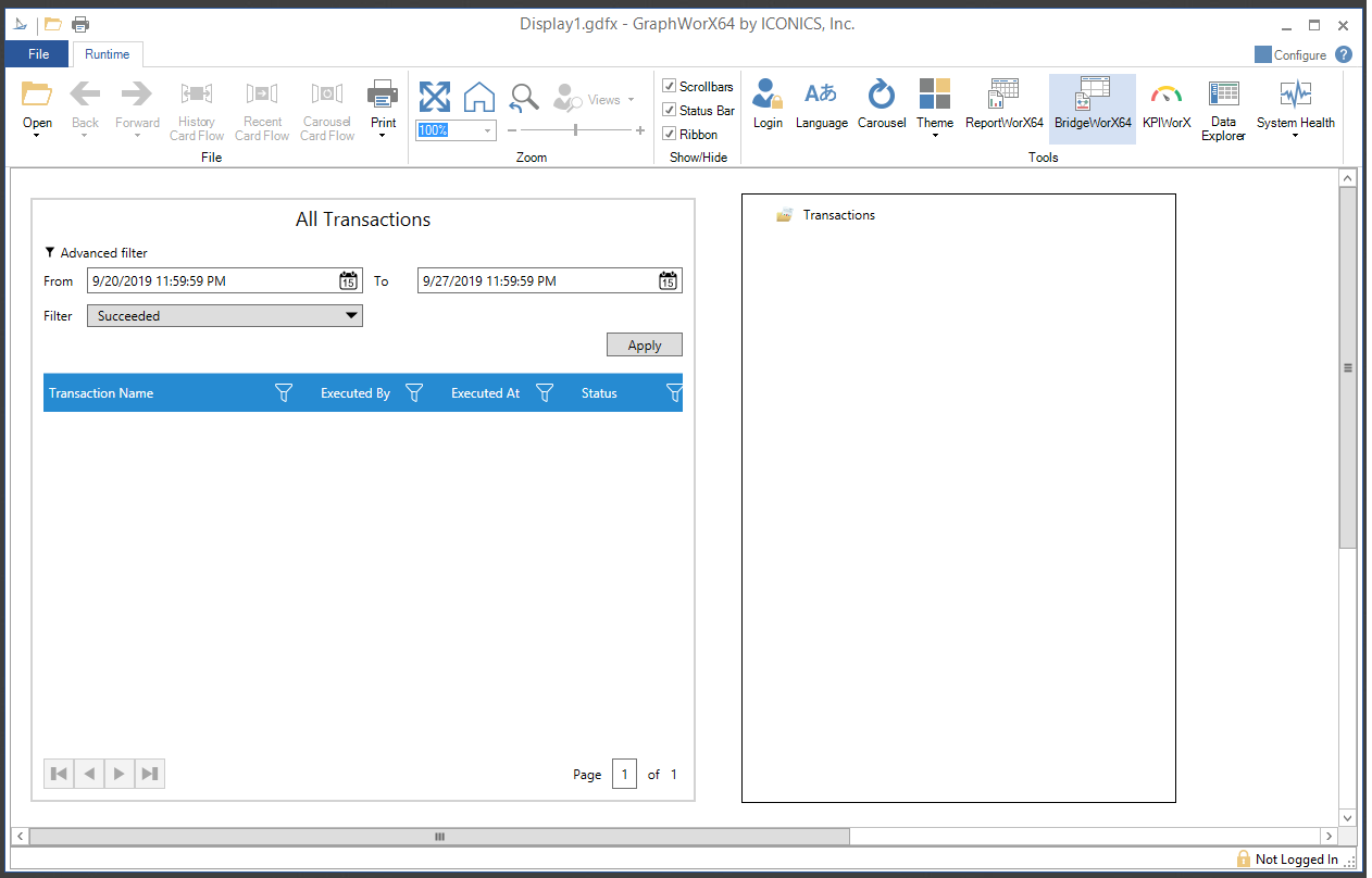
-
Advanced Filter - Click this link to show or hide the report selection criteria.
-
From - Enter a starting date (in the text entry field) for transactions or click on the
 button, which opens the date/time
picker tool and select your preferred date.
button, which opens the date/time
picker tool and select your preferred date. -
To - Enter an ending date (in the text entry field) for transaction or click on the
button, which opens the date/time picker tool and select your preferred
date. -
Filter - Use the pulldown menu to select from Standby, Running, Cancelled, Succeeded, Failed, Hibernating, or Awake.
-
Apply - Click this button to run your transaction search according yo the set selection criteria.
-
Drag columns here to enable grouping - When multiple items are listed in the bottom section of the viewer, you can drag columns to this area of the control to group by that column header.
For listed generated transactions, you can see information including Transaction Name, Executed By, Executed At and Status.
See Also: