Configuring Statistical Process Control Charts
You can add Statistical Process Control (SPC) charts to a GraphWorx display and subscribe them to SPC tags created in Data Historian. These tags aggregate raw process data into statistical summaries to monitor quality trends and trigger alarms. Learn more
Compatibility
SPC charts were significantly redesigned for GENESIS version 11. Displays created in previous version (10.97) should be compatible, but the old configuration of the charts is not available in version 11. No further enhancements or fixes to legacy configuration dialogs are planned.
Configuration
Previous versions of GENESIS used a configuration wizard in the GridWorX viewer (now Grid Viewer). This wizard is not supported in version 11. Instead, the charts are exposed as standalone chart controls.
The runtime control ribbon is not supported in version 11.
To configure an SPC chart:
-
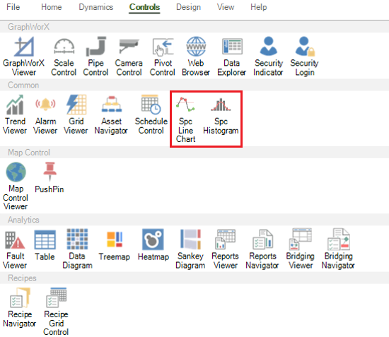
Open GraphWorX in the configuration mode (default). On the Controls ribbon, select Spc Line or Spc Histogram, and then drag the mouse diagonally across the canvas to make a rectangle for inserting the chart.
You can drop the desired number of SPC charts onto the GraphWorX canvas. Each chart has its own property grid; the properties of the selected chart are displayed in the right panel.
- Double-click inside the chart to open the configuration dialog.
-
On the General tab in Data Source, click
 to browse for a specific value of the desired SPC variable exposed in the Data Historian address space (such as Average, Range, or StdDev). You can connect each chart to a different SPC variable. The histogram chart is always connected to the Statistics value of the SPC variable (hda:\Configuration\%mySpcVariable\Stat).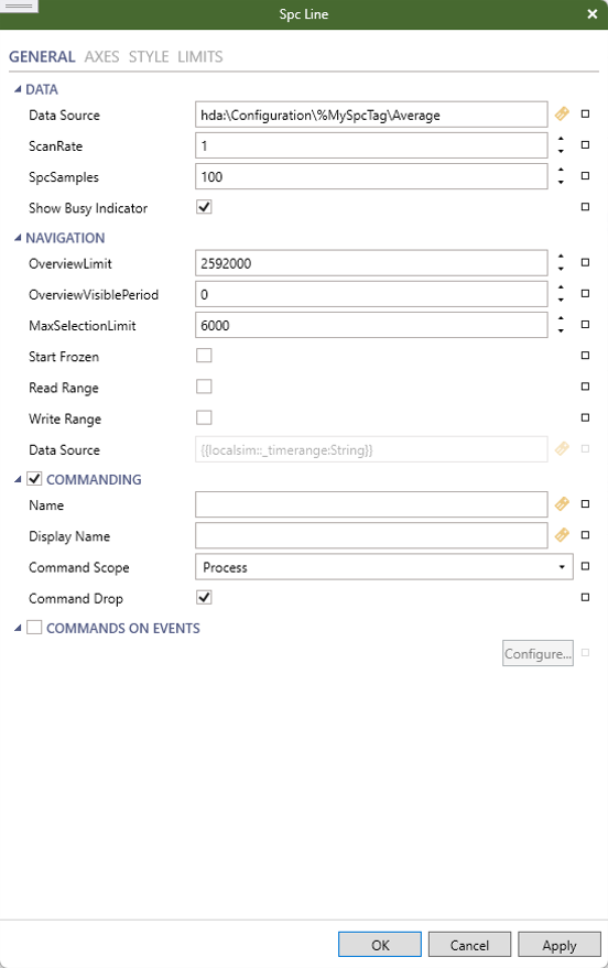
- In ScanRate, enter the time rate for logging new data (the default is 1 minute), and in SpcSamples, specify how many samples the chart will show.
-
Complete the settings in the Navigation section. Hover over each setting to view its description.
- OverviewLimit, OverviewVisiblePeriod, and MaxSelectionLimit configure the period of the chart overview and currently visible frame in seconds.
- Range Data Source, by default set to {{localsim::_timerange:String}}, is used to share the actual chart time range.
- When Read Range is selected, any changes to the shared range data source result in setting the current chart range to that value.
- When Write Range is selected, any changes to the range are automatically written to the shared range data source variable.
-
Selecting the Start Frozen checkbox freezes the chart immediately after switching to the runtime mode. Time range changes are visible only when the chart is frozen.
A frozen chart with the Write Range option enabled provides a small overview chart designed for navigation back and forth in time.
Read Range
Write Range
Overview in frozen state
0
0
Yes
For backward compatibility reasons, the default state also provides an overview chart in the frozen state.
0
1
Yes
1
0
No
1
1
Yes
- On the Axes tab, configure the commonly used properties for X and Y axes, such as thickness, color, or showing labels.
-
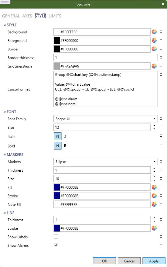
On the Style tab, configure the style of the remaining elements of the chart, such as background, foreground, border, or font. This tab also contains options to configure the chart line or bar style (color, thickness, label, or visibility).
-
On the Limits tab, configure formatting, visibility, and visual appearance of various control limit lines andareas, and then click OK to apply the settings and close the dialog.