Column Tab
Each grid configuration contains one or more columns. A column can contain multiple values. A column corresponds to the values or data points that you want to analyze in a grid. The columns that are defined for a configuration appear as child elements of the configuration in the tree control.
Column Tab
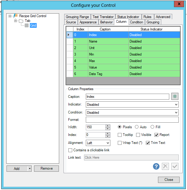
Column Properties
Selecting a row within the column view section in the top of the Column tab allows you to set the following items:
-
Caption - Enter a caption or click on the
 button to open the Data Browser and navigate to your selected data.
 -
Indicator - Use the pulldown menu to select from either Disabled, Access Level Translation or User Access Level Translation.
-
Condition - Use the pulldown menu to set the condition for the Status Indicator.
-
Format - Use the {0} placeholder for the original value when you want to format string values. Otherwise, you can use double or date time format. For additional info, see "Custom Date Time Formats" (https://msdn.microsoft.com/library/8kb3ddd4%28v=vs.110%29.aspx) or "Custom Numeric Formats" (https://msdn.microsoft.com/library/0c899ak8(v=vs.110).aspx).
-
Width - Enter a column width in the text entry field if you also select Pixels or Fill. If you select Auto, the column width will be set automatically.
-
Index - Enter the index in the text entry field.
-
Tooltip -
-
Visible -
-
Report -
-
Alignment -
-
Wrap Text -
-
Trim Text -
-
Contains a clickable link - Click this checkbox if the column will contain a clickable link. Once checked, you can then enter the link the in the Link text text entry field.
See Also: