Specification of each screen
“Process Automation Template Version1” consists of “Control Panel” screen, “Faceplate” screen and “Tuning” screen. The following scheme shows the layouts of each screen.
Screen images for Process Automation Template Version1
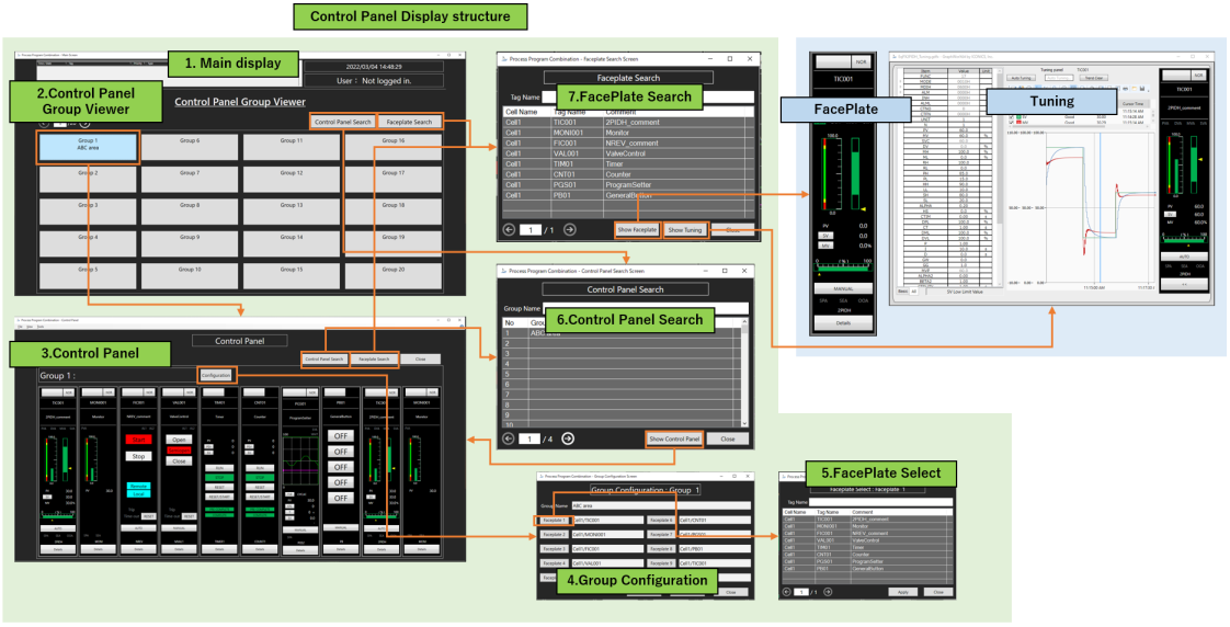
Control Panel
“Control panel” is a function that manages faceplates in groups and displays them side by side in each group.
Control Panel Specifications
|
No. |
Items |
File Format |
Contents |
|
1. |
Main display |
GDFX |
Main screen for displaying the Control Panel. [File Name] PpcControlPanelMain.gdfx |
|
2. |
Control Panel Group Viewer |
GDFX |
Display a list of groups in Control Panel. [File Name] PpcDisplayControlPanel.gdfx |
|
3. |
Control Panel |
GDFX |
Screen showing the faceplate of tags belonging to a group. [File Name] PpcControlPanel.gdfx |
|
4. |
Group Configuration |
GDFX |
Screen for group configurations. [File Name] PpcControlPanelGroupSetting.gdfx |
|
5. |
Face plate Select |
GDFX |
Screen for selecting a group to display in the Control Panel. [File Name] PpcSelectFaceplate.gdfx |
|
6. |
Control Panel Search |
GDFX |
Screen for searching groups. [File Name] PpcSearchControlPanel.gdfx |
|
7. |
Faceplate Search |
GDFX |
Screen for searching the faceplate of tag FB. [File Name] PpcSelectFaceplate.gdfx |
The following section shows the structure and layout of each screen.
Main display
“Main display” is used to display the Control Panel. The following diagram shows the screen image and configuration.
“Main display” layout
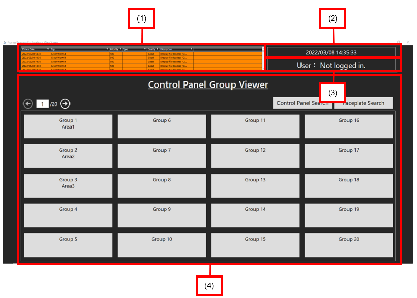
Main display configuration
|
No. |
Name |
Contents |
|
1. |
Alarm display |
Displays real-time alarms. |
|
2. |
Date and time display |
Displays current time. |
|
3. |
User display |
Displays the currently logged in user. If you are not logged in, "Not logged in" is displayed. |
|
4. |
Group Display |
Displays the group display screen. |
Control Panel Group Viewer screen
“Control Panel Group Viewer” screen is used to select groups to be displayed. The following shows the screen layout and configuration.
Control Panel Group Viewer layout
Control Panel Group Viewer configuration
|
No. |
Name |
Contents |
|
1. |
Back button |
Displays the previous page. |
|
2. |
Page number display area |
Shows the current page number and total number of pages. Moves to the page by directly entering the number of the page currently displayed and pressing “Enter”. |
|
3. |
Forward button |
Displays the next page. |
|
4. |
Control Panel Search button |
Displays the “Control Panel Search” screen. |
|
5. |
Faceplate search button |
Displays the “Faceplate Search” screen. |
|
6. |
Group buttons |
Displays the “Control Panel” screen. |
Control Panel screen
The Faceplate screen of the Process Automation template is displayed side by side. It enables the display to show up to 10 faceplates per group.
Control Panel screen
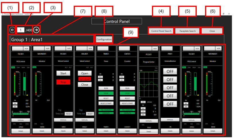
Control Panel Screen configuration
|
No. |
Name |
Contents |
|
1. |
Back button |
Displays the previous page. |
|
2. |
Page number display area |
Shows the current page number and total number of pages. Moves the page by directly entering the number of the page currently displayed and pressing “Enter”. |
|
3. |
Forward button |
Displays the next page. |
|
4. |
Control Panel Search button |
Displays the “Control Panel Search” screen. |
|
5. |
Face plate search button |
Displays the “Faceplate Search” screen. |
|
6. |
Close button |
Closes the “Control Panel” screen. |
|
7. |
Group Name display |
Displays the group name. |
|
8. |
Configure button |
Displays the “Group Configuration” screen. |
|
9. |
Faceplate screen display |
Displays the “Faceplate” screen. |
Group Configuration screen
This screen is used to register the faceplate for the target group.
Group Configuration screen layout
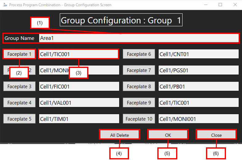
Specifications of Group Configuration screen
|
No. |
Name |
Contents |
|
1. |
Group name input area |
Types the group name by pressing “Enter”. The following one-byte symbols cannot be used: * % [ ] ‘ , |
|
2. |
Face plate buttons |
Display the “Faceplate Select” screen. |
|
3. |
Faceplate Input Area |
Types the “Cell Name/Tag FB” name by pressing “Enter”. |
|
4. |
All Delete button |
Deletes all faceplate input contents. |
|
5. |
OK button |
Saves the Group configurations. |
|
6. |
Close button |
Closes the “Group Configuration” screen. |
Faceplate Select screen
This screen allows you to select and register the faceplate you want to register in the group from the Tag FB list.
Faceplate Select screen layout
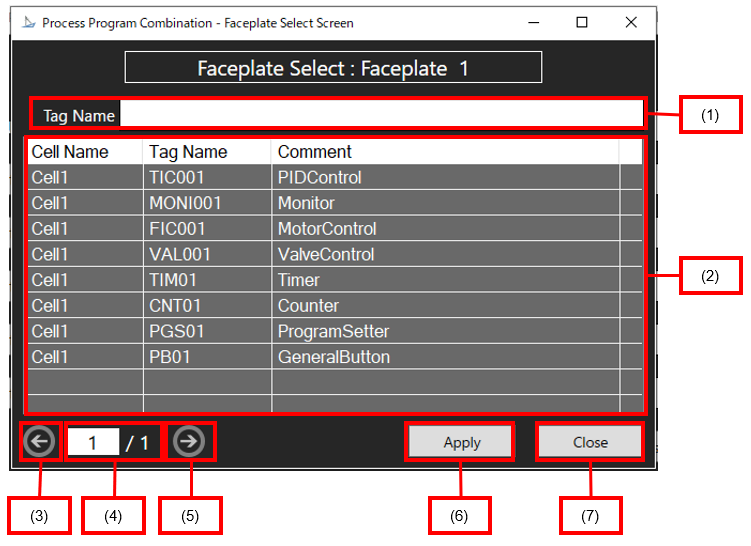
Faceplate Select screen specifications
No. | Name | Contents |
1. | Tag name input area | Types the tag name by pressing “Enter”. The tag whose name contains the input value is displayed in the tag list. The following one-byte symbols cannot be used: * % [ ] ‘ , |
2. | Tag list | Displays the tags stored in the FacePlateList.csv. |
3. | Back button | Displays the previous page. |
4. | Page number display area | Shows the current page number and total number of pages. Moves the page by directly entering the number of the page currently displayed and pressing “Enter”. |
5. | Forward button | Displays the next page. |
6. | Apply button | Applies the selected tag to the “Group Configuration” screen. |
7. | Close button | Closes the “Faceplate Select” screen. |
Control Panel Search screen
This screen is used to search for groups in the “Control Panel”.
Control Panel Search screen layout
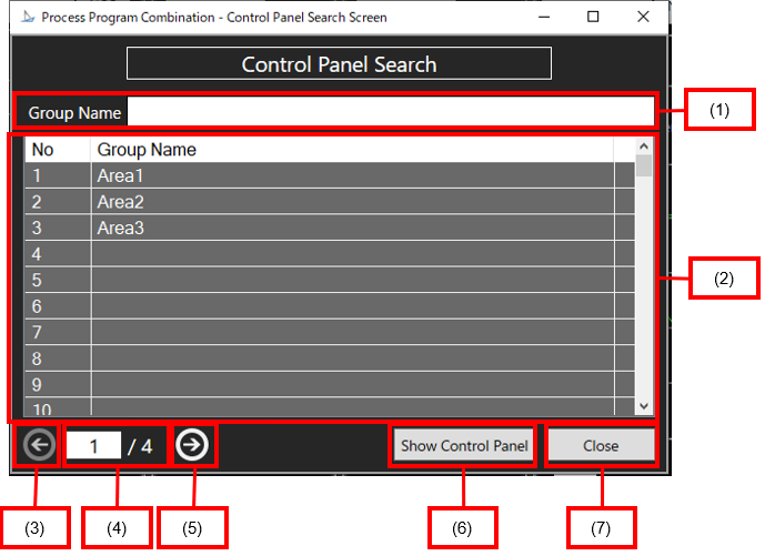
Specifications of the Control Panel Search screen
No. | Name | Contents |
1. | Group name input area | Displays the group name whose name contains the entered value in the group list by entering a group name and pressing “Enter”. The following one-byte symbols cannot be used: * % [ ] ‘ , |
2. | Group list | Displays the registered groups. |
3. | Back button | Displays the previous page. |
4. | Page number display area | Shows the number of the currently displayed page and the total number of pages (fixed at 4). Moves the page by directly entering the number of the page currently displayed and pressing “Enter”. |
5. | Forward button | Displays the next page. |
6. | Show Control Panel buttons | Displays the “Control Panel” screen for the selected group. |
7. | Close button | Closes the “Control Panel Search” screen. |
Faceplate Search screen
This screen is used to search for faceplates.
Faceplate Search screen layout
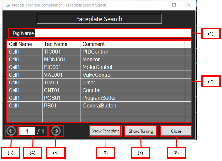
Faceplate Search Screen specifications
No. | Name | Contents |
1. | Tag name input area | Types the tag name by pressing “Enter”. The tag whose name contains the input value is displayed in the tag list. The following one-byte symbols cannot be used: * % [ ] ‘ , |
2. | Tag list | Displays the tags stored in the “Face Plate List”. |
3. | Back button | Displays the previous page. |
4. | Page number display area | Shows the current page number and total number of pages. Moves the page by directly entering the number of the page currently displayed and pressing “Enter”. |
5. | Forward button | Displays the next page. |
6. | Show Faceplate button | Displays the “Face Plate” screen of the selected tag FB. |
7. | Show Tuning button | Displays the “Tuning” screen for the selected tag FB. |
8. | Close button | Closes the “Control Panel Search” screen. |
Faceplate and Tuning screen
Faceplate
“Faceplate” (meter window) screen is a type of screen that displays the contents of the tag data of the tag FB in the form of a modulator.
When accessing the tag data, you can monitor the status of the corresponding process and set the conditions.
Faceplates allow you to manipulate the values of each tag data item within the display.
For details of the tag FB, please see the “MELSEC iQ-R Programming Manual (Process Control Function Blocks/Instructions)".
The basic specifications of the faceplate follow those of PX Developer Version1. For detailed specification, please see the “PX Developer Version1 Operating Manual” (Monitor Tools).
Loop Tag Faceplate
A typical example of a loop tag is shown below. It shows a faceplate with a tag type of 2PIDH.
Loop Tag (2PIDH) Faceplate Screen
_Faceplate_Screen.png)
Screen Specifications for Loop Tag (2PIDH) Faceplate
No. | Items | Contents |
(1) | Tag button | Displays the tag name. When the tag is on, you cannot use other buttons except for the “tag” button and the “detail” button. |
(2) | I/O mode button | Displays the current I/O mode. Displays the Change I/O Mode window by pressing this button. The connection status with the I/O unit of the PLC during operation can be changed. The I/O mode can be changed only when the control mode is MANUAL mode. The following four I/O modes are available:
This is the normal mode connected to the I/O unit.
In this mode, simulation operations are performed separately from I/O units.
In this mode, only the signal from the input/output unit is cut off and the output is not cut off in case of sensor failure. Input data (PV value) can be set from the screen.
This mode does not perform any tag processing. Stops input processing and loops control operation. |
(3) | Tag name display area | Displays the tag name. |
(4) | Tag comment display area | Displays the tag comments defined in “Language Aliasing”. |
(5) | Alarm display area (top) | The tag alarm is displayed. The following types of tag alarms can be displayed.
PV related alarms.
DV related alarms.
MV related alarm.
SV related alarm. |
(6) | PV value bar display area | Displays the current PV value in a bar format. The graph is displayed in the range from PV engineering value, the upper limit to PV engineering value increases/decreases. If PV upper limit alarm value, PV upper limit alarm value, PV lower limit alarm value or PV lower limit alarm value is set, the alarm bar is displayed. |
(7) | SV value bar display area | The area from the upper SV value to the lower SV value is indicated by a green bar, and the current SV value is indicated by a yellow indicator. |
(8) | PV value setting/display area | Displays the current PV value as a number. The PV button is active only when the I/O mode is “OVERRIDE” mode. Displays the PV value setting dialog by pressing the button. |
(9) | SV value setting/display area | The current SV value is displayed numerically. Displays the “SV Value Setting” dialog box is displayed by pressing the button |
(10) | MV value setting/display area | The current MV value is displayed numerically. (unit: %) Shows the MV value setting dialog box by pressing the button. |
(11) | MV value bar display area | The area from the MV upper limit to the MV lower limit is indicated by a green bar, and the current MV value is indicated by a yellow indicator. |
(12) | Control mode change button | Displays the current control mode. The “Control Mode Change” dialog box is displayed by pressing the button. The following six control modes are available:
This mode performs a manual operation. Outputs the MV setting.
This mode performs an automatic operation. Controls the MV value based on the SV set value.
This mode performs a cascade operation. Controls the output value (MV) of the upper loop as a set value (SV).
This mode enables a manual operation from the host computer. It outputs the MV settings from the host computer.
This mode performs an automatic operation from the host computer. The MV value is controlled by the host computer based on the SV set value.
This mode directly outputs the output value of the primary loop as the output value of the secondary loop during cascade connection. If the I/O mode is “OVERRIDE” mode, the control mode cannot be changed from “MANUAL” mode to any other control mode. |
(13) | Alarm display area (bottom) | The tag alarm is displayed. The following types of tag alarms are displayed:
Stop alarm You can reset SPA by pressing the SPA button.
Alarm for sensor failure or heater failure.
Output open alarm Turns ON when output disconnection is detected by the user program. |
(14) | Tag Type Display Area | Displays the tag type. |
(15) | Advanced button | Displays the current monitoring status. |
Loop Tag Tuning screen
Displays the “Tuning” screen in the pop-up window format.
Loop Tag (2PIDH) Tuning screen
_Tuning_Screen.png)
Loop Tag (2PIDH) Tuning screen specifications
No. | Items | Contents |
(1) | Graph Display check box | Sets the display of the graph. Checked: displaying Unchecked: hide |
(2) | Graph Switch Tab | Presses the tab to switch the graph display. Realtime: Displays real-time trend graphs. Historical: Displays a graph of historical data. |
(3) | Auto tuning button | Performs auto tuning. |
(4) | Auto tuning execution status | The display color changes when auto tuning is in progress. |
(5) | Trend Clear Button | Clears the current trend graph. |
(6) | Cursor position data | Indicates the data at the cursor position in the tuning trend graph. |
(7) | Tuning trend cursor position | By moving the cursor position, you can display the data at any time on the tuning trend graph. |
(8) | Tag Monitor Display Toggle Tab | Toggles the “Tag Monitor” display items. Basic: Displays only the tag data items (PV, MV, SV, PID constant, upper and lower alarm values, etc.) that you monitor and set frequently. All: Displays all tag data items. |
(9) | Tag Monitor | Displays the value of the tag data item. For word items that can be displayed for each bit item, a-> mark is displayed on the left of the item to display a hierarchical structure. You can change the value of a tag data item by entering a value in the grid. The tag data items that can be changed and the tag data items that cannot be changed can be determined by the character color displayed in the Data column. Modifiable data: Black Unmodifiable data: Gray Only users who have permission to change tag data items can change data. Note that data cannot be changed when tags are applied. |
(10) | Tag data item detail name | Displays the detailed name of the item on the line selected in “Tag Monitor”. |
(11) | Tuning trend graph | The PV, SV, and MV values are displayed graphically. |
(12) | Faceplate | Display the faceplate. |
Status Tag Faceplate
A typical example of a status tag is shown below for a faceplate with a tag type of NREV.
Status Tag (NREV) Faceplate screen
_Faceplate_screen.png)
Faceplate screen specifications for Status Tag (NREV)
No. | Items | Contents |
(1) | Tag button | Displays the tag name. When the tag is on, you cannot use other buttons except for the tag button and the detail button. |
(2) | I/O mode button | Displays the current “I/O” mode. Displays the Change I/O Mode window. The connection status with the “I/O” unit of the PLC during operation can be changed. The “I/O” mode can be changed only when the Control mode is “MANUAL” mode. The following four I/O modes are available: · NORMAL(NOR) This is the normal mode connected to the I/O unit. · SIMULATION(SIM) In this mode, simulation operations are performed separately from I/O units. · OVERRIDE(OVR) In this mode, only the signal from the input/output unit is cut off and the output is not cut off in case of sensor failure. Input data (PV value) can be set from the screen. |
(3) | Tag name display area | Displays the tag name. |
(4) | Tag comment display area | Displays the tag comments defined in “Language Aliasing”. |
(5) | Alarm display area | The tag alarm is displayed. The following types of tag alarms are displayed: · AL1 It is an alarm related to traffic jam. Turns ON when a timeout occurs. · AL2 Trip-related alarms. Turns ON when overcurrent or overload trip occur. |
(6) | Start button | Starts the motor. |
(7) | Stop button | Stops the motor. |
(8) | Center/Field Area | Displays the center (REMOTE) and field (LOCAL) conditions. |
(9) | Trip display area | Lights up if the device is tripped due to an overload. |
(10) | Congestion area | Lights up when the device times out. |
(11) | Reset button | Resets the congestion state. |
(12) | Control mode change button | Displays the current control mode. Displays the “Control Mode Change” dialog box. The control modes are the following: · MANUAL (MAN) Status operations: Yes · AUTO (AUT) Status operations: No |
(13) | Tag Type Display Area | Displays the tag type. |
(14) | Details button | Displays the current monitoring status. |
Status Tag Tuning screen
It displays the Tuning screen in a pop-up window format.
Status Tag (NREV) Tuning Screen
_Tuning_screen.png)
Status Tag (NREV) Tuning Screen Specifications
No. | Items | Contents |
(1) | Tag monitor | Displays the value of the tag data item. For word items that can be displayed for each bit item, > mark is displayed on the left of the item to display a hierarchical structure. You can change the value of a tag data item by entering a value in the grid. The tag data items that can be changed and the tag data items that cannot be changed can be determined by the character color displayed in the “Data” column. Modifiable data: Black Unmodifiable data: Gray Only users who have the permission to change tag data items can change the data. Note that the data cannot be changed when tags are applied. |
(2) | Tag data item detail name | Displays the detailed name of the item on the line selected in “Tag Monitor”. |
(3) | Faceplate | Displays the faceplate. |
See Also: