Working with Charts
Charts are the most powerful way to display data in KPIWorX. All charts can be sorted and filtered when using data from AnalytiX-BI.
For more information about sorting, filtering, and aggregating charts with AnalytiX-BI data, see On-the-Fly Filtering and Aggregation with AnalytiX-BI.
To configure other types of components, see Working with Other Components.
Types of Charts
KPIWorX provides multiple chart types:
-
Categorical
 - Categorical charts display one or more series of data
on an X/Y plot. They can display series in various types such as bar,
line, or area. The categorical chart has some additional configuration
beyond that of other charts - see Using
the categorical chart for details specific to this chart.
- Categorical charts display one or more series of data
on an X/Y plot. They can display series in various types such as bar,
line, or area. The categorical chart has some additional configuration
beyond that of other charts - see Using
the categorical chart for details specific to this chart. -
Donut
 - A donut chart is a variation of a pie chart
with a space in the middle.
- A donut chart is a variation of a pie chart
with a space in the middle. -
Pie
 -
A pie chart displays a single series of data, and is best suited for
visualizing the relative percentage of each slice to the whole.
-
A pie chart displays a single series of data, and is best suited for
visualizing the relative percentage of each slice to the whole. -
Treemap
 -
Treemaps display data as a series of progressively smaller rectangles.
-
Treemaps display data as a series of progressively smaller rectangles. -
Data Diagram
 - Data diagrams are designed to visually
provide a table of numbers, the value of each number defining the
shade in that particular cell. One use case of a data diagram is to
display energy usage in a room by days of the week across one axis
and hours of the day across another.
- Data diagrams are designed to visually
provide a table of numbers, the value of each number defining the
shade in that particular cell. One use case of a data diagram is to
display energy usage in a room by days of the week across one axis
and hours of the day across another. -
Funnel
 -
Funnel charts are often used to display stages in a process, usually
showing what percentage of the whole has reached each stage.
-
Funnel charts are often used to display stages in a process, usually
showing what percentage of the whole has reached each stage. -
Sankey
 - Sankey diagrams help illustrate flow between different sources and
destinations.
- Sankey diagrams help illustrate flow between different sources and
destinations.
Mapping Data
As described in Add and Modify Widgets and Use the Data Browser, charts can be mapped to data by simply dragging tags from the Data Browser onto the chart or onto the appropriate data field in Widget Settings.
To remove a mapping from any field, go to Widget Settings and select the X next to that mapping.
You can move data from one field to another by using the
drag handle  next to the field in Widget Settings.
If you have mapped data from AnalytiX-BI, you can use the dropdown arrow next to a series to set or change its aggregate.
Note: Not all data can be aggregated in all positions. For example, you cannot aggregate data in the Category (X-axis) field of a categorical chart.
Change Chart Appearance and Other Properties
In the Appearance section of Widget Settings you can select a Palette of colors to be used to draw chart elements, such as pie slices or treemap squares.
Note: Changing the palette will override the colors of individual series for the categorical chart.
Note: At this time you cannot create custom color palettes.
The Format field sets the format for data labels.
The Labels option toggles the appearance of data labels. For the categorical chart, this option appears under the individual series.
The Legend section allows you to toggle whether the legend appears, and set its Position.
Using the Categorical Chart
Working with Multiple Series
The categorical chart can accept more than one series of
data. To map additional series, drag additional tags onto the widget or
the Value (Y-axis) field. If dragged
onto the widget, the newly dragged series will appear at the bottom of
the list. You can determine the order by dragging the series into the
appropriate spot in Widget Settings,
or reordering it after the fact using the drag
handle .
To remove a series, select the X next to the series in the Value (Y-axis) section.
Change Chart Type (bar, line, area, etc.)
The type (such as bar, line, or area) of a chart is not actually a property of the chart itself. Multiple types can be combined into one chart, so the type is a property of the series. See the next section for information on how to change the series type.
Change Series Title, Type, or Appearance
Select your chart, go to Widget Settings, to Series, then select the series you would like to change. The different properties you can change are:
-
Title - The title appears in the legend (if visible) and in the Series section of Widget Settings.
-
CombineMode and StackGroupKey - SeeCombining, stacking, or clustering series below.
-
VerticalAxis - The axis that this series is tied to. See Configuring multiple axes below.
-
Appearance section
-
-
Fill and Stroke - The colors used in the bar, line, or area for this series. Not all types use both colors. For example, a line series does not use the Fill attribute. However, both of these colors are used in the legend regardless of series type, each coloring half of the circle.
-
Thickness - The thickness of the line for a line series, or the outline of bars or areas. Note: If you are using a line chart and wish the line to be visible, make sure this value is greater than zero.
-
Visibility - If you would like to keep a series as part of your chart but not have it immediately visible, you can toggle Visibility to off. Invisible series do not appear on the chart, but appear faded in the legend.
-
Labels - Toggles the presence of data labels.
-
Type - Sets the plot type. See Plot Types.
-
-
Markers section - This section determines the settings of markers for line-type (and similar) series. Not all types have markers, for example, bar series ignore this entire section.
-
-
Fill and Stroke - The colors used in the markers. These colors do not affect the legend.
-
Thickness - The thickness of the marker outline.
-
Size - The size of the marker.
-
Type - The shape of the marker. Set to None to remove markers altogether.
-
Combining, Stacking, or Clustering Series
Certaintypes of series, such as bar or area, can be combined in different ways.
-
-
None - No particular combination method. Bars or lines will be drawn overlapping each other.
-
Cluster - Series will be drawn next to each other.
-
Stack - Series will be stacked on top of each other.
-
Stack100 - Series will be stacked on top of each other and scaled so that the total area will take up the entirety of the Y axis.
-
When series are set as Stack or Stack100, there can be multiple stack groups. Enter the same string in the StackGroupKey field for all series you would like to be in that stack group. The exact string used as a key does not matter, but series with the same key will be grouped.
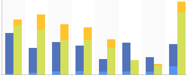
For example, the following figure illustrates four separate series, all set with a CombineMode of Stack. Two series have a StackGroupKey of One and the other two have a StackGroupKey of Two.
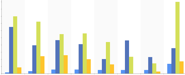
The figure below is the same four series, except all set with a CombineMode of Cluster.
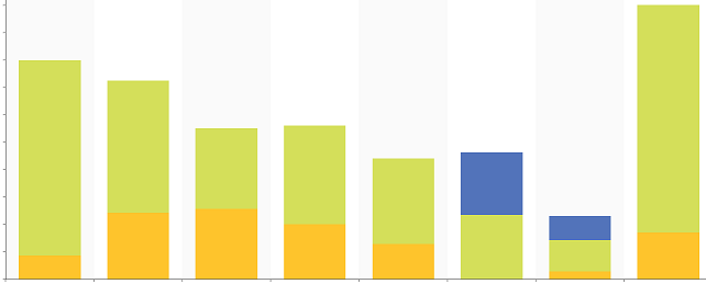
The figure below is the same four series, except all set with a CombineMode of None. As you can see, some series are obscured entirely with this CombineMode because they are behind the other series. You can change the Z-order by reordering the series in the Value (Y-axis) list. You can also hide series to expose the ones behind by selecting their legend entry in presentation mode or toggling Visibility on the series properties in edit mode.
Configuring Multiple Axes
If you would like to plot different types of data on the categorical chart, you can add additional axes.
To do this, select your categorical chart widget, go to
Widget Settings, then to the Vertical Axes section. Hit the + button at the bottom to add a
second axis. To change the order of the axes, select the edit button, then use the up and down arrows. Use the -
button here to delete axes.
button, then use the up and down arrows. Use the -
button here to delete axes.
To rename an axes or make other changes to it, make sure the edit button is not selected, then select an axis. From this page you can add a title and edit other settings, such as the visibility, color, and range. You can also change the side on which the axis is displayed by toggling the AlternativePlacement setting.
Once you have your axis created you need to assign a series to it. Go back to the main Widget Settings page for your chart, go to the Series section and select a series. For the VerticalAxis setting, choose your axis.
See Also: