Smart Tiles
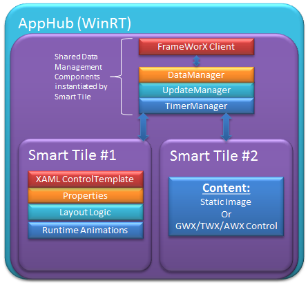
Smart Tiles are useful, at-a-glance graphic visualization tools that provide real-time information similar to Live Tile technology found in Microsoft Windows 8, Windows RT, and Windows Phone operating systems. The difference is that ICONICS Smart Tiles, created through the Smart Tile control in GraphWorX64, are applicable within HMI screens, whether those are PC-based or for mobile devices (phones, tablets, etc.).
Smart Tile Features Include:
-
Shows Live Process Values
-
Use in GraphWorX64 and the Mobile-based AppHub - In GraphWorX64, Smart Tiles use/share GraphWorX64’s existing data management components to get runtime data and handle updates. In the AppHub, Smart Tiles instantiate their own shared data management components. The data management components are disposed when all instantiated smart tiles are unloaded or disposed.
-
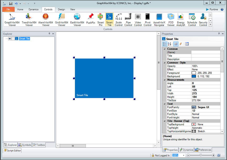
Open a new display in GraphWorX64, then select the Smart Tile control from the 'Controls' ribbon, as shown below.
-
A default Smart Tile shape will appear in the GraphWorX64 canvas. Configuration can be done either through GraphWorX64's Properties grid or by double-clicking the Smart Tile to access the popup Smart Tile Configuration dialog, shown below. The Smart Tile Configuration dialog has several tabs, including:

-
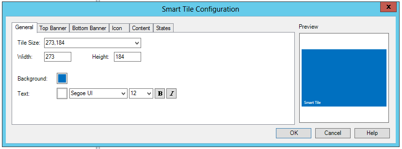
In the General tab of the Smart Tile Configuration dialog (shown below), you can set the following parameters:
-
Tile Size - A Smart Tile can be any width or height. The pulldown is populated with preset 'standard' sizes including Windows 8: Square (150x150), Windows 8: Wide (310x150), Windows Phone 8: Small (159x159), Windows Phone 8: Medium (336x336), Windows Phone 8 Wide (691x336).
-
Width - If not using a standard size from the pulldown menu, you can enter your selected width (in pixels). Once you add numbers in the Width and Height fields, they will appear in the Tile Size pulldown field in order to confirm your selected Smart Tile Size.
-
Height - If not using a standard size from the pulldown menu, you can enter your selected height (in pixels).
-
Background - Clicking on the colored square to the right of the Background setting opens a secondary Color dialog box, as shown below. The Color dialog contains three tabs: Solid Color, Gradient and Image, described below.
-
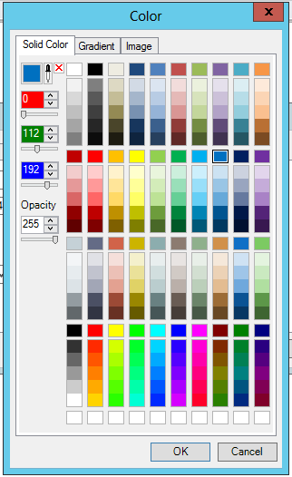
Solid Color tab - The Solid Color tab (shown above) allows you to select a color from one of the shown boxes. You can also click on the colored box in the top left corner to open a Colors dialog (itself containing two tabs: Standard or Custom; both providing alternate means of color selection). You can also use the eyedropper tool (to the right of the color box) that allows you to click on any on-screen item in order to copy its color. Alternatively, you can enter the color ranges (RGB) by number in the provided text entry fields (or via the up/down arrows to the right or via the slider beneath). An Opacity setting is also provided.
-
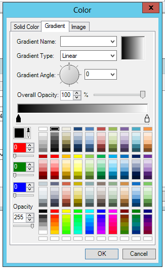
Gradient tab - The Gradient tab (shown below) allows you to pick a gradient fill for the Smart Tile. You can use the Gradient Name pulldown to select from a number of gradient versions. The Gradient Type allows you to make the gradient either Linear or Radial. The Gradient Angle tool allows you to set an angle via the dial or via the pulldown menu (with pre-set angles [0, 45,90, 135, 180, 225, 270, 315]). You can also set the gradient's Overall Opacity using the text entry field or up/down arrows or the slider tool. The gradient can be even further fine-tuned by moving the upward-pointing arrows within the color bar. Beneath the color bar are the same tools described in the Solid Color tab bullet above.
-
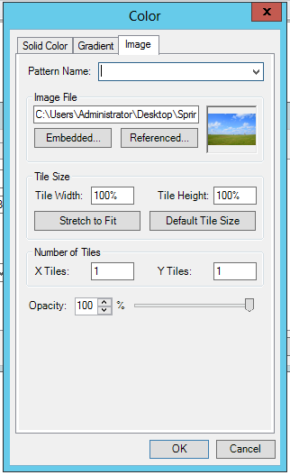
Image tab - The Image tab (shown below) allows you to insert either a patterned tile (via the Pattern Name pulldown box) or an Image File. The image file can be either Embedded (saved as part of the Smart Tile file size) or Referenced (pointed to via a network-accessible location). A preview will appear in the box to the right. The Tile Size section does not refer to the Smart Tile itself but to the Pattern or Image File size. You can set the Tile Width or Tile Height (by percentage), Stretch to Fit, set the Default Tile Size. You can set the number of patterned or image tiles that will appear within the Smart Tile. The X Tiles text entry field determines how many appear horizontally, and the Y Tiles sets how many appear vertically. You can also set the pattern tile's or image tile's Opacity using the text entry field, the up/down arrows or the slider.
-
Text - Clicking on the colored square to the right of the Background setting opens a secondary Color dialog, similar to the one described in the Background bullet above. The same properties can be set to the text as to the background, including solid colors, gradients or even patterned tiles/images. The pulldown menus allow you to select a font and a font size. You also have the option of setting a bold or italics style to the text.
-
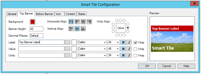
In the Top Banner tab of the Smart Tile Configuration dialog (shown below), you can set the following parameters:
-
Background - Clicking on the colored square to the right of the Background setting opens a secondary Color dialog. See the Color Dialog Box description for more details. This sets the background options for the Top Banner only.
-
Banner Height - Sets the height of the top banner.
-
Decimal Places - Sets the number of digits to display to the right of the decimal point in the top banner.
-
Horizontal Align - Sets the horizontal alignment of the label and value text in the top banner (stretch, left, center, or right).
-
Vertical Align - Sets the vertical alignment of the label and value text in the top banner (top, center, or bottom).
-
Units Align - Sets the position of the units text (relative to the value text) in the top banner.
-
Label - Sets the text of the label in the top banner. Clicking on the ellipsis button [...] opens the Data Browser, allowing you to browse for a data point that will provide the label name automatically. Clicking on the colored square to the right of the ellipsis opens the Color Dialog Box. This sets the background options for the text within the top banner only. You can then set the font, font size, style (bold/italics) and text wrapping option (the default is no text wrapping).
-
Value - Sets the data source of the value in the top banner. You can type directly into the text entry field or use the ellipsis button [...] to access the Data Browser.
-
Units - Sets the text of the units in the top banner. You can type directly into the text entry field or use the ellipsis button [...] to access the Data Browser.
-
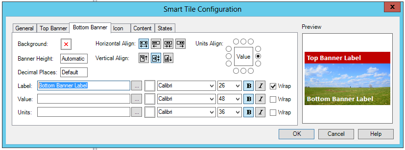
In the Bottom Banner tab of the Smart Tile Configuration dialog (shown below), you can set the following parameters:
-
Background - Clicking on the colored square to the right of the Background setting opens a secondary Color dialog. See the Color Dialog Box description for more details. This sets the background options for the Bottom Banner only.
-
Banner Height - Sets the height of the bottom banner.
-
Decimal Places - Sets the number of digits to display to the right of the decimal point in the bottom banner. Default = (regional settings (ex. EN-US: 2 for floats, 0 for integers)). For more complex formatting, use expression in TopValue (toformat())
-
Horizontal Align - Sets the horizontal alignment of the label and value text in the bottom banner (stretch, left, center, or right).
-
Vertical Align - Sets the vertical alignment of the label and value text in the bottom banner (top, center, or bottom).
-
Units Align - Sets the position of the units text (relative to the value text) in the bottom banner.
-
Label - Sets the text of the label in the bottom banner. Clicking on the ellipsis button [...] opens the Data Browser, allowing you to browse for a data point that will provide the label name automatically. Clicking on the colored square to the right of the ellipsis opens the Color Dialog Box. This sets the background options for the text within the bottom banner only. You can then set the font, font size, style (bold/italics) and text wrapping option (the default is no text wrapping).
-
Value - Sets the data source of the value in the bottom banner. You can type directly into the text entry field or use the ellipsis button [...] to access the Data Browser.
-
Units - Sets the text of the units in the bottom banner. You can type directly into the text entry field or use the ellipsis button [...] to access the Data Browser.
-
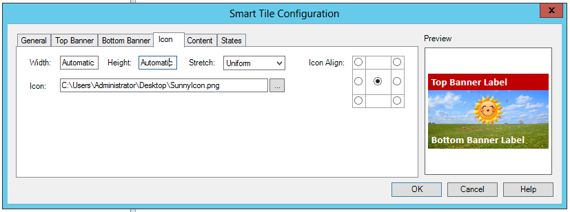
In the Icon tab of the Smart Tile Configuration dialog (shown below), you can set the following parameters:
-
Width - Sets the width of the icon within the Smart Tile.
-
Height - Sets the height of the icon within the Smart Tile.
-
Stretch - Sets how (or whether or not) to stretch the icon within the Smart Tile (None, Uniform, Fill).
-
Icon Align - Defines the position of the icon within the Smart Tile.
-
Icon - You can enter an icon location within the text entry field or use the ellipsis button [...] to access the location of either 'Embedded Images...' or 'Referenced Images...'.
-
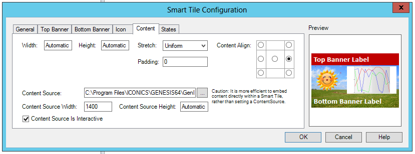
In the Content tab of the Smart Tile Configuration dialog (shown below), you can set the following parameters:
-
Width - Sets the width of the content within the Smart Tile.
-
Height - Sets the height of the content within the Smart Tile.
-
Stretch - Sets how (or whether or not) to stretch the content within the Smart Tile (None, Uniform, Fill).
-
Padding - Sets the amount of extra space surrounding the content of this tile. The content padding value is relative to the actual (unscaled) size of the content. The padding will scale with the content if ContentStretch is set to Uniform or Fill. The padding value can be a single number for equal padding on all four sides, or four comma-separated numbers to individually specify padding for left, top, right, and bottom.
-
Content Align - Defines the position of the content within the Smart Tile.
-
Content Source - Defines a uniform resource identifier (uri) that provides the content for the Smart Tile. The uri can point to an image file (.png, .jpg, etc.) or a configuration file for graphics, trends, or alarms (.gdfx, .twwx, .awwx). NOTE: It is more efficient to embed content directly within a Smart Tile, rather than setting a Content Source. You can either enter a location into the text entry field or navigate to a source by clicking on the ellipsis [...] button (and accessing the file explorer). When a Content Source is specified, the Smart Tile checks the file extension of the uri, instantiates the appropriate control for that extension, and then instructs that control to load the uri.
-
Content Source Width - Sets the width of the content element loaded by the Content Source.
-
Content Source Height - Sets the height of the content element loaded by the Content Source.
-
Content Source Is Interactive - Click the checkbox if the content element loaded by the Content Source is to be user-interactive. Clear the checkbox if the content is meant to be View Only. For Smart Tiles configured in GraphWorX64/viewed through traditional runtime, on Click/Touch, the user will be able to use a pick dynamic on the tile. For Smart Tiles accessible via the AppHub, the user will be able to configure any “Commanding” command.
-
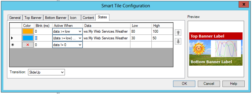
In the States tab of the Smart Tile Configuration dialog (shown below), you can set the following parameters:
-
Color - Sets the tile background color for the state. Click on the color square to access the Color Dialog Box.
-
Blink (ms) - Sets the blink rate (in milliseconds) for the background color of the state when the state is active (zero for no blink). If no data sources are configured for the state, the blink rate acts as a duration for showing this specific state in sequence with other states in this Smart Tile. This can be used to produce a "slideshow" effect, where each state is visible for the specified duration.
-
Active When - Type of comparison for ConditionDataSource and LowValue/HighValue (or zero) to determine when the state should be active.
-
Data - The condition for the state. When the data source resolves to true, the state will be considered "active". The list of states is a prioritized sequential list. "True" items later in the list override true items that are earlier in the list.
-
Low - Sets the low value for the state. Optionally used with StateActiveWhen and ConditionDataSource to determine when the state should be active.
-
High - Sets the high value for the state. Optionally used with StateActiveWhen and ConditionDataSource to determine when the state should be active.
-
Transition - Defines the animation used when transitioning from one background state to another. Choices include None, Fade, SlideUp and SlideDown.
-
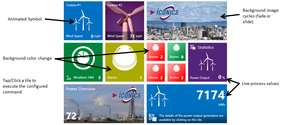
Click OK to save your changes. Your configured Smart Tile will now be added to your GraphWorX64 display canvas. The following image shows several Smart Tiles in runtime.