GraphWorX64 Viewer Properties

The viewer can be used inside the Workbench application, or you can drop a GraphWorX64 Viewer control onto a GraphWorX64 design surface. A GraphWorX64 Viewer can be placed into a GraphWorX64 display, which means you can create a standalone viewer, then use it in any number of GraphWorX64 displays. Note that there are some small differences in how the displays are configured and run in either the Workbench or in the GraphWorX64 standalone application.
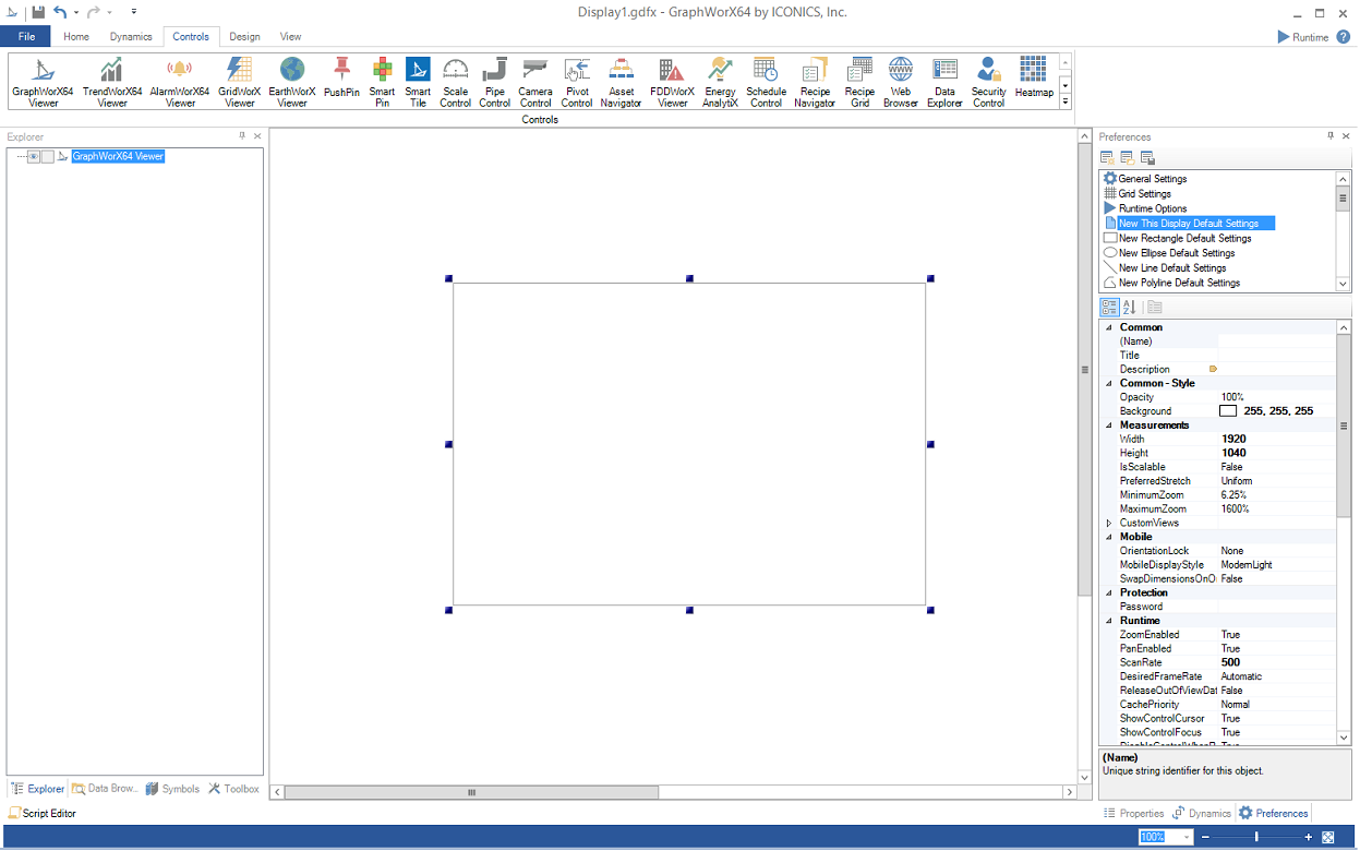
To add a GraphWorX64 Viewer within a GraphWorX64 display, click on the Controls ribbon, then on the GraphWorX64 Viewer icon and then click within the main window or draw a box where you intend the viewer to appear.
GraphWorX64 Viewer Added in a GraphWorX64 Display Within the Workbench
The following Properties can be set for the GraphWorX64 Viewer:
Common
-
Name: Unique string identifier for this object.
-
Title: Title for this object. Unlike the Name property, the Title does not have to be unique.
-
Description: Description for this object. The Description typically appears as a tooltip for the object.
Common - Style
-
Opacity: Overall opacity percent of this object. Range: 0% (fully transparent) - 100% (fully opaque).
-
Effect: Visual effects (3D-edge, shadow, glow, blue) applied to this object.
-
Foreground: Foreground color, gradient, or pattern of this object.
-
Background: Background color, gradient, or pattern of this object.
-
Border Brush: Color, gradient, or pattern of the border surrounding this object.
-
Border Thickness: Width of the border surrounding this object.
Measurements
-
Angle: The current angle of rotation for this object.
-
Left: Horizontal position of top-left corner of the object.
-
Top: Vertical position of top-left corner of the object.
-
Width: Width of the object.
-
Height: Height of the object.
-
Padding: The amount of space surrounding the content of this object.
Misc
-
Source: Get/set the address (URL or filename) of the loaded display.
-
 InitialGlobalAliasesInitialGlobalAliases
Clicking on the ellipsis button [...] next to InitialGlobalAliases in the GraphWorX64 Viewer Properties opens the 'Set Global Themes and Aliases' window. You have the option of Adding (then Editing or Removing) both Themes and Aliases. Once you have finished making your settings, click OK to save them.
Set Global Themes and Aliases Window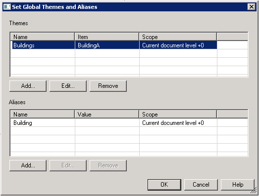
: Gets/sets initial Global Alias values for the first display loaded into this viewer. -
InitialLocalAliasCommandType: Gets/sets an initial Local Alias command type for the first display loaded into this viewer (used with InitialLocalAliasCommandData).
-
InitialLocalAliasCommandDataInitialLocalAliasCommandData
Clicking on the ellipsis button [...] next to InitialLocalAliasCommandData in the GraphWorX64 Viewer Properties performs certain actions based on the option set in the InitialLocalAliasCommandType pulldown (None, Direct or File).
* If 'None' is selected in the InitialLocalAliasCommandType pulldown, then clicking on the ellipsis [...] button next to 'InitialLocalAliasCommandData' will do nothing.
* If 'Direct' is selected in the InitialLocalAliasCommandType pulldown, then clicking on the ellipsis [...] button brings up the 'Edit Local Aliases' window. In this new window, clicking on the ellipsis [...] button in the Alias Name column opens the 'Select Local Alias' window and clicking the ellipsis [...] button in the Alias Value column opens the Data Browser.
Edit Local Aliases Window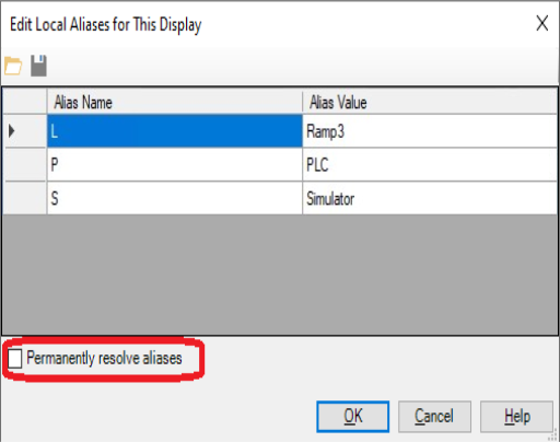
* If 'Local' is selected in the InitialLocalAliasCommandType pulldown, then clicking on the ellipsis [...] button brings up an 'Open File' window, allowing you to navigate to your desired file.: Gets/sets an initial Local Alias command for the first display loaded into this viewer (used with InitialLocalAliasCommandType). -
HasBorder: Gets/sets whether or not this control has a border.
-
VerticalScrollVisible: Gets/sets vertical scroll bar visibility.
-
HorizontalScrollVisible: Gets/sets horizontal scroll bar visibility.
Misc - Commanding
-
CommandingEnabled: True to enable receiving commands.
-
DragAndDropCommandingEnabled: True to enable receiving commands by drag and drop.
-
CommandingDisplayName: Control name visible to users.
-
CommandScope: Maximum scope of commands this control can send.
Mode
-
AutoStartRuntime: True, automatically starts this control in runtime mode.
Text
-
FontFamily: Specifies the name of the font used to render text.
-
FontSize: Specifies the size of the font used to render text.
-
FontStyle: Specifies the style of the font used to render text (italic).
-
FontWeight: Specifies the thickness of the font used to render text (bold).
See