Appearance Tab Options (AlarmWorX)
Although all objects have an Appearance tab, not all options are contained on each one. For example, the Show Outline option draws a box around the viewer; that option would not be useful for a grid object as it defeats the purpose of grid lines. The significant features exposed on this tab are the ability to change the name of the viewer and control its display, as well as to add a subtitle as a second line below the title. You can also dock the toolbar top, bottom, right, and left, as well as float the toolbar; but these operations are available using your mouse in runtime as well. The table below summarizes the options available to a control in AlarmWorX64 Viewer .
All of the settings described above, and more, are exposed in the Configuration dialog box on the Appearance tabs. This topic describes Appearance Tab options as they are offered for the following:
Click the hyperlinks above to read more about each object's Appearance tab.
|
|
Note: For a description of the Advanced tab, refer to Advanced Display Options (AlarmWorX). For a description of other grid options, refer to Grid Options in AlarmWorX. |
Appearance Tab for a Viewer
To open the AlarmWorX64 Viewer Configuration dialog box, click to select the viewer and then click the Configure Viewer button. The Appearance tab is shown in the figure below. The Advanced tab gives you access to the viewer's properties.
The Appearance Tab for a Viewer Object
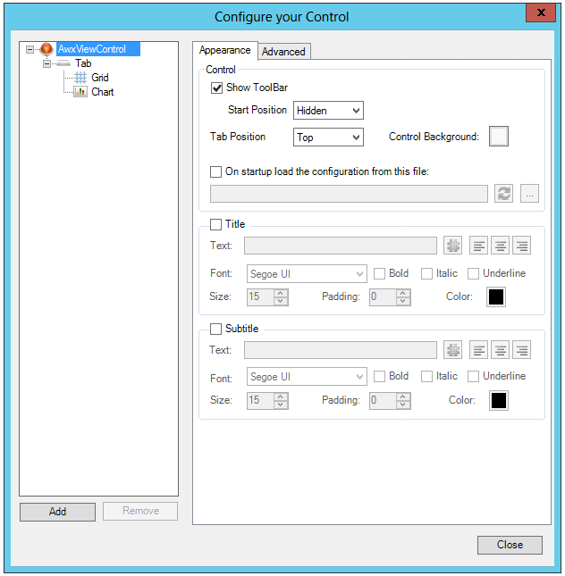
The options for the entire AlarmWorX64 Viewer is set in the dialog box shown above. The major options you can set are:
-
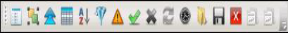
Show Toolbar: This displays the runtime toolbar in the Start Position you select in the drop down menu. You can select Top, Bottom, Left, Right, Float, or Hidden as the Start Position.
AlarmWorX Runtime Toolbar
-
Tab Position: This option determines where Tabs for the different displays appear at runtime. You can choose Top, Bottom, Left, or Right.
-
Control Background and Header Background: Set the color, gradient, or image that appears in the viewer background or in the header background at runtime. An X indicates that nothing (blank) is selected.
-
On startup load the configuration from this file: Click this checkbox if you would like a specific saved configuration file to load at startup. Click the ellipsis [...] button to browse to your selected file. Note that if you specify a link to an external file, all the configuration changes to this specific control will be ignored when the display is saved.
-
Title: The Title section allows you to set the properties (enter the text or connect it to a data source via the hashtag [#] button, set the positioning, the font, the font style, the size, the padding and color) of the first line of labels that appears in the header. Use the Text Ellipsis button if you want to assign an alias or expression as the text that shows for your label. The font characteristics apply to this first line (Title) only.
-
Subtitle: The Subtitle section duplicates the properties for the Title section, but applies to a second line of text. Both Title and Subtitle are optional properties.
Appearance Tab for a Tab Object
The Tab object options are rather simple and apply only to the tab object itself. Other than determining the text that appears in the tab, the other options set font characteristics or color only. The option for where Tab objects are placed relative to the viewer is set at the Viewer object and were described above.
The Appearance Tab for a Tab Object
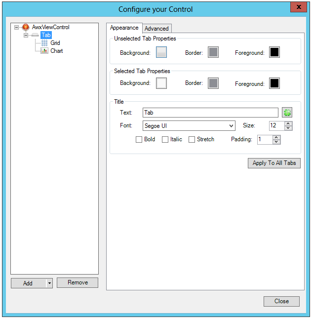
The properties for the Tab object is shown in the figure above. The following properties are available to you for those tabs:
-
Unselected Tab Properties: These properties allow you to set the color of the background and border as well as the amount of padding separating the tab from the header and grid objects for any tab that isn't currently in view.
-
Selected Tab Properties: These properties apply to the currently viewed tab, and to only the tab area.
-
Title: The title is the text that you see displayed in the tab object. Using the hashtag [#] button, you can assign a language alias (letting you translate tabs for a multi-lingual user base) or expression. The other properties allow you to set the font characteristics of the text.
-
Apply to All Tabs: This button makes your current selections the default for all tabs in the viewer.
Appearance Tab for a Grid
The Appearance Tab for a Grid
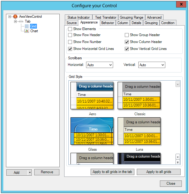
The Appearance of the Grid is defined in the properties shown above. These properties are duplicated in the Show/Hide tab group found in AlarmWorX64 Configuration ribbon. You see this ribbon when AlarmWorX64 is in configuration mode. There are some additional options that you see in the Appearance tab that aren't available in the ShowHide tab group. The following options are available for grid objects:
-
Show Elements:This check box either selects or deselects all of the check boxes in the Show Elements section.
-
Show Row Header: A row header is a small first column that appears on the left of the grid. At runtime you can click on the row header to select a specific alarm.
-
Show Group Header: A group header can be displayed that will show which groups are used to sort your alarm data. Any value or column can be used to sort values, and multi-level sorts are possible. To add or remove sorted criteria drag a column header to the group header, or drag the name of the column off the group header.
-
Show Row Number: Shows row numbers.
-
Show Column Header: Shows the column header.
-
Show Horizontal Grid Lines and Show Vertical Grid Lines: Grid lines separate the different values of the alarms. Horizontal grid lines separate one alarm's values from another alarm. Vertical grid lines separate each type of value displayed in columns, one from the next.
-
Show Header Filters: Click this checkbox to show filter options for the grid's headers.
Scrollbars
- Horizontal and Vertical : These two pulldown menus affect scroll bars for the grid object at runtime when there is additional data that can be displayed. Options include Auto, Disabled, Hidden or Visible.
Grid Style
-
Grid Style: You can change the color scheme of the grid by selecting one of the styles in the gallery.
-
Apply to all grids in the tab button: Makes your choices appear on any grid in the tab.
-
Apply to all grids button: Makes your choices the assignment for all grids in the display, regardless of the tabs that they are located on.
The figure below shows different elements of a grid at runtime.
Grid Display Features

See Also: